A Practical Guide to Improving Web Accessibility
Skip other details (including permanent urls, DOI, citation information)

: This work is licensed under a Creative Commons Attribution 3.0 License. Please contact mpub-help@umich.edu to use this work in a way not covered by the license.
For more information, read Michigan Publishing's access and usage policy.
This paper was refereed by Weave's peer reviewers.
Introduction
This article is intended to provide guidance on making library websites and other digital content accessible within the constraints of most organizations’ technological environments. Accessibility can mean different things depending on the context, but the focus in this article is on web accessibility, which the World Wide Web Consortium (W3C) defines as “enabling people with disabilities to participate equally on the Web” (W3C, 2016). Many existing articles provide an overview of the big picture aspects of accessibility, including benefits to the organization (see Rowland, Mariger, Siegel & Whiting, 2010), legislation (see Fulton, 2011), statistics (see local census data), and general principles (see Quesenbery, 2014). The focus of this piece will be on specific best practices and guidelines, as well as their benefits for content creators, who frequently have limited access to edit digital content and cannot always apply recommended solutions that assume full control and access.
Benefiting Everyone with Universal Design
Web accessibility is often considered separately from other aspects of web design and development, pigeon-holing accessibility into a single point on a checklist (Quesenbery, 2009) instead of being integrated throughout the workflow. Unfortunately, such practice ignores the fact that accessibility impacts usability, findability, user experience, and other aspects of digital content, and affects all users, not just those with disabilities (Quesenbery, 2009). In order to provide a user experience that allows people to achieve their goals, accessibility guidelines and best practices need to be integrated into the regular content lifecycle.
Understanding accessibility requires us to consider the use of websites and other digital content holistically, encompassing:
- Hardware including desktop and mobile devices, pointing and input devices
- Software including operating system, browser, assistive software
- Environmental conditions such as lighting (Shneiderman & Hochheiser, 2001)
.") Figure 1. The user experience honeycomb. Source: Schofield, 2016 (used with permission).
Figure 1. The user experience honeycomb. Source: Schofield, 2016 (used with permission). Accessibility does not refer only to website design or code creation. The vast majority of most library websites are composed of content written and created by contributors outside of the team that maintains a website or digital service or system. All aspects of a website or digital services need to be considered when creating or maintaining content (see fig. 1).
Taking so many considerations into account can be difficult, but one potential solution is a holistic approach called universal design—also known as universal usability, or design for all—“to enable the widest possible range of users to benefit” (Shneiderman & Hochheiser, 2001). Ensuring that users with disabilities can make use of digital content is vital, but most of the recommended guidelines make digital content accessible to a broad range of people, not just those with disabilities. Thus, making content accessible to those with disabilities means it will be more accessible for all users.
Making Content Accessible
In many organizations, staff are encouraged to create and edit content in a variety of digital systems, including content management systems, LibGuides, and learning management systems. In these systems, content creators are usually limited to a WYSIWYG (What You See Is What You Get) editor that offers a very limited range of control over the content and its presentation. However, it is still possible to make content more accessible by following some content creation best practices.
Writing for the Web
While it is easy to focus on the technological aspects of digital content, the written text itself also affects accessibility. The average person, for example, can make simple inferences but will have difficulty with lengthy, dense text that requires constructing meaning across multiple chunks of text (National Center for Education Statistics, n.d.). Even without specific accessibility concerns, when text is presented in large and long paragraphs, users may have more difficulty reading the text and will have to spend more effort referring back and looking for specific pieces of information. Well written and spaced text decreases the chances of a reader getting lost, thereby improving the likelihood that users find what they want or need, and improving user experience.
There are many books published on writing for the web, but at the core, there are three main points to keep in mind when writing content:
- Be clear and concise.
- Format text to include considerable white space; break up longer paragraphs, and use bullet points.
- Write in simple language with everyday words; avoid jargon and acronyms, or make sure to explain them.
Simple and clear writing improves accessibility, particularly for users with reading disabilities and those with difficulty concentrating. It is important to have white space so that users can easily scan text, and find their spot should they be interrupted. Jargon and acronyms can be difficult to mentally parse if they are not part of a user’s everyday vocabulary, and if not properly explained may impede understanding. Following these writing guidelines will improve the user experience since users can better understand and interpret the content (Kammerer, 2009).
Headings
A heading is a topical or subject phrase, describing the content below it. Often headings are treated as a visual element, created by changing the size and weight of the text, but they are an important semantic element that helps structure and organize the text for all users. Headings in digital content are used much like in formal writing or writing done for print. The top level heading is heading 1, and typically reserved for the title of a page, with headings 2 through 6 used for page content.
Example:
- Heading 1 (Title): Making Content Accessible
- Heading 2 (Topic): Creating Documents
- Heading 3 (Subtopic): Using Headings
- Heading 2 (Topic): Creating Media
Using headings properly also makes content more consistent, as each level of heading is typically styled by the system, such that even if changes are made to the code, the change will be applied uniformly to each affected heading. As users become familiar with a site, they will also become more familiar with what each level of heading looks like, making it easier to look for information within the content.
Many reading tools and assistive technologies allow users to read the headings first like a table of contents (see fig. 2) or to skip content by heading, so using headings to organize writing greatly increases the navigability of longer content.
 Figure 2. Weaveux.org outlined by WAVE, an accessibility tool.
 Finally, using headings not only makes the content easier for people to mentally parse, but also makes content more searchable and findable. Some search engines use headings to help determine what a page is about, so without headings, a page may end up lower in search results (Purtell, 2016).
Links
Much like headings, many assistive reading tools and software allow users to view all the links on a single page while ignoring the surrounding text, or to jump from one link to the next. Therefore, the textual description of a link needs to signal clearly the purpose of each link. Content creators need to particularly avoid uninformative phrases, such as “read more,” and “info” (WebAIM, 2016b).
Consider the following short piece of text (where underlined text is a link):
If you want to know more about descriptive links, click here.
In a list of links, a user using a “links only” view would only see or hear the text “click here,” making it difficult to distinguish from other links that have the same text. In order for links to be accessible, link text should be descriptive, ideally explaining what is linked to:
You can learn more about descriptive links from WebAIM.
Even if the user only sees the link text, it is now clear that the link goes to a WebAIM article about descriptive links. Assistive software users frequently show or read links only, so using “click here” does not allow users of such software to distinguish the differences between all the links with the same link text. Users of visual browsers also scan links when looking for relevant content, so using descriptive link text improves the user experience for all visitors by allowing for an easier understanding of where links go, letting users quickly find links, and preventing repetitive content.
Audio and Visual Content
For all audio and visual content (such as images and videos), an alternate version of the information should be provided to make the information accessible to users who cannot hear audio and/or see images and video. Not only is a textual alternative to audio/visual content necessary for deaf and visually impaired users, it can be helpful to users whose software cannot load the visual content, such as if the link is broken, or there is a bad connection. Almost one-third of the United States is not on broadband connections (Horrigan & Duggan, 2015), and many more are on slow connections, such as users in rural areas, on cheap internet packages, or on cellular network connections. These users are more likely to have images and video fail to load due to unreliable networks, and are more likely to intentionally turn off audio/visual content from loading in their browser to speed up page load times or save on data usage. Creators should keep in mind that they often have access to better hardware, software, and network connections than many, if not most, of their audience.
Images
Images need either “alt text” (alternative text) or a caption filled in with a brief description of what the image is trying to convey. The alt text is the textual description used in place of the image when the image cannot be loaded or read to the user when accessed using screen readers. The caption is text that is kept with the image and typically displayed below it. Most WYSIWYG editors provide fields to add text for alt text and caption, allowing for both to be filled in (see fig. 3). They should not repeat each other, but can be used to complement one another. For example, the alt text might describe the image itself, and the caption might have commentary or a source note.
 Figure 3. Screenshot of WordPress image editor with caption field filled in.
 In cases of images of charts or datasets, it is recommended to provide a summary of the data in the alt text, and if possible have an equivalent data table available either on the same page or an easily reached other location.
Note that not all images need captions or alt text. No text description is needed if the image is purely decorative, or if the image is a duplicate of textual explanation. For example, in a tutorial with step-by-step instructions, screenshots or other images to simply show what each step looks like do not necessarily need alt text. In figure 4, the flowchart helps people decide when alt text is required.
.") Figure 4. Image alt text decision flowchart. Source: Alexander, 2010 (used with permission).
Figure 4. Image alt text decision flowchart. Source: Alexander, 2010 (used with permission). Images of text should be used sparingly, if at all, as actual text is accessible by default. For example, an organization’s name and contact information should be in text so that anyone can easily copy it for use elsewhere, such as a map application. Having contact and other basic information in text format is also very important, not only for direct accessibility purposes, but also to improve search results in search engines.
Adding and Creating Other Media
Like images, any audio/visual material should have an accessible alternative version. For audio the alternate version is a text transcript, either presented on the same page or as link to the transcript. Video alternatives include:
- text transcripts,
- closed or open captions: subtitles with description of non-speech elements, and
- descriptive video: video with an audio track describing the visuals.
If adding media that is not created in-house, consider asking the person or organization who created the material for a copy of the transcript. If that is not possible, consider using an automatic transcription program and then editing the transcript. There are a number of free and paid software, installable and online, such as PopUp Archive and VoiceBase. Commonly, video creators will use the transcript from YouTube’s automatic caption service that is generated after a video is uploaded.
Since it is time consuming to create or edit transcripts of existing material, consider making use of existing services within the organization or hiring a transcription service to provide accessible versions of required material on-demand, when requested by users with related disabilities. While that can be daunting, consider offering transcription services on-demand for users if you have a large backlog of non-captioned or transcribed media. At an academic institution, there may be a department with experience in making material accessible, who can provide assistance.
Transcripts and captions are useful not only for those using assistive software, but also for those who are hard of hearing, listening in noisy environments, and are less familiar with the spoken language (Griffin, 2015). One study showed that 80 percent of the respondents used captions to watch television even though they did not have a hearing impairment (Ofcom, 2006).
Embedding Third-Party Media
When adding media from a third-party (such as YouTube) in such a way that it can be played on the web page, also add a link to where the original source can be found. A link allows users to view the content on the original site, which may have more controls, accessibility features, and other features not available in the embedded version, including auto-generated closed captions.
Most embeds also include a small set of options the designer of the page can set (see fig. 5). While often these can be left to the defaults, it is worth making sure that the embedded media:
- has controls to play and pause at a minimum,
- has keyboard functionality for its controls, and
- does not automatically start playing (autoplay).
 Figure 5. Screenshot of YouTube embed options with “Show player controls” and “Show video title and player actions” checked.
These guidelines also apply to other interactive features on a website, such as carousels or slide shows.
Many embedded videos can be set to autoplay when the page is loaded or at some other time, as in figure 6. Media that autoplays can be distracting or confusing. For those using assistive software, autoplay is especially problematic because depending on how the media player is coded, the cursor or page focus may move every time the media automatically triggers an action, interrupting what the software is reading to the user. A user navigating the site by keyboard will constantly find the cursor jumping back to a carousel every time the image changes. For these reasons, autoplay should be avoided or switched off whenever possible.
 Figure 6. Screenshot of carousel from shouldiuseacarousel.com with autoplay enabled as It is changing slides.
Controls for media elements should be clearly visible with keyboard functionality enabled. Generally, media players will either be built into the system or originate from a third party, but should be properly tested before use.
Adding links to sources, disabling autoplay, and providing playback controls, ensures a positive user experience by allowing users to decide how they interact with the content. In WordPress YouTube embedded videos have controls and do not autoplay by default, so that the only other thing needed is a link below to the actual YouTube page with the video. Users come to a site for the content, but for the best user experience, the user should be allowed to decide how to access, view, and interact with that content.
Color Contrast and Text Styles
For text and media, color should not convey meaning. For example, charts and figures are frequently made with different solid colored sections. However, about 8 percent of men and 1 percent of women (Mandal, 2014) have a form of colorblindness, and may not be able to tell which color reflects which piece of information. For example, in figure 8, the green at the top and the red to the right of it are difficult to distinguish in the grayscale version, being divided only by a very thin line. The two yellows on the left may also be difficult to distinguish in both versions.
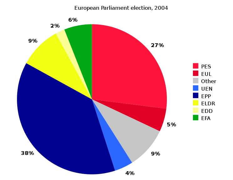

Figures 7 & 8. Example pie chart using various solid colors with grayscale version for comparison. Source: Liftarn, 2009.
While this is particularly relevant to images, this guideline applies to text content as well. Assistive software will frequently indicate if text is bold or italic, but not if it is simply displayed in a different color. Some users may need to view a site using monochromatic displays. Users may also print information, and will appreciate being able to print in black and white, or grayscale.
Good color contrast also increases visibility in poor lighting conditions. For example, when viewing a screen in bright light that causes glare on the screen or if the screen is set to a low brightness level to save battery life, content is more viewable if it has high contrast. These are situations that affect all users, not just those with assistive devices.
Documents
Document creation (Word, PDF, etc.) should follow the same general principles as web content. Making documents accessible allows users not only to read them with assistive software, but also allows all users to annotate and make notes, copy, and print information. Most document creation programs, including Word and Acrobat Reader, have built-in accessibility checkers. Document content is not guaranteed to be viewable in a web browser, which may force the user to open the content in a separate application. Text that is meant to be read online should not be put into a document, but made part of the page.
Assessment and Evaluation
Many excellent strategies for evaluating and assessing websites and digital content are covered in other articles or resources on usability, analytics, and user experience (see usability.gov/ for more). While a full exploration of this area is out of scope of this article, this brief overview should provide a starting point, and focuses on assessment and evaluation centered on meeting accessibility guidelines.
There are many types of tools that can help determine whether digital content is accessible:
- Documents and other non-web page content: most popular commercial document creation software, such as Microsoft Office and Adobe Acrobat, have built-in accessibility checking tools. Otherwise, following the content creation guidelines above should cover most cases (see WebAIM, 2016a for more).
- Emulation/simulation tools: These tools provide a different representation of what users see or hear. Examples:
- WAVE Toolbar can display a web page in different ways, such as an outline of headings, and a text-only version.
- Colorblind Web Page Filter simulates different common types of colorblindness.
- Fangs, a Firefox plugin, emulates a screen reader by providing what would be read out loud in text format.
- Automated code checkers check whether a web page meets guidelines based solely on the output code. Examples:
- HTML Codesniffer, a bookmarklet, which checks whether code conforms to either Section 508 of the Americans with Disabilities Act or Web Content Accessibility Guidelines (WCAG).
- WCAG Contrast Checker, a Firefox plugin, which checks color contrast of all elements.
- Assistive technology: directly test a website’s accessibility, usability, and overall user experience using screen readers and other assistive technology. However, many specialized software and devices require training to use.
The difficulty with many of these assessment and evaluation tools are that they assume the user will understand and know how to interpret the results and apply the necessary changes to fix any issues. Unfortunately, many of these tools do not have an “easy” or “basic” mode, flagging all instances of possible accessibility issues, which can be overwhelming.
Content creators may also find errors in parts of the website that they have no control over, such as the header or the default styles of content. Focus on the content pieces that can be easily fixed (see W3C, 2015 for more information), and then, if possible, speak to the administrators or developers of the website (see next section on Talking to Vendors).
False positives are common with automated tools, so the results they produce need to be carefully scrutinized. For example, some checkers will flag all instances when an image has no alt text. However, if the image is decorative, then that particular instance of the error can be ignored.
Even without automated tools, content creators can still do periodic checks of their own or their peers’ content following the guidelines presented in this article.
The most important evaluation method is to get feedback from users. Design decisions are frequently made based on assumptions that cannot be validated or invalidated without testing by real users (Loranger, 2014). Whenever possible, find users who use assistive technology to help with testing. Make the effort to include such users in any usability testing.
Talking to Vendors
Because many content creators or organizations do not have full control of the digital services provided by the library, it is important to have a review of third-party digital content and services and report any issues to the appropriate vendor.
When reporting issues to vendors, it is critical to provide as much detail as possible about the problem, and how or when it occurs. Simply saying “the website is broken” or that the product needs to be “made accessible” is uninformative and makes it difficult for the person receiving the comment to assist, resulting in very little change. However, if there are specifics about the issue, then it is at least possible for the vendor to fix the issue. If there are multiple issues, report the issues separately, addressing each one as they are found. Possible solutions to the problem should be included or a link to such a solution provided. If providing a link, the page or a section of the page should clearly solve the specific problem, preferably with code examples if applicable.
Always provide information on the device’s operating system, browser (if applicable), vendor software or service where the problem is encountered with version numbers, if applicable. Try to detail the specific steps that were taken and whether the issue could be replicated in another session. Also, include an annotated screenshot of the problem if possible.
For example, a simple request might look something like this:
I think this change could improve the accessibility for images added in the system. When a user adds an image:
- Choose the file to upload.
- Fill in the alt text field.
- Leave the title field empty.
For some reason, the alt text always shows up as the title instead.
Example: http://library.com/location/; the picture of our main branch has alt=”” and title=“large red brick building” but in the media library, it’s the opposite.
Using: Library Website v1.2.3
Browser: Firefox 43.1
OS: Windows 10
Accessibility Statement
After making digital content more usable and accessible, an organization can increase transparency and show commitment to providing equivalent access to users by writing and posting an accessibility statement.
An accessibility statement can be relatively short, but should include some basic information, including:
- what has been made accessible
- whether the site conforms to one or more specific sets of guidelines
- what part of the content is not controlled in-house (namely vendor products, but it can include a line to say the organization works with vendors)
- who can be contacted, and how, if there are any issues.
Some examples of accessibility statements are:
- University of Toronto Accessibility Statement,
- University of Oxford Accessibility Statement, and
- North Carolina State University Accessibility Statement.
Conclusion
Many organizations do not have complete control of the online systems used to provide information and services to their users. Off-the-shelf vendor tools make up a large amount of the digital tools many libraries offer users, so often organizations leave it to vendors to make the needed improvements. However, as this article shows, there are things staff likely can do within the constraints of vendor tools and systems to make their content more accessible, as well as communicating more effectively with vendors about accessibility issues.
Accessibility is not simply a way to meet legislation or avoid litigation, but a fundamental aspect of a user’s experience of the organization’s digital space. Libraries should integrate accessibility concerns into the larger picture of user experience to benefit all users, not just those with assistive devices.
Note: For a more technical look at creating accessible websites and applications, see the author’s recent co-authored article in Code4Lib Journal: A Practical Starter Guide on Developing Accessible Websites.
References
- Alexander, D. (2010). Text alternatives—a decision tree. 4 Syllables. Retrieved from http://4syllables.com.au/articles/text-alternatives-decision-tree/
- Fulton, C. (2011). Web accessibility, libraries, and the law. Information Technology & Libraries, 30(1), 34–43.
- Griffin, E. (2015). Who uses closed captions? Not just the deaf or hard of hearing. Retrieved from http://www.3playmedia.com/2015/08/28/who-uses-closed-captions-not-just-the-deaf-or-hard-of-hearing/
- Horrigan, J. B., & Duggan, M. (2015). Home broadband 2015. Pew Research Center. Retrieved from http://www.pewinternet.org/2015/12/21/home-broadband-2015/
- Kammerer, M. (2009). Writing user friendly content. UX Booth. Retrieved from http://www.uxbooth.com/articles/writing-user-friendly-content/
- Liftarn (2009). Pie chart EP election 2004.svg [image file]. Wikipedia: The Free Encyclopedia. Retrieved from https://en.wikipedia.org/wiki/File:Pie_chart_EP_election_2004.svg
- Loranger, H. (2014). UX without user research is not UX. Nielson Norman Group. Retrieved from https://www.nngroup.com/articles/ux-without-user-research/
- Mandal, A. (2014). Color blindness prevalence. News Medical. Retrieved from http://www.news-medical.net/health/Color-Blindness-Prevalence.aspx
- National Center for Education Statistics (n.d.). PIAAC 2012/2014 results summary. Retrieved from https://nces.ed.gov/surveys/piaac/results/summary.aspx
- Ofcom. (2006). Television access services. Retrieved from https://www.ofcom.org.uk/consultations-and-statements/category-1/accessservs/summary
- Purtell, M. (2016). In 2016, how important is an H1 tag for SEO? Search Engine Journal. Retrieved from https://www.searchenginejournal.com/in-2014-how-important-is-an-h1-tag-for-seo/
- Quesenbery, W. (2009). Usable accessibility: Making web sites work well for people with disabilities. Retrieved from http://www.uxmatters.com/mt/archives/2009/02/usable-accessibility-making-web-sites-work-well-for-people-with-disabilities.php
- Quesenbery, W. (2014, January 21). A web for everyone: Accessibility as a design challenge [webcast]. Hosted by O’Reilly. Retrieved from http://oreillynet.com/pub/e/2992?imm_mid=0b6284&cmp=em-na-webcast-info-webcast_20140120
- Robson, N. (2013). Horizontal scrolling and user experience: best practices. Usability Geek. Retrieved from http://usabilitygeek.com/horizontal-scrolling-user-experience-best-practices/
- Rowland, C., Mariger, H., Siegel, P. M., & Whiting, J. (2010). Universal design for the digital environment: Transforming the institution. EDUCAUSE Review, 45(6). Retrieved from http://www.educause.edu/ero/article/universal-design-digital-environment-transforming-institution
- Schofield, M. (2016). How to talk about user experience. LibUX. Retrieved from http://libux.co/how-to-talk-about-user-experience/
- Shneiderman, B., & Hochheiser, H. (2001). Universal usability as a stimulus to advanced interface design. Behaviour & Information Technology, 20(5), 367–376. doi:10.1080/01449290110083602
- W3C. (2015). Evaluating websites for accessibility: Overview. Retrieved from https://www.w3.org/WAI/eval/Overview.html
- W3C. (2016). Accessibility. Retrieved from https://www.w3.org/standards/webdesign/accessibility
- WebAIM. (2016a). Articles. Retrieved from http://webaim.org/articles/
- WebAIM. (2016b). Links and Hypertext. Retrieved from http://webaim.org/techniques/hypertext/link_text