Collecting Space Use Data to Improve the UX of Library Space
Skip other details (including permanent urls, DOI, citation information)
: This work is licensed under a Creative Commons Attribution 3.0 License. Please contact mpub-help@umich.edu to use this work in a way not covered by the license.
For more information, read Michigan Publishing's access and usage policy.
This paper was refereed by Weave's peer reviewers.
Abstract
Collecting data about where people are and what they are doing is an easy entry point into exploring the UX of library space. This article examines projects at two academic libraries where space use data was collected multiple times per day for several months. The two projects were designed and carried out independently but had the same purpose: to better understand how students were using library spaces so that we could improve student experiences. Collecting space use data provided a baseline understanding of user behavior in these spaces. Similar to web analytics, this baseline can be useful on its own or used in conjunction with other forms of user research.
Introduction
Librarians can better understand user behavior and subsequently improve user experience within physical library space by choosing to capture what we call space use data. Space use data is simply information about how and where people are using library space. The data can be very detailed—specific seats occupied, conversation levels, tools or materials in use—or quite general, such as areas labeled “mostly full” or “half full.” Collecting space use data can be useful because it can answer very basic questions about how students use the physical library environment and prompt librarians to further explore why students do the things they do within our spaces. This understanding can subsequently be used to improve user experience within an existing space or inform design decisions for new spaces.
Librarians can also use space use data as a baseline against which to measure the effects of changes made to physical space. In this way, space use data is similar to web analytics. Just as it’s useful to conduct user research beyond web analytics (Casden & Davidson, 2013), improving the user experience within physical spaces will require more than space use data alone. However, both web analytics and space use data provide an important baseline that can both support and drive other forms of user research.
This article examines separate space use data collection projects conducted at our respective libraries: MacOdrum Library at Carleton University and Mary Idema Pew Library at Grand Valley State University. These projects represent only one aspect of user research that we’ve conducted in our libraries, but we consider this data collection to be a useful starting point for librarians interested in improving UX within their physical spaces. The methodology is flexible and can be customized to work at any institution. It can be modified to examine entire libraries or selected spaces, specific time frames or long-term trends, and it can be used to gain an understanding of new or existing spaces.
While we designed and carried out these projects separately, the purpose of both projects was to better understand how students are using our library spaces and to use that knowledge to improve student experiences. Our individual methodologies were driven by priorities that were also similar: gathering data over a full semester or more, minimizing disruption to students, and getting our projects off the ground quickly. There were also notable differences in our results, demonstrating that libraries should examine how people use their own particular library spaces rather than relying on conclusions drawn from user research done at other libraries.
This article details each project individually and concludes with a shared reflection. Comparing the two projects side-by-side demonstrates that:
- there are multiple ways to collect and apply space use data;
- results can vary even among similar institutions;
- collected data can be used to drive library policy; and
- this work can be conducted regardless of organizational structure.
Literature Review
The purpose of space use data collection is consistent with a concept prevalent in library UX literature: user behavior should drive decision making. Amanda Etches states that “bringing user research data to bear on the decisions you make about your services, spaces, and interfaces elevates the discussion from one based in staff opinion to one based on the actual behavior of the people you serve: your users” (2013, p. 14). Aaron Schmidt similarly notes that “working with facts about the library and the behavior of users elevates the discussion from being a collection of people's opinions to one that's grounded in reality” (Schmidt, 2016, p. 26).
Although Etches and Schmidt advocate for studying user behavior to improve user experience within the physical library, the authors of the studies that laid the framework for our projects do not explicitly situate their work within the context of UX. Given and Leckie (2003) seem to have been the first to use what they call “seat sweeps” to gather information about use of library space: where people are in the library and what they are doing. They situate their work within behavioral and social geography, as well as environmental psychology; seeking to document and understand user behavior, not to improve spaces or user experiences. Ramsden (2011) and Harrop and Turpin (2013) used observational sweeps and other methods to explore academic libraries as learning spaces and the learning behaviors within them. Holder and Lange (2014) looked to the fields of urban planning and architecture to contextualize their mixed-methods study of library space. Khoo, Rozaklis, Hall, and Kusunoki (2016) examined shifting paradigms of the academic library building using sweeps and surveys. As UX practitioners, we believe that explicitly situating space use data within UX contributes to a growing understanding and practice of UX in libraries.
Most studies that have examined use of library space through these kinds of sweeps have focused on short periods of time. Given and Leckie (2003) collected data three times per day over six days, but only analyzed three days’ worth—nine sweeps. Holder and Lange (2014) did eleven sweeps of one space under study and ten sweeps of another. Ramsden (2011) conducted many more sweeps—four times per day every weekday in November—but data gathering was still limited to a single month. Even studies that collected data over a longer time span covered only a small window within that time. Harrop and Turpin (2013) collected data four times per day on single days in December, January and March, for a total of twelve sweeps. Høivik (2008) did sweeps once per hour on six days spread out over seven months, May to November. Fox and Doshi (2013) gathered data four times per day, every day for one week in 2008 and again in 2010. Clark amassed a huge amount of data over two academic years “consist[ing] of almost 40,000 patron observations” (2015, p. 146), but his paper focuses almost exclusively on survey and focus group data. The recently published study by Khoo et al. (2016) gathered 114 seat counts over nine months, but data was captured irregularly, varying from one sweep in a month to thirty-four sweeps. We wanted a more complete picture of how our spaces were used, so chose to collect data multiple times per day over several months. Much as you would not want to limit your web analytics to the busiest week, we saw value in both observing the rhythm of the year and in examining the highs and lows.
Any discussion of space use data in libraries is not complete without mentioning North Carolina State University Libraries and their Suma project. Since 2011, they have been using Suma, a “mobile web-based assessment toolkit for collecting and analyzing observational data about the usage of physical spaces and services” (North Carolina State University Libraries, 2014). The team has not shared their experiences in the library literature, but has given many conference presentations and, perhaps more importantly, has shared their code. Suma is open source, available on GitHub, and in April 2016 their website stated “there are over 100 implementations at other academic libraries.” However, similar to our own experiences, Thompson (2015) found that adapting Suma for use at her library was going to be more work than creating a new solution.
It should be noted that data on space use was only one component of many of the studies cited here. Holder and Lange (2014) used a survey and comment boards to solicit opinions on furniture and satisfaction with space. Harrop and Turpin (2013) asked students to take part in a coordinate or photographic mapping exercise to demonstrate and explain their space preferences. Clark (2015) used a survey and focus groups to determine user preferences. Fox and Doshi (2013) administered a survey to ask how well the space met student needs, and Khoo et al. (2016) also conducted a survey on user perceptions. In addition to both a survey and focus groups, Ramsden (2011) had students complete learning logs, take photos of favorite and least favorite spaces, and complete short in-person interviews to examine the impact of space on learning behavior. This kind of triangulation certainly gives a more complete picture than raw data alone, going beyond what users do and attempting to discover why they do it. As useful as a mixed methods approach can be, starting with space use data is an easier, less time-consuming way to begin user research relating to physical library space. Space use data can then generate questions to explore in subsequent user research projects.
Carleton University Case Study
Background: Carleton
Carleton University, located in Ottawa, Ontario, has a single library for its student population of 28,000, 86 percent of which are undergraduates. By the end of 2013 the library had been extensively renovated to add:
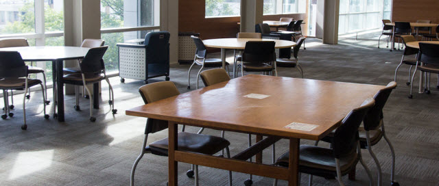
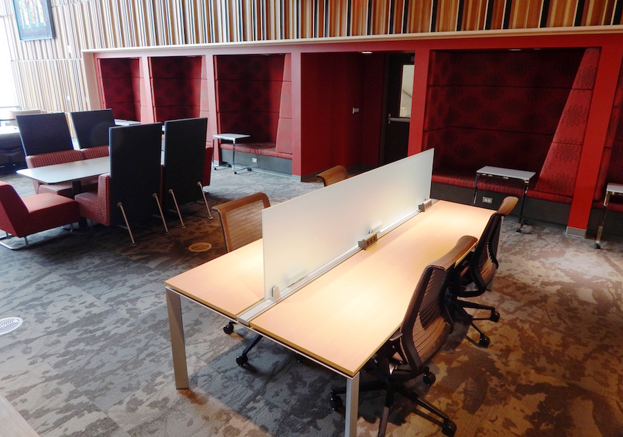
- More space at the front of the building: a lounge space with a variety of soft benches and carrels on the main floor, and a mix of carrels and group study tables on the other floors.
- A floor-to-ceiling glass facade, replacing its previous bunker-type exterior.
- Two floors on a previous extension of the building: one adding silent study space primarily for graduate students, the other creating the Discovery Centre—a flexible space with a mix of furniture to facilitate and encourage undergraduate student collaborative research. The Discovery Centre is not operated by the library, but through the Office of the Provost.
There was interest in evaluating use of the new Discovery Centre space, but a formal evaluation of library space was not planned. As a web librarian, I do a lot of work on the UX of our web interfaces, but have no formal responsibilities regarding physical space. However, I felt strongly that we needed to assess the library space as well as the Discovery Centre space. I spoke to our assessment librarian and to the associate university librarian responsible for the building and got their support to pursue a space use study on my own. At the outset, the goal of the study was to gain broad insights into how students were using our space.
Most random sampling of library space use tries to hit busy times, which makes sense: you don’t want to spend time collecting data that show your library is not used. Harrop and Turpin collected their data at “peak assignment hand in dates and examination periods” (2013, p. 62). Ramsden collected at “peak times” of day (2011, p. 456). However, during peak times, students may be sitting wherever they can find a seat, not necessarily where they want to sit. Non-peak times show where students really want to be when they have their choice of space. Collecting data to span both peak and non-peak times would help us better understand the differences in use throughout the academic year.
Methodology: Carleton
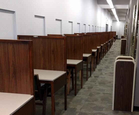
I had planned to do seat sweeps similar to those done by Given and Leckie (2003) to find out where people were and what they were doing in the library. However, because of our library’s configuration I wasn’t able to stand in a few spots and gather information about a large number of spaces; many of our carrels are arranged in long lines with a narrow aisle separating them from the stacks, so sightlines are poor (see fig. 3). I tried a test sweep of a section of the building with these kinds of carrels to see how much information I could capture. It became readily apparent that students were unnerved by someone walking slowly down the aisle beside them, making notes on a clipboard. It was better when I picked up the pace and simply counted them, but when I took even a small amount of time to glance at what they were doing, they would notice me and look up. I didn’t want to break student concentration or make them feel uncomfortable. Because of the limited sightlines in narrow spaces, seat sweeps became head counts—checkmarks in the places people were sitting.
The library’s stacks staff were recruited to do the data gathering. Stacks staff are responsible for shelving as well as the general well-being of the building and the people in it. They’re often on the floor helping students find materials, answering basic questions, responding to noise complaints, and more. My test sweeps of the whole building took about fifteen minutes. Stacks staff could split up the building, each covering one or two floors in about five minutes. They conducted the sweeps three times per day—generally at 10 a.m., 2:30 p.m., and 8:30 p.m.—Monday through Friday.
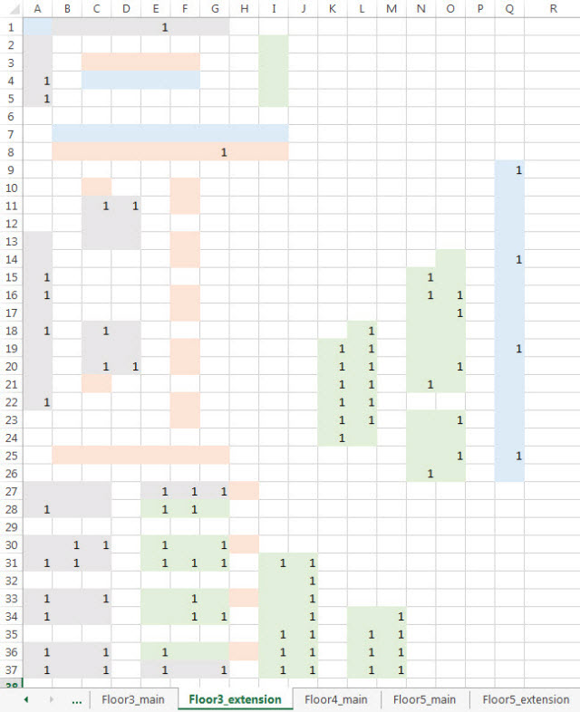
I updated our floor plans with the furniture layout so it was easy to mark where people were. For each sweep, stacks staff wrote in the date and time, made checkmarks where people sat, and circled the marks where people were actively working together. From that relatively small bit of data, I could then analyze the relative popularity of renovated spaces versus older spaces, silent spaces versus those that allowed quiet conversation, various kinds of furniture in the library, and window spaces versus interior spaces. I could see where and when people were doing group work. I could look at patterns over the course of the term or by time of day. By using detailed floor maps, if the data showed that particular seats were never used, I could follow up to find out why; were there problems with power outlets? Drafts? Excessive noise? Using detailed floor maps also made it easy for the staff gathering the data to keep track of which sections had been completed. The downside was that I had to keep the maps up to date when furniture was shifted.
This was a manual system—marking paper floor maps with pens or pencils—and an automated system could have been more efficient. But the time taken to automate would be time not gathering data. The project was about getting the data, not finding the best way to collect it. After collection, the floor map data was manually entered into Excel. It was time-consuming and awkward. But instead of spending time solving my data entry and analysis problem before I could even start, I could start gathering the data right now and do the data entry whenever I had a spare moment. We collected data from November 1 to December 22, 2014 and again from January 5 to April 17, 2015 for a total of 292 sweeps.
Analysis: Carleton
The Excel file used for data entry was structured and color-coded so that it looked like the floor maps. Because of the way the data was collected and entered, I was able to see patterns emerging early on in the project, which helped me identify potentially interesting areas for analysis.
The base for my analysis was to look at how many seats were occupied and divide that by the number of seats that were available, resulting in an occupancy rate. If eight out of ten carrels had check marks, it would be an 80 percent occupancy rate. Space described as “more popular” had a higher occupancy rate; fewer seats went unused.
This was not a perfect measure; in some cases people pulled up chairs from other spaces and the occupancy rate would exceed 100 percent. This often happened when people took chairs from carrels to use for group work at computers. The computers would then have an occupancy rate of above 100 percent, while the nearby carrels would show as unused when really they were unavailable. But since the computer space was obviously more desirable than the carrel space, I was comfortable showing artificially low occupancy rates for carrels. The point of collecting the data was not to get exact measures, but rather to identify trends and gain an overall sense of how the space was used.
Another area that was problematic was when students moved soft seats from the windows into carrels, so the carrel space was counted but the soft seating was not. I knew this was happening because some of the stacks staff were making notes on their data collection sheets when this happened, and others simply told me this was the case. This lowered the occupancy rate of the soft seats by the windows but, again, the carrel space was clearly valued more than a soft seat with no desk space. The data demonstrated that the soft seats in their original position were not popular. Staff observed that students wanted a soft seat in conjunction with a carrel. So, combining data with staff observation, the lesson was not that soft seats aren’t used, it was that these seats need desks or tables.
I created heat maps based on overall occupancy rate to get a quick visual of areas and furniture that were most and least popular with our students. This showed a few things very clearly. Although one area was extremely popular, certain kinds of furniture in that area were never used. Single carrels against the wall were very popular, but single carrels in the open were not. In blocks of carrels, the seats right beside the wall were occupied much more often than the other carrel seats in the same block (see fig. 6). Seeing the data in this way led to more questions: Can we fit more carrels beside existing wall space? What do students like so much about sitting next to a wall? Is there any way we can replicate that feeling in open spaces?
Results and Impact: Carleton
Since windows were such a significant part of our renovation, I looked at whether seats beside windows were more popular. Surprisingly, they were not. Because of the known issue with soft seats beside windows, I looked at the data without the soft seating, and still window seats were less popular. This seemed odd, so I expanded the analysis to look not just at seats immediately beside windows, but seats that were close to natural light as opposed to seats that were not. This showed a bit more popularity, but not as much as expected. Did seats by walls have better access to power? Not in all cases. Carrels that were near windows and had power outlets were still used less than carrels beside walls. As I was doing this analysis, Cha and Kim’s 2015 article was published, showing their findings that window views were less important to students’ choice of study space than other factors . In a survey done in my library about use of study space, students commented about the desirability of space by windows. In a recent meeting of our Student Library Advisory Committee, most students said their favorite place in the library was beside the windows. This may well be a case of people saying one thing and doing another, but this rather large discrepancy between data and opinion bears closer examination.
One of the goals of the renovation was to increase collaborative study space, primarily within the Discovery Centre, but also with more tables for group work. The vast majority of observed group work was two people working together; 81 percent of all groups noted were pairs and only 6 percent had four or more people. Often, one or two people occupied a group table so it was unavailable for a larger group, but this doesn’t entirely account for the very low number of larger groups working together since sometimes there were open tables nearby that larger groups could use. Sometimes a larger group will be sitting at a table but not working together—what Crook and Mitchell call “ambient sociality” (2012, p. 136) and what Medaille et al. more prosaically—and perhaps more accurately—labeled “just sitting together” (2015, p. 6). Group tables are not used as often as expected for collaborative group work, but are clearly desired by our students.
Study room use was also less than expected. Group study rooms are managed through a central university portal and we have little control over this system, but the library manages study rooms assigned to graduate students. Library staff had noticed that the grad rooms seemed empty, but thought they might be busier in the evenings. Seeing the data confirm the low use of these spaces has prompted a more in-depth evaluation of our graduate students’ needs.
As the project neared its completion, a new phase of library renovations was announced and new study space will be added on one of our silent floors. The data from this project can be used to help plan this new space, given what we now know about space use in silent areas.
As the web librarian, I’ve found it very interesting how much this project resembles web analytics. We now have a baseline for how people actually use our library study space. This baseline has answered simple but important questions: What kind of space are students likely to use at night in the middle of term? Is an event in this area more likely to be disruptive in the afternoon or the evening? The baseline also triggers other questions: Would use change if we put different furniture in an area? Why are people reluctant to share a round table when they will squish together at a long table against a wall? Why are the window seats less popular? This is exactly what happens when I look at web analytics; they prompt questions about the “why” of our users’ behavior that I then use other methods to answer.
Another similarity with my use of web analytics is in double-checking the information that we get from other research methods. Do those findings match up with what we have observed people actually doing? When survey results show that students prefer study space near windows but our space data show that window seats are less popular than seating beside walls, we know there is a bigger picture beyond what either method is showing us.
Grand Valley State University Case Study
Background: Grand Valley
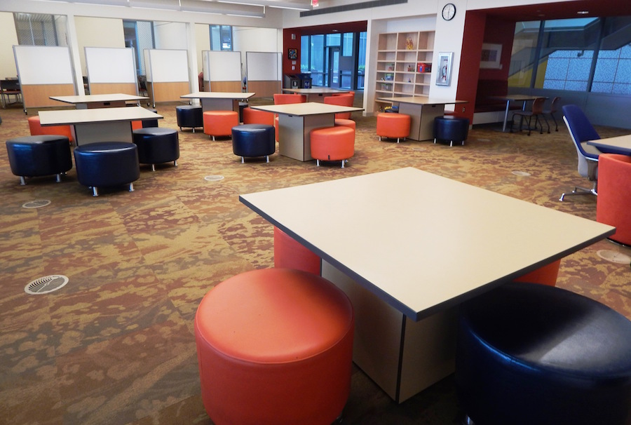
Grand Valley is located in Allendale, Michigan and has a student population of about 25,000, 85 percent of which are undergraduates. Grand Valley has five library locations across two campuses. The largest, busiest library is the newly constructed Mary Idema Pew Library Learning and Information Commons that opened in 2013; this facility primarily serves undergraduate students. The space was designed to be student-centered and flexible enough for students to manage their own learning: there are few formal rules for the space, signage that dictates behavior is avoided, and furniture is mobile and can be easily reconfigured to meet individual needs. About sixty mobile whiteboards are interspersed throughout the building and were designed to be used for writing and drawing, but also to partition space in public areas, creating what we call “rooms-on-the-fly.” Moving from the traditional academic library design of the highest floors designated as the quietest spaces, floors two through four are similar: the west side of each floor features furniture and other design elements that are conducive to collaborative group work, while the east side houses book stacks, furniture, and spaces that are meant to be quieter and individual in nature. Overall, two-thirds of the library was designed for collaborative work, while one-third was intended for individual study.
The library includes a variety of unique spaces, including the following:
- An Innovation Zone featuring floor-to-ceiling whiteboards and toys meant to be used for problem solving and the expression of abstract ideas.
- A Knowledge Market where students can get one-on-one assistance from peer consultants in the areas of research, writing, and public speaking.
- Two event spaces.
- Two reading rooms designed for quiet study.
- Public computers that are positioned on serpentine-shaped desks to allow extra space for group interaction.
In many ways, the building design was experimental, and we were curious how students would use it. Would they use spaces the way they were designed to be used? Was flexibility as important as we thought it was? Did we get the mix of individual and collaborative spaces right? Which spaces do students use most frequently? Do students use spaces differently during the day than they do in the evening? Are they moving furniture and whiteboards? Finally, and perhaps most importantly—if students are using the library differently from how it was designed to be used, then can we change something to improve their experience? We designed our methodology specifically to answer these questions.
As the user experience librarian, I have direct responsibility for understanding and improving the student experience of physical library space and lead a team of staff and students who are involved in this type of work. Our UX student assistants take the lead in staffing the single service desk, and their role includes roaming the library to assist patrons at the point of need and to ensure that the library is running smoothly from an operational standpoint. This team of students was intentionally created to help us improve the student experience of the library; their role and responsibilities help us identify pain points, implement solutions, and better understand the student perspective. This group was excellently positioned to help us collect space use data—they were already roaming the library each hour and the very nature of their work is meant to help us better understand student needs.
Methodology: Grand Valley
Collecting space use data was our first UX project focused on physical space in the Mary Idema Pew Library, and although we have since conducted several other user research projects regarding physical spaces, this was a useful starting point. When the building first opened, my position was new, the UX team of students was new, and the library was extraordinarily busy. As a result, we were well into our first semester in the building when we first started to think about collecting this data. While we considered utilizing Suma, we decided it wouldn’t work for us; we wanted to start collecting the data as soon as possible and needed to choose a technical tool that could be up and running quickly and customizable on-the-fly. Since we had limited time for prototyping, we wanted to use something that would be easy to change if we discovered a way to make it better any time throughout the collection process. While our digital initiatives librarian could have potentially made Suma work for us, it would have taken too much time to customize and implement.
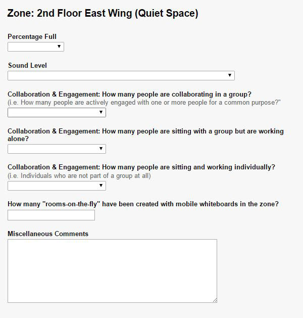
We created a simple Google form and asked our UX students to fill out the form on an iPad every day during their hourly roams during the peak and non-peak hours of 8 a.m., 10 a.m., noon, 2 p.m., 4 p.m., 6 p.m., 8 p.m., and 10 p.m. Similar to Carleton’s project, we wanted to understand which library spaces students would use when they had their choice of seating during non-peak times.
The Google form worked well for our original purposes—it was easy to create and modify, and because we were not collecting private or individual information, data security was not a priority. The form divided the library into zones and asked questions aimed at discovering what we wanted to know about how the building was being used. The first question asked students to indicate how full each zone was. While we initially designed the form to use exact numbers or headcounts here, after testing the instrument, we decided to instead include the following options: totally full, mostly full, half full, a few students, and empty. Because the library often has six hundred to nine hundred students at once in the building, this decision significantly reduced the time it took our student employees to complete the form and, in turn, minimized disruption to student patrons. Additional fields included the following:
- Conversation volume levels with scaled answer choices ranging from Low: the area is mostly quiet to High: It is loud in here! Many noisy conversations are happening!
- Type of study with the following choices: groups actively collaborating; groups sitting together but working alone; and individual study. Our “groups sitting together but working alone” description is similar to the “just sitting together” label used by Medaille et al. (2015, p. 6). For each of these choices, our students would choose an approximation of how many students in the zone were engaged in this type of study—all, most, etc.
- Groups using the computers with yes/no answer choices.
- Whiteboard “Rooms-on-the-fly” with exact counts.
When UX students were trained to collect this data, they were paired with another student or staff member for normalization purposes. However, inter-rater reliability was not tested. In later semesters, we discovered that normalization could be improved and have since worked to develop additional training components, including a normalization guide. The guide includes photographic depictions of each zone as well as photos of what we mean by values such as “mostly full” and “groups actively collaborating.” The guide only took a few hours to develop, and I would recommend creating one at the outset of data collection.
We started collecting data during the last two weeks of the fall 2013 semester and collected it through the winter 2014 semester. While data was collected the majority of the scheduled times, it was occasionally skipped if operational challenges arose. Overall, 654 observations were collected throughout this period.
Around the same time that we started collecting this data, we decided that we wanted to learn more about how students were using our nineteen group study rooms that are designed to accommodate groups of three to twelve students. We wanted to determine how often the rooms were being used, if students were using the reservation display screens appropriately, how often they were utilizing the technology available in the rooms, and how many students were typically using the rooms.
We decided to create a Google form—similar to the larger space use form—that specifically focused on study room use. We employed a similar methodology and had our UX students collect this data multiple times per day on their hourly roams during hours that the space use data was not scheduled to be collected.
Analysis: Grand Valley
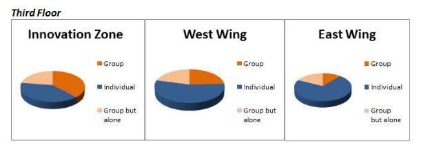
We used Microsoft Excel to analyze data in the spring/summer 2014 semester. We calculated and created visual representations of fullness by zone, noise level by zone, overall type of study, and type of study by zone.
We were also able to break down the sound level results by peak versus non-peak times and by time of day. This analysis was important to us—if no one is talking in a space that is fairly full, that indicates that most students are using that zone as quiet space, which is more meaningful than if no one is talking in a space that only has a few people in it. Similarly, the time of day analysis allowed us to get a more accurate understanding of how the library changed throughout the day. We also broke down fullness levels and type of study by time of day.
Using Excel wasn’t ideal. With so much data and no easy way to limit the data by peak times, this was an involved process. This partly contributed to our decision to utilize a more sophisticated data collection instrument in subsequent semesters. Our digital initiatives librarian and a student programmer constructed a dashboard that we now use for analysis. The dashboard allows us to view the data much more quickly and efficiently. While it wouldn’t have been worth creating the dashboard for one semester’s worth of data, it has been extremely useful for ongoing data collection.
Results and Impact: Grand Valley
Some results have led to changes in how we use certain spaces. For example, the data demonstrated that the third floor was the busiest floor of the library, while the space outside instructional classrooms in the Atrium level was underutilized. Knowing that the third floor is the busiest floor has prompted us to use this area for occasional marketing purposes, and we now consciously avoid using the third floor for events and special activities that would take away space from students. Data about the space outside the classrooms helped us identify that as an area that could benefit from furniture reconfiguration. When we had the opportunity to try a new line of furniture, we purposely chose that space to see if alternative furniture choices would improve the popularity of the space. While we cannot prove causation, there has been correlation: since the furniture was reconfigured, the data indicate that the space has been more popular.
While a significant benefit of collecting space use data is identifying opportunities for improvement, this data can also be used to confirm good design decisions. Our data as a whole demonstrated that for the most part, students used the new library the way that it was designed to be used. For example, the zones meant for collaboration were noisier and used by groups more frequently than the spaces meant for individual study, and students frequently used the whiteboards to create “rooms-on-the-fly.”
The data also made it clear that the flexibility built into our spaces was perhaps our greatest design success. Library employees had observed that the library was used differently during the day than at night. We could describe an increased “energy” in the building, but could not articulate what that energy was. The data confirmed that the library is indeed used differently based on time of day. In particular, individuals were recorded more frequently during daytime hours, while groups were recorded more often in the evenings than throughout the day. Likewise, conversation levels were higher in collaborative areas in the evenings than they were during the day. The “energy” that staff noticed is likely the result of more groups actively collaborating in the evening.
This difference in how the library is used throughout the day, coupled with insight relating to group and individual use, has made it clear that the flexibility of our spaces is very important. The data indicate that students sat individually slightly more often than they sat in groups. Also, 60 percent of the students who sat together were actively collaborating, while 40 percent of the students sat together but appeared to be working on their own. These are significant results because two-thirds of the library was designed to be collaborative in nature, while one-third of the library was designed for individual use, which may indicate that we overestimated the amount of library space needed for collaboration. Because most furniture is mobile, however, individuals can easily modify a collaborative environment to meet their own needs; they can break apart tables, pull chairs from a group cluster, or use mobile whiteboards to create a room on-the-fly. Going forward, student needs and behaviors could change, and again, the flexibility of this space would likely minimize the impact of this change.
Some of the data have raised additional questions and have helped us identify opportunities for further study. For example, individuals frequently sat in collaborative areas, which is a trend identified in several other studies (Bryant, Matthews, & Walton, 2009; Crook & Mitchell, 2012; Holder & Lange, 2014). Additional inquiry could help us better understand what factors our students consider when making this choice. Do some students make this choice simply because other space is not available? Is it because they need large table space? Do some students choose these spaces because they like to study with some noise? Is it because of the brighter color scheme and plethora of natural light? Ultimately, this increased understanding could help us ensure that our spaces meant for individual study offer the furniture and resources that students want and need. That our project data identified areas for future study reinforces our assertion that this type of data is a useful starting place for user research regarding physical library space.
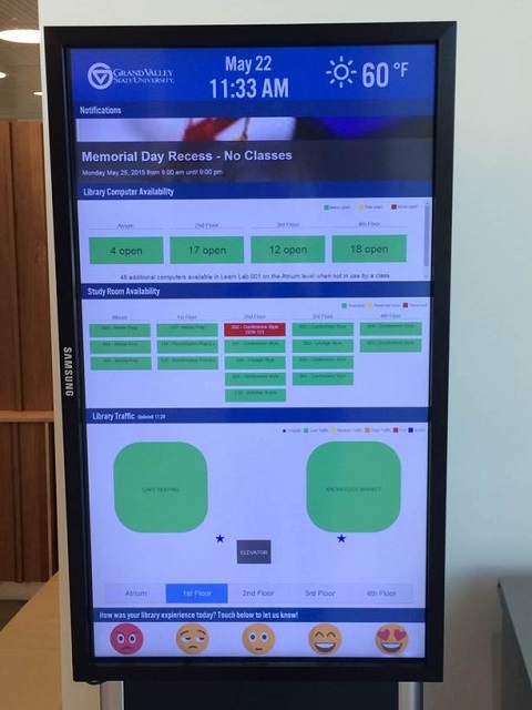
We continue to collect space use data. Initially, we found value in the results and wanted to continue to collect the data to see if space use would change over time. Eventually, however, we identified what I consider one of the most significant outcomes of this project: displaying this data can be helpful to student patrons. Digital displays throughout the library now show data on how full each library zone is, which allows students to quickly identify open seating, reducing a known pain point in their experience. This feature has been useful to students and is an example of how our data has allowed us to both directly and indirectly improve the student experience of the physical library.
Finally, our group study room results illustrate how this data can inform policy-making decisions. Shortly after the building opened, we placed signs featuring “Study Room Tips: for students by students,” on the outside of the study rooms. The tips included limiting the study rooms to groups of three or more when the library is busy. Library employees often observe instances of one or two people using study rooms, and because the library is often busy, some staff have perceived this to be problematic and have suggested tightening restrictions to actively ensure that these spaces are being used by groups of three or more. Because we had collected this data, we were able to determine that in the vast majority of instances when we recorded only one or two people in the study rooms, there were other study rooms free at the same time. When all of the study rooms were full, the rooms were overwhelmingly filled with groups of at least three people. The only purpose of limiting room use to three or more people is to ensure that larger groups requiring a study room have access to one. If one person is using a room but there are other group study rooms available, then that individual is not preventing a larger group from using a room and there is not a problem to solve. In this case, data helped demonstrate that what some library employees had perceived to be a problem was not actually problematic, and we were able to maintain an approach that is consistent with our overarching philosophy of allowing students to manage their own learning.
Reflection on Both Projects
We pursued these projects separately, although they both served as a starting point for user research relating to the physical use of our libraries. We undertook these projects for similar reasons: we had new or newly-renovated libraries and wanted to better understand how our students were using these spaces and, ideally, use that understanding to improve student experiences. Both of us were more interested in gathering space use data as soon as possible rather than waiting for a perfect methodology. We also wanted to ensure that our methodologies would include minimal disruption to students studying in our spaces and we prioritized this over collecting more robust data. Essentially, we did not want our goal of improving future user experiences to involve methods that would negatively impact the current user experience. This seems especially important when collecting data over a long timeframe.
Student employees at both libraries had job duties that included roaming the building and were already in a position to help gather the space use data without much advance planning or notice. This helped us get our projects up and running quickly, and we both learned a great deal from this quick-and-dirty approach. After two terms, Grand Valley was able to develop a more sophisticated data collection instrument that better balanced our requirements for easy data gathering with our needs for data analysis. When or if the project at Carleton continues, we’ll take the time to automate and streamline our processes, based on what we have found most useful.
Our results both show higher individual use of space and less collaborative work than we were expecting. For Grand Valley, this demonstrates the importance of the flexibility we’ve built into our spaces; our students are able to modify library space to meet both individual and group study needs. For Carleton, this shows that despite the popularity of the new areas, many of the older and more traditional spaces remain in high demand.
Being able to rely on data rather than anecdotes or opinions to drive policy is a great benefit of collecting space use data. It is important, however, to analyze that data within an institutional context. The data at both our libraries showed instances where study rooms were sparsely occupied. Grand Valley found that it was not problematic to have study rooms sometimes occupied by only one or two people, whereas Carleton found that empty study rooms were an issue that needed to be addressed. This difference reinforces the benefit to collecting and analyzing space use data at your own institution rather than relying on results from other libraries.
One rather large difference has been the impact of our projects, and we believe that this may be directly related to the difference in our respective positions. At Grand Valley, Kristin has been able to use her data to make specific changes to processes and policies. Her institution has been deliberate in creating an employment model that can maximize the impact of this kind of work. At Carleton, Shelley has no responsibilities for space or staff and so, although she has passed on her findings and has seen some impact from them, she is not able to directly make—or even formally recommend—changes. At first glance, this may seem to be a good reason not to pursue projects like this: unless you have the authority to act on your findings, there is little point in gathering the data. We reject this view. We believe that user perception is based on their interactions with both the physical and the digital library, and we should examine the holistic user experience of libraries. Even if our organizations are not yet taking that holistic view, those of us who are passionate about UX should be advocating for improvements to the full user experience—whether it’s physical, digital, or some combination. The first step is doing user research, and we can do that without waiting for our organizations to create a specific position or structure.
Finally, it’s important that we don’t downplay our differences. The goal of this kind of user research is to develop and deepen the understanding we have of our own library’s users and their needs, not to create a theory of user behavior that covers all academic libraries. Our two libraries have similarities in terms of student population served, high percentage of undergraduates, and new library spaces to support collaborative work. We have differences in terms of geography, mobility of furniture, how student-focused our spaces and services are, how our services are offered and staffed, and more. How much does this context matter to how our students use our spaces? We cannot possibly know until we go out and capture the data that shows what our students are doing in our spaces. It’s not so important that our methodologies are perfect, or that our results are statistically significant. What is important is that we make a choice to do this work. Space use data increases our baseline understanding of user behavior; we can use this baseline to improve the UX of physical space in the library and to drive new questions that other forms of user research will help us answer. Something as simple as walking around, noting where people are and what they’re doing can start this iterative cycle of researching and improving UX within your library.
References
- Bryant, J., Matthews, G., & Walton, G. (2009). Academic libraries and social and learning space. Journal of Library and Information Science, 41(1), 7–18.
- Casden, J., & Davidson, B. (2013, April). The Suma project: Integrating observational data assessment into space and service design. Presented at ACRL 2013 Cyber Zed Shed track, Indianapolis, IN. Retrieved from https://speakerdeck.com/bretdavidson/the-suma-project-integrating-observational-data-assessment-into-space-and-service-design
- Cha, S. H., & Kim, T. W. (2015). What matters for students’ use of physical library space? Journal of Academic Librarianship, 41(3), 274–279.
- Clark, J. C. (2015). Library as place: What students value in a performing arts library. Music Reference Services Quarterly, 18(3–4), 139–156.
- Crook, C., & Mitchell, G. (2012). Ambience in social learning: Student engagement with new designs for learning spaces. Cambridge Journal of Education, 42(2), 121–139.
- Etches, A. (2013). Know thy users: User research techniques to build empathy and improve decision-making. Reference & User Services Quarterly, 53(1), 13–17. Retrieved from https://www.journals.ala.org/rusq/article/view/2882/2939
- Fox, R. & Doshi, A. (2013). Longitudinal assessment of “user-driven” library commons spaces. Evidence Based Library and Information Practice, 8(2), 85–95. Retrieved from http://ejournals.library.ualberta.ca/index.php/EBLIP/article/view/19544/15214
- Given, L. & Leckie, G. (2003). Sweeping the library: Mapping the social activity space of the public library. Library & Information Science Research, 25(4), 365–385.
- Harrop, D., & Turpin, B. (2013). A study exploring learners' informal learning space behaviors, attitudes, and preferences. New Review of Academic Librarianship, 19(1), 58–77. Retrieved from http://shura.shu.ac.uk/7710/
- Høivik, T. (2008). Count the traffic. In World Library and Information Congress: 74th IFLA General Conference and Council, Quebec. Retrieved from http://archive.ifla.org/IV/ifla74/papers/107-Hoivik-en.pdf
- Holder, S., & Lange, J. (2014). Looking and listening: A mixed-methods study of space use and user satisfaction. Evidence Based Library and Information Practice, 9(3), 4–27. Retrieved from https://ejournals.library.ualberta.ca/index.php/EBLIP/article/view/21810
- Khoo, M. J., Rozaklis, L., Hall, C., & Kusunoki, D. (2016). “A really nice spot”: Evaluating place, space and technology in academic libraries. College & Research Libraries, 77(1), 51–70. Retrieved from http://crl.acrl.org/content/77/1/51.full.pdf+html
- Medaille, A., Beisler, M., Radniecki, T., Ressel, H., Slater, H., Cooper, D., & Foster, N. F. (2015). Exploring group study at the University of Nevada, Reno. Retrieved from http://sr.ithaka.org?p=274115
- North Carolina State University Libraries. (2014). Suma. Retrieved from https://www.lib.ncsu.edu/reports/suma
- Ramsden, B. (2011). Evaluating the impact of learning space. Reference Services Review, 39(3), 451–464.
- Schmidt, A. (2016). Data-driven design. Library Journal, 141(6), 26. Retrieved from http://lj.libraryjournal.com/2016/04/opinion/aaron-schmidt/data-driven-design-the-user-experiencehttp://lj.libraryjournal.com/2016/04/opinion/aaron-schmidt/data-driven-design-the-user-experience
- Thompson, S. (2015). Using mobile technology to observe student study behaviors and track library space usage. Journal of Access Services, 12(1–2), 1–13.


