Creating Data Literate Students
Skip other details (including permanent urls, DOI, citation information): This work is licensed under a Creative Commons Attribution-NonCommercial-NoDerivatives 4.0 International License. Please contact [email protected] to use this work in a way not covered by the license.
For more information, read Michigan Publishing's access and usage policy.
7 Data presentation: Showcasing your data with charts and graphs
You’ve run the numbers; you’ve got your data — now it’s time to present it. You may be feeling pressure to go all out and make your data look like the intricate data visualizations you see in the news — but you can create charts and graphs right now, without breaking a sweat or needing to learn new software from scratch! You can build your argument around data that you bring together in simple spreadsheet software. It’s amazing what simply focusing on the data and embracing clean, uncluttered design can do for getting your argument across.
This chapter will start by going over some tips to help you best present any data. Then it will delve into the specifics of some chart and graph types that are useful in a variety of different contexts and great to have on hand. This chapter will help you match your data (and your question) to a particular means of presentation and provide you with tips for creating compelling charts and graphs.
General rules of thumb
- Clarity and simplicity are key.
- Remember to keep things simple: let the data speak for itself. You don’t need neon colors or myriad thematic icons to get a point across. Data visualizations should be a combination of visual appeal and clearly represented information, but if you have to choose, be simple.
- If you find that your chart is getting overly complicated, think about splitting it up into multiple charts. This can make the information easier to read and absorb.
- Make it easy to read and interpret.
- Help your readers understand the point you are trying to make with your data. Start by giving your visualization an informative title. Provide a legend and labels: make it clear what symbols, colors, and sizes mean, and be consistent in their usage. Emphasize the units you are using. You can even use arrows and concise phrases to call attention to important elements of your chart.
- When dealing with information sorted into categories (i.e., non-numeric information), organize values in a meaningful order (such as ascending or descending in terms of their values) to make it easy for others to compare values.
- When using colors, use hues that stand out from one another or use a saturation spectrum (going from very light to very dark) of a single color, making sure your reader can easily distinguish between hues. Avoid using color combinations that are hard to distinguish for readers who are colorblind (such as reds with greens, or blues with yellows).
- Respect visual and mathematical principles.
- When using shapes to convey data, size them proportionally according to their area, rather than their length or diameter. Separate your data into variables. A variable is a characteristic or quantity that can be counted. For example, if you are creating a bar chart comparing the total populations of different countries, the variable you’re looking at is population (and the numbers for each country are the different values).
- Keep things in two dimensions, preferably: 3D shapes are difficult to read and compare. The perspective that is used to create the illusion of three dimensions can also be confusing for readers by accidentally making some items feel larger or smaller than they really are.
- A lot of visualizations include icons, or small pictures, as decoration. Consider leaving these out. Even when they match your data, they can distract from the point you are trying to make. They often make it more difficult to make comparisons and assess differences. Stick with plain representative shapes instead.
- Play around with your data!
- It’s easy to test out a couple different charts and see which ones do a good job showcasing your data — and which ones do not: play around with the tools at your disposal to get an idea for what feels right for visualizing an individual dataset. Excel and Google Sheets are good starting points: you can switch from chart to chart at the click of a button, and it’s easy to customize general elements.
- You might find things you hadn’t noticed before, (trends, patterns, outliers — or even typos or errors in the data) and you’ll definitely get a good sense of what charts and graphs are a good fit for your data.
- Cite your sources.
- Finally, always give the source of your data so others can investigate for themselves. It’s like providing a bibliography at the end of a paper: it’s good scholarly practice, and it lets your readers know your data comes from a legitimate source.
- If you created the data yourself (like with a class survey), consider providing it in its entirety. This allows readers to check your findings, and even play around with your data themselves.
Useful charts & graphs
Any graph or chart has its own strengths and weaknesses in presenting different datasets. To pick the best one, think about the story you are trying to tell or the question you are trying to answer. Consider these different chart and graph types — and their accompanying questions and suggestions — as you choose a means to present your data.
Pie charts
A pie chart showcases the parts of a whole or percentages of a total.

Figure 1. Instructional Faculty in U.S. Institutions of Higher Education, by Gender: Comparison of 1987 and 2011. Created with Google Sheets. Data source: National Center for Education Statistics (https://nces.ed.gov/programs/digest/d13/tables/dt13_315.10.asp).
The pie charts in Figure 1 showcase the breakdown by gender of the number of faculty members at institutions of higher education in the United States in two different years, 1987 and 2011. (See Appendix A for the data.) If x is the variable representing the number of men in the chart, and y is the variable representing the number of women, what do you notice? What information does the chart communicate?
In Figure 1, the pie charts answer questions like:
- What percentage of the total do women faculty members make up?
- How do the percentage of men and the percentage of women compare?
Since there are two charts, both depicting the same thing in different moments in time, you can also compare them to one another.
These pie charts tell us that, while women made up one third of faculty members in the United States in 1987, in 2011 they made up almost one half of the total number of faculty members. Together, these two charts tell a more complex story than they would separately, because they show an evolution in time. In some ways, these pie charts are limited: we know only percentages, not raw values. In other ways, it is good to not have too much information because it allows the reader to focus on the most relevant information. You have to make a decision about the authentic interpretation of the data into a visualization. It would be interesting to know how the total number of instructional faculty had changed between 1987 and 2011. But if you just want to show how the ratio of male to female faculty has changed, the pie charts do an admirable job.
Waffle charts: A pie chart alternative
A waffle chart, also known as square pie chart, can also be used to showcase the parts of a whole or percentages of a total. It consists of a large square divided into smaller squares: small squares can be colored in proportionally to the part or percentage that is being represented.
Whereas with a pie chart the reader is looking at the angles of segments in order to make a comparison, with a waffle chart the reader can analyze the area of segments or the number of individual boxes that make them up. These spatial differences are easier to assess than the differences between angles.
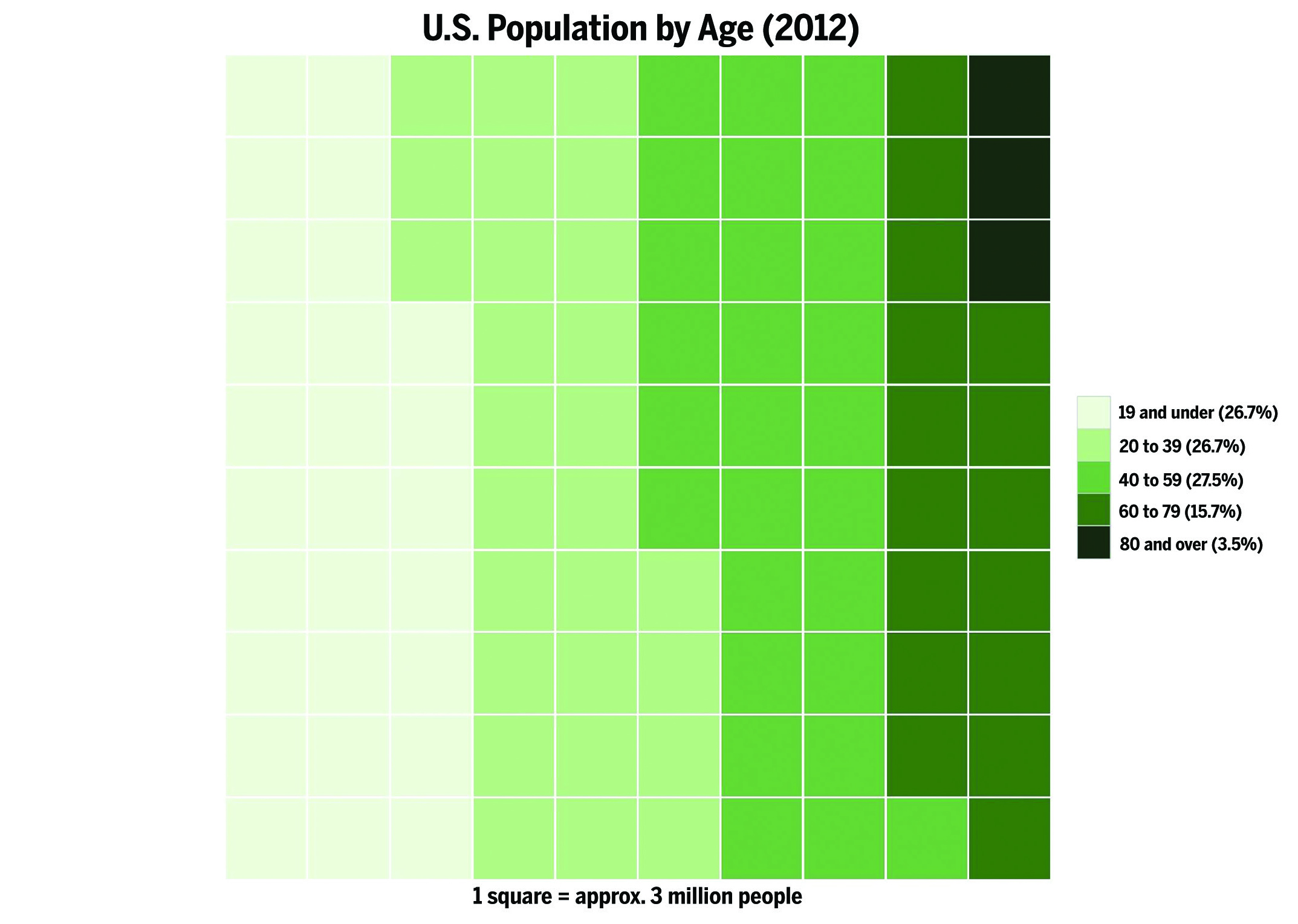
Figure 2. U.S. Population by Age (2012). Created in R (with waffle and ggplot2 packages). Data source: United States Census Bureau (http://www.census.gov/population/age/data/2012comp.html, Table 1).
The waffle chart in Figure 2 displays the U.S. population in 2012 as a whole, segmented by age groups that are each indicated by their own color. What do you think of this chart type? Does it do a good job conveying information about the breakdown of the U.S. population by age?
In Figure 2, the waffle chart can answer questions like:
- What percentage of the whole U.S. population in 2012 was under the age of 19?
- What was the breakdown of the U.S. population in 2012?
- How does the number of 40- to 59-year-olds compare to the number of 60- to 79-year-olds?
It is tricky to compare segments to one another in this chart, since the segments are quite close in size to begin with, and the chart rounds the percentage values. But you can see clearly how there are progressively fewer people in the older age brackets, as the organization is more meaningful than in a pie chart, and the waffle chart is not as crowded as a pie chart would be with five segments.
Bar charts
A bar chart or bar graph displays values assigned to individual categories. Each bar represents an entire, exact value for a variable in question.
Figure 3 shows the number of male and female faculty members at institutions of higher education in the U.S. between 1987 and 2011. Here, the variable is gender. Each year gets two bars: one for the number of women and one for the number of men. The values from our earlier pie charts in Figure 1 are at either end of the chart, in 1987 and in 2011. What do you think about this chart? How does it convey information differently than the Figure 1 pie charts?
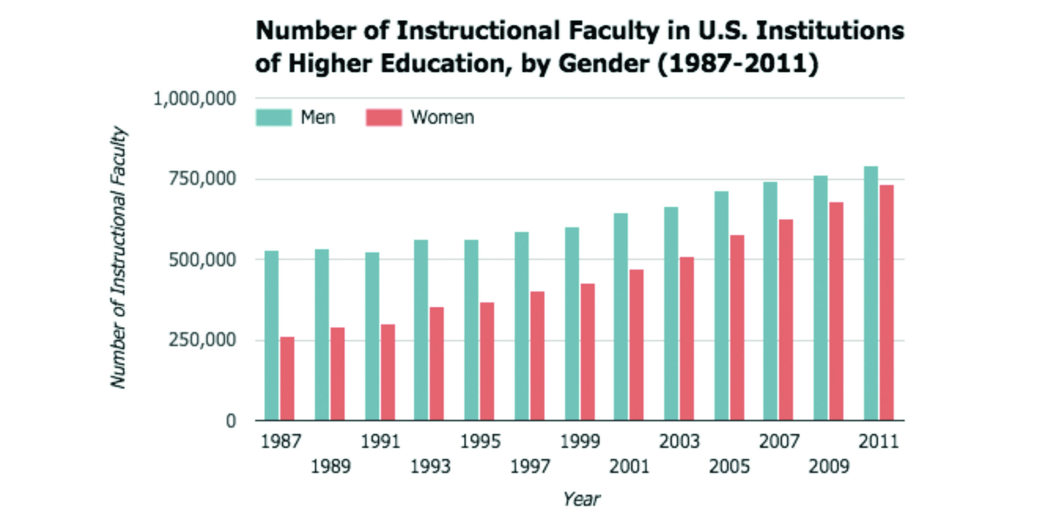
Figure 3. Number of Instructional Faculty in U.S. Institutions of Higher Education, by Gender (1987-2011). Created with Google Sheets. Data source: National Center for Education Statistics (https://nces.ed.gov/programs/digest/d13/tables/dt13_315.10.asp).
In Figure 3, the bar chart answers questions like:
- Which year has the highest number of female faculty?
- How does the number of male faculty compare to the number of female faculty in 1991?
- How does the number of female faculty in 1987 compare to the number of female faculty in 2011?
The chart in Figure 3 tells an interesting story. You can see that, while both grow, the number of female faculty grows at a more rapid rate than the number of male faculty: between 1987 and 2011, the number of female faculty has almost tripled. This chart helps you compare this information more effectively than a pie chart for each year would, since you can compare each bar to all the other bars. These bar charts provide a bigger picture than the pie charts in Figure 1: here, we see both the ratio of men to women, by comparing the two bars for a given year, and the raw numbers that show how much the number of faculty has grown between 1987 and 2011.
Note that the bar chart in Figure 3 showcases data that is continuous: the years depicted have a sequential order, so you can talk about an upward trend, or growth, in faculty members as years go by and you can observe an evolution from one set of bars to another. But bar charts do not necessarily have to showcase continuous data: they can also showcase data for distinct categories. In a bar chart showing the total populations of different countries, each country is a separate entity: you can compare the values associated with them, but you can’t chart an evolution between them.
Dot plots: A bar chart alternative
A dot plot, also known as the Cleveland dot plot after its inventor, is similar to a bar chart in that it showcases values assigned to individual categorical elements — but instead of showing the entire value in the form of a bar, it plots the value as a single dot.
One advantage of dot plots is that they do not have to start at 0, so you can hone in on slight differences between elements — do not forget to clearly label your numerical axis, though! Another advantage of dot plots is that you can use them to display multiple values for each element (such as values from different years), by using different symbols and labeling them in a legend. Readers can then compare the multiple values of a single element or compare the same value type across elements.
The dot plot in Figure 4 shows amounts of money allocated to various categories of the 2009 U.S. government budget. Does the dot plot format encourage us to look at the data differently than bar chart does? If so, how?
The dot plot in Figure 4 answers questions like:
- Which category is allocated the most money in the budget?
- How does allocation vary across different categories?
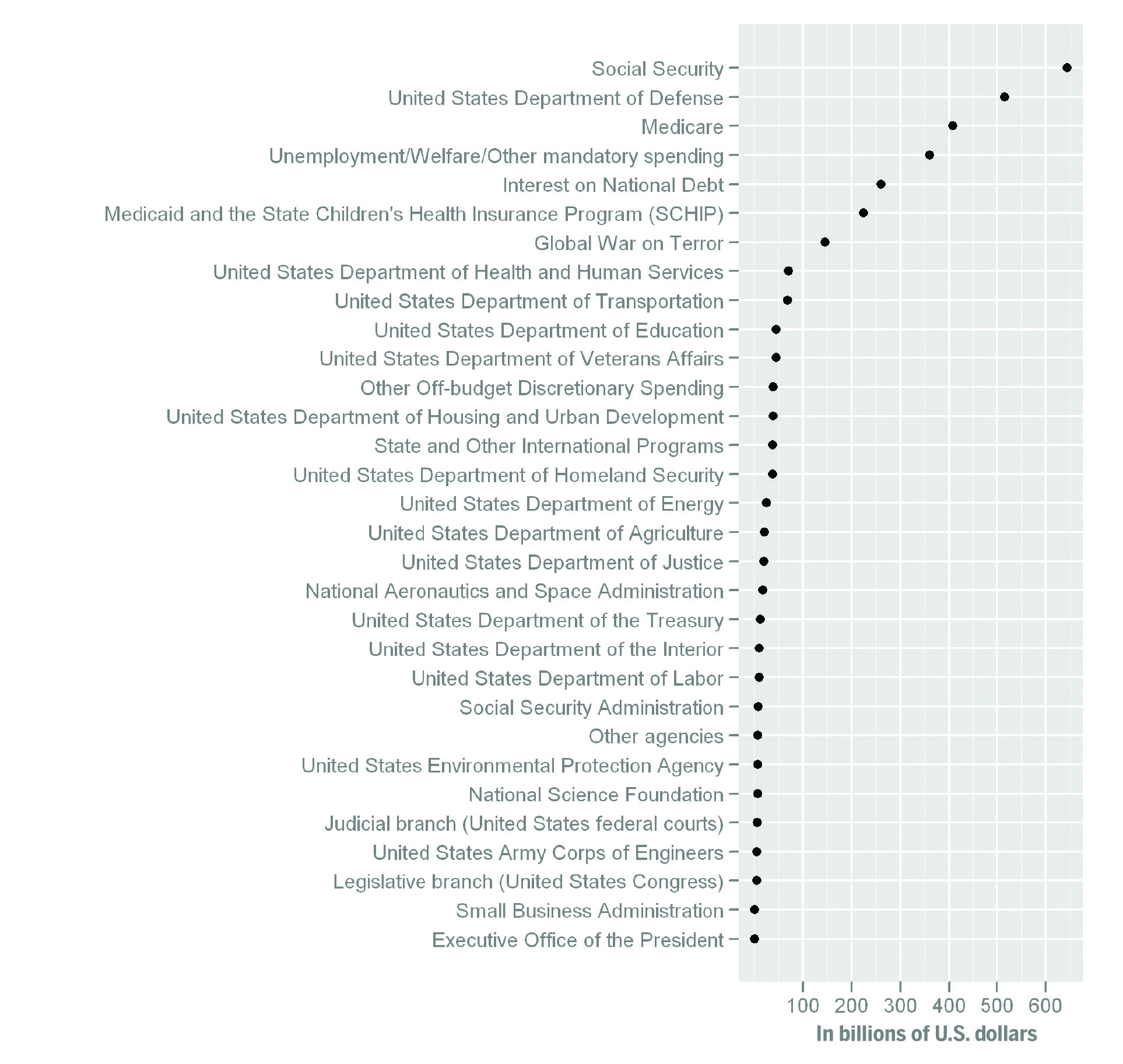
Figure 4. Dot plot of the total U.S. government budget in 2009, including both mandatory and discretionary, by Thopper, licensed under CC-BY-SA. Source: Wikipedia (https://commons.wikimedia.org/wiki/File:U.S.2009FederalExpenditures.png).
Figure 4 minimizes clutter on the chart, by using dots instead of bars, which can make it easier to compare values to one another. You can see that over twice as much is allocated to Social Security, the category with the highest value, than to interest on the national debt. You can also see that the top five or six categories are allocated quite a bit more money than the others. With a dot plot, it seems easier to observe subtle differences in the smallest values: these details might be lost in a bar chart. The dot plot could easily handle one or two more variables with very little trouble: another symbol could be used to plot values from a different year for each category, on the same line.
Maps
A map can be used to display a continuous spectrum of values (such as population density or the percentage of the workforce that is unemployed): this is often indicated through changes in color and shading. Color and shading can also be used on a map to help convey information about categories (like coloring states, usually red and blue, to indicate the presidential candidate preference of the states’ voters).
A map can also be used to display data points on the map itself: these can be figurative (like lines indicating migration movement from area to area, or points indicating a certain number of unemployed people in a particular area) or literal (like true-to-life depictions of roads and rivers).
Figure 5 is a map of the United States that shows the population density of each state, using a saturation spectrum that goes from light purple for the least dense states to very dark purple for the most dense ones. A map that uses this type of proportional shading to convey values is known as a choropleth map. What information does this choropleth map convey?
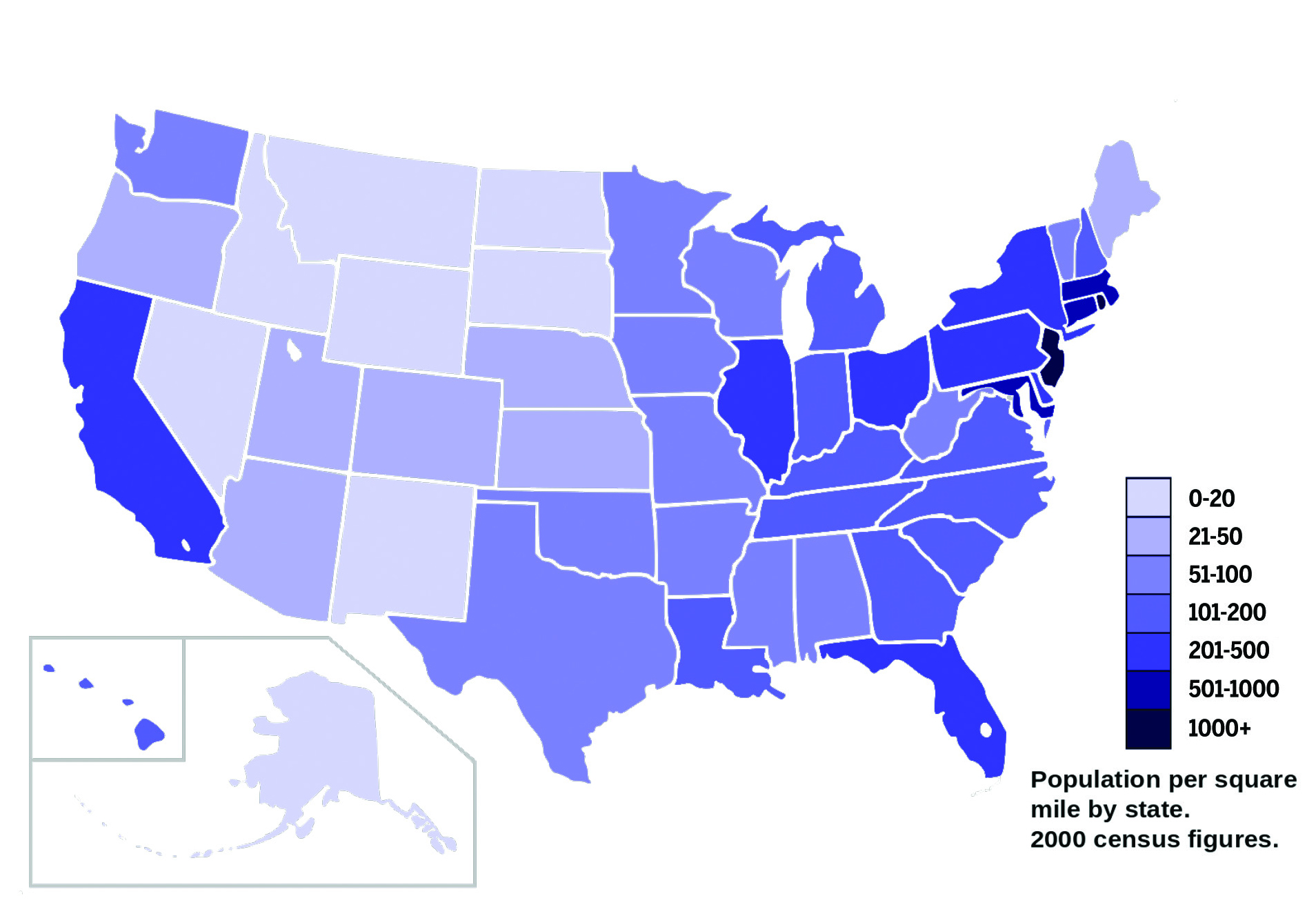
Figure 5. U.S. Population Density by State (2000 Census), by AmericanXplorer13, licensed under CC-BY-SA. Source: Wikipedia (https://commons.wikimedia.org/wiki/File:US_2000_census_population_density_map_by_state.svg).
Population density is a continuous spectrum of values, so Figure 5 answers questions like:
- What are the most dense states?
- Are there patterns in the density or lack thereof?
- How does one state compare to another?
You can see from their color which states are the most densely populated, and which are the least. The map is a familiar chart type: you can make deductions based on what you already know about the area (such as the locations of big cities, or of geographic features like mountains) that might affect population density. This map shows data at the state level: it could be interesting to see what population density looks like at the county level.
Line charts
A line chart or line graph displays data points on a graph, plotted according to a quantitative (i.e., numeric) variable and a continuous variable (often time is used). The data must be continuous or ordered so as to connect the dots with a line. Line charts depicting the evolution of something over time are also called “time series.”
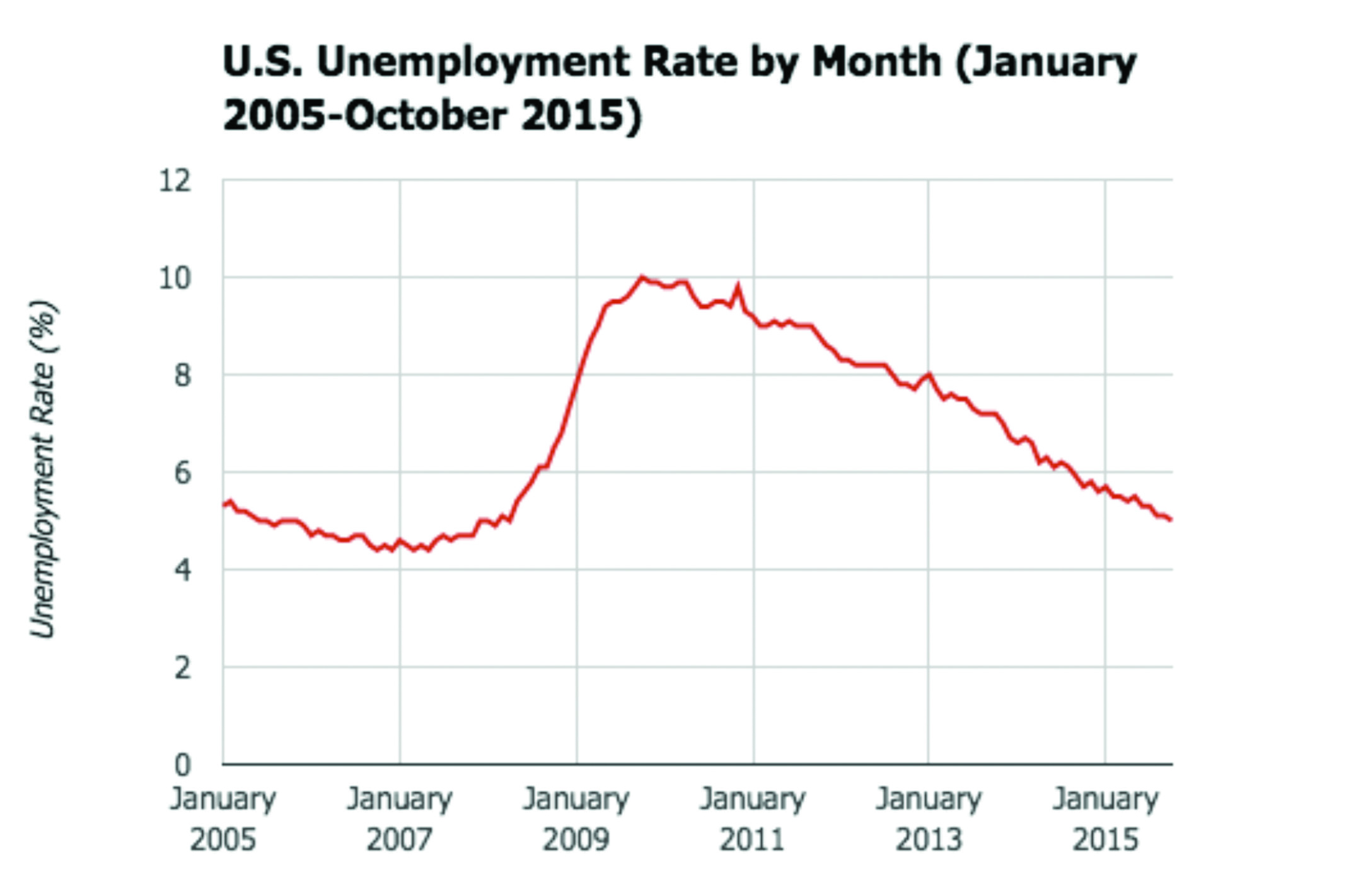
Figure 6. U.S. Unemployment Rate by Month (January 2005-October 2015). Created with Google Sheets. Data source: Bureau of Labor Statistics (http://data.bls.gov/timeseries/LNS14000000).
In Figure 6, the line chart answers questions like:
- How did the unemployment rate evolve over time?
- When in this period of time was the unemployment rate highest? And when was it lowest?
From this chart, you can see how the unemployment rate often rises and falls by small amounts from month to month. The big spike in early 2008 (between January 2007 and January 2009) can be explained using some background knowledge: that is when the recession hit. It could be helpful for this chart to add an annotation there (perhaps an arrow) to explain this sudden climb, since its cause is known.
Scatterplots
A scatterplot or scattergraph displays the values of a dataset with two quantitative, or numeric, variables. It plots every individual data point onto a single graph: the position of each point is dictated by the two variables, one on the x-axis and another on the y-axis.
When using a scatterplot, look for clusters of points, points that seem to follow a line (this implies correlation between the variables on the axes), and points that are set apart from the rest (these are called outliers).
The scatterplot in Figure 7 plots the total bill on the x-axis and tips received on the y-axis. Each dot is thus connected to two values: that of the total bill, and that of the tip associated with it. The line offers an annotation that helps you read the scatterplot: it shows where tips that are 16% of the total bill would be. Points above the line are tips greater than 16% of the bill, and points below it are tips less than 16% of the bill. What information does the chart help you understand? Is it effective?
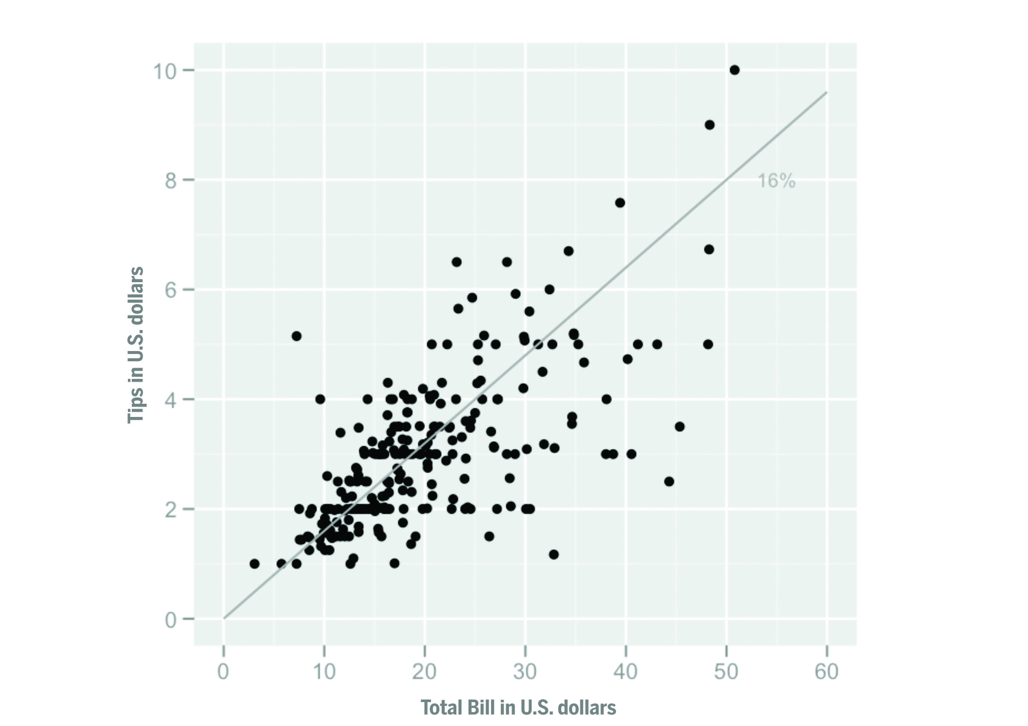
Figure 7. Scatterplot of tips vs. total bill, by Visnut, licensed under CC-BY-SA. Source: Wikipedia (https://commons.wikimedia.org/wiki/File:Tips-scat1.png).
In Figure 7, the scatterplot answers questions like:
- Does a bigger bill correlate to a bigger tip?
- What are the outliers in the scatterplot?
- What are the patterns in the scatterplot?
You can infer quite a bit of information from this scatterplot. There is a slight upward trend: this means that, in general, a bigger bill has a positive correlation with a bigger tip. There are some outliers in this data if you look closely. Someone tipped a little over $1 on a $33 bill, which is only a 3% tip. And someone else tipped a little over $5 on a bill that was about $7, which is a 71% tip! Points seem to cluster around a certain part of the graph: it seems like quite a few customers had bills that were between $10 and $20.
Bubble charts
A bubble chart is similar to a scatterplot: data points are mapped onto a graph depending on two variables along the x- and y-axes. But a bubble chart introduces a third variable: the size of the data points, represented as bubbles, also conveys information about data elements. The bubbles can even be colored according to categories to which they belong. This can be useful when you want to visualize the potential relationships between three different variables.
The chart in Figure 8 showcases how intricate a bubble chart can be: you will probably want to go to the source and look at it more closely. Each bubble represents a country (and is helpfully labeled accordingly): a bubble’s position on the x-axis is determined by the country’s income per person, its position on the y-axis is determined by the percent of adults in the country infected with HIV, and its size indicates the raw number of people living with HIV in that country. The color of the bubble corresponds to the area in the world in which the country is located.
The bubble chart in Figure 8 answers questions like:
- Are there correlations between any of the variables?
- Are there patterns in the data?
- Where are individual countries located on the chart, and what do their positions mean?
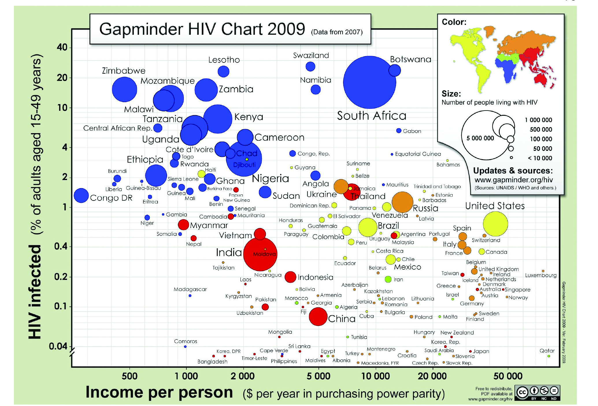
Figure 8. Gapminder HIV Chart 2009 (Data from 2007). Free material from gapminder.org, licensed under CC-BY. Source: Gapminder (http://www.gapminder.org/downloads/gapminder-hiv-chart-2009/).
It is hard to notice trends and patterns in this chart, since it contains so much information. Sometimes it can be more meaningful to read this kind of packed chart for information about individual points, rather than for overview information about the dataset as a whole. You can look at the dots for individual countries to learn more about them or to compare them to one another. But there are a few larger patterns you can glean from this chart. For example, many of the countries with the highest percentages of HIV infection are in Africa: the vast majority of the points high on the y-axis are blue. Additionally, many of the countries with high percentages of HIV infection are on the lower end for income per person (and the reverse seems true as well): this implies a correlation between the two variables.
Histograms
A histogram shows the distribution of a quantitative dataset. It may look like a bar chart, but it displays numeric (rather than categorical) data, and there is a mathematical logic behind the sizes of the bars. A histogram groups values into consecutive numeric ranges or intervals, also known as bins: the more values from a dataset fall within a particular range, the bigger its bar. The ranges are continuous, so bars do not usually have much space between them (unlike bar charts, which use the spaces between bars to distinguish between categories).
A histogram is useful because it gives a meaningful overview of data. For example, imagine you want a chart that shows the heights of students in a ninth-grade math class. It is unlikely that two people would be the exact same height, so it might be more interesting to show how many people fall into ranges of heights, rather than the exact heights of each person. You can set your own intervals, for example, 0.5 feet, and then display the people with heights between 4.5 and 5 feet in one bin, people with heights between 5.1 and 5.5 feet in the next bin, and so on. The bin gets bigger with each value that is added to it. By looking at which one is the biggest, you can see at a glance where values are most concentrated — also known as which interval of values has the highest frequency.
With the overview offered by a histogram, you can immediately see if your data skews a certain way, and investigate further. Unlike box plots (up next), histograms show variation between values, since you can change the interval size of the bins.
The two histograms in Figure 9 both showcase the same data: tips given in a restaurant. But the sizes of the intervals (the bins) are different. The histogram at the top has a $1 bin width. And the histogram at the bottom has a 10¢ bin width: this allows you to see the data in greater detail. What do the two different histograms tell you about the data?
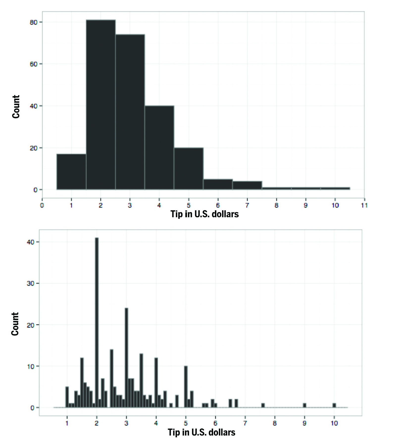
Figure 9. Histograms of tips given in a restaurant, with both a $1 bin width (top) and a 10¢ bin width (bottom), by Visnut, licensed under CC-BY-SA. Source: Wikipedia (https:// en.wikipedia.org/wiki/File:Tips-histogram1.png and https://en.wikipedia.org/wiki/File:Tips-histogram2.png).
The two histograms in Figure 9 answer questions like:
- What are the patterns in the tips?
- In what intervals do the most tips fall?
- What is the distribution of the data?
Both bin widths used by the two histograms reveal different patterns in the data. The histogram with the $1 bin width demonstrates very clearly that the data skews to the right (i.e., to smaller rather than larger tips — since that’s where the highest frequencies are on the graph). It shows that the range with the highest frequency is $1.5 to $2.5. The histogram with the 10¢ bin width shows an interesting pattern: tips that are round dollar amounts have higher frequencies. It also shows more precisely what range has the highest frequency: it is the $1.95 to $2.05 range.
Box plots
A box plot, also known as a box-and-whiskers or merely a whisker plot, shows the distribution of a quantitative dataset. It uses a dataset’s quartiles to create a box that can provide overview information about the dataset. Quartiles are the three values that divide a dataset into four equal parts. The middle quartile is more commonly known as the median: it is the value that divides a dataset into two equal parts (as in, there as many values above the median as there are below it).
In a box plot, the quartiles are represented as lines that form a box, with the median as a line dividing the box in two. The upper and lower extremities of the dataset are represented as lines emanating from the box (these are the whiskers): the ends of the lines show the maximum and minimum of the dataset, respectively. Outliers are points that fall more than one and a half times away from either end of the box plot: these outliers are traditionally represented as individual points outside of the box plot. The whole box plot is shown on a graph, so values can be located quickly and easily.
Like histograms, box plots can be helpful for getting a very general overview of your dataset: you can see if your data skews a certain way (by gauging the range between quartiles), and investigate further.
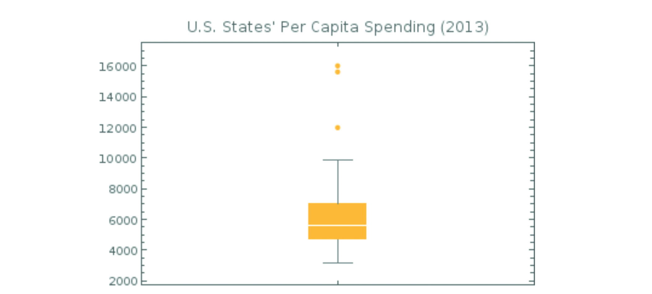
Figure 10. U.S. States’ Per Capita Spending in 2013. Created with Google Sheets and g(Math) for Sheets. Data source: The Henry J. Kaiser Family Foundation. (http://kff.org/other/state-indicator/per-capita-state-spending/).
The box plot in Figure 10 showcases the distribution of a dataset of individual U.S. states’ per capita spending in 2013. The median is the white line bisecting the orange box. The orange dots toward the top of the graph are outliers. What do you notice about the distribution of this dataset? Does the box plot seem like a helpful way to get an overview of a dataset?
This box plot answers questions like:
- what is the median of per capita spending by state?
- what is the distribution of the data?
The median sits low in the box: this means that the data skews toward the bottom, which is to say toward lower per capita spending. The data has quite a wide range: the lowest value is around $3,000 and the highest (which is one of three outliers) is about $16,000 — that’s a range of $13,000! It would be interesting to compare multiple box plots, each showing states’ per capita spending for a different year, to see if and how the range and skew of the data might change.
Conclusion
Next time you need to create a chart or graph, think about these examples and the kinds of questions they provoke. Consider the rules of thumb from the beginning of the chapter, and how you might put them into practice. Try out a few different types of charts and graphs with your data before you decide on one. Experimentation is key to seeing new patterns and envisioning new ways of representing your data.
The other key to successful data presentation is to learn from other people’s charts and graphs. Notice visualizations as you come across them in your daily life (or, even better, seek them out) and think about the questions they answer and the way they are used. Think deeply: what stories do they tell? are they misleading? what do you like about them, and what might you do differently? The critical eye that you develop will help you make more compelling charts and graphs yourself.
Once you have created a visualization that you like, check your work against the questions and rules of thumb in this chapter, and you’ll be on your way to communicating your data effectively!
Resources
- Abela, Andrew W. 2006. Choosing a good chart. Extreme Presentation (blog), September 6. Accessed April 19, 2017. http://extremepresentation.typepad.com/blog/2006/09/choosing_a_good.html
- Cleveland, W. S. 1993. Visualizing data. Summit, NJ: Hobart Press.
- R Core Team 2015. R: A language and environment for statistical computing.
- R Foundation for Statistical Computing, Vienna, Austria. Accessed April 19, 2017. https://www.R-project.org/.
- Robbins, N. B. 2004. Creating more effective graphs. Hoboken, NJ : Wiley-Interscience.
- Tufte, E. R. 1983. The visual display of quantitative information. Cheshire, CT: Graphics Press.
- Vital, Anna. (2015, March 6). How to think visually using visual analogies. Anna Vital (blog), March 6. Accessed April 19, 2017. http://anna.vc/post/112863438962/how-to-think-using-visual-analogies .
- Yau, Nathan 2008. How to read and use a box-and-whisker plot. FlowingData (blog), February 15. Accessed April 19, 2017. http://flowingdata.com/2008/02/15/how-to-read-and-use-a-box-and-whisker-plot/
- Yau, Nathan. 2009. “9 ways to visualize proportions – a guide”. FlowingData (blog), November 25. Accessed April 19, 2017. http://flowingdata.com/2009/11/25/9-ways-to-visualize-proportions-a-guide/
- Yau, Nathan. 2010. “11 ways to visualize changes over time – a guide”. FlowingData (blog), January 7. Accessed April 19, 2017. http://flowingdata.com/2010/01/07/11-ways-to-visual¬ize-changes-over-time-a-guide/
- Yau, Nathan. 2013. Data points: visualization that means something. Indianapolis, IN: John Wiley & Sons.


