Creating Data Literate Students
Skip other details (including permanent urls, DOI, citation information): This work is licensed under a Creative Commons Attribution-NonCommercial-NoDerivatives 4.0 International License. Please contact [email protected] to use this work in a way not covered by the license.
For more information, read Michigan Publishing's access and usage policy.
6 Making sense of data visualization
While humans have been creating maps for millennia, we only started creating statistical graphics — also referred to as data visualizations — within the last 500 years. Still, the first data visualizations, such as Edmond Halley’s wind maps of the world’s oceans (Figure 1), were still geographic maps, with data (in this case, wind currents) added atop the map.
From these early beginnings, data visualization has become a pervasive part of our information-intensive society. It is now used for everything from the daily weather report to advanced scientific research to managing complex business processes in real time. While data visualization can include massive datasets generated and processed by computers, we should keep in mind that the techniques of data visualization originate from and still include hand-drawn visuals.
There is a great diversity of technologies and techniques for making data visualizations; that being said, there are some common goals that underlie the process of visualization overall. Said simply: data visualization allows us to see something — for example, patterns, trends, or anomalies — in the data that we otherwise would not see. Lev Manovich (2010) explains that the goal of visualization “is to discover the structure of a (typically large) dataset ... a visualization is successful if it reveals this structure.”
A famous dataset, known as Anscombe’s Quartet (Figure 2), was designed explicitly to show how visualization can reveal the structure of data. While the statistical description of each dataset (shown first) is exactly the same, and the range of data points in each seems to be similar, we immediately see the differences when the points are graphed.
Anscombe’s Quartet | |||||||
|---|---|---|---|---|---|---|---|
I | II | III | IV | ||||
x | y | x | y | x | y | x | y |
10.0 | 8.04 | 10.0 | 9.14 | 10.0 | 7.46 | 8.0 | 6.58 |
8.0 | 6.95 | 8.0 | 8.14 | 8.0 | 6.77 | 8.0 | 5.76 |
13.0 | 7.58 | 13.0 | 8.74 | 13.0 | 12.74 | 8.0 | 7.71 |
9.0 | 8.81 | 9.0 | 8.77 | 9.0 | 7.11 | 8.0 | 8.84 |
11.0 | 8.33 | 11.0 | 9.26 | 11.0 | 7.81 | 8.0 | 8.47 |
14.0 | 9.96 | 14.0 | 8.10 | 14.0 | 8.84 | 8.0 | 7.04 |
6.0 | 7.24 | 6.0 | 6.13 | 6.0 | 6.08 | 8.0 | 5.25 |
4.0 | 4.26 | 4.0 | 3.10 | 4.0 | 5.39 | 19.0 | 12.50 |
12.0 | 10.84 | 12.0 | 9.13 | 12.0 | 8.15 | 8.0 | 5.56 |
7.0 | 4.82 | 7.0 | 7.26 | 7.0 | 6.42 | 8.0 | 7.91 |
5.0 | 5.68 | 5.0 | 4.74 | 5.0 | 5.73 | 8.0 | 6.89 |
Property | Value | Accuracy |
|---|---|---|
Mean of x | 9 | exact |
Sample variance of x | 11 | exact |
Mean of y | 7.50 | to 2 decimal places |
Sample variance of y | 4.125 | plus/minus 0.003 |
Correlation between x and y | 0.816 | to 3 decimal places |
Linear regression line | y = 3.00 + 0.500x | to 2 and 3 decimal places, respectively |
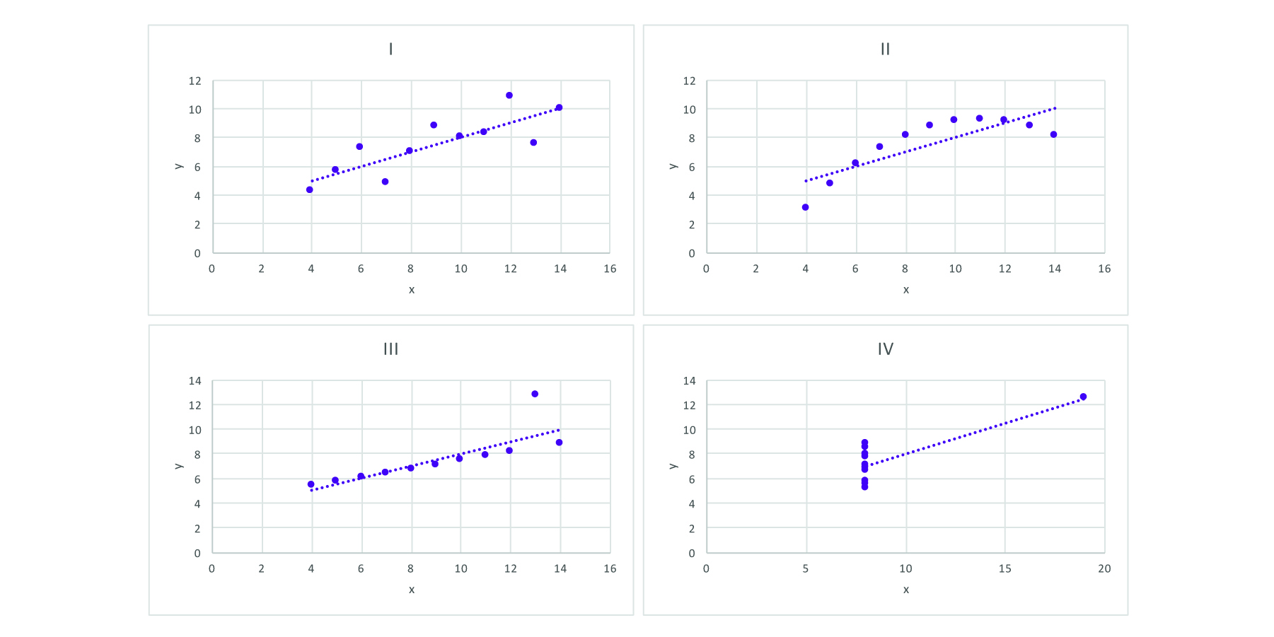
Figure 2: Anscombe’s Quartet, showing how four sets of similar data can actually look quite different when visualized.
Anscombe’s Quartet illustrates the fundamental principle of data visualization: to make something that is not obvious seem clearer in a compact amount of space. How does data visualization reveal data? How do these graphs show us something that is difficult to see in the raw data or even the summary statistics? Hopefully, these questions can be answered in more depth as we explore data visualization, but at this point, the history of data visualization and its relation to mapping can suggest an answer.
Data visualization allows us to map large amounts of data to a single space where it can be seen all at once. With a single graph, we can see global temperature averages over 150 years; we can see the entire history of the population of the United States, or a lifetime of stats for a favorite baseball player. Each of these examples take a series of information and maps it to a space — creates a graph — we can see with a single glance. With Anscombe’s Quartet, we could read each data point one by one, but we would have a hard time keeping track of them over the time it takes to read them. But, patterns and structures emerge when seeing them all together.
This chapter provides a framework for describing what it is that data visualization does. While there are some recommendations for best practices, our overarching purpose here is to break the task of visualization into its individual components so that you and your students can explore and understand them deeply. By doing so, we hope that students can understand the visualizations they encounter and develop language to discuss the process of making data visualizations.
Graphs
Rarely, if ever, does a visualization simply show the data as it is; if we wanted to show the data itself, we could simply list it in a table. Visualization maps the data onto a visual space, the “graph.” This is important, because it means that visualizing always involves making decisions. There are not necessarily right or wrong choices, but there are better or worse choices. Making better choices about data visualization helps clearly communicate our data. Graphs are common starting points when exploring visualizations.
Working through a simple example will allow us to demonstrate the stages of moving from data to visualization. We can also see how each of these mappings requires decisions that will affect the resulting graph. Take this graph of U.S. unemployment rates going back to 1980 (Figure 3). The graph takes a time series and shows us the entire dataset (meaning all of the data points) in one visual, with the horizontal x-axis showing us the year and the vertical y-axis showing us the percentage of population that was unemployed. While this graph may seem simple, it still required making decisions and moving data into positions on the graph to create the resulting visual.
While this represents one way to visualize data on a graph, it’s critical for us to share with students that there is often more than one way. Let’s use the data points graphed above, from the Bureau of Labor Statistics, to demonstrate the kinds of decisions we might think through before graphing ... and how those decisions can lead to rather different visual outputs.
The first decision that we must make is one of scale — specifically, how should we mark the points on the x- and y-axes along with the intervals, or distances between points. For example, should the y-axis start with zero, like the graphs we are used to from math class? Or is that irrelevant as there are no points even close to zero to map? Should the y-axis go from 3 to 11? Or 4 to 15? Each of these options would be correct, but the range you pick will determine how the graph appears to the human eye. Different intervals and different starting and ending points will help determine how significant the change appears over time.
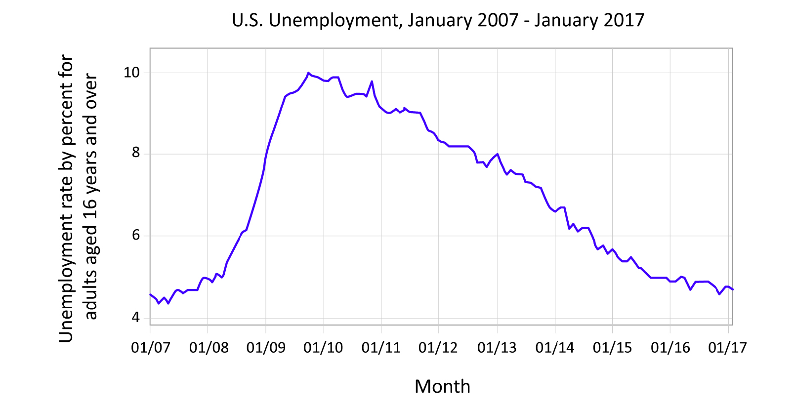
Figure 4: Graph with data points connected with a solid line. Graph shows the unemployment rate for adults, aged 16 and up, for the past decade. Data courtesy of the Bureau of Labor Statistics, http://data.bls.gov/timeseries/LNS14000000
Similar decisions have to be made with the x-axis. Notice how, in Figure 4, we limit the same dataset from Figure 3 by date, showing only the data of the past 10 years. The resulting line tells a different story! Figures 5–7 contain identical data to Figure 4, but you may notice that you react differently to them. The data is the same, and the intent to display the data is honest, but each gives us a slightly different reaction. Good designers of data visualizations are aware of the impact that design choices make. Figure 6’s red lines may evoke emotion, whereas the smooth line of Figure 4 feels calming. The rabbits are whimsical but perhaps make you think the data isn’t conveying impactful or serious information.
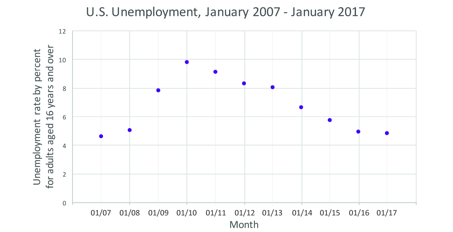
Figure 5: Scatter plot showing the unemployment rate for adults, aged 16 and up, for the past decade. Data courtesy of the Bureau of Labor Statistics, http://data.bls.gov/timeseries/LNS14000000.
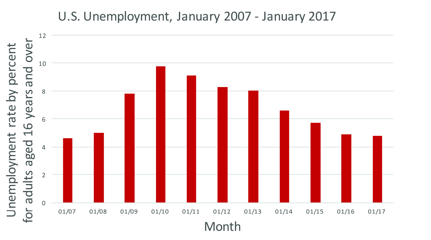
Figure 6: Bar graph showing the unemployment rate for adults, aged 16 and up, for the past decade. Data courtesy of the Bureau of Labor Statistics, http://data.bls.gov/timeseries/LNS14000000
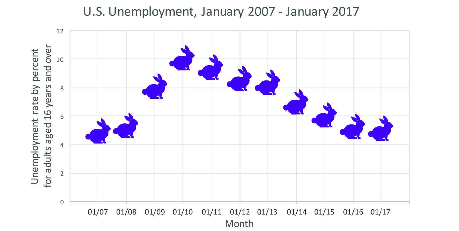
Figure 7: Unemployment rate for adults, aged 16 and up, for the past decade, with each rabbit representing the rate for each month. Data courtesy of the Bureau of Labor Statistics, http://data.bls.gov/timeseries/LNS14000000.
Decisions like these form the bedrock of data visualization. And it’s important to note here, from the very beginning, that these decisions are not part of the graphs students create in school. We need to be clear with students and ourselves that different choices may play into data visualizations “in the wild” than we are used to from math class.
While the graph with rabbits may not be the easiest to read, both the line and bar graphs provide reasonable displays of the data. The line may be slightly better at showing change over time; the bars are better for showing quantity. Since we are dealing with a change in quantity over time (the percentage of unemployment over time) both show the data well, but as we will see for different data this may not always be the case.
Pie charts
Let’s move from graphs to pie charts. Figure 8 shows a pie chart of living things in my house: six total living things (two adults, two cats, one baby, and one dog).
We could easily make a bar chart or graph, with points on the x-axis for each creature type and numbers representing quantity on the y-axis. But if we did, we would be overlooking something important: how the number of any one type of creature relates to the total population. For that, a pie chart is a better visual tool.
The first thing you might notice (or already know) about pie charts is we always have a full pie and each of the slices is a part of the whole. Instead of counting numbers directly, we have to convert our data to percentages of the whole. So, instead of visualizing six things we are visualizing 100%. Before we can plot with this scale we have to transform our data from two adults, one dog, two cats, one baby to 1/3, 1/6, 1/3, 1/6 (often graphing software will do this automatically for us, but it still must be done), or directly to percentages (33%, 17%, 33%, 17%). In this case, we’ve rounded to the nearest whole number, so our percentage total equals 100%. In some cases, rounding may lead the total to be 99% or even 101% — that is OK, too.
With this transformation complete, we now simply define our scale as the correctly proportioned slice of pie. So instead of 2 mapping to 2 units on a graph, we map 1/3 to 1/3 of the pie (more technically, this could be thought of as 1/3 of the degrees of a circle — 120 out of 360°).
In essence, a pie chart is just a bar chart that uses proportions of a whole instead of raw counts and proportions of a circle rather than height. After we have our pieces of pie, then all we have to do is choose what color to make them and we have a relatively familiar visualization.
Many people likely know how to make a pie chart and how to read one, so what do we learn by describing it in this way? Well, there is value in discussing the process: if we understand and can describe every transformation that is done between our raw data to the final visualization, we can then imagine all sorts of different ways we could manipulate and map the data. Moreover, we can recognize when these transformations are done incorrectly and gain ways of talking about where a visualization may fail.
For instance, Figure 9 shows support backing various presidential candidates. At first glance, we see three candidates and three slices of pie. It is when we look at the percentages labeling the pie that we realize the mistake. We know that a pie chart should add up to 100% ... but here, the numbers add up to 193%! This is likely because in the survey, respondents were allowed to identify more than one candidate. (When surveys have phrases like “choose all that apply,” pie charts aren’t a good option.)
In this case, the numbers are accurate, but the pie chart format gives off misleading information, implying that each candidate has near-equal support when, in fact, Candidate 1 has 10% more supporters than Candidate 3!
If, instead, we simply display the data as a bar graph (Figure 10), where we are not converting the data to proportions of a whole, the information makes much more sense. The bar chart allows us to see each candidate’s individual support compared against the other.
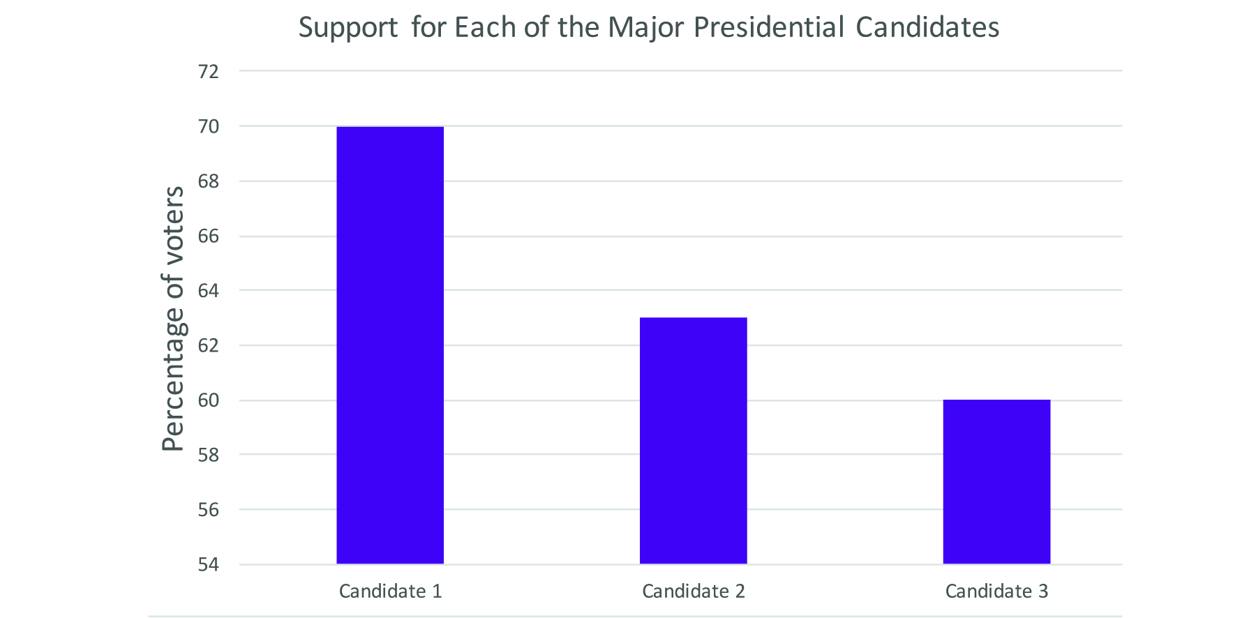
Figure 10: A bar chart (or bar graph) is a more effective way of representing data when people select more than one option.
Another benefit to the bar chart for the candidate data is that it is easier to judge differences in height than in area. Remember Figure 9, in which each candidate had a pie slice of near-identical size despite differences in percentages? Compare that to Figure 10. Now the differences are clear. (And remember our earlier lessons from Figures 3–7 about where to start the y-axis? If we started the y-axis for Figure 10 at zero, we might see less-pronounced differences.) While there are often good reasons to use pie charts, it is much easier to see when something is bigger than something else if you are looking at the side-by-side height rather than trying to compare the angle of a pie piece or its area.
From this example, we can see how important the notion of proportion of a whole is to a pie chart, and this is precisely what a pie chart excels at displaying. But, there are other aspects of datasets we may be interested in — the distribution of a dataset (i.e., how frequent certain values or outcomes are; what values make up a dataset) or how two values in a dataset relate to each other (e.g., what is the relationship between height and income — scatter plots are excellent for showing the relationship between two such values). If we are interested in distribution, a histogram is an excellent graph for understanding the values in a dataset. We can understand exactly how it works through a similar analysis.
Histograms
Imagine that we want to visualize household income in the U.S. We could make each point on the x-axis a different dollar amount — $20,000 then $21,000 then $22,000 and so on — but imagine how long the resulting graph would be! Instead, we can display information more compactly, in a smaller space, if we allow one point on the x-axis to represent a range of incomes. When we use one data point to represent a range, we’re creating a histogram.
Figure 11 shows a histogram of estimated 2010 household income. Along the x-axis, we see various salary ranges. On the y-axis, we see what percentage of households fall into that income range.
![Figure 11: Household income distribution from 2010 [estimated]. Source: U.S.
Census Bureau, Current Population Survey, 2011 Annual Social and Economic
Supplement Figure 11: Household income distribution from 2010 [estimated]. Source: U.S.
Census Bureau, Current Population Survey, 2011 Annual Social and Economic
Supplement](/m/maize/images/mpub9873254-00000032.jpg)
Figure 11: Household income distribution from 2010 [estimated]. Source: U.S. Census Bureau, Current Population Survey, 2011 Annual Social and Economic Supplement
How is such a histogram constructed? The first step is to “bin” data — by that, we mean to sort the data into bins, one for each salary range. In Figure 11, for example, each “bin” (except the last) holds a range of $4,999 ($5,000–$9,999; $10,000–$14,999; etc.). $4,999 is an arbitrary bin size — we could just as easily set bins that hold a range that is twice as big, or $10,000 each. Just know that the visualization will look different depending on the bin size — it will still be accurate, but different patterns may reveal themselves. It can take a few tries to figure out which bin size is most meaningful for your particular dataset. Neither of these choices is “correct” or even necessarily better than another. Each shows something slightly different about the data. Once we have made this transformation, then the histogram is really just a bar chart of these counts. The y-axis shows the count (this time, in percent) and the x-axis shows the bin that is being counted.
Layered visualizations
Computers now make it easy for us to layer many kinds of data onto a single graphical image. These images can communicate a large volume of information in an efficient amount of space once one learns to read them. Figure 12 shows an example of one of these complex visualizations. This graph, from the open-source tools at Gapminder.org, the brainchild of data visualization expert
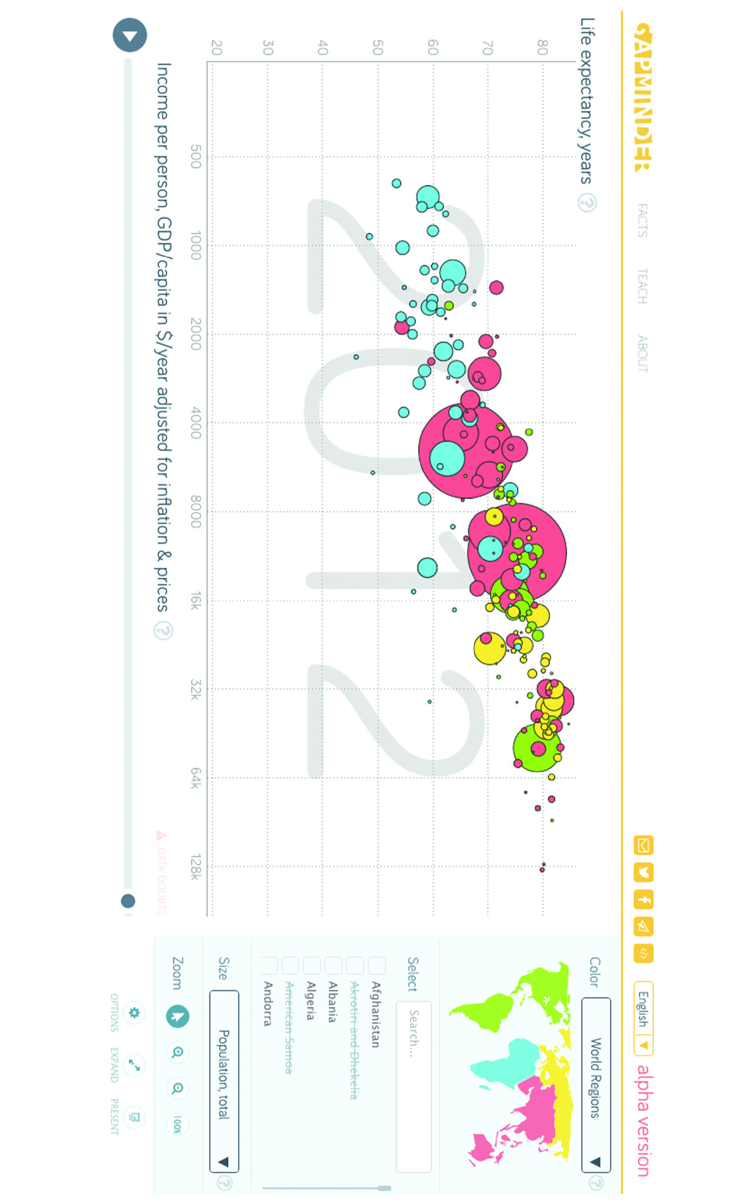
Figure 12: This chart, from the open-source tools at Gapminder.org, maps multiple variables onto a single graph.
Hans Rosling, allows us to see the relationship between a number of variables on a single graphic: life expectancy, income per person, population by country, and region of the world. Additionally, hovering over each bubble will reveal which country is represented by each bubble. We can peel back one layer at a time.
The graph puts life expectancy on the y-axis, with a range from 20 to 80+. Each tick mark represents a decade.
The x-axis shows per person income, but with one important change. Instead of equally spacing out the values on the x-axis, a logarithmic scale has been used. The first tick mark represents $500. The next tick mark doubles to $1,000 ... then doubles again at the next tick mark to $2,000 ... then $4,000 ... and so on. For students used to graphing on graph paper, with the interval between each point equal, this approach can seem illogical or confusing. However, this approach was used by Rosling and his team because this data is highly skewed (e.g., there are many countries with very low income and a few countries with very high income). If we were to plot the data linearly (like the birth rate data, with equal distance between each marked point on the axis) the vast majority of the data would be squished at the extreme ends of the x-axis.
Population is mapped in a different way: instead of using an axis to map the variable to a place, this graph represents it using the size of the bubble. Larger bubbles represent countries with larger population. This helps us establish a general sense of which nations’ populations are larger and which are smaller, though one has to hover over a particular dot to reveal the nation’s name and exact population. What this approach helps us see is that the largest countries fall somewhere in the middle of the trend.
The final variable is region. This is not a quantitative variable. We cannot intuitively represent it as size or position on an axis. Gapminder instead uses color — one matches the color of the bubble with the regional map provided in the upper-right corner. The graph directly converts each region into a specified color (e.g., green for North and South America). Again, being able to see where bubbles of similar color cluster adds to our understanding of human longevity and income.
Gapminder presents us with a complicated graph, but we can define each variable and how it has been mapped. By dissecting graphs in this way, we can understand exactly how they are made and what they are really showing us. For simple graphs, this level of analysis may appear unnecessary and uninformative, but as students encounter or make more complex graphs, carefully analyzing each step can reveal all sorts of insights, problems, and other ways the graph could be made.
Categories, quantities, colors, and shapes
In the prior examples, you may have noticed many of the datasets required an initial transformation before we could graph them. For example, when we made the pie chart, we converted our numbers to proportions and percents. With the histogram, we “binned” the data and graphed the count of values in each bin.
To better understand these transformations, we must distinguish between quantitative variables and qualitative variables. Quantitative variables are numbers that measure some value. On the other hand, qualitative variables are categories that represent some quality. Lingering over this distinction with students can clarify a number of issues that arise in data visualization. One important aspect of a quantitative variable is that it is the measure of some value (such as weight, height, income, or years) and not just that it is a number. For example, one occasionally sees survey data online where multiple choice answers are listed in the data as 1 or 2. If the question is about gender we can have data where a 1 represents female and a 2 represents male. Of course, these are numbers, but they are not really quantitative since they are merely stand-ins to represent categories of answers (in this case, gender). This is important to note, because a graphing program will likely not know these are categories rather than quantities, and this can easily lead to trouble with novices.
It is possible to convert values from quantitative to qualitative or vice-versa. We have already seen this in some of our examples from above. For instance, when we constructed “bins” for our histogram, we were in essence creating categories ($20,000–$24,999 is a category, even though the category represents numbers).
Taking numbers and putting them into discrete groups is a very common technique in data visualizations that allows us to create distinct bars (as in the histogram) or apply a color scale to a graph or map.
The map of median age by state in the United States (Figure 13) uses five colors to represent these values and each color corresponds to a range of values. We are visualizing numbers, but we first must convert them to groups (under 32; 32–35; 36–38; 39–41; above 41) and then color (lighter shades representing younger median ages, and darker shades representing older groups).
The decision as to what these groupings should be can dramatically impact the visualization. If, instead, we sort median ages into three categories (under 20; 20-30; and over 30), as shown in Figure 14, the map becomes nearly useless; it only tells us a little bit about Utah. All we know is that Utah has a younger median age as a state than any other state does ... but we lose the power of comparison among the other contiguous states.
Again, there is no exact formula for calculating which “bin” size is “best” — even expert designers experiment until they find an approach that delivers maximum meaning.
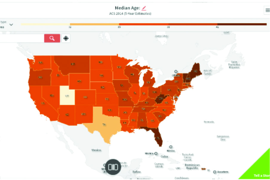
Figure 13: Map of median age in the U.S. made with SocialExplorer.com and visualized into five age groups: under 32, 32-35, 36-38, 39-41, and above 41 years of age.
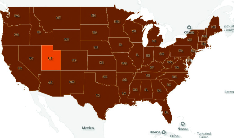
Figure 14: Map of median age in the U.S. made with SocialExplorer.com and visualized into three age groups: under 20, 20-30, and over 30 years of age.
Likewise, we can convert categories into quantities, although this is often less straightforward than the other way around. Imagine we have a survey with possible responses: strongly disagree, disagree, neutral, agree, strongly agree. It might make sense to treat these responses as 1, 2, 3, 4, 5 respectively (this is often called a Likert scale). But there are also other numerical conversions we can make based on the data.
One option is to rank the data and then use the ranking as a numerical value and organize the data based on that value. For example, Figure 15 is a bar chart showing state population ranked by population, with the y- or vertical axis sorted from the largest to the smallest. In a sense, then, the y-axis is displaying both qualitative data (the state name) and quantitative information (population). The data would look different if we arranged the state names alphabetically or by some other numeric variable such as the year each was granted statehood. Each rearrangement is purposeful and communicates very different information about the states.
Representing quantitative and qualitative data
Now that we have discussed how to transform between quantitative and qualitative data, we can explore ways to represent them in graphs. Position and size are the two main methods available for displaying quantitative data. In the complex Gapminder graph of life expectancy and income (Figure 12), both position and size of the dot were used to display quantitative information. Likewise, the pie chart of animate beings in Figure 8 used the size of pie pieces to represent quantities. The bar chart of state population (Figure 15) used vertical positioning as well as bar length to display the population.
Color and symbol are especially adept at showing qualitative data. The population maps use quantities (median age) converted into categories and then used color to differentiate each of these categories. Furthermore, for printing in black and white, shades of gray and different fill patterns (such as cross hatching) can also be used to represent qualitative data. Symbols can also be used to differentiate between categories of data — think back to childhood atlases that placed icons of cattle, factories, or sheaves of wheat inside states to represent common industries.
Color can also be used to display quantitative data directly, by creating a continuous color scale. In the topographical map of Figure 16, the continuous color scale is mapped directly to meters of depth and height, such that each value corresponds directly with a color rather than with a category. The key shows lower depths as blue hues and the highest heights as red. The continuous scale strategy tends to work well for directly mapping physical properties that have smooth transitions between values, like elevation or temperature. Keep in mind that data that tends to cluster together or be highly skewed, like income or population counts by state, can often be seen much more clearly by categorizing the values first and coloring by category.
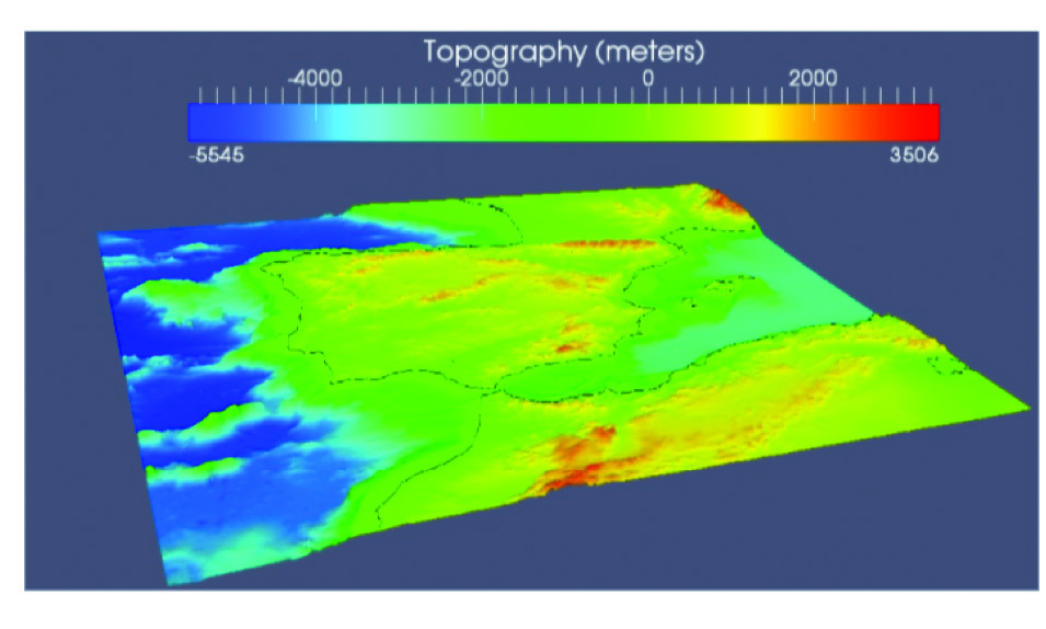
Figure 16: A topographical map using a continuous color scale to represent changing height and depth of water and land masses created with MMesh 3D. Image from
As always, it is important to remember that there is no hard-and-fast rule, and the best choice will depend on the data. Moreover, when asking students to make visualizations, we should encourage them to try multiple strategies and see what best represents the data.
Students can learn a lot about a visualization by asking how data has been treated or collected as quantitative or as qualitative and then how those variables are represented in the graph. Sometimes multiple elements in a graph will be used to represent a single variable, such as in the bar chart of states where the bar width represented the actual population and the order on the y-axis represented the population relative to other states. Sometimes elements of a graph will represent nothing at all, a graph could just use a single color or randomly ordered bars for a bar chart.
Other times almost every possible element of a graph will be used to represent different variables, like the graph of income and life expectancy; although even that graph did not use different symbols. Some graphs work incredibly well by showing lots of complexity while others end up unreadable.
Likewise, some graphs that use a single element displaying only one variable beautifully demonstrate some deep insight while other simple graphs could easily be replaced with a table or even a few sentences.
Reading data visualizations
This chapter has focused largely on the ways in which data can be mapped to visual space and when such mappings work and when they do not. We have focused largely on the transformations and mappings that can be applied to data in order to create a diversity of visualizations. By studying the transformations and mappings necessary for a data visualization, students can discover whether a visualization succeeds and accurately represents the data.
Furthermore, through analysis, students can begin to build up a set of strategies that can be applied to any data to make visualizations. Our goal is not to deliver a lockstep set of rules but for students to think critically about how visualizations they encounter are created so that they can become savvier consumers and more thoughtful creators.
One of the best ways to learn effective data visualization is to see examples and make one’s own visualizations. We have only touched on a limited number of transformations and mappings, but by exploring other data visualizations throughout the other
chapters of this book and elsewhere, students will discover all sorts of options. By breaking down visualizations into smaller pieces,
what a data visualization does can be understood, described, and taught.
These transformations and mappings ultimately succeed or fail in representing data based on how well they transform data to the visual space. A successful visualization makes reasonable choices for the data at hand and creates a visual space that can be read and understood. It is the spatial distribution of information that makes visualization so powerful.
We are able to see, as a result of these transformations of the data, important components and relations within the data. These transformations and mappings can range from simple counting to complex statistical functions. Likewise, they can be done by hand on small sets of data or using lots of computing power to transform huge datasets in real time. This range of possibilities and complexities make data visualization an exciting tool for teaching students of all levels about data and about any subject matter of interest, since visualization allows us to spot patterns and relations that otherwise would be inaccessible to human understanding.
We should note a final danger that confronts data visualization, but has little to do with exactly what type of graph is used to present the data. As humans we are incredibly sensitive to patterns. This is what makes data visualization so powerful. When data is displayed in space, we can quickly pick out interesting patterns and relationships. Often these patterns provide us with deep insights into the nature of our world, but on occasion we can see patterns that do not really exist or are the result of random chance. Especially today, with so much data easily available, it is possible to find patterns that hold no real meaning or predictive power.
Tyler Vigen (Figure 17) has created an algorithm dedicated to searching out such random patterns in order to demonstrate how seemingly strong patterns can be found among random pairs of data. While of course it is possible that there is some relationship between the divorce rate in Maine and consumption of margarine, it is most likely that this is simply a coincidence. (See Chapter 1 for more discussion on correlation and causation.)
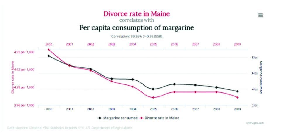
Figure 17: Graphs by Tyler Vigen showing two graphs that appear to move in tandem but are most certainly not causing one another! From http://tylervigen.com/spurious-correlations,CC-BY-4.0.
Even the most compelling and well-created visualizations should not be taken as the final truth. We should always bear in mind that we may be seeing a random coincidence.
Conclusion
Educators often hear that students can absorb visual information in less than the blink of an eye. But effective data visualizations should be seen as a chance to ask more questions rather than as something that offers a definitive answer.
- Where does the data come from?
- What would the visualization look like if we had more data?
- What other aspects of the data would be interesting to see?
Educators can teach students a lot about the how data is transformed into a visualization. What colors work well to convey your message? Which statistical methods were used to summarize the data? If students understand how these transformations are made, they will have a deeper knowledge of the topic at hand, and they can translate data into simple bar charts or complex interactive visualizations to enhance the understanding of others. Ultimately, it is through these transformations and mappings that data visualization either succeeds or fails to tell us something interesting about the world around us, or even more importantly to inspire us to ask more questions and investigate further.
Resources
- Manovich, Lev. 2010. “What is visualization?” Manovich.net, Mar - Oct. Accessed April 17, 2017. http://manovich.net/content/04-projects/064-what-is-visualization/61_article_2010.pdf
- Perry, Marc J., Paul J. Mackun, Josephine D. Baker, Colleen D. Joyce, Lisa R. Lollock, and Lucinda S. Pearsson. 2001. “Population Change and Distribution 1990 - 2000.” U.S. Census. Accessed April 17, 2017. https://www.census.gov/prod/2001pubs/c2kbr01-2.pdf


