Creating Data Literate Students
Skip other details (including permanent urls, DOI, citation information): This work is licensed under a Creative Commons Attribution-NonCommercial-NoDerivatives 4.0 International License. Please contact [email protected] to use this work in a way not covered by the license.
For more information, read Michigan Publishing's access and usage policy.
Graphs
Rarely, if ever, does a visualization simply show the data as it is; if we wanted to show the data itself, we could simply list it in a table. Visualization maps the data onto a visual space, the “graph.” This is important, because it means that visualizing always involves making decisions. There are not necessarily right or wrong choices, but there are better or worse choices. Making better choices about data visualization helps clearly communicate our data. Graphs are common starting points when exploring visualizations.
Working through a simple example will allow us to demonstrate the stages of moving from data to visualization. We can also see how each of these mappings requires decisions that will affect the resulting graph. Take this graph of U.S. unemployment rates going back to 1980 (Figure 3). The graph takes a time series and shows us the entire dataset (meaning all of the data points) in one visual, with the horizontal x-axis showing us the year and the vertical y-axis showing us the percentage of population that was unemployed. While this graph may seem simple, it still required making decisions and moving data into positions on the graph to create the resulting visual.
While this represents one way to visualize data on a graph, it’s critical for us to share with students that there is often more than one way. Let’s use the data points graphed above, from the Bureau of Labor Statistics, to demonstrate the kinds of decisions we might think through before graphing ... and how those decisions can lead to rather different visual outputs.
The first decision that we must make is one of scale — specifically, how should we mark the points on the x- and y-axes along with the intervals, or distances between points. For example, should the y-axis start with zero, like the graphs we are used to from math class? Or is that irrelevant as there are no points even close to zero to map? Should the y-axis go from 3 to 11? Or 4 to 15? Each of these options would be correct, but the range you pick will determine how the graph appears to the human eye. Different intervals and different starting and ending points will help determine how significant the change appears over time.
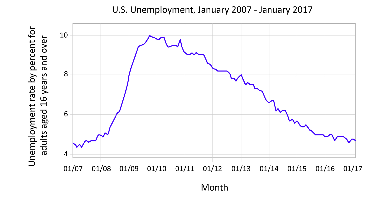
Figure 4: Graph with data points connected with a solid line. Graph shows the unemployment rate for adults, aged 16 and up, for the past decade. Data courtesy of the Bureau of Labor Statistics, http://data.bls.gov/timeseries/LNS14000000
Similar decisions have to be made with the x-axis. Notice how, in Figure 4, we limit the same dataset from Figure 3 by date, showing only the data of the past 10 years. The resulting line tells a different story! Figures 5–7 contain identical data to Figure 4, but you may notice that you react differently to them. The data is the same, and the intent to display the data is honest, but each gives us a slightly different reaction. Good designers of data visualizations are aware of the impact that design choices make. Figure 6’s red lines may evoke emotion, whereas the smooth line of Figure 4 feels calming. The rabbits are whimsical but perhaps make you think the data isn’t conveying impactful or serious information.
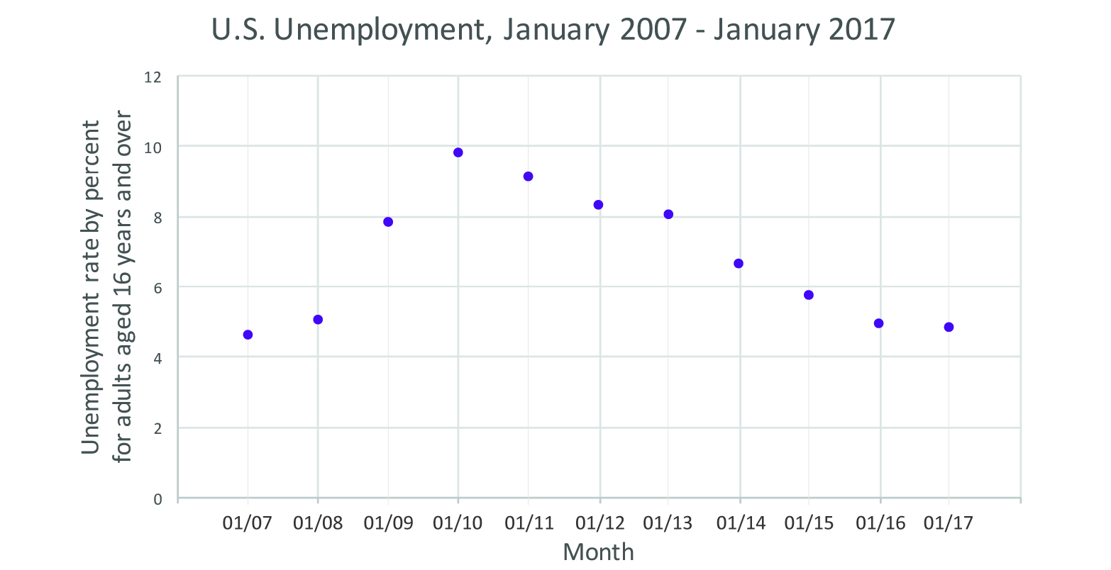
Figure 5: Scatter plot showing the unemployment rate for adults, aged 16 and up, for the past decade. Data courtesy of the Bureau of Labor Statistics, http://data.bls.gov/timeseries/LNS14000000.
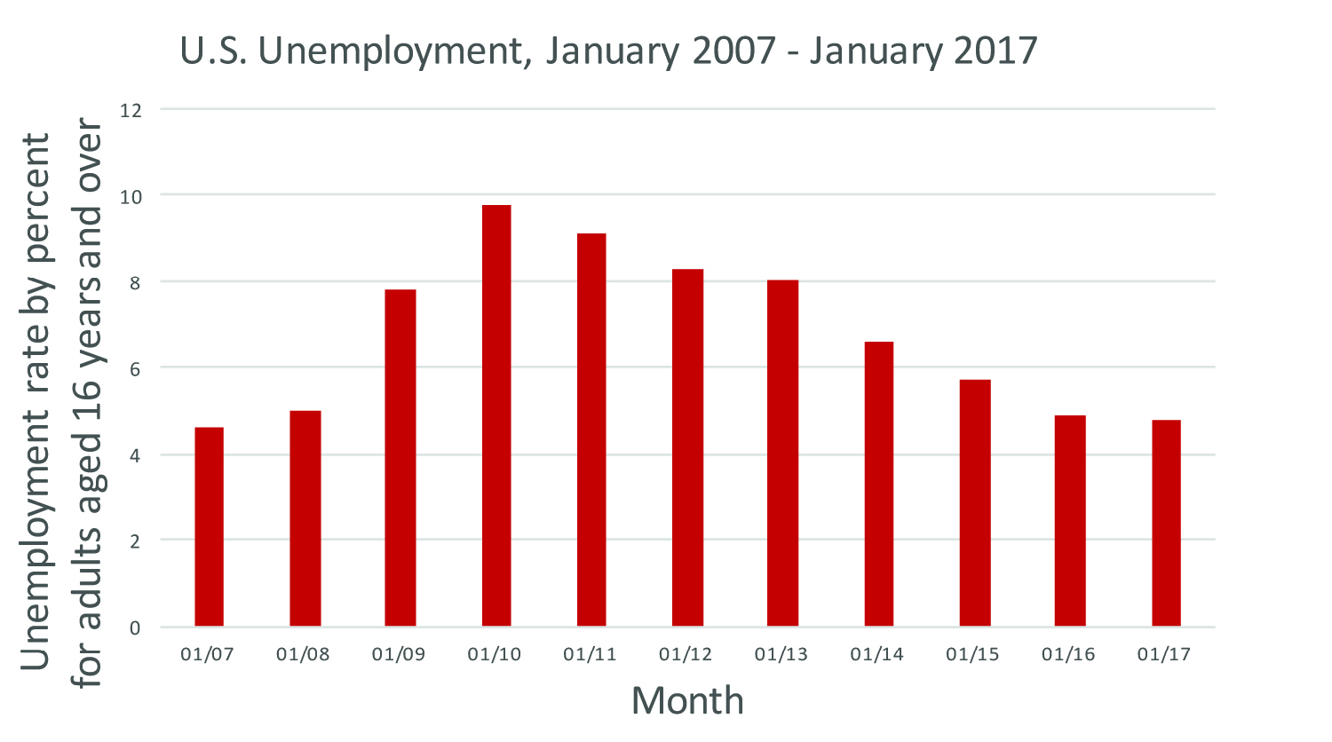
Figure 6: Bar graph showing the unemployment rate for adults, aged 16 and up, for the past decade. Data courtesy of the Bureau of Labor Statistics, http://data.bls.gov/timeseries/LNS14000000
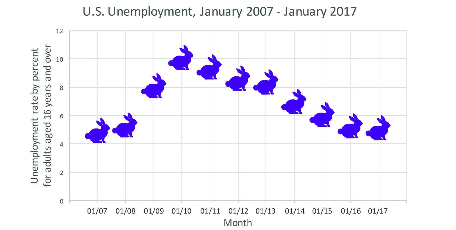
Figure 7: Unemployment rate for adults, aged 16 and up, for the past decade, with each rabbit representing the rate for each month. Data courtesy of the Bureau of Labor Statistics, http://data.bls.gov/timeseries/LNS14000000.
Decisions like these form the bedrock of data visualization. And it’s important to note here, from the very beginning, that these decisions are not part of the graphs students create in school. We need to be clear with students and ourselves that different choices may play into data visualizations “in the wild” than we are used to from math class.
While the graph with rabbits may not be the easiest to read, both the line and bar graphs provide reasonable displays of the data. The line may be slightly better at showing change over time; the bars are better for showing quantity. Since we are dealing with a change in quantity over time (the percentage of unemployment over time) both show the data well, but as we will see for different data this may not always be the case.


