Creating Data Literate Students
Skip other details (including permanent urls, DOI, citation information): This work is licensed under a Creative Commons Attribution-NonCommercial-NoDerivatives 4.0 International License. Please contact [email protected] to use this work in a way not covered by the license.
For more information, read Michigan Publishing's access and usage policy.
5 Manipulating data in spreadsheets
A practical side of being data literate is working with data to spot patterns, build arguments, and create visualizations. But first, you need a place to store and explore data. Knowing strategies for working with data in spreadsheets makes those tasks easier. Spreadsheets help us think about data by allowing the reader to view and interact with the individual data points that make up both summary statistics and data visualizations. By learning the features of spreadsheets outlined in this chapter, you’ll find spreadsheets more approachable for thinking about and working with data.
This chapter includes ways to identify patterns from data in spreadsheets and ideas for manipulating data. It will focus on features of Excel 2016 (with file extensions of .xlsx) and Google Sheets by walking through examples. Other versions of Excel might have slightly different steps, offer features in different menu locations, or lack features altogether. To navigate other software editions, use the Help function, search online for guidance, and/or find a manual. Data in this chapter, with the exception of a dataset in Google Sheets, are publicly available online. You can download the same data and follow along with the steps to learn the tools! In fact, trying the steps with the same data is a smart way to familiarize yourself with the strategies in this chapter. Keep in mind that there are some typical steps for using data in spreadsheets:
- Finding data
- Downloading data to a spreadsheet
- Cleaning up the data in the spreadsheet
- Sorting and filtering your spreadsheet to discover patterns
- Drawing conclusions from your spreadsheet
Both you and your students can use the information in this chapter to manipulate your data and others’ data. By the end of this chapter, you will be able to explore creating arguments and visualizations from manipulating data in spreadsheets.
Finding data
There are many places, both online and in print, to find data. While this chapter does not explore finding data in depth, there are several questions to consider when you encounter datasets that impact whether it will be easy to work with the data in a spreadsheet. You might even consider teaching these skills as part of your lesson plans with students!
- Is the data freely available and easily accessible? There’s a lot of data online. If you have to purchase data and funding is a constraint, perhaps you could find something available for free that will also meet your needs. In any case, make sure you have an option to easily download the data.
- What is the source of your data? Just like any other piece of information, you should evaluate your source. Do you trust where this information is coming from?
- Can you download the data? Look for options to download or export your data, especially into Excel files (files with the extension .xlsx) or CSV files (files with the extension .csv). Comma separated values files (files with data divided by commas) are easily managed using common spreadsheet software.
Data.gov (https://www.data.gov/) is one of many useful places to find datasets. It catalogs datasets from the U.S. government. Data.gov offers data about a wide variety of topics, from the environment to education, and the datasets are browsable by topic. If you can’t find data on what you are looking for, you might want to think about who would collect the kind of data you need and search for that organization (for example, the National Highway Traffic Safety Administration might have some information about highway fatalities). Consider what you are interested in when seeking out datasets or browse all the datasets. You can usually manipulate the search mechanisms in some data repositories to limit searches to topics, file types, and other specifications. Almost all U.S. government documents and creations are in the public domain; however, you should check a dataset’s documentation for exceptions before using them. In general, datasets on crime, finances, and population might be interesting to explore in the classroom. Finding data about a topic of interest to you or your students can make it more fun to manipulate!
Downloading your data into a spreadsheet
Once you have found data online, downloading your data into a spreadsheet involves a few steps. Selecting the Excel or CSV file from a website and clicking on it to download it is often successful. The downloaded file can usually be found in your folder for downloads, unless you specify a different destination. CSV files can be opened in Excel and saved as Excel files. A possible limitation is your download settings on your computer or Internet browser. If you are unable to download a file, check those settings to make sure that they allow you to download files. Another limitation could be the amount of available storage space on your computer. If there is not enough room for the file, try clearing storage space to make room. An alternative to clearing space on your computer’s hard drive is downloading the file to an external storage tool, such as a USB flash drive or external hard drive. If something goes wrong with downloading the file, try downloading it again, searching your computer files for the file, closing and reopening your browser before downloading it again, or using a different browser to download it. Check for help documentation with suggestions for troubleshooting issues on the website offering the data, too.
Let’s walk through an example. We searched Data.gov for data related to farmers markets. Notice that the Data.gov landing page indicates that the data are federal and from the U.S. Department of Agriculture (USDA). The data are compiled by the Agricultural Marketing Service, an agency of the USDA.
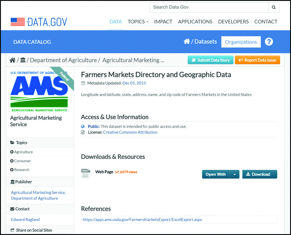
Figure 1. Landing page about farmers market data on Data.gov.
https://catalog.data.gov/dataset/farmers-markets-geographic-data
To obtain the data, click “Download.” When clicking the download button, sometimes Data.gov provides a file for downloading, and other times, it redirects to another government website. In fact, you might not even get a spreadsheet, but don’t despair! You might get some other kind of file. This time, “Download” takes me to the USDA website, rather than providing a file for my browser to download. When it takes you to another website, the data is often on that next web page and downloadable, or it is located somewhere on that website. Sometimes it takes a little detective work to download the data. In this case, I had to do some further digging and then found a directory of farmers markets, which is in a table on the USDA website. I clicked on “Export to Excel” to retrieve a spreadsheet that will allow me to work with the data for all the registered farmers markets in the country. Alternatively, I later observed that the URL under the word “References” on Data.gov provides a CSV file for your browser to download. Still, the table on the USDA website is updated regularly.
By exporting the data to a spreadsheet program, the data can be manipulated, rather than just viewed in a browser. Opening the file finally gives us a spreadsheet, but it needs to be cleaned up first. For a list of spreadsheet tips, see Appendix A.
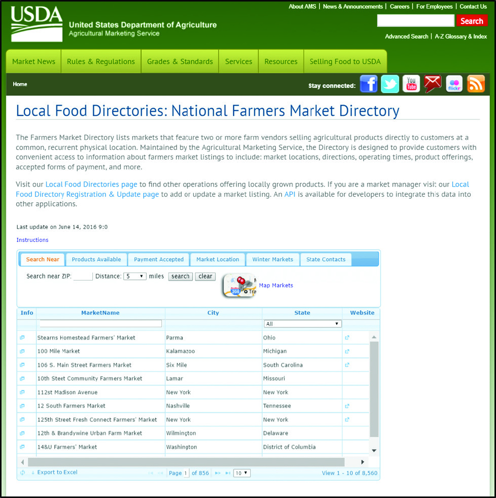
Figure 2. USDA displays the farmers market information in an online directory. Clicking “Export to Excel” in the bottom left corner of the table provides a file. https://www.ams.usda.gov/local-food-directories/farmersmarkets
Cleaning up the data in your spreadsheet
When you first download a dataset, the data may be difficult to read. For example, the rows and columns may have labels that are difficult to read. Take a look at this spreadsheet about foreclosures from the United States Department of Agriculture in Figure 3.

Figure 3. Spreadsheet of foreclosed properties from the United States Department of Agriculture, as found on Data.gov and downloaded from the USDA website. http://www.sc.egov.usda.gov/data/data_files.html
It is nearly impossible to tell what data are in each column because there are no explanatory headers at the top of the spreadsheet. Some data doesn’t fit in the width of the column, making the information hard to read. In this case, a web page called “Rural Development Datasets” offers a Microsoft Word document, called “File Description,” which contains the headers. However, it is still hard to tell with certainty what each header means because the document does not specify to which column each header belongs or definitions for the headers.
In general, it is not uncommon to encounter this kind of messy dataset. Data has not always been collected with the intention that people less familiar with the collection process might read and use it, and standard formats and practices are still being established. Luckily, there are ways to handle it. Check out these best practices, and keep them in mind when working with data:
- Sometimes data can be “messy” or “dirty,” meaning there are pieces of data that mean the same thing but may be represented in different ways, have accidental errors in them, or have some other problems. For example, ZIP codes in the Boston area have zeroes as the first of five digits (e.g., 02108 or 02123). Spreadsheet software may not recognize that the zero is not superfluous but essential to the number, so it may cut off the zero from the start of the ZIP code. Another example is names that are written or spelled differently but refer to the same entity. For example, a column for “state” could have data that says Michigan, Mich., and MI to represent the same location. In order to have an accurate count of the number of records that refer to the state of Michigan, these entries will need to be standardized before the data can be manipulated. Otherwise, important data can be left out. Similarly, Missus, Madame, and Mrs. need to be standardized. Male and boy must be consolidated to a consistent gender term. Paying attention to these details and standardizing entries or taking them into account when you manipulate data can save you from accidentally leaving data out of your analysis later.
- Look for additional documentation. As in the example shown above, datasets are sometimes missing headers or keys to abbreviations and codes. This information about the information is known as metadata. Metadata can sometimes be found in separate but essential documents; websites or files’ accompanying data can offer definitions of column headers and codes (Herzog 2016). Seeking out and viewing this information helps with understanding and analyzing data. This information is not always easy to find – it often requires some digging – but it helps you be as accurate as you can be. Guessing should be a last resort and only if you document those guesses in your research. Likewise, create documentation for your own data as you generate it. If you share it or do not look at it for a while, your metadata will clarify your data to others (and refresh your memory).
- When working with secondary data, save changes as a new file to indicate that the data have been modified (Herzog 2016). In the file name, note that you have made changes to the spreadsheet (example: FarmersMarketDataModification1.xlsx). This practice helps keep track of what you have done with the data.
One potentially intimidating part of working with spreadsheets is that they are all different, and so you might have to do some additional data organization. Column headings and other features of course vary from dataset to dataset. Going back to our farmers market data we can get our bearings by looking at column headings, as well as determining what data the rows contain.
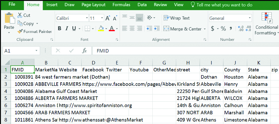
Figure 4. Spreadsheet downloaded from the USDA website.
https://www.ams.usda.gov/local-food-directories/farmersmarkets
We notice that the fields, or column headings in row 1, are human-readable with headers like “City,” as well as “Credit” to indicate payment options and “Flowers” to show goods sold (visible when spreadsheet is downloaded). These are presumably the fields that the farmers market directors fill out when they register and update their information for the directory. These headings make it possible to work knowledgeably with the data. For example, it can help us navigate quickly to those farmers’ markets that sell flowers or accept credit cards. Also, we can notice that each column contains one piece or category of information.
Another component to check for is duplicates in the data, because duplicate records could create errors in data interpretations. Finally, it is good practice to make sure that we have downloaded and have all of the data. According to the online table, there are 8,558 entries. Click in a cell and press Control + page down (use Command instead of Control on a Mac) to move quickly to bottom row of the data. The last row is numbered 8,559 (The number of farmers markets may be different when you download the data because numbers change over time. That’s okay, though ... it won’t change our discussion). Since row 1 contains column headings and thus adds a row to the total, we know that we have successfully downloaded all the data. Now that the data has been organized or cleaned up, let’s work with it to sort and filter information and discover something new using its content.
Let’s also save the entire file to the computer since we are making changes. Give it a name like FarmersMarketDataModification2.xlsx to indicate that it has been modified.
Sorting and filtering to discover patterns
Now that you have a spreadsheet full of data that is easier to read and understand, you’ll want to organize it to make sense of it. What does all of this data mean? Sorting and filtering data can help you determine patterns. Patterns help you uncover meaning. Sorting lets you put data in various sequences, such as alphabetical order or grouping all of the rows of data related to California together. Filtering creates a smaller subset of the data, while hiding the rest of the dataset. Think of the entire spreadsheet as a grocery store where everything has been dumped on the floor. Sorting helps put all the canned vegetables in one section of the store and all the frozen items in another. Filtering would hide all of the room-temperature groceries and just show those that are refrigerated or frozen. Sorting and filtering can add value to your dataset and may be enough to draw conclusions from data, spark ideas for arguments, and make decisions about a visualization.
Now that our farmers market data is cleaned up and has clear column headings, we can sort it. In Excel, “Sort” is located under the “Data” tab, and clicking it provides a dialog box that offers options for what to sort by. To put the farmers market data in alphabetical order by state, highlight all the data by clicking in the upper left corner between column A and row 1 where the triangle is. Then click on the data tab and open the “Sort” feature, choose “Sort by” State (the column we are sorting) and “Order” by A-Z (how it will be sorted). Make sure that the checkbox next to “My data has headers” is marked.
Since the data were not in order by state previously, sorting presents the data in a more readable way by moving farmers markets that are in the same state next to each other and ordering the states alphabetically. If the box for “My data has headers” is not checked, the “Sort by” menu will only show options for columns identified by letters, not the headers or labels for the columns. It is harder to select a column to sort by then. If you uncheck the box for “My data has headers” before sorting, the headers will disappear in the sorted data, which makes the data difficult to interpret. To remove the sorting, click “Clear” under the “Data” tab.
We can also use the “Filter” feature to zoom in on a specific section of the data and hide the rest of the data. This feature helps us view part of the dataset and makes analyzing the data more manageable by showing fewer rows. In Excel, “Filter” is located under the “Data” tab, and clicking it provides drop down menus in each column heading. Consider what category you are interested in, and identify the column that contains it. Then, use “Filter” to limit the visible data to only the data fulfilling a particular characteristic, such as location or product. For example, to view the farmers market data for only California, as shown in Figure 6,
- Select the “State” column.
- In the dropdown menu, (accessed by clicking the triangle next to the State heading) uncheck “Select all.”
- Check only the box for California
- Click OK, and the only rows visible will be for farmers markets in California.
Other ideas for filters are selecting several states in a particular region or farmers markets that offer a particular product.
If you want to remove a filter for one column, click the filter icon in the column heading and click “Clear Filter From” the name of the column. If you want to remove all filters, click “Clear” in the “Sort & Filter” group of the “Data” tab.
When you are working with data, it is helpful to automate as many processes as possible. This allows you to play with data in many ways in a short amount of time – the more sorting and filtering you do,the more likely it is that you will find useful patterns.
Pivot tables
Let’s turn to pivot tables, a different type of filtering which will help us explore our data more deeply. A pivot table is a tool to summarize data by reorganizing it in a new view. It is useful for understanding your data because it can quickly and automatically show patterns by sorting, counting, and/or averaging data. In searching on Data.gov, I found data for the 2010 School Improvement Grants, which were awarded by the U.S. Department of Education to support schools with the lowest achievement. This public dataset is not labeled with a copyright or any other kind of license, but it is a federal dataset, so it is fair to assume that this government data is in the public domain according to https://www.usa.gov/government-works. Note that this dataset was summarized in 2013, a couple of years after the year being studied. Because compiling data can take a long time, it is not unusual for the most recent data available to be a few years old.
I downloaded the CSV file from Data.gov and opened it in Excel. Figure 7 shows what it looks like to start. Before making modifications to the data, save the file with a new name to avoid mixing up the raw data with any changes and findings, as we did with the other datasets. The downloaded file was automatically given the file name of userssharedsdfschoolimprovement2010grants.csv. I re-saved it as an Excel file with the file name of schoolimprovement2010grantsModified1.xlsx.
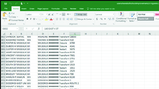
Figure 7. Unmodified spreadsheet about school improvement grants, as downloaded from Data.gov.
https://catalog.data.gov/dataset/school-improvement-2010-grants
Because the columns are not fitted to the width of the data, it is hard to read what each cell contains. Clicking the Wrap Text icon and/or widening the columns will fix that.
Let’s get to know the data. This spreadsheet has seven column headings that are are in a clear, concise format and span from A to G. By pressing Control + [End] on a PC (use Command + [Page Down] on a Mac), my cursor jumps to the last row, and I learn that there are 832 rows (831 schools listed, plus one row for the column headings), meaning that 831 schools received grants because the first row in our spreadsheet contains column headings. For an easy way to keep track of column headings in Excel, freeze the top row by selecting “Freeze Top Row” under “Freeze Panes” in the “View” tab. Then, we need to think about what we want to know from the data. I am curious which states received the most grants. To answer my question, I will create a pivot table by inserting the pivot table and putting “State” in both the “Row Labels” and “Values” fields of the pivot table.
Because each district was only eligible to receive one grant, finding two entries for the same district would show that there was some error in the data. A duplicate district (indicated in the “School Name” column) would mean that something is wrong with the data. You could check for duplicates by sorting by district name and scrolling row by row through all 831 school districts. That would be time-consuming, and if your eyes got tired, they could miss a repeated entry. Instead, let’s create a pivot table.
To check for duplicates, create a pivot table by following these steps:
- Select the column of interest, which for us is Column A containing the School Name, by clicking on the label for column A.
- In the “Insert” tab, click PivotTable.
- In the dialog box that opens, choose the options to “Select a table or range” and make sure that column A is listed.
- Also in the dialog box, choose New Worksheet as the location to place the PivotTable. It is easier to work with pivot tables in a new tab of the spreadsheet.
- Click “OK,” and a new tab with a sidebar for PivotTable fields opens.
- Click and drag the category of “School Name” into both the rows and values fields. Now, we will be able to see if any school names occur more than once and consequently have duplicates by looking at the new “Count of School Name” column.
We have completed all the steps to create our pivot table and can now learn from it. We can see that there are duplicates (as indicated by school names that have 2 next to them, instead of 1, in the “Count of School Name” column), so we need to investigate. Further investigation by returning to the original spreadsheet and searching for a duplicate name (press [Control] + f (use Command + f on a Mac) to activate the “Find” dialog box and use it to search), such as “Mount Pleasant High School” reveals that two high schools, one in Delaware and one in Tennessee, have the same name. Place names can also be abbreviated, so I also checked for “Mt Pleasant,” too. Though I did not find any schools with that name in this data, it is important to consider abbreviations to avoid overlooking data. We can conclude that we do not actually have a problem with duplicates in these data.
Given that this dataset contains data for each state, another good check is to make sure that it contains 50 states. I can check the state column for unique data points to ensure that I have 50 by using a filter. Here are the steps:
- Highlight the State column.
- Go to the “Data” tab, and click “Advanced,” in the “Sort & Filter” group.
- In the “Advanced Filter” dialog box, select “Copy to another location.” Then click your cursor in the “Copy to” box and select a column to the right of the data (I chose column I to separate the state data from the dataset).
- Be sure to click the “Unique records only” checkbox.
Each state abbreviation will appear in the column, and the heading “State” will be at the top. We can scroll down to the end of the data in Column I to see that there are 51 rows, which seems correct for the number of states because row 1 contains the header. However, it is not quite that straightforward. What about Washington D.C. or Puerto Rico? Those would bring the count above 50. We can find documentation showing that the District of Columbia and Bureau of Indian Education have also received school improvement funding, as well as Puerto Rico (http://www2.ed.gov/programs/sif/index.html). According to the documentation, Puerto Rico’s and the Bureau of Indian Education’s data appears to be separated from data for states, and North Dakota was not included in the 2010-2011 funding. Our spreadsheet contains Washington D.C. and North Dakota but Hawaii is missing. When you are working with data, think about any circumstances like these that might arise and address them from the start. Sometimes you may not know the larger facts around your data. In this case, for example, that there should be 50 entries. You need to know the context around your data. You need to find data about your data! You may even uncover other aspects to consider when you research your data – like that you need to consider information from the Bureau of Indian Affairs.
Having gotten to know the data and checked over the spreadsheet, we are ready to make visualizations from this spreadsheet.
Drawing conclusions: Visualize data from a spreadsheet
Spreadsheets not only help you manipulate and learn about data but also visualize it. Simple built-in visualization tools in spreadsheet software can automatically turn your data into charts and graphs. With the school improvement data, I was curious which states had the most schools that received grants. I created a pivot table using “State” in both the “Row Labels” and “Values” fields of the pivot table to summarize number of schools that received grants per state and show only the top 10. Next, I explored visualization options to display these data.
To create a graph or chart from the school improvement data, I went through a process of inserting, modifying, and evaluating visualizations with the following steps:
- Select the data you want to visualize. In this example, it’s the Count of State column for the top-10 states. In the “Insert” tab, click “Recommended Charts.” A dialog box will open with types of charts and graphs to choose.
- Explore the types of charts and variations within the types by inserting and evaluating them. Excel offers a preview in the dialog box. Select one and click OK, which will provide a chart that hovers over your spreadsheet.
- Manipulate your chart to add labels and change its appearance. Click the plus sign next to the chart to add labels and the paintbrush symbol to modify its appearance.
- Review the chart to determine if it is the best fit for the data. Try other charts to see which one fits best.
Consider the visualization choices. Think about which chart or graph will best showcase the data without being confusing or inaccurate. Trying out visualizations and assessing their strengths and weaknesses helps select a visualization that is a great fit for the data. For example, try out the pie chart. Given the large number of slices, it is hard to compare states and analyze how the state with the most grants, California, differs from the state that’s tenth on this list, North Carolina. A different visualization could do a better job. Experiment with a line with markers. What do you think of this visualization?
The line is unnecessary and confusing because the data point for an individual state does not influence another state. These data are for one year, and each state has its own count. Line charts are better for data that change over time. It is clear that this is not the right visualization. Another chart or graph could illustrate these data better. A stacked bar chart is a great fit. You might consider ordering the bars from least to greatest, or greatest to least, for easier interpretation.
It clearly shows the range of the number of schools. It is straightforward and not confusing to look at, unlike the pie chart and line chart. Now conclusions can be drawn from the data. The chart is used to explore questions like, why might California have the most schools that received grants? Its large population might be a factor. Google Sheets also offers visualizations in the Insert menu.
Inserting your spreadsheet or graph into Word
Taking the data and visualizations from Excel or Google Sheets to Microsoft Word or Google Docs is a useful way to showcase what’s earned through data manipulation in reports and other products.
Inserting (copying and pasting) an Excel spreadsheet or a piece of a spreadsheet into Word can be done in several ways. If you want a table that will never change, you can highlight, copy, and paste the spreadsheet or part of it into Word. If you want to preserve spreadsheet capabilities, you can embed the spreadsheet in Word, and Excel features will be available through Word (use “Paste Special” and paste as a “Microsoft Excel Worksheet Object”).
If you want a spreadsheet in your Word document that dynamically changes whenever you change things in Excel, make sure to select the “Paste link As” option and choose “Microsoft Excel Worksheet Object.” See Figure 16 to see how the different options appear. All are handy!
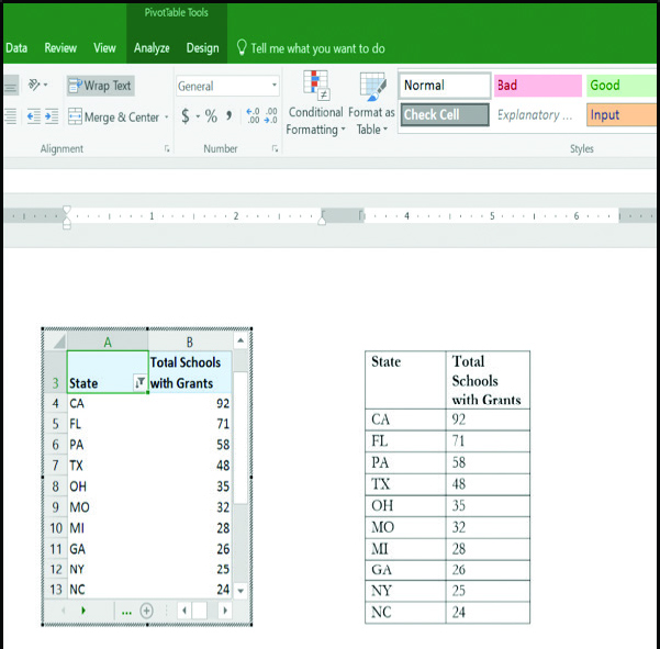
Figure 16. On this Microsoft Word page, the left spreadsheet shows how a spreadsheet pasted as an Excel object or linked to Excel appears. As data in Excel changes, so will the corresponding spreadsheet on the Word document. The right spreadsheet shows cells cut-and-pasted that are not linked to Excel. Any changes to the original Excel document will not be auto-transferred to the Word document.
Workarounds for Google Drive
At press time, Google Docs does not offer the feature to insert a Sheet. Copying and pasting rows and columns from Google Sheets provides a table in a Google Doc and is a good workaround. Taking a screenshot and pasting it in your Doc is another workaround. To transfer visualizations, copying and pasting from Google Sheets to Google Docs works well. Google Docs allows you to link visualizations to the spreadsheet so that they update.
Conclusion
Spreadsheets help us think about and draw conclusions from our data, allowing us to tease out patterns we might not notice otherwise. Finding data, downloading it appropriately, cleaning it up and sorting and filtering it help us understand the data and then communicate it more effectively to others. Spreadsheets can provide different views and perspectives on our data. We can even generate simple visualizations using the data within the spreadsheet software. The examples in this chapter give you a taste of ways to use spreadsheets to organize and think about your data.
Resources
- Herzog, David. 2016. Data Literacy: A User’s Guide. Los Angeles, CA: SAGE.
- Office of Elementary and Secondary Education. 2015. School Improvement 2010 Grants. U.S. Department of Education. Distributed by Data.gov. https://catalog.data.gov/dataset/school-improvement-2010-grants.
- United States Department of Agriculture. 2016, June 9. Local Food Directories: National Farmers Market Directory. Washington, DC: Agricultural Marketing Service, Department of Agriculture. Distributed by the Agricultural Marketing Service and Data.gov. https://www.ams.usda.gov/local-food-directories/farmersmarkets.
- United States Department of Agriculture. “Rural Development Datasets.” Service Center Agencies Online Services. Last modified May 5, 2016. Accessed June 12, 2016. http://www.sc.egov.usda.gov/data/data_files.html.
- U.S. Department of Education. “School Improvement Grants.” Data.gov. Last modified April 26, 2016. Accessed June 12, 2016. https://catalog.data.gov/dataset/school-improvement-2010-grants.
- U.S. General Services Administration. “National Farmers Market Directory.” Data.gov. Last modified November 18, 2015. Accessed June 9, 2016. https://catalog.data.gov/dataset/national-farmers-market-directory.
- “U.S. Government Works.” USA.gov. Accessed June 12, 2016. https://www.usa.gov/government-works.
Appendix A: Spreadsheet tools
If you are new to spreadsheets, need a refresher, or are not quite sure how to do something in this chapter, here are some useful features of spreadsheets in Excel. Google Sheets has some slightly different names for functions and formulas but has many similar features.
Name | What it does | Location or Formula in Excel 2016 |
|---|---|---|
AutoFit Column Width | Fits each column to the width of the cell with the widest data | Home tab > Cells > Format > AutoFit Column Width |
Freeze Top Row | Makes the top row, which usually contains column headings, hover when scrolling down | View tab > Freeze Panes > Freeze Top Row |
TRIM | Removes extra spaces before and after text | Enter the formula in a cell: =TRIM(column and cell) (example: =TRIM(A2) ) |
Text to Columns | Splits data combined in one column into multiple columns, so that each column contains one category of data (example: first and last names) | Data tab > Text to Columns |
AutoSum | Calculates the sum of a range of cells and also offers average, count, maximum, and minimum functions | Formulas tab > AutoSum |
PivotTable | Summarizes the data | Insert tab > PivotTable Then, drag and drop column headings into the pivot table fields to create it |


