On Arabic Justification
Skip other details (including permanent urls, DOI, citation information)
: This work is licensed under a Creative Commons Attribution 4.0 International License. Please contact mpub-help@umich.edu to use this work in a way not covered by the license.
For more information, read Michigan Publishing's access and usage policy.
Abstract
Justified setting is one of the most common configurations of a block of text. It is found across different cultures, writing systems, and languages. Yet whilst the concept of equalising the width of lines in a column to achieve a rectangular block is shared, the techniques that are employed towards this end are diverse. This paper discusses the justification of Arabic text. It lays out the methods that evolved in manuscript practice and reflects on their interpretation in typography. It casts a spotlight on the origins of the typographic justification techniques in Europe and compares them in three case studies to examples from the nineteenth century Middle East. A sketch contextualises how Arabic justification changed under the influence of technology and prepares the ground for a review of the provisions found in current typographic environments. The paper then presents the state-of-the-art of digital text layout for Arabic and queries its suitability. The argument concludes with recommendations of best practice aimed at toolmakers and designers of Arabic documents.
Acknowledgements
The project from which this paper originated has received funding from the European Union’s Horizon 2020 research and innovation programme under the Marie Skłodowska-Curie grant agreement No 841712, which is gratefully acknowledged. I would also like to thank Richard Ishida for feedback on a draft of this paper, and the anonymous reviewers and editor Simon Rowberry for their valuable input.
Author Biography
Titus Nemeth is a typographic designer and historian. His work revolves around Arabic script culture, which is reflected in his practice and his publications. Titus has designed original type, multilingual editions, and a range of Arabic interpretations of well known Latin typefaces. His publications include scholarly articles, papers in edited volumes, contributions to reference works, and the monograph Arabic Type-Making in the Machine Age, published by Brill in 2017. He holds a PhD in Typography & Graphic Communication from the University of Reading, UK and has taught type design and typography at schools in Austria, France, Morocco, Qatar and the UK. He is currently (2020) a Marie Skłodowska-Curie research fellow.
1. Introduction
A block of text in which every line is adjusted to appear of equal width is called justified.[1] It is a fundamental configuration of text that can be found across cultures, writing systems, languages, and technologies used for the multiplication of texts. As such it merits consideration by anyone involved in the production of documents, and it calls for appropriate implementations by toolmakers, and the informed use of justification techniques by their respective users. Both requirements rely on knowledge of script-specific characteristics, cultural conventions, and established best practice.
In an ideal scenario, these are readily available to toolmakers and users alike. In a living trade, a chain of transmission provides the necessary knowledge through apprenticeship structures or similar direct dissemination. In formalised education, textbooks may support the teaching, which in turn contribute to building a body of knowledge independent of the trade from which it emerged. Savoir faire and competence may thus be acquired widely. For Arabic typography, however, neither a chain of transmission nor trade literature are sufficiently developed and accessible for reference by toolmakers or users. Instead, unthinking doing with available tools, which are frequently shaped by technical constraints or economic necessity, as well as uncritical imitation, shaped practice over most of the last century.[2] Today we are therefore confronted with a situation in which any precedent, no matter its initial validity or quality, serves as role model. Currently Arabic typography lacks authoritative references, resulting in a field shaped by technological default settings, instead of informed best practice.
Against this background historical research attains particular relevance. It may help current students and practitioners to develop a more comprehensive picture of their field, a picture which reaches beyond the confines of the current tools, or its immediate precursors. The argument presented here emerges from research into Arabic typography from an era that was identified as a formative moment in the history of the craft. In the second half of the nineteenth century Arabic typography flourished for the first time in the Middle East, leaving behind 400 years of indifference to this technology by native users of the script. It was here, when craftspeople with the relevant cultural competence embraced typography and type-making, that the medium of letterpress printing was given a form that was accepted by the intended audience.
This was a seismic change if we compare it to the failure of Arabic typography from Europe to make any inroads to the Middle East in the preceding centuries. In contrast to all attempts at making Arabic letterpress printed books from Italy, Central Europe, the Low Countries, France, or Britain – which left Middle Eastern readers unimpressed – the publications that emerged in the region in the nineteenth century elicited a response. Once punch cutters, type founders and printers in Istanbul, Beirut, or Cairo began making books using locally produced foundry type, and employed it with sensitivity to the established conventions of document design, a print and publishing revolution began. Arabic typography was given a shape that held up next to the exceptional Ottoman manuscript culture of the nineteenth century, demonstrating its unprecedented quality. For the first time this medium was used to successfully represent the Arabic script for native readers, and thus established its archetypal form using movable type. Yet, as the twentieth century brought renewed technological change, the foundations of Arabic typography were eroded. Typesetting machinery did not allow to maintain the norms that had emerged in Middle Eastern print shops, and little of the achievements of the pioneers of the craft survived to our days. It is because of this break in the chain of transmission that we need to reach back to the pre-mechanical era, when documents were produced under circumstances that lent them qualities which transcend time and may therefore inform how our craft is practised today.
With this premise the present paper discusses the justification of the Arabic script. It begins by considering justification techniques as they emerged from manuscript practice, setting out some fundamental observations about the subject which underpin the following discussion. It then demonstrates the European origins of a specific justification technique before juxtaposing it to a selection of case studies examining exemplary historical practice from the Middle East. A historical sketch then provides the background for a review of current Arabic software implementations, discussing their approaches, qualities, and shortcomings. In conclusion some observations and recommendations for contemporary practitioners are proposed.
1.1. Fundamentals of Arabic justification
Arabic justification uses different concepts to those that are widely known from the Latin script. Because most Arabic letters connect, hyphenation, i.e. the breaking of words at the end of a line, is generally not practised.[3] In Arabic texts the remaining space of a line is principally filled using either or a combination of three techniques: (1) the variation of letterforms (principally elongation and alternative letterforms), (2) the variation of white space, and (3) the configuration of words in a line, including the vertical stacking of letters, reduction of size, and extension of the line into the margins.[4] [Figure 1] In the context of typography, the latter is of marginal relevance, and this paper will only consider techniques 1 and 2.[5]
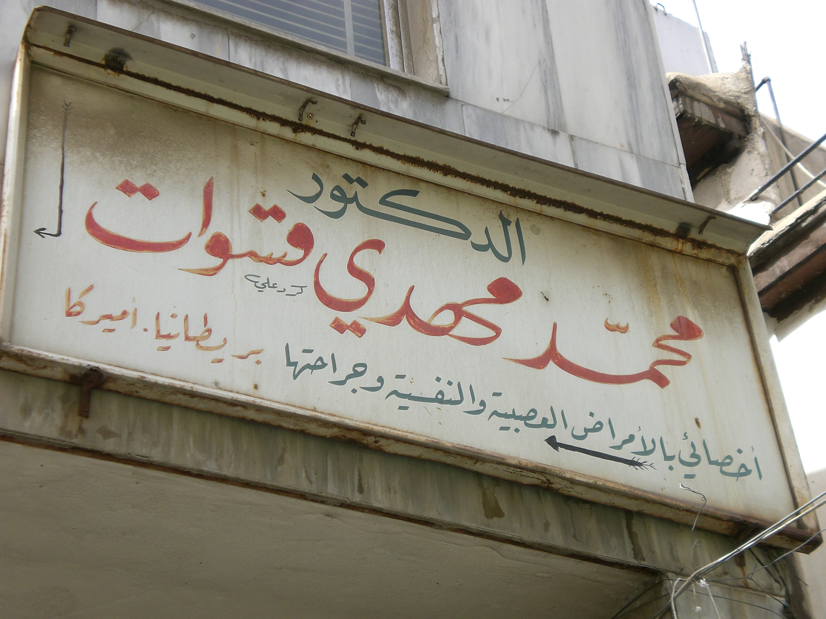 Figure 1. Hand-lettered shop sign of a doctor’s surgery illustrating elongation principles of Arabic writing styles. From top to bottom: Naskh style using a swash variant of kāf, Nast‘alīq style employing kashīda elongation, Ruq‘ah style foregoing any elongation because of the ambiguity it would create with medial sīn. Damascus, Syria, 2007. Photograph by the author.
The most prominent technique for Arabic justification is elongation, and it is known by various terms with ambiguous usage.[6] Whilst kashida, the simplified English spelling, is most frequently used, it often lacks precision. However, there is growing consensus that kashīda is the preferred term for the elongation of letter parts, agnostic of technological implementation.[7] This paper employs the more elaborate distinction that Thomas Milo established in the context of DecoType’s technology, in which kashīda relates to the elongation of letterforms by means of curvilinear strokes following conventions observed in manuscript practice, and tatweel refers to the Unicode character U+0640 Arabic Tatweel.[8] A further, specialised kind of elongation is found in swash variants of letterforms. Although also used for justification (amongst other uses), they are governed by different rules to kashīda elongation.[9]
By contrast, the tatweel extension stroke, although widely seen as the standard means of justification in Arabic, is an artefact of typographic technology and should be considered separately. More on the tatweel below, suffice it to say here that it should not be regarded as a script-inherent feature. Note also that the elongation of letterforms does not mean stretching (which implies distortion), but a reconfiguration of the whole letterform, and that only some letters, and only certain parts of them may be elongated – and that only in specific, style-dependent contexts. [Figure 2]
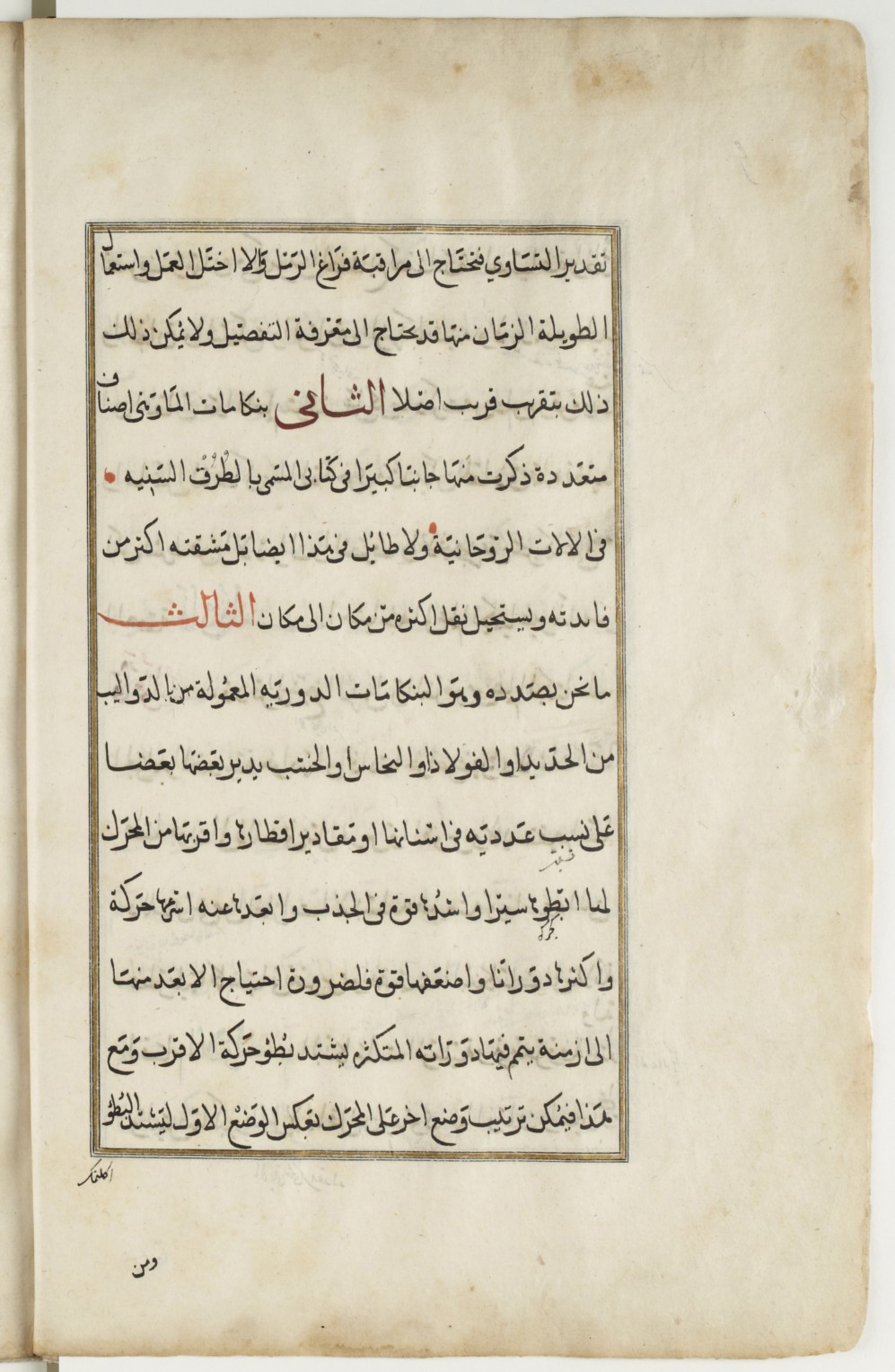 Figure 2. Arabic manuscript demonstrating various justification techniques in a Naskh hand. Note how subtly the justification means are used: apart from the red subsections, which are meant to stand out, the main text appears to have equal line lengths without apparent elongations. Only careful observation reveals elongation, letter-stacking and changes in the density of the writing. Taqī al-Dīn Muḥammad ibn Ma‘rūf, Treatise on watchmaking, 1701–1800, Nablus, 27,5 cm by 17,5 cm, 85 pp. Courtesy of BnF Gallica, ark:/12148/btv1b8406163s
2. Justification in historical typography
When printers adopted typography to compose Arabic texts, justification principles had to be translated into the new medium. In manuscript production a scribe could use his experience to approximate the number of words he could fit in a line. Whether he needed more or less space he could tweak the proportions of letter shapes, the width of white spaces, the vertical arrangement of letters and words etc, all before resorting to the more visible justification means: swash letterforms and elongations. Scribes thus had a range of tools to make a written line fit the column.
In letterpress printing not much of this malleability remained. Although white space could be modified too, it was not as flexible. Adding quads to fill a line was easy enough but reducing the space between sorts required a disproportionately bigger effort by the compositor than by the scribe. Letterforms, on the other hand, could not be modified at all, considerably reducing the margin of manoeuvre. Metal type left the compositor with three means to quickly justify a line and lock the forme:[10] (1) increase the width of word spaces, (2) use swash sorts if contained in the font and applicable in the given line, or (3) insert specialised sorts between letters to mimic the elongation of letter parts. Although technically possible, it was economically inconceivable for compositors to create elongated letters as they were needed. Typesetters had to work with the font at hand, employing its sorts to best effect, and as quickly as possible. Rather than making custom sorts for every justified line, typography’s modularity was therefore used to imitate Arabic elongation by means of a dedicated typeform: the tatweel.[11]
2.1. The origins of the tatweel
The tatweel was first used by European type-makers and printers when they began composing Arabic in the sixteenth century. Straight extension strokes can be found as early as 1516 in a multilingual volume of the gospels published in Genoa, and henceforth it remained a feature of European Arabic typography.[12] The utility of the tatweel is obvious and would have been appreciated by the compositors of Arabic type. A uniform, straight line that could be repeated as desired and inserted between any connecting letterform greatly facilitated their work. If setting Arabic was laborious, at least its justification was easy.
Yet, the compromises of Arabic typography justified with what amounts to a horizontal rule may not have been appreciated by sixteenth century printers.[13] Although the basic principle of elongation could be readily observed and explained by Oriental scholars, typically involved in the context of European typography, the more elaborate rules underpinning it remained opaque to the first printers of Arabic texts. This discrepancy is well illustrated in books produced at the Medici Oriental Press in Rome. [Figure 3] Backed by considerable political and economic clout, in Europe its Arabic volumes were regarded as hallmarks of scholarly and artistic achievement. The renown French punch cutter Robert Granjon, then at the height of his career, was commissioned to cut new Arabic types specifically for the task, and produced five fonts in various sizes.[14] Their influence was considerable as they were widely copied and until recently held up as role models of Arabic type-making.[15] The fonts achieved somewhat greater fidelity with the Arabic script than their precursors, and included swash variants and elongated letterforms that Granjon may have intended for justification. Yet the publications of the Medici Oriental Press are dotted with instances in which the compositors still resorted to inserting straight tatweel sorts, with predictably alien results. Whereas Granjon’s fonts had a lively appearance, with a multitude of curves and rounded strokes, justification by means of the tatweel introduced a geometric linearity found nowhere else in the type. The unrestrained use of this sort stretched words beyond recognition, and created blank spaces without apparent function, undermining a central tenet of typography for reading: lending shape to meaning.
 Figure 3. An example of the excessive use of the tatweel sort in early Arabic letterpress typography. From Bashārat yasū‘ al-masīḥ kamā kataba mār matī wāḥid in ithnaī ‘ashara min talāmīḏihi (Rome: Typographia Medicea, 1591) 137. Courtesy of the Austrian National Library, http://data.onb.ac.at/rec/AC09709138
2.2. How was text justified in Middle Eastern Arabic typography?
Justified setting was also the norm for Arabic typography practised in the nineteenth century Middle East. Without exception, all volumes that were reviewed for this paper, including works of grammar, literature, poetry, history, rhetoric, etc, from more than 18 different print shops from Beirut, Cairo, and Istanbul, were justified. This pattern is consistent irrespective of the number of columns, the type size, or language. This, of course, is not surprising, as justified text was also the dominant configuration of manuscripts. Yet, the systematic and more rigid features of typographic composition limited justification techniques to two: (1) the variation of letterforms, principally through elongation and alternative letterforms, and (2) the variation of white space. By contrast to the European examples, when letterpress printing flourished in the Middle East justification by tatweel was used sparingly and only under certain conditions.
In the following case studies, I will show different examples of typographic justification from print shops in the publishing centres Beirut, Cairo, and Istanbul. I will consider the different genres, the kinds of texts and books, the layout, the typefaces used, and the strategies that were used to achieve equal line lengths across the columns.
2.2.1. Tuhfe-i Vehbi, 1798, Istanbul
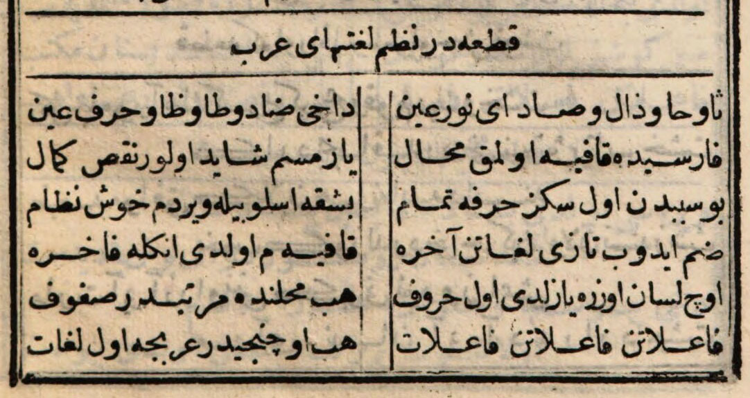
The Tuhfe-i Vehbi is a Persian-Ottoman Turkish dictionary that was printed as early as 1798 at the Dār al-Ma‘mūra, the Imperial print shop in Istanbul. [Figure 4] It forms part of a genre of rhyming dictionaries that were used in the Middle East in the teaching of foreign languages. Based on a corpus of words usually taken from a classical work, these dictionaries combined verses with glosses explaining the new words to pupils and students. The Tuhfe-i Vehbi became particularly popular and this volume was reprinted more than 50 times in the ten years after its first publication in 1798.[16]
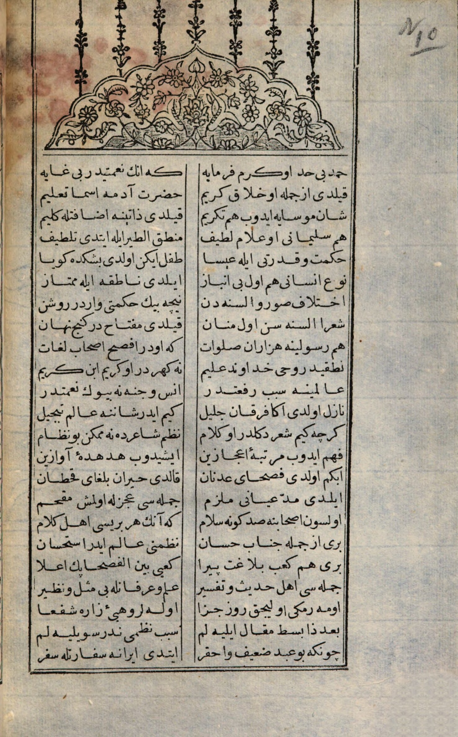 Figure 4. Tuhfe-i Vehbi, opening page 2, courtesy of the Austrian National Library, http://data.onb.ac.at/rec/AC10145310
This mid-sized (128mm × 255mm) volume is well printed and demonstrates high production standards: The type is mostly clear and only slightly impressed, inking is even, and register is within expected tolerances, demonstrating a high level of craftsmanship. The text area is delimited by a double rule border, and alternates between a one column and a two-column layout, the latter separated by two vertical rules. The book is composed from a single size font of Bogos Arabyan’s 16pt Naskh typeface, cut in 1791.[17] Section headers are centred, and enclosed by horizontal rules above and below, creating structure and hierarchy with minimal means. [Figure 5]
Whereas some of the verses are set in the most conventional layout seen above – setting one couplet per line in two, justified columns – others follow another configuration that can be found in manuscript practice. Here the two parts of the couplet are set in two consecutive lines, with the first part right-aligned, and the second part left-aligned, both justified to approximately the same width. [Figure 6] Thus, the two parts of a couplet have some horizontal overlap each, with the result that a third ‘column’ emerges in the middle of the text area.[18]
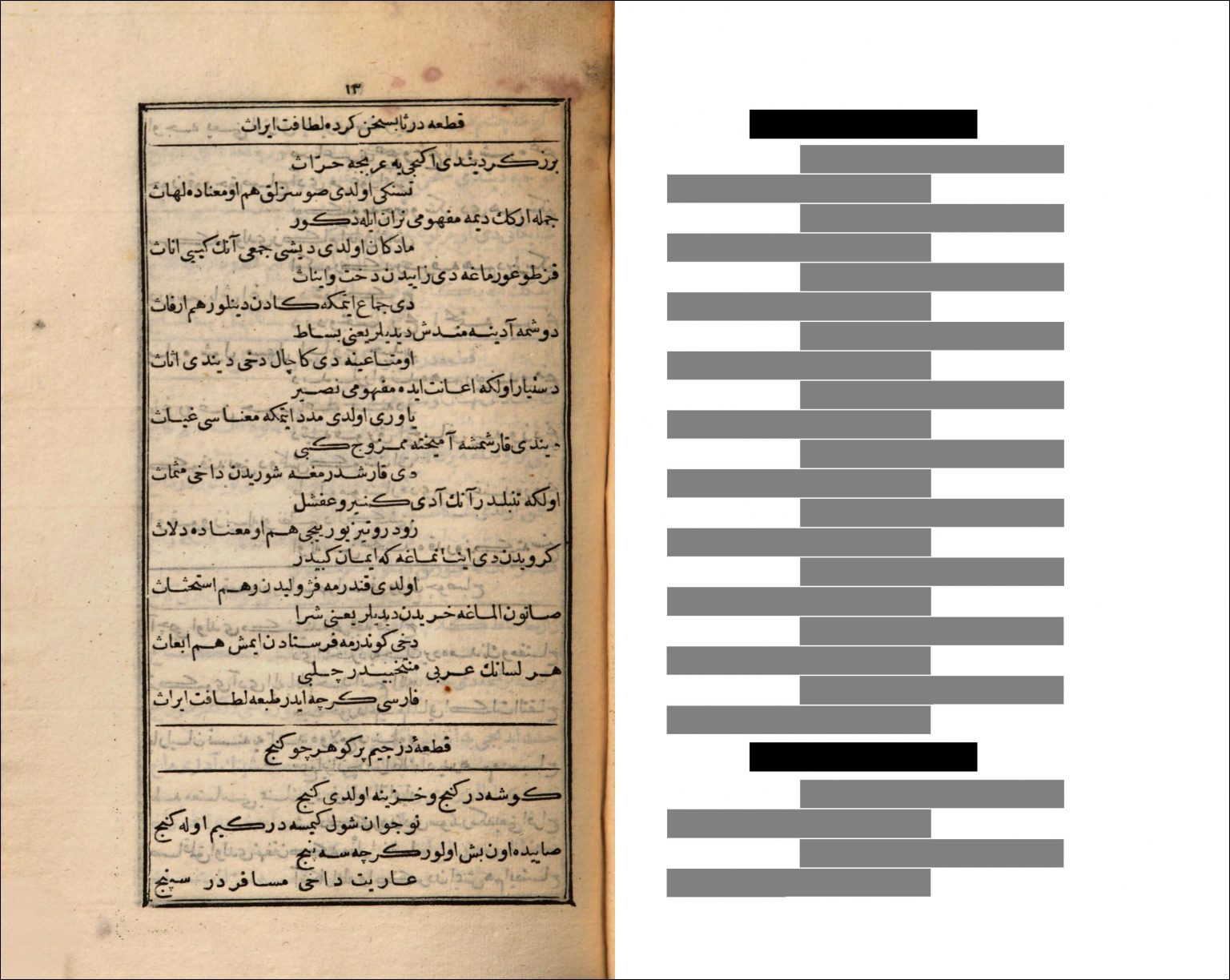 Figure 6. Tuhfe-i Vehbi, p.13, juxtaposed with a schematic illustration of the typographic configuration.
Turning to justification, despite the narrow columns a relatively even distribution of spaces is readily apparent throughout the volume. The typesetter thus modified white spaces as little as possible, and seemingly only as a last resort. Lines were justified either through selection of swash variants of letterforms, or the insertion of tatweel sorts. [Figure 7] However, looking through the volume, as well as other books composed from the same font, a few sorts appear particularly frequently. Especially the elongated forms of the kaf stand out, but also a final ālif sort with an extended connecting stroke, the returned yeh, as well as the wide, curved form of final rāh are frequently used. Most lines that feature a kāf and require justification seem to be set with the swash variant, rather than a tatweel, suggesting a preference by the compositor. Similarly, when a final rāh may be set with its round alternate this sort is often used, limiting tatweel mainly to those lines that do not feature any of the letters for which the font provides wider alternates.
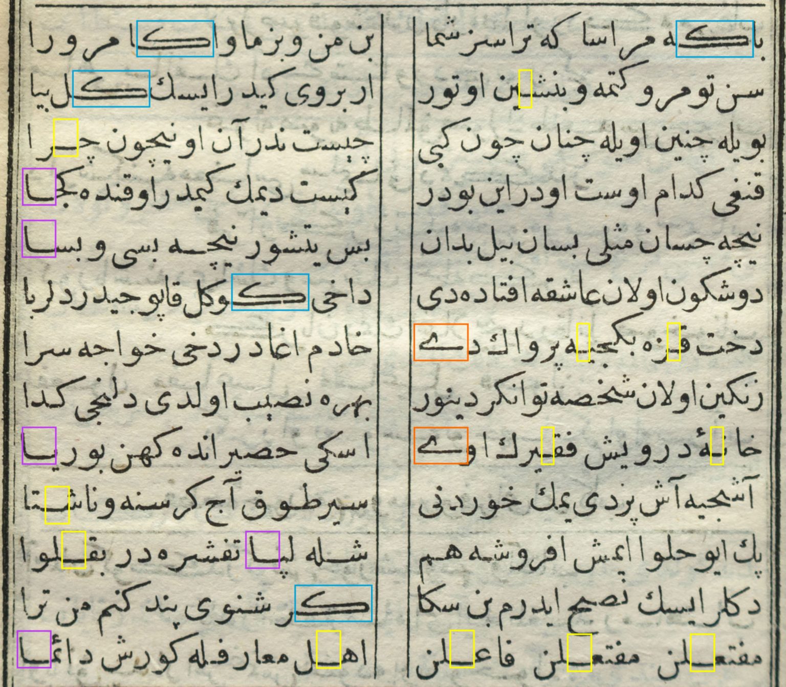 Figure 7. Tuhfe-i Vehbi, detail of page 7. Blue shows the swash kāf, purple is used for the final elongated ālif, orange marks the returning Yeh, and yellow highlights the use of tatweel sorts.
Examples that do not fall into this pattern can of course be found in this volume, and the factors influencing the choice of sort by the compositor are too numerous to be reconstructed by induction alone.[19] Yet there appears to be enough of a tendency of using elongated alternates, rather than tatweel, to infer that if the font had contained more variant sorts, they would have been used by the typesetter.
2.2.2. Kitāb Majma‘ al-Bahrayn, 1856, Beirut
The second case takes us half a century ahead, into the emerging centre of Middle Eastern publishing, Beirut. Here the American Mission Press, set up by the American Board of Commissioners for Foreign Missions in 1834, had established itself as a key conduit for the advancement of local publishing activities. Since 1841, when George C. Hurter became the first trained printer to assume this role at the mission, and a new set of fonts began to be used that came to be known as the ‘American Arabic’ typeface, the press became a central institution of regional print culture.[20] Not only did it produce the Mission’s own publications, but it also provided the service of a regular print shop to aspiring publishers and authors, and distributed printing hardware throughout the region.
The Kitāb Majma‘ al-Bahrayn is a typical publication of this period and place. [Figure 8] Published in 1856 without any imprint other than that of the patron Nakhla al-Mudawwar, it is readily recognisable as a publication from the American Mission Press. Its medium format (144 × 243), the quality of printing, the typography in two sizes of the American Arabic typeface, and editorial decisions such as the use of footnotes make the Kitāb Majma‘ al-Bahrayn an exemplary production of this printing house. The text itself is also a typical example for the emerging print culture, and the cultural movement of the Nahḍa. Written by Nāṣīf al-Yāzijī, the Kitāb Majma‘ al-Bahrayn is a collection of fifty stories that reference the style of al-Harīrī’s 11th century Maqāmāt, a key work of the Arabic literary tradition.
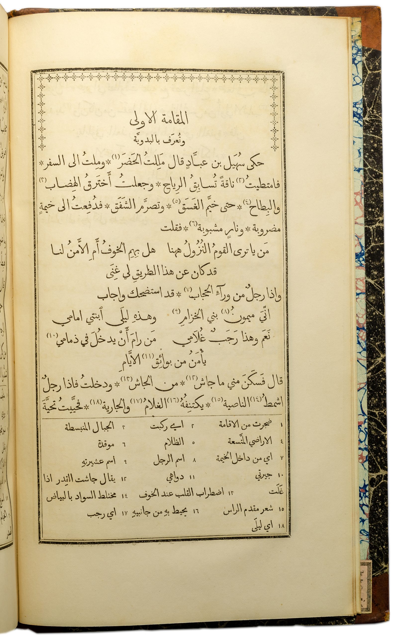 Figure 8. Kitāb Majma‘ al-Bahrayn, p.4, courtesy of the Austrian National Library, http://data.onb.ac.at/rec/AC10151400
The volume is defined by the American Arabic typeface, used here in three sizes. The main text is set in the 24pt font, and footnotes and subheadings are set in the 20pt font. The section headers are centred, and set from a 32pt font that is loosely inspired by the Thuluth style, making it one of the first uses of this size.[21] The main prose is fully justified and interspersed with verse couplets which are either set in a two column configuration, or off-set over two lines, as in the Tuhfe-i Vehbi discussed above. The book is marked by the vast number of notes that accompany the text, and therefore the footnotes take up a significant part of every page. They are set flush right in three columns, yet the layout adapts to longer notes, which are set across the full measure of the main column, demonstrating what was possible in letterpress typography.
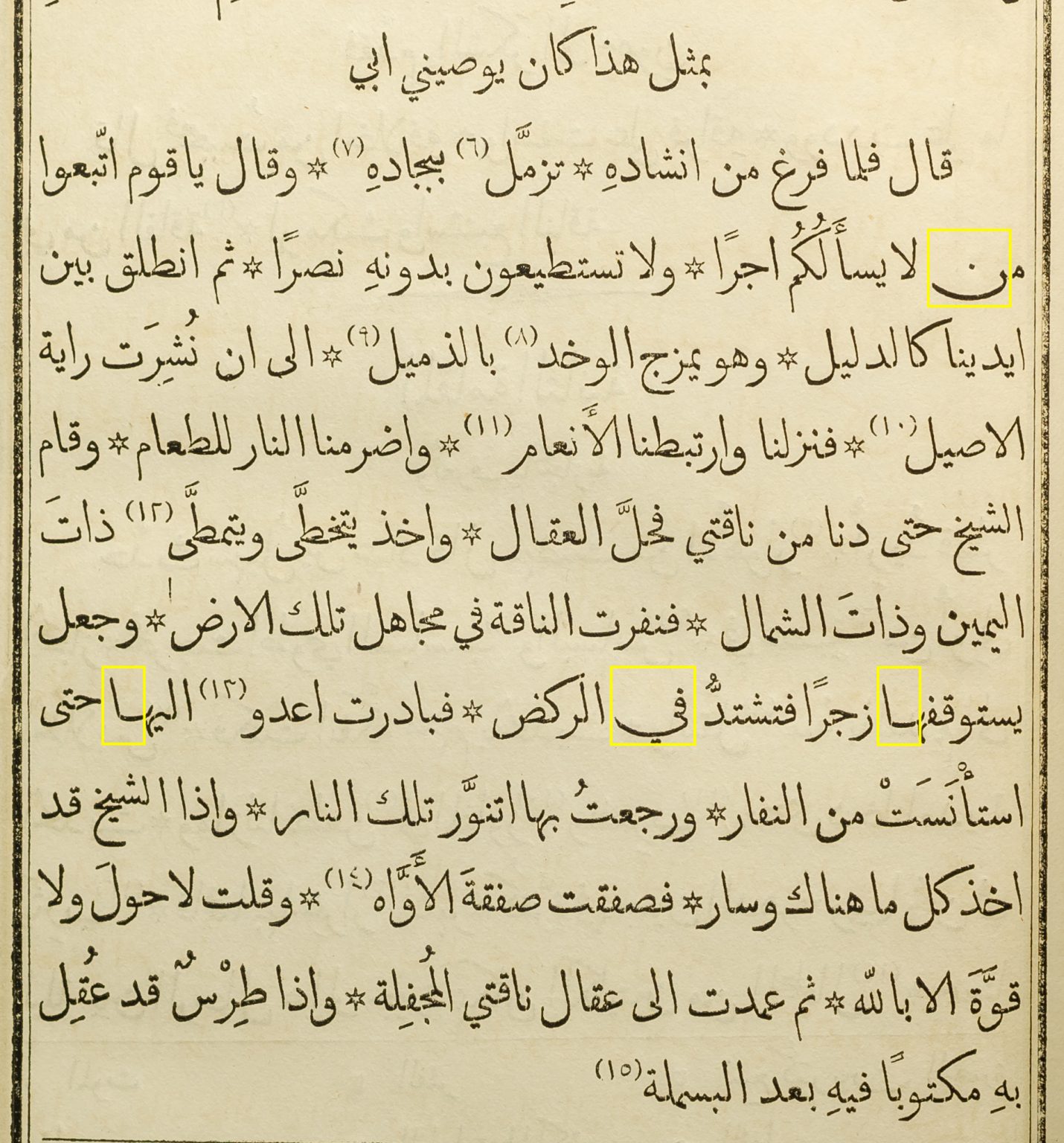 Figure 9. Kitāb Majma‘ al-Bahrayn, p.7. Yellow highlights the instances in which variant sorts were used to achieve justification.
Indeed, the justification is testimony to the typographic quality that could be achieved by a competent printer with a Arabic metal font of high quality. Depending on the context, individual methods or a combination of techniques are used to justify lines, namely the variation of white space, the use of swash variants, or the use of elongations. [Figure 9] However, rather than straight tatweel sorts, curved kashīda are combined with dedicated alternate sorts to give the impression of smooth, curvilinear connections. [Figure 10]
 Figure 10. Detail of Kitāb Majma‘ al-Bahrayn, showing dedicated kashīda sorts for correct justification, p.467
Through the combination of these means, a typical text page requires few apparent ‘interventions’ to achieve justification and an even distribution of spaces. A page that has been justified with these combined techniques appears inconspicuous, almost as if lines were of similar lengths by default, rather than active modification – a mark of successful justification.
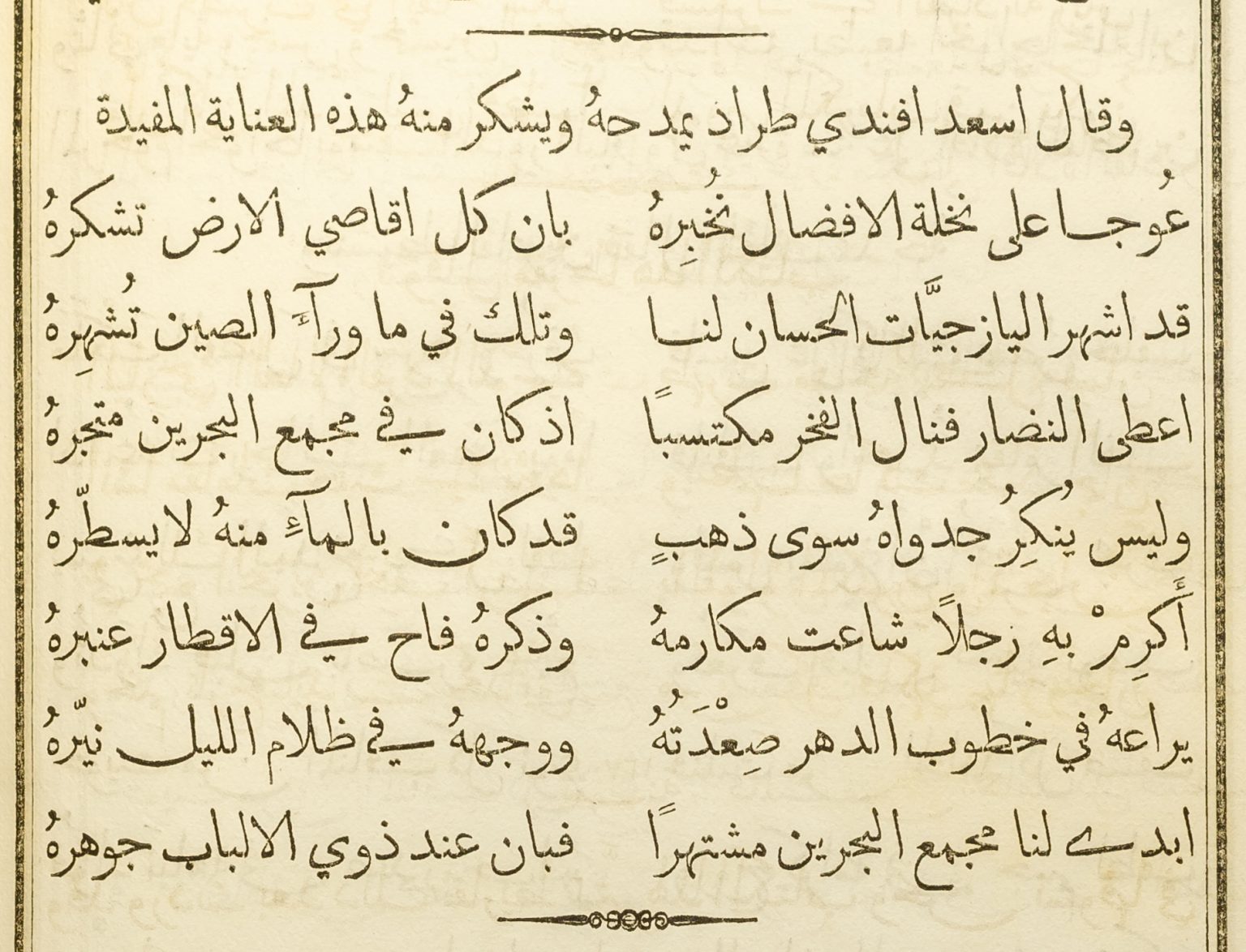 Figure 11. Kitāb Majma‘ al-Bahrayn, p.7. A two-column verse setting that illustrates how swash variants and kashīda elongation were used to achieve equal line lengths.
Looking at the verses, the interventions necessary to achieve equal line lengths become more apparent, owing to the narrow columns. [Figure 11] Here more swash sorts and more kashīda were employed, lending the verses a different appearance than the prose – an effect that corresponds to manuscript practice, and may even have been desired from a semantic design perspective. Furthermore, the variation of white spaces was handled more freely. There is a clear preference for visibly extended word spaces over the use of kashīda, and in some cases column width and alignment are allowed to vary as verses are wider or narrower.
2.2.3. Ilīadhah Hūmīrūs, 1904, Cairo
The final example takes another leap in time and space to early twentieth century Cairo, where the second generation of intellectuals that defined the Nahḍa continued the work of literary renewal and language reform. Sulaiman al-Bustāni’s (1856–1925) edition of Homer’s Iliad was celebrated upon its publication, and is still regarded as a key work of comparative literature in Arabic.[22] The monumental volume was the result of 17 years of engagement with the subject, and it includes an extensive introduction that repositioned the text for an Arabic audience, and a critical, annotated translation of the verses. Born in 1856 in Lebanon, Sulaiman al-Bustāni was a nephew of the renowned Butrus al-Bustāni (1819–83), who had been a key influence at the aforementioned American Mission Press. Later Sulaiman contributed to his uncle’s encyclopaedia Da’irat al-ma‘arif, worked on early Lebanese newspapers, and became a successful Ottoman dignitary. His edition of the Iliad was published at Jurjī Zaydān’s al-Hilāl press in Cairo, in an exemplary convergence of diverse strands of the Nahḍa.
 Figure 12. Ilīadhah Hūmīrūs, title page, courtesy of the Austrian National Library, http://data.onb.ac.at/rec/AC09967190
Just like Sulaiman al-Bustāni’s oeuvre built on the work of the preceding generation of writers, so did the printed works of his era benefit from the pioneering work of the previous decades. Whereas the typesetters who worked in Istanbul on the Tuhfe-i Vehbi had only a single typeface, in one size, the printers at al-Hilāl could choose from a range of types, in numerous sizes and styles. Moreover, they could tap into a vastly expanded repertoire of typographic forms, paper stocks, printing plant, and skilled craftspeople. Indeed, the leap that the trade had made over the preceding century is apparent when opening al-Bustāni’s Ilīadhah Hūmīrūs. It is a monumental tome of some 1260 pages, neatly printed on firm, coated paper. The title page is adorned with a large, calligraphic title piece, a typeset description of the contents, a calligraphic rendition of the author’s name, and a translation into French. In total five different fonts are used on this page alone. [Figure 12] It is followed by a frontispiece featuring a half-tone reproduction of a photograph of al-Bustāni, showing the fast adaptation of new printing technology in the region.[23]
Al-Bustāni’s Ilīadhah Hūmīrūs encompasses diverse kinds of texts, from the historical background notes, to an analytical contextualisation within Arabic literary tradition, and the actual translation of the Greek verses with accompanying critical notes. The volume’s typography reflects this, as the compositor used different configurations and fonts to visually distinguish textual qualities. [Figure 13] The body of the main texts is set from two different sizes of fonts that originated from Ohannes Mühendisyan.[24] Prelude and the historical sketch of the introduction are set as one column, whereas the translation is set in the typical double column configuration of two verse couplets per line.
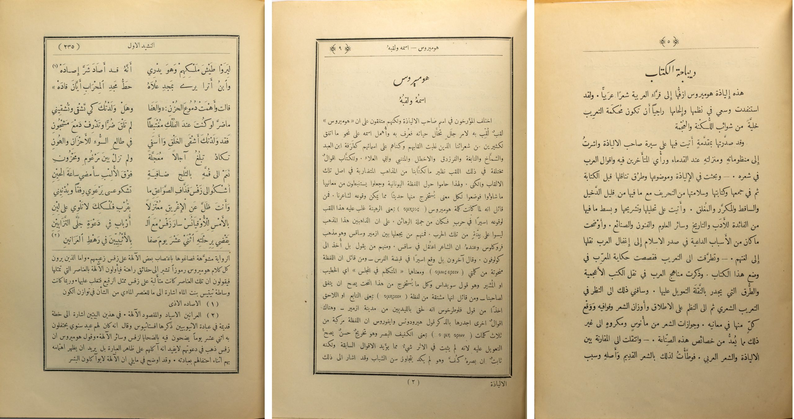 Figure 13. Ilīadhah Hūmīrūs, from right to left: page 5 from the Prelude, page 9 from the Introduction, page 235 from the main text, illustrating the use of various typographic configurations to reflect changes of textual qualities.
However, irrespective of the type used and the width of the column, overall the text is composed loosely, with a predominance of enlarged white spaces. Although some swash variants can be found, the fonts used appear severely reduced in characterset when compared to earlier publications by Mühendisyan, which feature a wider range of variants. Justification is therefore primarily achieved through the increase of white space, with unfavourable consequences for the cohesion of lines. [Figure 14]
The verse setting in two narrow columns is most demanding for justification and illustrates some of the results most starkly. Here spaces are often as wide as short words, and the typesetter did not feel the need to counter this through the insertion of tatweel sorts. There are cases where elongations are used, but they are not consistent, and numerous lines which could have been justified with swash variants were set with the default sorts. However most striking is that sometimes letterblocks are broken across the column gutter. Contrary to manuscript practice, and in what appears like a solution that was driven by technological limitation, letters which ought to be joined are separated by white spaces. [Figure 15]
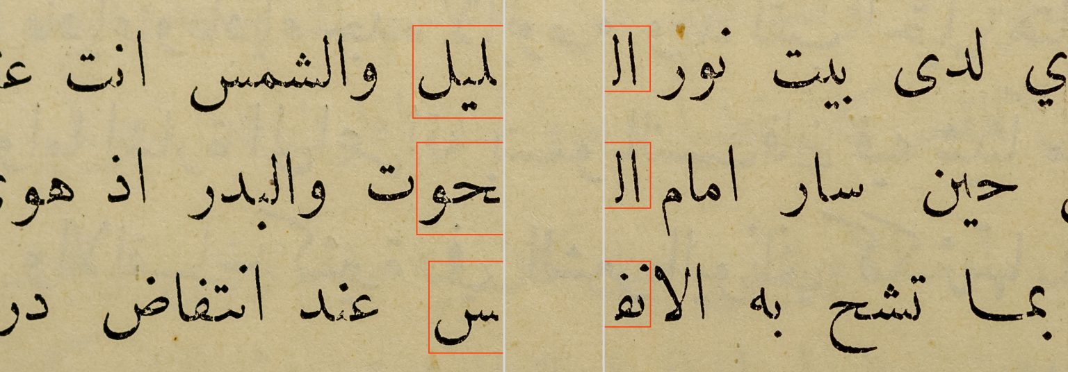 Figure 15. Ilīadhah Hūmīrūs, detail demonstrating the breaking of letterblocks across the column gutter.
Until further evidence and a meaningful rationale for this technique is found, it appears like a ‘typographism’ in which the means unduly prescribed how the text could be represented in print. Furthermore, that this case is found in the latest of the discussed publications may be indicative of wider trends. Whereas the earliest printers in the Middle East adhered more strictly to established conventions, by the twentieth century the inherent logic of the medium, including its technical and economical limitations may have eroded standards from manuscript practice, and opened the door to a dynamic that was accelerated a few years later by the onset of mechanisation.
2.3. Mechanical justification and the tatweel: made for each other
As demonstrated above, manual Arabic typesetting relied on a number of techniques to achieve justification. Use of the tatweel was one amongst others, and in many cases it appears to have been a last resort. However, notwithstanding its shortcomings, the tatweel remained in use, and proliferated. Rather than disappearing with advances in technology, increasing mechanisation contributed to its continued ascent. Machinery and industrial manufacturing processes favoured modular concepts, and systematic organisation. Point sizes and the organisation of type widths into repeatable units are but two elements of type-making that had resisted uniformity and consistency for hundreds of years but were standardised soon after mechanical processes supplanted manual techniques. The tatweel fitted very well into the systematisation of type-making and typesetting, whereas formal variety as expressed for example through swash characters, did not.
With the emergence of the typewriter in the late nineteenth century, the segmentation of the Arabic script into recurring elements reached a new low. [Figure 16] Although the repertoire of forms that could be represented with 90 keys required a drastic cull of letterforms, the tatweel was retained. Thus, it acquired unprecedented prominence, and today justification using the tatweel, although historically inaccurate, is often associated with the typewriter and its drastic simplification of the Arabic script.
 Figure 16. Left: Close-up of the type petal carrying the tatweel on an Olympia SM-8 typewriter; right: typewritten sample using the same machine, illustrating the function of the tatweel. Photographs by the author.
Throughout the twentieth century, and across the numerous technological changes that it saw, the tatweel retained its place. From the first Arabic Linotype (1911), to the first Monotype system for Arabic composition (1939), photocomposition devices, and computer-assisted typesetting, the tatweel was included in fonts, and used in typography. When Linotype & Machinery and Compugraphic co-developed the first automated Arabic justification computer in the second half of the 1960s, the role of the tatweel was firmly established.[25] Hrant Gabeyan, at the time L&M’s representative to Egypt and Sudan, became responsible for the design of the substitution tables that governed the justification ‘choices’ of the computer. It constituted the first case of algorithmic insertion of tatweel, and thus set an important precedent. We know that Gabeyan consulted a range of professionals in the field, including calligraphers, teachers, and Linotype operators, to inform his task, yet the exact process and the rationale that guided the resulting specifications are difficult to reconstruct today. Probably the prospective customer of the system, the Al-Ahram newspaper, had considerable influence on its design, tailoring it to the needs of newsprint composition. [Figure 17] The Arabic JusTape justification computer’s algorithm was built around the tatweel as the principal means for justification, and modification of white space and elongation of letter shapes were largely disregarded. Indeed, the patent that L&M filed to protect its invention lists the term ‘kashida’ 64 times across its 12 pages.[26] Although the JusTape primarily automated what newspaper compositors in the 1960s already did, it also codified practice, and thereby established a precedent for subsequent automated justification systems.[27]
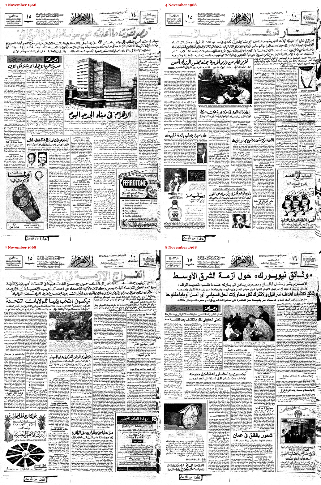 Figure 17. Front page of Al-Ahram newspaper from 1, 4, 7, and 8 November 1968, showing the transition from hand-lettering to automated type composition. On 1 November, all headlines were hand-lettered in the Ruq‘ah style; on 4 November, the main heading was written in a ‘typographised’ Naskh style, anticipating the upcoming change; three days later, the main header kept its typographic look, whilst more sub-headlines also changed from Ruq‘ah to Naskh; by 8 November, the new equipment from Linotype and Compugraphic was installed and first put to use, replacing all hand-lettered headlines with hot-metal composition type. This issue of Al-Ahram probably is the first ever publication using automatically composed Arabic type with automatic tatweel insertion. Illustration made by the author using images obtained from the Internet Archive, https://archive.org/details/AlAhram1968EgyptArabic, accessed 8 November 2019.
3. Tatweel today
Over time, and through continuous, uncritical repetition of previous practice the tatweel secured its place in contemporary typography. A place that was cemented, for the time being, through the inclusion of a discrete Unicode codepoint in version 1.1 of the Standard in 1993. ‘U+0640 Arabic Tatweel’ is defined as a modifier letter with the ‘join causing’ property. The Unicode Standard notes that this differs from the ‘dual joining’ property in that characters of this class ‘do not change shape themselves’. Thus, according to the standard that encodes nearly all contemporary text, the tatweel is defined as a solid rule, in shape and behaviour identical to the sorts that European type-founders used in the sixteenth century. Unicode therefore assigns semantic meaning – a codepoint – to what should be a graphical device, demonstrating one of the many inconsistencies of the Standard. After all, a central tenet of Unicode is the distinction between semantics and form, between characters and glyphs. Yet because many of its cues were taken from typographic legacy, technological artefacts such as the tatweel entered its conceptual framework.
The pronounced technological bias is also manifest in the inclusion of the tatweel on most contemporary Arabic keyboards.[28] One of the unintended consequences of the hard-coding of a graphical elongation device is that users employ it for purposes that it was not meant to be used for. For example, it is common that users key tatweel characters in order to trigger joining behaviour. [Figure 18] Because some fonts fail to make the expected isolated form of heh accessible, users frequently key heh followed by tatweel to give them the initial form of heh, visually similar to the required isolated shape, but then followed by the straight tatweel bar.
 Figure 18. Illustration of unintended usage of U+0640 Tatweel for joining behaviour in incorrectly programmed fonts. From right to left: (1) Arial does not provide the isolated heh form that is expected for the abbreviation of the Hijra date; (2) a frequently used workaround is to insert U+0640 Tatweel after the heh to trigger joining, resulting in a make-shift approximation of the desired shape; (3) the expected letterform as shown with the Adobe Arabic font.
Another problem of hard-coded elongation is searchability. Because a tatweel inserts a character into a string of characters, albeit only for graphical purposes, in some environments a user searching for a word cannot find it even if it is present in the text, but elongated. Thus, a search for طويلة won’t return any results if the text contains an elongation using tatweels such as here طويــلة. Examples of this problem can be found in Mozilla’s Firefox browser, or Apple’s default text editor TextEdit.
4. The current state of Arabic justification support
Having outlined the origins of the tatweel, juxtaposed it with historical models of justification from the Middle East, and sketched out the continued reliance on legacy practice in the last century, we can now turn to contemporary practice. The two central technologies of current mainstream typography, OpenType (OT) and Unicode, promised global typography at their inception. Both are now well into their twenties, having been published in 1996 and 1991 respectively, suggesting maturity in current implementations.[29]
Unfortunately, fragmented support of OpenType features by text layout engines, the continuation of competing font formats, and widely divergent agendas of key stakeholders have prevented the main typographic technologies to advance substantially beyond their Western origins.[30] Apple, for example, maintains and develops its in-house text layout engine Apple Advanced Typography (AAT) in parallel to providing support for OT, in effect dividing the resources available for typography between two formats. As a consequence, support for AAT is better than support for OpenType, despite the latter being more widely used. Adobe’s record for typographic support beyond the Western hemisphere has been haphazard too. Since the making of Middle Eastern versions of Adobe’s applications was moved to in-house development, advances were piecemeal, poorly documented, and opaque. The gradual roll-out of the so-called ‘Adobe World-Ready Paragraph Composer’ is moderated by the continued use of the older ‘Adobe Paragraph Composer’ for backwards compatibility. Its features are not comprehensive, as will be shown below. Microsoft has been one of the more active proponents of the OpenType format, developing lighthouse projects such as the fonts ‘Arabic Typesetting’ and ‘Aldhabi’. Yet typographic support in its flagship application suite Office remains inconsistent, with a user interface that leaves much to be desired and hamstrung by irreconcilable contradictions between the aspirations of the designed typefaces, and the underlying technology.
In view of the slow-moving, Silicon-Valley juggernaut with apparent biases towards the Western hemisphere, alternative approaches have been evolving in parallel since the beginnings of personal computers. The Dutch company DecoType has been in the business of developing dedicated Arabic typographic technology since the mid-1980s, and in Iran the company Sinasoft has been making capable software since 1985. From the early 1990s Klaus Lagally of the University of Stuttgart has been developing ArabTeX, a macro package based on Donald Knuth’s TeX that provides typesetting capabilities for the Arabic script. More recently related approaches, specifically concerned with Arabic text justification, are found in the work of Mohamed Jamal Eddine Benatia, Mohamed Elyaakoubi, and Azzeddine Lazrek, as well as Aqil M. Azmi and Abeer Alsaiari.[31] However, they do not seem to have evolved beyond prototypes. In the context of the TeX community, one may also mention Andreas Hallberg’s recent contribution that seeks to address the poor support of Arabic justification in typesetting software.[32] Although Hallberg’s method is limited, it demonstrates that the need for solutions is such that users have to resort to building their own tools in the face of inadequate available means.
The evangelical Christian organisation SIL International has a substantial record of making type and typographic technology for scripts and languages that are underserved by commercial offers.[33] As a result of the slow advances of OT for complex scripts, SIL has developed its own font format, Graphite, and made it freely available.[34] It provides more powerful shaping capabilities, as well as a built-in algorithm that automatically prevents collisions of glyphs, a key feature for scripts and writing styles that display a high degree of contextual variation and non-linear joining. Recently Simon Cozens also developed a new typesetting system called SILE, borrowing concepts of TeX and improving upon them. Cozens’ initial work focused on the development of features that are not found in mainstream software, providing, for example, Uyghur hyphenation capability.[35]
Having outlined the current landscape of Arabic typography software, the following discussion seeks to provide an overview over some of the most widely used applications and their justification capabilities.
4.1. Adobe Creative Cloud applications
Adobe is the undisputed market leader for professional design software. Its applications are widely used, and highly regarded. Adobe’s type library was among the first to be converted to the OpenType format, and applications such as InDesign pioneered support for the added functionality when competitors lagged behind. However, since the early 2000s, this dynamic changed, and advances slowed down.
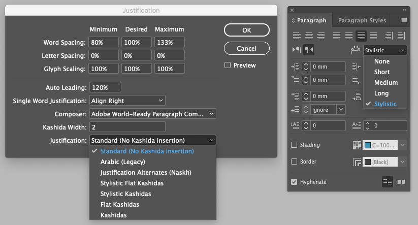
Since Adobe began to develop Arabic script functionality in-house, also documentation of the features emerged in Adobe’s official publications.[36] Unfortunately, some of the options are not explained, and aspects of the text betray a superficial grasp of the subject, as well as sloppy editing. On the subject of justification, the official help document states:
In Arabic, text is justified by adding Kashidas. Kashidas are added to arabic [sic] characters to lengthen them. Whitespace is not modified. Use automatic Kashida insertion to justify paragraphs of arabic [sic] text.
Select the paragraph and from the Paragraph panel (Window > Type & Tables > Paragraph), choose a setting from the Insert Kashida drop-down list. The options available are: None, Short, Medium, Long, or Stylistic. Kashidas are only inserted if the paragraph is justified. This setting is not applicable for paragraphs that have alignment settings.
To apply Kashidas to a group of characters, select the characters and choose Kashidas from the Character panel menu.
Whilst the description of kashīda elongation appears to describe tatweel insertion instead, and the categorical rejection of any other justification technique in Arabic is debatable, the key issue is that the listed options are neither complete, nor are their effects explained.[37] A review of the menu reveals that further to the five options mentioned above, users can also select a numerical value for ‘Kashida width’, as well as an additional four (!) options: (1) ‘Arabic (Legacy)’, (2) ‘Justification Alternates (Naskh)’, (3) ‘Stylistic Flat Kashidas’, and (4) ‘Flat Kashidas’. [Figure 19] This assumes that the options provided in the other menu map to ’Stylistic Kashidas’ and ‘Kashidas’. What is most astonishing, however, is that not one of these options is explained, nor its effects documented, nor the rationale for this plethora of options provided.
Putting the options to the test unfortunately is not any more satisfactory. Whereas the various length settings do indeed change the lengths of the automatically inserted tatweel-like strokes, the meaning of the other options remains incomprehensible for the author. Indeed, no change is observable upon selection of the respective ‘Flat’ option. Besides the pointless range of options, and lack of documentation of their effects, not to speak of rationale, the most troubling aspect that can be observed is that the justification algorithm breaks the text when glyphs join anywhere else but along the flat baseline. Thus, so-called ligatures that are formed with two distinct, dedicated type forms that are substituted in a given context (Contextual Alternates), are broken up by straight tatweel bars inserted along the notional baseline. [Figure 20]
 Figure 20. A selection of shaping errors in Adobe InDesign 15 Arabic with the Sakkal Majalla OT font when set to justification with kashīda. Flat tatweel bars are inserted between contextual alternates whose joins are not on the baseline, breaking the formation of word shapes.
‘Justification Alternates (Naskh)’ is the one redeeming aspect of InDesign’s Arabic justification system. [Figure 21] If a font provides such alternate glyphs, InDesign will use them to attempt to fill the line. Rather than activating all available glyphs, the algorithm appears to calculate the available space in a line and only selects such variants where applicable. Furthermore, it combines the use of these alternates with the variation of white space and kashīda elongation strokes, making it an appropriate justification algorithm for Arabic.
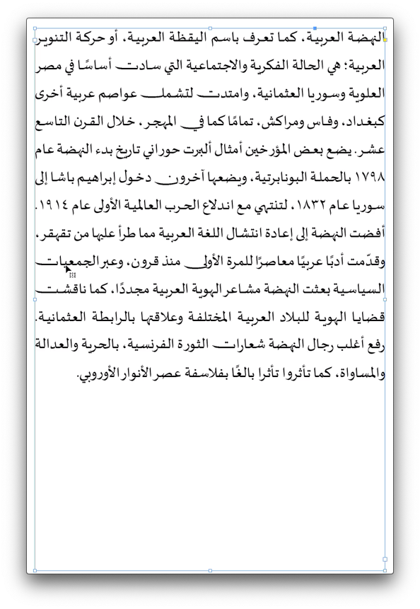 Figure 21. Screen recording of a text area of Adobe InDesign. Resizing of the area demonstrates the operation of the ‘Justification Alternates (Naskh)’ algorithm and its selective use of swash variants of letters to achieve equal line lengths.Click here to download the full video of this screen recording.
Unfortunately, also this last option is not aware of joins that are not along the baseline. Therefore, Arabic fonts that make use of the Contextual Alternates feature – incidentally registered by Adobe and on paper widely supported – cannot be set fully justified in the leading professional page layout application.[38]
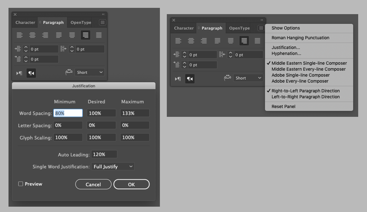
Adobe Illustrator provides only the five options that we know from InDesign’s Paragraph palette, relieving the user of some of the redundant choices.[39] [Figure 22] Unfortunately, however, it does not feature InDesign’s best method, ‘Justification Alternates (Naskh)’, and it also suffers from the erroneous insertion of extension strokes between contextual alternates.
Adobe Photoshop, meanwhile, although providing the same interface for kashīda insertion as InDesign and Illustrator, makes life even easier for the user. [Figure 23] Here no change at all can be observed when either of the five options is selected. Justification is achieved only through adjustments of word spaces, and as no tatweel strokes are inserted contextual alternates are not broken either. Photoshop does, however, provide a tick-box option for ‘Justification Alternates’. Yet, unlike in InDesign’s algorithm, here all alternates provided in a font get activated irrespective of line-length, making it yet another useless option.
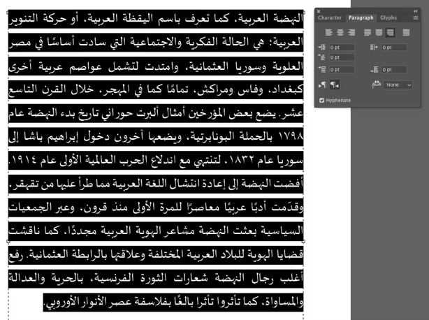 Figure 23. Screen recording of the effect of Arabic justification options in Adobe Photoshop.Click here to download the full video of this screen recording.
In conclusion we can observe that despite the plethora of options, in current Adobe CC applications Arabic fonts that make use of contextual alternates can only be used with the default justification method that modifies word spaces. Fonts that do not use contextual alternates can be justified using the other options. Whether elongation strokes are inserted in suitable positions is not documented, and I did not verify it given the glaring shortcomings already observed.
4.2. Word processors, aka office applications
Whereas Adobe’s professional design applications promise many options without delivering on them, office software has a much broader user base and therefore provides less choices. Typographic design decisions are instead made on behalf of the user, either by default settings, design templates, or simply by the absence of controls. For the purpose of this paper, I have reviewed the capabilities of three leading word processors: Microsoft Word for Mac, Apple’s Pages, and LibreOffice. All three offer a similar set of typographic options, but whereas Pages and LibreOffice provide only ‘Justified’ as an option, Word offers justification by space or by tatweel-like kashīda insertion.
Whereas Adobe’s software is only able to make use of the Arabic layout features in OpenType fonts, the three word processors support different formats.[40] Here the platform bias mentioned above comes into play. Whereas Microsoft’s applications only understand OT layout, Apple’s system apps provide support for OT and AAT, whilst LibreOffice can handle all three formats thanks to its use of the Harfbuzz shaping engine. As a consequence, the typographic capabilities of the respective word processor change significantly depending on the font format that is used. Unfortunately, this remains entirely opaque to the user. None of the applications provide any indication about the format of the various fonts listed in the font menu. A user may thus select a font whose layout technology is not supported by the application, with the result that the text shaping breaks. Apart from the visual result, this is not fed back to the user either.
Microsoft Office Word on Mac handles Arabic OT fonts in the expected, minimal way. By default, justification is achieved by variation of white space, and the rather unintuitive options ‘Justify Low’, ‘Justify Medium’, and ‘Justify High’ enable tatweel-like kashīda insertion similar to Adobe’s ‘Short’, ‘Medium’, and ‘Long’ selections. There is no option to select justification alternates. Whereas the default strategy produces acceptable results for full width columns, decreasing the measure quickly reaches the limits of this approach. [Figure 24]
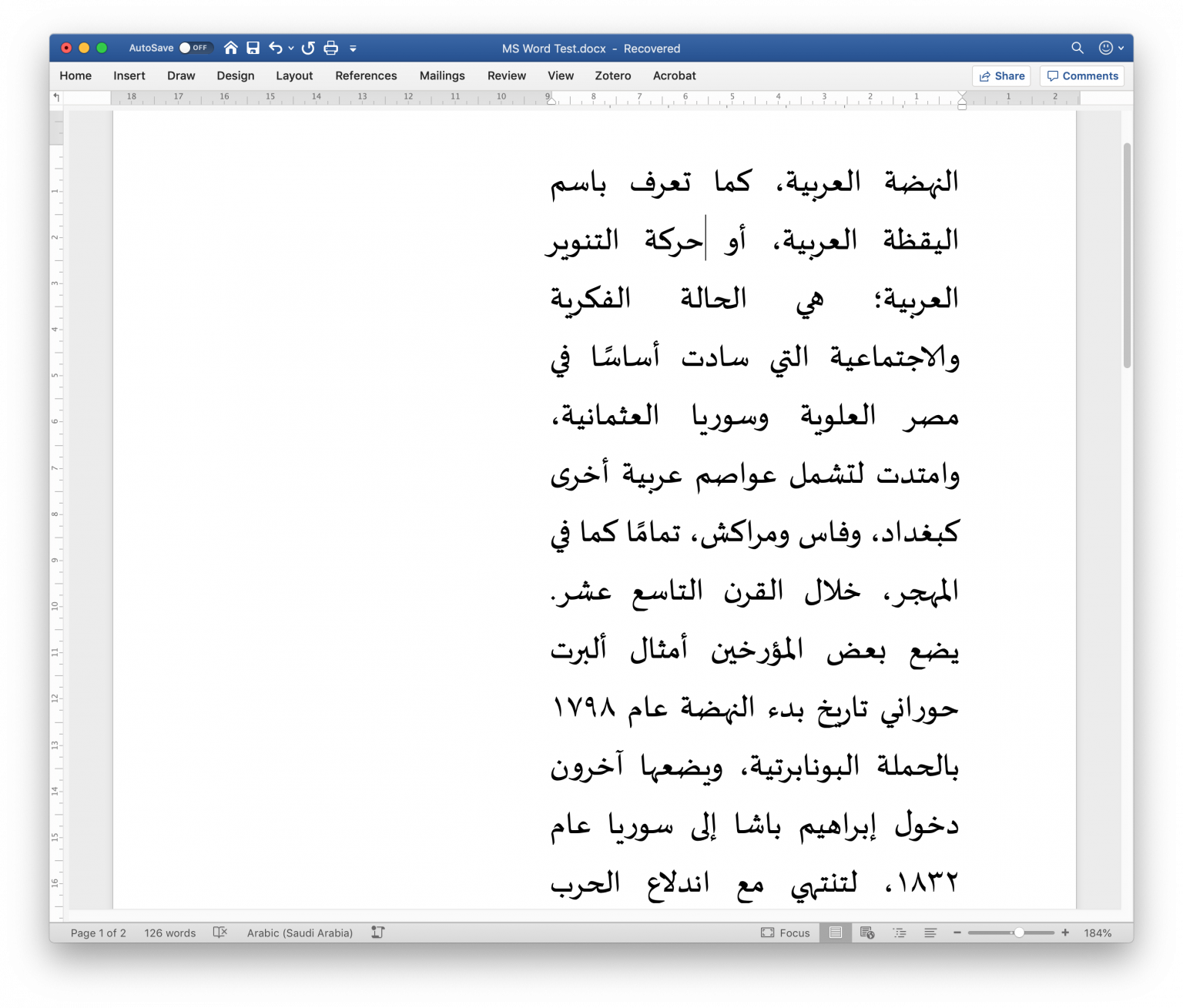 Figure 24. Justification with white space in a narrow column in Microsoft Word for Mac 16.32, using the Sakkal Majalla OT font.
For this context one of the three options that employ tatweel-like kashīda insertion may be used, resulting in more evenly distributed white spaces. However, and although the font and the application are both distributed by Microsoft, also here straight justification bars are inserted between contextual alternates, breaking joins that are not aligned on the baseline.
Since this is Word on the Mac platform, the system fonts of OSX are also available to the user. [Figure 25] However, because some of them rely on AAT for Arabic shaping, the text breaks in Word, which does not support the format. Any user who has not read this article or is otherwise not aware of these technical issues of text layout – an estimated 99,99% – is left to their own devices.
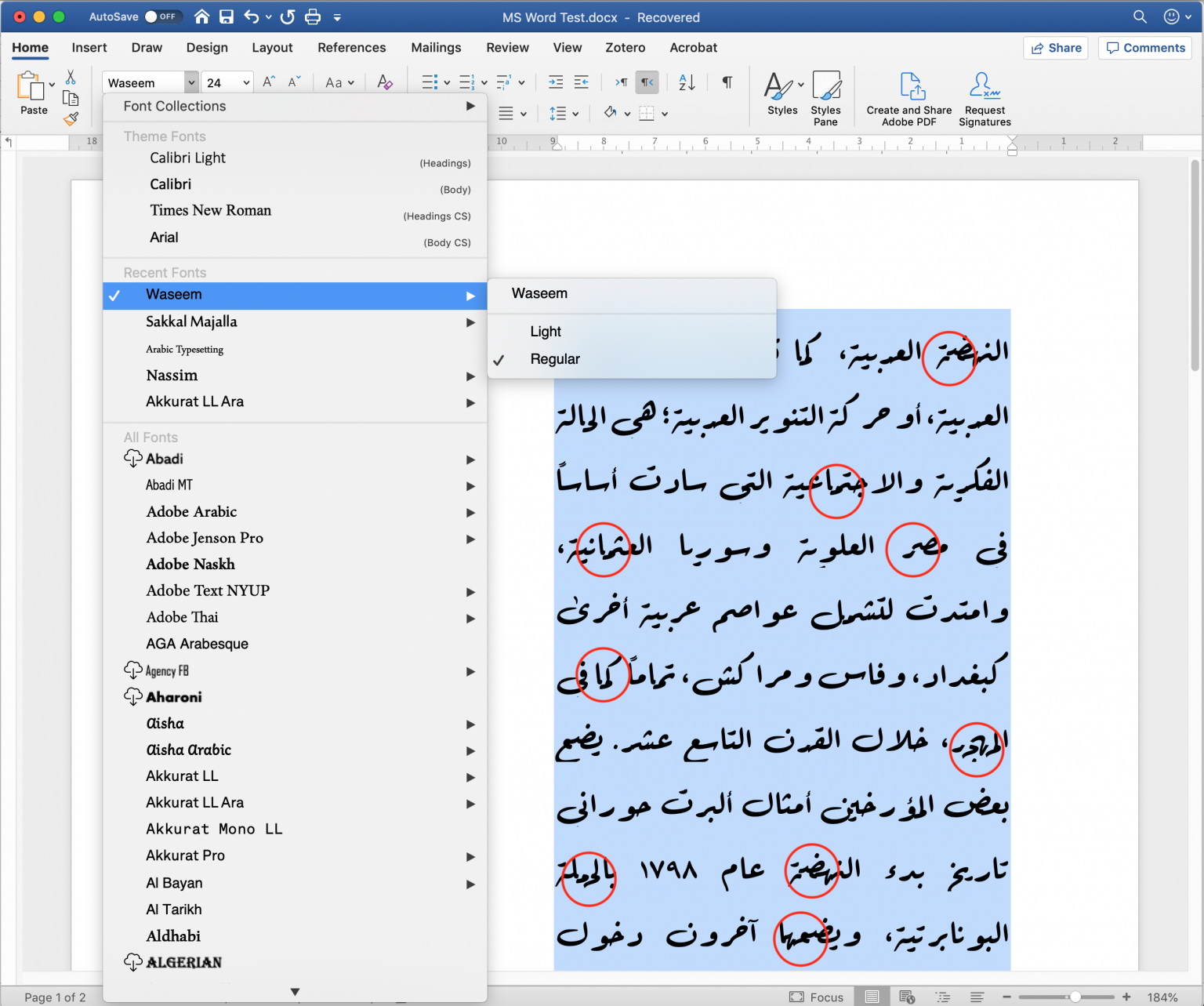 Figure 25. The font menu of Microsoft Word for Mac 16.32 displays all installed fonts irrespective of format. When the user selects a font format that cannot be displayed correctly by the application, as is the case with Waseem, an AAT font, the text shaping breaks. The user is not warned about this incompatibility, but needs to recognise the misaligned glyphs and broken letter joins by himself.
Doing the inverse-check, testing OT and AAT fonts in Apple’s Pages, the problems are mirrored. Here justification of OT fonts employs a strategy that combines the known techniques except for justification alternates. White space is modified, and kashīda are mimicked through use of the tatweel glyph. The latter results in similar problems to those observed in other applications. Non-linear connections are interrupted by the tatweel glyph. [Figure 26] In other contexts, glyphs appear pulled-apart, showing white gaps between the connections of letterforms.
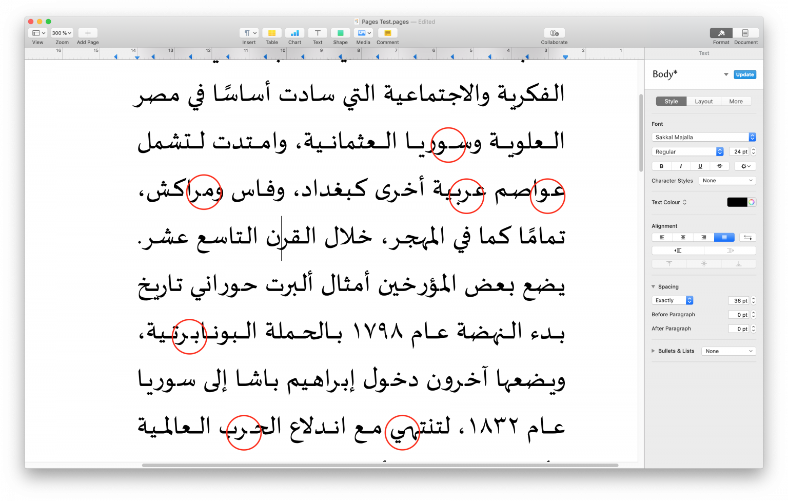 Figure 26. Shaping errors in Apple Pages using the Sakkal Majalla OT font in justified setting. Similar to the errors in Word, also here tatweel glyphs break the connections between contextual alternates; moreover, white gaps occur between glyphs that should appear to have continuous connections.
As expected, Pages performs better with Apple’s in-house font format AAT. Indeed, using fonts which take advantage of its advanced layout features, Pages comes close to achieving satisfactory Arabic text justification. [Figure 27] The tested fonts, Farisi and Waseem, do not provide kashīda elongation between letters (rightly so in the case of Waseem, which follows the Ruq‘ah style), therefore justification is achieved through a combination of glyph variants and modification of white space.[41]
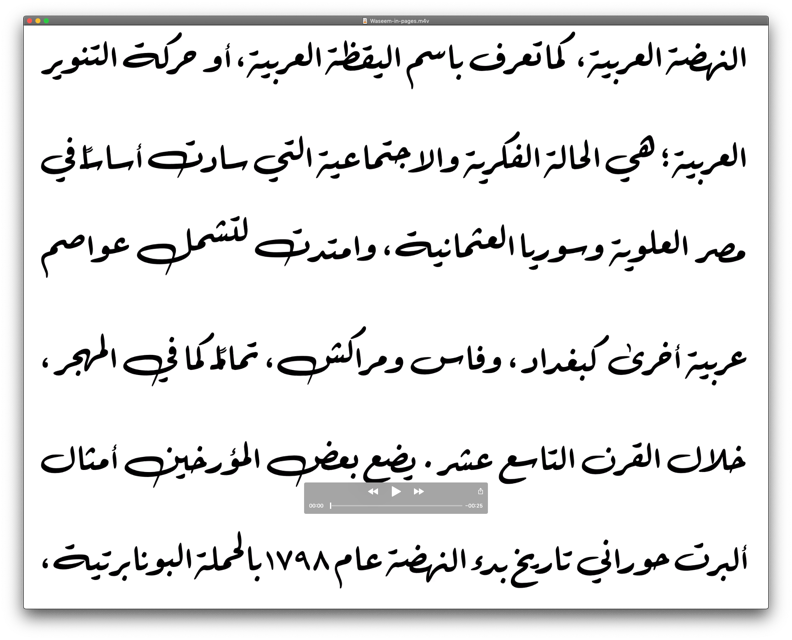 Figure 27. Screen recording of Apple TextEdit using the AAT font Waseem. A change of column width demonstrates how the built-in substitution routines of the font select glyph variants to fill a line.Click here to download the full video of this screen recording.
Unfortunately, even here are problems: the two instances of tanwīn marks break the shaping, and there are some unresolved collisions of glyphs. Conceptually, one may raise the question whether justification should be defined in the specification of the font, as is done here. It is easy to imagine use cases in which the user – say a discerning typographer – would want to have some control over the justification methods used. On the other hand, providing a better result for most non-specialist users, as is the case in system fonts, may be a valid rationale.
LibreOffice is the only word processor that nominally supports all three font formats, the display of all fonts in the menu is therefore appropriate. Its general typographic parameters are also comparable to the commercial competitors, and so is its Arabic justification strategy. LibreOffice provides no choices about justification parameters, and with OT fonts the results are comparable to those obtained either with the default setting of Pages, or Word’s ‘Justification Low’ option, all of them relying on tatweel-like kashīda insertion. When using the Graphite enabled font Scheherazade, justification results appear like those obtained with an OT font. In contrast, the Graphite font Awami Nastaliq displays no kashīda elongation, relying exclusively on variation of white space, which demonstrates the format’s potential influence on justification. Conversely, when using an AAT font, font-shaping only works in ragged-left setting, as justification breaks the text with tatweel glyphs. [Figure 28] LibreOffice therefore only supports AAT fonts partially and is currently unable to fully take advantage of their features.
4.3. Arabic justification on the web
The current support for Arabic justification with OT fonts in browsers is minimal. Across platforms and browser models, only justification through variation of white spaces is consistently available. [Figure 29] Although the OpenType feature Justification Alternates ’jalt’ can be activated in the current versions of Mozilla Firefox, Opera, Google Chrome, and Microsoft Edge Beta, its implementation is dysfunctional as all alternates are always activated, rather than selectively used to fill the remaining space of a line.
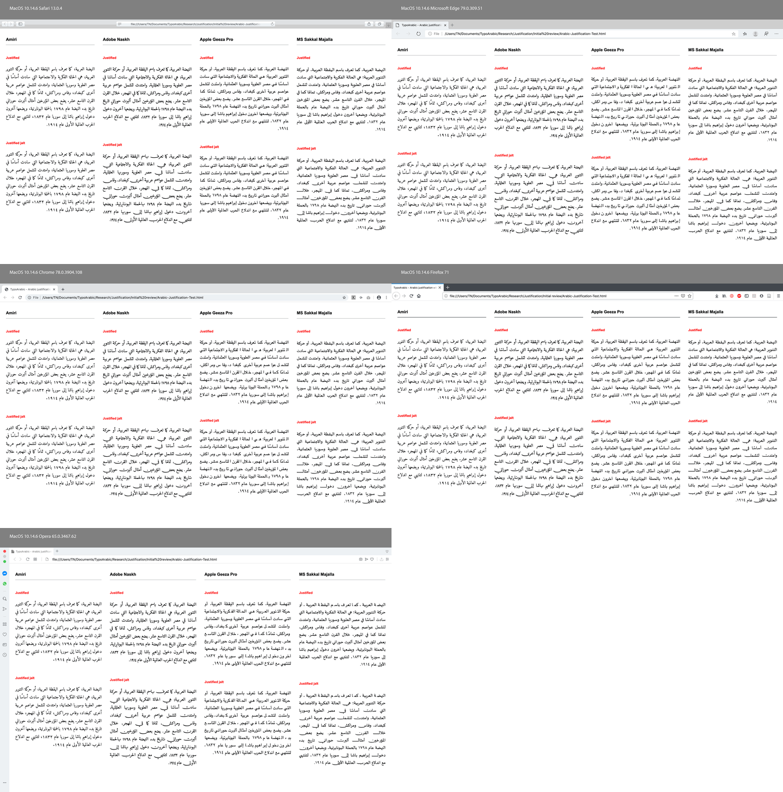 Figure 29. Overview of Arabic text justification in current browsers on the Mac OS platform using OT fonts.
Microsoft Internet Explorer had an algorithm for tatweel-like kashīda insertion from version 5.5 (2000), which was also adopted in the Edge browser until its recent change to the Chromium codebase. Documentation for Microsoft’s justification approach can still be accessed.[42] Incidentally this source also appears to have been used by the developers of OpenOffice (and subsequently LibreOffice) in their implementation.[43] As discussed above in relation to other applications, also here tatweel bars are inserted indiscriminately between any connecting glyphs, breaking the text whenever connections are not on the level of the baseline.
Although Graphite and AAT fonts could in principle also be used on the web, they are rarely specified because of lacking cross-platform and browser support. Whilst HarfBuzz is implemented in Firefox, and Apple’s Safari supports AAT fonts natively, it is interesting to observe that in both cases justification relies on variation of white space, as both browsers fail to make use of the shaping rules in the tested font. It follows that not even Apple’s native applications consistently use the potential of AAT, making its scope of use even narrower.
4.4. And now for something completely different
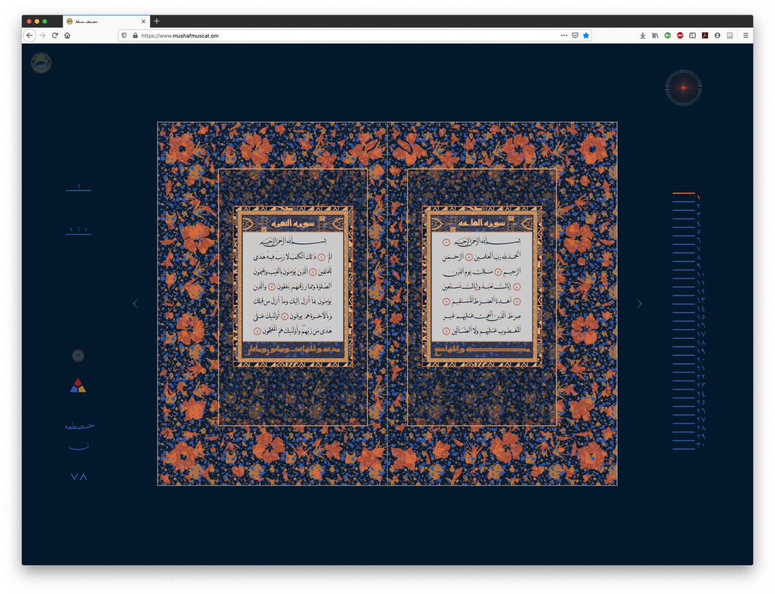
In the context of Arabic typography on the web, a recent project of DecoType merits discussion. In 2017 the Mushaf Muscat was launched, a web-based Qur’ān commissioned by The Ministry of Endowments and Religious Affairs of the Sultanate of Oman. [Figure 30] It provides a contemporary interpretation of classical Qur’ān layout for on-screen reading, with playful navigation of the content, and a range of controls for the display of the text. For example, ijām (diacritical marks) and tashkīl (vocalisation and grammatical marks) of the main Naskh text can be coloured separately; use of either kind of marks can be toggled for the sūra headings that are set in an ‘Abbassīd era writing style;[44] and mimicry (‘alāmāt al-ihmāl) of miniature consonants below the main text is provided as an option.
By default, a double page-spread and controls are shown, a click into the margin zooms in, hiding the controls, and a further click on a page zooms to an enlarged, single-page view. In this mode, the reader can select words, letter groups, or individual letters, which are highlighted when the cursor hovers over them. Text can be selected and copied and is fully Unicode compliant. A click on a letter group toggles a new shaping menu that displays all the options in which the selection can be rendered in the DecoType Naskh typeface.[45] [Figure 31] Double-click on one of the variants selects it and updates the display of the text with the chosen form. As the options include numerous swash letterforms, as well as kashīda elongation in various lengths, the layout of the page must react to the user selection. The engine therefore automatically alters shaping and justification options of the surrounding text in order to accommodate the changes in line length. The latter, of course, takes us back to the subject of this paper.
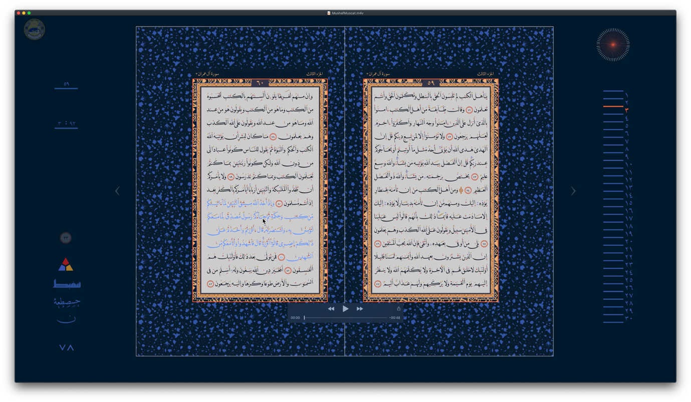 Figure 31. Screen recording of the user interface of the Mushaf Muscat, showing text layout options and the effect of individual word shaping choices on paragraph justification.Click here to download the full video of this screen recording.
The Mushaf Muscat adheres to a predetermined page layout as known from the Medina Mushaf, in which every page ends with a verse number marker. In other words, verses are not allowed to break from one double page spread to the other. Yet the verses of the Qur’ān differ significantly in length, and as the format prescribes which verses fall on which spread, greatly divergent amounts of text have to be made to cover the same area. A central element in the design of this digital Mushaf therefore was to build a page layout engine that operated within the confines of a spread. In order to achieve justified columns of differing text lengths on identical surface areas, the algorithm has to take advantage of all Arabic justification techniques. It makes full use of the font’s shaping options, including kashīda elongation, alternates, and swash variants, and combines them with variation of white space, including use of the margins as a last resort. Moreover, because the displayed text allows user interaction, the layout must be able to adjust dynamically. This last aspect is significant, for it shows that the concepts and technologies at work here could be applicable well beyond the project. So here, finally, we encounter an implementation that combines the shaping functionality of the font with layout algorithms that are appropriate for the script, to successfully use the various justification techniques available in Arabic.
Computer typography is nothing new, and some 30 years after it became the dominant form of all text composition, one should be able to expect comprehensive support for the main, if not all the writing systems of the world. The Mushaf Muscat is testimony that it is achievable to provide the means to practice digital Arabic typography without undue compromises, across platforms, across languages, across styles, and with exemplary standards compliance.[46] Finally, in light of the stagnation of support from the leading IT businesses, we note that whilst the Mushaf Muscat is the culmination of 35 years of research and pioneering practice of DecoType, the actual making of this project, including the page layout algorithms, only took this small team some two years.
5. Some patterns, conclusions and recommendations
The historical record shows us how Arabic typography was practised when it became accepted by native readers. Amongst the patterns that emerge, it is apparent that typesetters in the nineteenth century Middle East sought to reproduce manuscript forms as closely as their medium allowed. In most instances the full extent of compositional possibilities of a given font were used. Most of the time short-cuts compromising the script were avoided, and typesetters aspired to achieve the best possible justification with the means at their disposal, even if it required more time and effort. Strikingly, however, tatweel bars were used sparingly, perhaps as a last resort. Often even the modification of white space, at times resulting in large white gaps, was chosen instead of tatweel justification. In the instances in which tatweel sorts were used, they were almost exclusively inserted in permitted locations.[47]
Incidentally, as the example of the Iliad may indicate, standards, expectations, and techniques changed as typographic print spread and became established throughout the region. Norms that may have been inviolable in the 1850s were worn down by the dual tendency towards efficiency increases and modularisation, which are inherent in typography. Thus, even though the compositors at al-Hilāl had better and more diverse tools than their forebears, other factors such as economic pressures, Western influences, or loss of cultural competence may explain that the typography of the Iliad was inferior.
Moreover, the juxtaposition of the historical record with contemporary typographic tools demonstrates that the digital revolution has yet to deliver on its promise of unbound global design. Electronic devices, software, and digital publishing have moved on considerably since the 1990s. So it would be reasonable to assume that the oft-repeated liberation from material confines of the digital era, paired with the continued applicability of Moore’s law, would have enabled typography to evolve without recourse to obsolete concepts. However, this is not the case. Although we have at our disposal enough computing power to reproduce the Arabic script without inadequate simplifications, advance is hindered by the continuation of legacy practices, and concerns for backwards compatibility. The tatweel is a clear example of this dilemma as it only provides a coarse approximation of a central requirement of Arabic text layout. Whereas limitations of technology may historically have provided the rationale for such a compromise, today there is no reason to accept inadequate representations of any script in type. If we imagine for a moment that an equivalent shortcoming in the typography of the Latin script – say the distinction between capitals and minuscule letters – could not be handled by layout engines, we can be sure that the industry would rush to address this shortcoming.
Today, digital Arabic typography could shake off the shackles of redundant technology and legacy practice. The means are there, the expertise and the technology exist, all it takes is the will to find better informed approaches and implement them for the broadest possible use. The following suggestions are but a small contribution towards this goal. They are intended for developers of any kind of text processing software for the Arabic script and may also be useful to students and practitioners of Arabic typography.
- the common perception that Arabic justification is achieved primarily by means of tatweel is an ill-informed remnant of obsolete typographic technology: tatweel or flat kashīda should only be used as a last resort
- to achieve the best Arabic justification different techniques can be combined, namely (1) the variation of white space, (2) the use of swash variants, and (3) curvilinear elongation with kashīda
- Variation of white space is preferable over excessive elongation of words
- Algorithmic insertion of kashīda and/or tatweel should be based on attested elongation rules that depend on the writing style on which the font is based, requiring further research
- Search functions of applications should ignore the tatweel character U+0640 when returning results
- The Unicode consortium should deprecate the tatweel character
6. References
- Adobe Systems Inc. “Arabic and Hebrew features in InDesign.” Last modified 12 July 2019, accessed 26 November 2019. https://helpx.adobe.com/indesign/using/arabic-hebrew.html
- Azmi, Aqil M. and Abeer Alsaiari. “A calligraphic based scheme to justify Arabic text improving readability and comprehension.” Computers in Human Behaviour 39, (2014): 177–186. http://dx.doi.org/10.1016/j.chb.2014.07.003
- Benatia, Mohamed Jamal Eddine, Mohamed Elyaakoubi and Azzeddine Lazrek, “Arabic text justification.” TUGboat, 27, no. 2, Proceedings of the 2006 Annual Meeting: 137–146.
- Bringhurst, Robert. The Elements of Typographic Style, 2nd ed. Points Roberts, WA: Hartley & Marks Publishers, 1997.
- Coakley, J. F. “Homan Hallock, Punchcutter.” Printing History 45. The Journal of the American Printing History Association 23, no. 1 (2003): 18–41.
- Conidi, Emanuela. “Arabic Types in Europe and the Middle East, 1514–1924: Challenges in the Adaptation of the Arabic Script from Written to Printed Form”. PhD thesis, University of Reading, UK, 2018.
- Cozens, Simon. The SILE Typesetter, accessed 26 November 2019, https://sile-typesetter.org/
- Elyaakoubi, Mohamed and Azzeddine Lazrek. “Justify Just or Just Justify.” The Journal of Electronic Publishing 13, no. 1 (Winter 2010). http://dx.doi.org/10.3998/3336451.0013.105
- Gacek, Adam. Arabic Manuscripts: A Vademecum for Readers. Leiden ⸱ Boston: Brill, 2009.
- Glass, Dagmar. Malta, Beirut, Leipzig and Beirut Again: Eli Smith, the American Syria Mission and the Spread of Arabic Typography in 19th Century Lebanon. Beirut: Orient-Institut der Deutschen Morgenländischen Gesellschaft, 1998.
- Hallberg, Andreas. Uppercase ālif: Andreas Hallberg’s notes on Arabic linguistics, “Stretchable kashida and Arabic text justification in LaTeX.” 3 March 2017, last modified 11 December 2018, accessed 26 November 2019. http://andreasmhallberg.github.io/stretchable-kashida/.
- Hitchcock, Greg. “Thirty Years of TrueType Fonts.” LinkedIn, 19 September 2019, accessed 26 November 2019. https://www.linkedin.com/pulse/thirty-years-truetype-fonts-greg-hitchcock/
- Inan, Murat Umut. “Imperial Ambitions, Mystical Aspirations: Persian Learning in the Ottoman World.” In The Persianate World: The Frontiers of a Eurasian Lingua Franca, edited by Nile Green, 75–92. University of California Press, 2019.
- Internet Archive Wayback Machine. https://web.archive.org/web/20030628024130/http://www.microsoft.com/middleeast/Arabicdev/IE6/KBase.asp captured on 28 June 2003, accessed 12 December 2019.
- Lamberti, Sergio. Means For Controlling Typographic Composing Machines. UK Patent GB1162180, filed 24 December 1966, and issued 20 August 1969.
- Luna, Paul. Typography: A Very Short Introduction. Oxford University Press, 2018.
- Microsoft Corporation. “Registered features, f-j - Typography | Microsoft Docs,” last edited 17 August 2018, accessed 26 November 2019. https://docs.microsoft.com/en-gb/typography/opentype/spec/features_ae#tag-calt
- ———. “Registered features, f-j - Typography | Microsoft Docs.” Last edited 17 August 2018, accessed 26 November 2019. https://docs.microsoft.com/en-us/typography/opentype/spec/features_fj#jalt
- Milo, Thomas. “Lecture during the official presentation of Mushaf Muscat (www.mushafmuscat.om).” YouTube, last edited 7 June 2017, accessed 16 December 2019. https://www.youtube.com/watch?v=UpxsWGxgJIo
- ———. “Towards Arabic Historical Script Grammar Through contrastive analysis of Qurʿān manuscripts.” In Writings and Writing: Investigations in Islamic Text and Script: In Honour of Dr Januarius Justus Witkam, edited by R. M. Kerr and Thomas Milo, 249–292. Cambridge: Archetype, 2013.
- ———.Tasmeem: The Spirit of Arabic Writing. Grenoble: WinSoft, 2006.
- Nemeth, Titus. Arabic Type-Making in the Machine Age: The Influence of Technology on the Form of Arabic Type. Boston ⸱ Leiden: Brill, 2017.
- Noorani, Yaseen. “Translating World Literature into Arabic and Arabic into World Literature: Sulayman al-Bustani’s al-Ilyadha and Ruhi al-Khalidi’s Arabic Rendition of Victor Hugo.” In Marilyn Booth (ed.) Migrating Texts: Circulating Translations around the Ottoman Mediterranean. Edinburgh University Press, 2019.
- OpenOffice Git Hub repository. openoffice/porlay.cxx, last edited 6 November 2011, accessed 9 December 2019. https://github.com/mirror/openoffice/blob/ac58ea25d9ea6e57181d6047264340cdc75de79a/main/sw/source/core/text/porlay.cxx#L1145
- Safadi, Yasin H. “Printing in Arabic.” Monotype Recorder no. 2, New Series (October 1981)
- SIL International. “About SIL.” Accessed 26 November 2019, http://www.sil.org/.
- –––. “Graphite – Home.” Accessed 26 November 2019, https://scripts.sil.org/cms/scripts/page.php?site_id=projects&item_id=graphite_home
- The Unicode Consortium. The Unicode Standard. Version 12.1.0. Mountain View, CA: The Unicode Consortium, 2019. http://www.unicode.org/versions/Unicode12.1.0/
- Tracy, Walter. Letters of Credit: A View of Type Design. Jaffrey (NH): David R. Godine, Publisher, 2003.
- Twyman, Michael. Printing 1770–1970: an illustrated history of its development and uses in England. London: Eyre & Spottiswoode, 1970.
- Willberg, Hans Peter and Friedrich Forssman. Lesetypographie. Mainz: Hermann Schmidt Verlag, 1997.
Definitions of the term justified in typography are infrequent and often incomplete. For example, the Oxford Dictionary of English lacks any reference to type, making it all but meaningless: “Having been adjusted so that the print fills a space evenly or forms a straight line at the margin.” Oxford Dictionaries Online, 3 ed. s.v. “justified”, accessed 6 April 2020, https://www.lexico.com/definition/justified. Typographic literature, in turn, commonly discusses the concept in terms that are specific to European scripts where justification is achieved through modification of white spaces and the division of words (hyphenation). See for example Paul Luna, Typography: A Very Short Introduction (Oxford University Press, 2018) 37; Walter Tracy, Letters of Credit: A View of Type Design (Jaffrey, NH: David R. Godine, Publisher, 2003) 16; Hans Peter Willberg and Friedrich Forssman, Lesetypographie, (Mainz: Hermann Schmidt Verlag, 1997). A notable exception is found in Robert Bringhurst’s The Elements of Typographic Style, with a definition that is applicable beyond the sphere of European scripts: “To adjust the length of the line so that it is flush left and right on the measure.” 2nd ed. (Point Roberts, WA: Hartley & Marks Publishers, 1997) 293.

See Titus Nemeth, Arabic Type-Making in the Machine Age: The Influence of Technology on the Form of Arabic Type (Boston ⸱ Leiden: Brill, 2017).

A notable exception is the modern Uyghur orthography which adopted wordbreaks across lines in typography. Also, in early manuscripts word-division at the end of lines was common, but this practice fell into disuse. Adam Gacek, Arabic Manuscripts: A Vademecum for Readers (Leiden ⸱ Boston: Brill, 2009) 146.

Some authors refer to letterform variations that may be used in specific contexts as ‘aesthetic ligatures’, and frame them as a distinct justification technique. In this paper ‘variation of letterforms’ encompasses these cases. By contrast, the term ‘ligatures’ predicates the analysis of the script on a specific technological approximation – metal type. Ligatures are used in type wherever contextual letterform variations exceed the capacity of modular joins to form connections. The term may thus be misleading, and appears tautological in the description of a connected script. See e.g. Mohamed Elyaakoubi and Azzeddine Lazrek, “Justify Just or Just Justify,” The Journal of Electronic Publishing 13, no. 1 (Winter 2010) http://dx.doi.org/10.3998/3336451.0013.105; Mohamed Jamal Eddine Benatia, Mohamed Elyaakoubi and Azzeddine Lazrek, “Arabic text justification”, TUGboat, 27, no. 2, Proceedings of the 2006 Annual Meeting: 137–146.

Kashīda derives from the Persian کشیدن, to draw, pull; to extend, protract. Other terms include madd and taṭwīl.

See e.g. Elyaakoubi and Lazrek, “Justify Just or Just Justify;” Benatia, Elyaakoubi and Lazrek, “Arabic text justification.”

Thomas Milo, Tasmeem: The Spirit of Arabic Writing (Grenoble: WinSoft, 2006) 23. The Unicode Standard considers the two terms as synonymous. The Unicode Consortium, The Unicode Standard, Version 12.1.0 (Mountain View, CA: The Unicode Consortium, 2019), http://www.unicode.org/versions/Unicode12.1.0/

In “Arabic text justification”, Benatia, Elyaakoubi and Lazrek do not make that distinction, rendering some of their suggested rules imprecise.

Locking the forme, ensuring that all sorts and furniture stayed in place during printing, was significantly easier if text was justified, rather than ragged. Similarly, it was much faster to cut a paper frisket for a justified block, and re-use it on every page, than it was for a block with different line lengths which could only be used once. Both aspects contributed to the prevalence of justified setting in letterpress printing.

I am not aware what term was used for this sort in the first Arabic letterpress fonts. In this paper tatweel is used for consistency.

The polyglot Psalterium, Hebræicum, Græcum, Arabicum, & Chaldæum emerged from a collaboration between the orientalist and Bishop of Nebbio in Corsica, Agostino Giustiniani (1470–1536), and the printer Pietro Paolo Porro.

As any cursory review shows, neither do many contemporary practitioners.

For a thorough analysis of Granjon’s Arabic types see Emanuela Conidi “Arabic Types in Europe and the Middle East, 1514–1924: Challenges in the Adaptation of the Arabic Script from Written to Printed Form” (PhD thesis, University of Reading, UK, 2018).

See for example Yasin H. Safadi, “Printing in Arabic,” Monotype Recorder no. 2, New Series (October 1981): 4.

Murat Umut Inan, “Imperial Ambitions, Mystical Aspirations: Persian Learning in the Ottoman World,” in The Persianate World: The Frontiers of a Eurasian Lingua Franca, edited by Nile Green (University of California Press, 2019) 88.

For a discussion of Arabyan and his works see Conidi, ‘Arabic Types in Europe and the Middle East, 1514–1924,’ 573–581.

Whereas this configuration has a precedent in manuscript practice, it may also reflect the constraints of letterpress printing. If some couplets were too wide to fit next to each other within the same line, this configuration may reflect the search of a workable model from manuscript practice within the physical confines of foundry type.

We cannot know when and why the compositor decided to keep a word on the line, or push it to the next line; we do not know whether all the sorts were always available; and we have no way of knowing which of the choices were owed to preference, circumstance, or happenstance, such as the convenience of the typesetter or his urge to finish a line before having a break or going home to see his family.

Dagmar Glass, Malta, Beirut, Leipzig and Beirut Again: Eli Smith, the American Syria Mission and the Spread of Arabic Typography in 19th Century Lebanon, (Beirut: Orient-Institut der Deutschen Morgenländischen Gesellschaft, 1998) 24.

According to J. F. Coakley, the 32pt font was only used after 1856. “Homan Hallock, Punchcutter,” Printing History 45. The Journal of the American Printing History Association 23, no. 1 (2003): 18–41.

Yaseen Noorani, “Translating World Literature into Arabic and Arabic into World Literature: Sulayman al-Bustani’s al-Ilyadha and Ruhi al-Khalidi’s Arabic Rendition of Victor Hugo,” in Migrating Texts: Circulating Translations around the Ottoman Mediterranean, edited by Marilyn Booth (Edinburgh University Press, 2019) 237.

According to Michael Twyman, halftone reproductions had only become current in the UK during the 1890s, demonstrating that the Middle Eastern publishing sector had all but caught up with the most advanced industrial countries in the early twentieth century. Printing 1770–1970: an illustrated history of its development and uses in England (London: Eyre & Spottiswoode, 1970) 32.

There are also some sorts of other fonts, for example from the American Arabic typeface.

Note that L&M’s system used the term ‘Kashida’. See Nemeth, Arabic Type-Making in the Machine Age, 183–204.

Sergio Lamberti. Means For Controlling Typographic Composing Machines. UK Patent GB1162180, filed 24 December 1966, and issued 20 August 1969. This patent may have contributed to establishing the term ‘kashida’ in the trade: In Gabeyan’s documents the term ‘kashida’ was always set in quotation marks, whereas the author of the patent removed them, using kashida without explanation or qualification.

Gabeyan developed another justification system for Compugraphic’s own Arabic typesetting system in the late 1970s when the company tried to enter the Middle Eastern market. At that time, it also developed Arabic fonts which, in line with its catalogue of Latin typefaces, were clones of the commercially most successful designs by the competition. In 1988 the Compugraphic Corporation was bought by Agfa Gevaert. The new owner subsequently licensed Compugraphic’s Arabic fonts to the Microsoft Corporation, where they were used as the default Arabic script fonts of the Windows operating system for more than a decade. One may conjecture that Microsoft, at that time without any experience in developing Arabic typesetting software, may have built on Compugraphic’s justification system. Should this be the case, a direct line could be traced from the justification system that was developed for a hot-metal line-caster to those in use in today’s digital devices.

By contrast, one of the letters that are required for the correct spelling of Allah, ‘U+0670 Arabic Letter Superscript Alef’, is not accessible on common Arabic keyboards.

TrueType, one of the key components of OpenType was published thirty years ago, whereas PostScript, the other central component of the format was already on the market in 1984. Greg Hitchcock, involved in the development of TrueType recently wrote: ‘In 1996 we worked with Adobe to create OpenType, which was essentially a rebranding of TrueType, bringing the best of Adobe and Microsoft’s technologies into the TrueType format.’ Hitchcock, “Thirty Years of TrueType Fonts”, LinkedIn, 19 September 2019, accessed 26 November 2019. https://www.linkedin.com/pulse/thirty-years-truetype-fonts-greg-hitchcock/

The OpenType specification provides some techniques for typographic justification. The jalt feature was registered by Microsoft and is intended to improve ‘justification of text by replacing glyphs with alternates forms specifically designed for this purpose’, yet as of now there is not a single rendering engine that supports it. Microsoft Corporation, “Registered features, f-j - Typography | Microsoft Docs,” last edited 17 August 2018, accessed 26 November 2019. https://docs.microsoft.com/en-us/typography/opentype/spec/features_fj#jalt

The following publications have considerable overlap: Elyaakoubi and Lazrek, “Justify Just or Just Justify”, Benatia, Elyaakoubi and Lazrek, “Arabic text justification”, and Aqil M. Azmi and Abeer Alsaiari, “A calligraphic based scheme to justify Arabic text improving readability and comprehension,” Computers in Human Behaviour 39, (2014): 177–186, http://dx.doi.org/10.1016/j.chb.2014.07.003

Hallberg interprets elongation similar to the tatweel character as a straight extension line that can be inserted between any two joining glyphs. This approach ignores conventional placement, stylistic differentiation, and aesthetic concerns. Uppercase ālif: Andreas Hallberg’s notes on Arabic linguistics, “Stretchable kashida and Arabic text justification in LaTeX,” 3 March 2017, last modified 11 December 2018, accessed 26 November 2019, http://andreasmhallberg.github.io/stretchable-kashida/.

SIL International, “About SIL,” accessed 26 November 2019, http://www.sil.org/

SIL International, “Graphite - Home,” accessed 26 November 2019, https://scripts.sil.org/cms/scripts/page.php?site_id=projects&item_id=graphite_home

Simon Cozens, The SILE Typesetter, accessed 26 November 2019, https://sile-typesetter.org/

Adobe Systems Inc., “Arabic and Hebrew features in InDesign,” last modified 12 July 2019, accessed 26 November 2019, https://helpx.adobe.com/indesign/using/arabic-hebrew.html

The author has sought clarification about these options from Adobe first in February 2017, and again in September 2019, yet did not receive a meaningful answer.

Ironically the OpenType specification defines the purpose of the feature in exactly the way that the Arabic font in our test tries to use it: ‘In specified situations, replaces default glyphs with alternate forms which provide better joining behavior. Used in script typefaces which are designed to have some or all of their glyphs join.’ Microsoft Corporation, “Registered features, f-j - Typography | Microsoft Docs,” last edited 17 August 2018, accessed 26 November 2019. https://docs.microsoft.com/en-gb/typography/opentype/spec/features_ae#tag-calt

Note that Illustrator uses different names for what are presumably the same layout engines: rather than showing an ‘Adobe World-Ready Paragraph Composer’ here we encounter the ‘Middle Eastern Every-Line Composer”.

At the time of writing it appears as if Adobe may adopt Harfbuzz more widely. In its current versions Arabic AAT shaping does not yet work.

Ironically the font Farisi does not feature characters for Persian or Urdu, the languages that make most use of the Nasta‘līq style; and that despite its name, which means Persian in Arabic.

Internet Archive Wayback Machine, https://web.archive.org/web/20030628024130/http://www.microsoft.com/middleeast/Arabicdev/IE6/KBase.asp captured on 28 June 2003, accessed 12 December 2019.

OpenOffice Git Hub repository, openoffice/porlay.cxx, last edited 6 November 2011, accessed 9 December 2019, https://github.com/mirror/openoffice/blob/ac58ea25d9ea6e57181d6047264340cdc75de79a/main/sw/source/core/text/porlay.cxx#L1145

All text display options can be saved locally as a .xml file. The interface allows to upload these settings at another time, enabling the re-use and sharing of settings.

Over the years DecoType has released numerous fonts by that name. However, the font used for the Mushaf Muscat has nothing in common with the DecoType Naskh font that is bundled with various versions of the Mac OS system. It is a specialised font that is not commercially available. The closest relative is DecoType’s ‘Naskh’ typeface bundled with WinSoft’s Tasmeem software.

The text of the Mushaf Muscat is encoded in Unicode, and can be searched, copied, and pasted without loss of semantics. Representatives of both, the Unicode Consortium and the W3C commented on the exemplary use of state-of-the-art technology and web standards in this project. See Thomas Milo, “Lecture during the official presentation of Mushaf Muscat (www.mushafmuscat.om),” YouTube, last edited 7 June 2017, accessed 16 December 2019, https://www.youtube.com/watch?v=UpxsWGxgJIo

Milo has been popularising the term ‘script grammar’ to describe the rules that govern the shaping principles in Arabic manuscript practice. See “Towards Arabic Historical Script Grammar Through contrastive analysis of Qurʿān manuscripts”, in Writings and Writing: Investigations in Islamic Text and Script: In Honour of Dr Januarius Justus Witkam, eds. R. M. Kerr and Thomas Milo (Cambridge: Archetype, 2013), 252. This grammar extends to elongation, which can only be attested for certain letters in specific combinations. Random insertion of tatweel is thus grammatically incorrect.


