Balancing Surface, Volume, and Materiality: Integrating Visual and Haptic Approaches into Graphic Design Processes to Enhance Audience Understanding and Emotional Response
Skip other details (including permanent urls, DOI, citation information)
: This work is licensed under a Creative Commons Attribution-NonCommercial-NoDerivatives 4.0 International License. Please contact [email protected] to use this work in a way not covered by the license.
For more information, read Michigan Publishing's access and usage policy.
Abstract
The substrates and rendition mediums that graphic designers now use to facilitate the delivery of what we visually communicate tend to involve printing ink on some form of paper or arranging pixels within the confines of a digitally configured, two-dimensional display screen. The inherent two-dimensionality of most of the work we create confines us spatially within the x- and y-axes. This confinement can be broken, or at least expanded, when the designer activates the z-axis, as additional creative and communicative opportunities can be discovered and explored by complementing what can be perceived visually with what can be perceived haptically. In the context of this article, haptics refers to our ability to perceive and interpret meaning from objects and systems by using our sense of touch to experience texture and motion, or to apply limited force, to help us augment our understanding of an artifact or system by interacting with it kinesthetically.
Accounting for and exploring the z-axis of a given form or within a given configuration of forms allows those who perceive these to engage with what they can literally touch, feel and move in ways that allow them to explore additional variations in surface textures, densities and key components of a 3D experience to become tools. While sight is the primary formal sense graphic designers rely on to facilitate their creative processes, the ability to utilize the sense of touch allows us to tap an additional means to inform our design decision-making, and reveals opportunities to explore additional variables such as texture, hardness-versus-softness, volume, and light-versus-shadow. These can be employed to help clarify the meaning of a message, and may not even be considered, much less employed, if the designer/maker relies purely on her visual senses to guide the construction of her work. Just as how utilizing a specific typeface or color affects how a given audience connotates the meaning of a particular word, utilizing a specific texture and shape can affect how a given audience perceives the implied function of an object in a particular composition. Recognizing that physical materiality and three-dimensional volume can be harnessed to the designer’s communicative and expressive advantage not only adds to the array of choices a designer/maker may employ to communicate meaning, but also expands the scope of her creative repertoire. A graphic designer can then expand the breadth of her means for engaging in the design process, and strive to create work that achieves what Mihaly Csikszentmihalyi refers to as “optimal experience”[1] by activating tactility as an open path of exploration in the creative process. As he writes in Flow: The Psychology of Optimal Experience, “[F]low activities have as their primary function the provision of enjoyable experiences.... Because of the way they are constructed, they help participants and spectators achieve an ordered state of mind that is highly enjoyable.” Pursuing analog, tactile methods of making presents a contrast to what, for many graphic designers, is a creative process that is predominantly a visually-focused experience. In current graphic design practice, the means for manipulating the elements and systems that constitute these experiences tends to be confined to interactions with an individual graphic designer’s mouse, keyboard, and trackpad. The analog process, especially when it incorporates physical tactility, expands the horizons of the common spaces that graphic designers tend to work within, and can promote the creation of more effectively communicative and emotionally engaging design solutions.
When a graphic designer aspires to unify surface,[a] volume,[b] and materiality[c] in a given compositional structure, a need to consider the operation and functionality of production tools and sequences of use arises that is quite diverse compared to the operation and functionality of production tools and sequences required to render conventional planar, or two-dimensional, forms of graphic design. For example, when a graphic designer chooses to use wood or anodized aluminum as substrates or as compositional elements, she must account for their variable textural and structural qualities that respond differently to manipulation through sanding, laser etching, and folding/bending. Employing haptics[d] as the graphic design decision-making process evolves offers the designer an elevated level of engagement with the materiality inherent in the combination of forms she wishes to manipulate, thus positioning her as an inventor and generator of original concepts and ideas. As Diane Ackerman writes in A Natural History of the Senses, “Touch, by clarifying and adding to the shorthand of the eyes, teaches us that we live in a three-dimensional world.”[2] Recognizing our growing dependence on digital devices to facilitate our daily routines presents an opportunity to consciously redirect this attention to the realm of the actual and the physical—both in our daily existence and in the creative processes employed by graphic designers. The three-dimensional reality of the world drives a need for us to reconnect to its inherent physicality by expanding the traditional 2D tools of the designer into the 3D space.
Dual-sensory creative methods are not rare in the creative processes that guide the execution of sculpture, ceramics, or paper engineering, but have become so in the creative process that guide the execution of graphic design, especially as we have adopted various computing technologies as our primary tools. The British sculptor Henry Moore stated that, “Our knowledge of shape and form remains, in general, a mixture of visual and of tactile experiences... a child learns about roundness from handling a ball far more than from looking at it.”[3] Not only do we learn more epistemologically by engaging in a parallel tactile/visual experience, but it allows us to create more fluidly because of the benefit we derive from receiving feedback from more than one sensory system. In graphic design practice, haptics and dimensionality offer avenues for graphic designers to connect on a directly tactile, physical level with their work, allow for discovery, and help them formulate and answer questions about their working processes as these evolve.
In 12 years of teaching and researching spatial design to and on behalf of graphic designers, I have explored how physical dimensionality and materiality can frame and guide various approaches for engaging in creative experimentation within our discipline. Not only do I explore the implicit and explicit communicative properties inherent in compositions comprised of typography and imagery—I also examine the ways that material quality, physical dimension, solidity, and voids can support the delivery of the essential message of a specific designed artifact. Consciously immersing myself within a visual and haptic process as I endeavor to create my work has brought me to a place of emotional satisfaction, and has also helped me immerse myself in the creative process in ways that help ensure what I produce communicates effectively. I have achieved an ability to work “in flow,” as I rely on two senses simultaneously to develop and execute my design work.
Employing a Haptically Informed Methodology to Guide the Creation of Imagery
Graphic designers sometimes create their own imagery, most commonly when they generate and implement photography, illustrations, and symbols. A methodology for guiding these processes that incorporates physical dimensionality and materiality, while employing haptic feedback, results in the physical creation of objects and scenes that are then manipulated and photographed for use in artifacts intended to facilitate visual communication. Such processes are illuminated in Nancy Skolos and Tom Wedell’s book Type, Image, Message: A Graphic Design Layout Workshop,[4] as well as Franz Werner’s Designing with Light.[5] Each of these design educators and practitioners have defined and deployed methodologies that balance the visual and tactile in their work. Their respective œvrés capture 3D constructions in 2D photography, into which they later integrate other typographic elements and then manipulate further on screen.
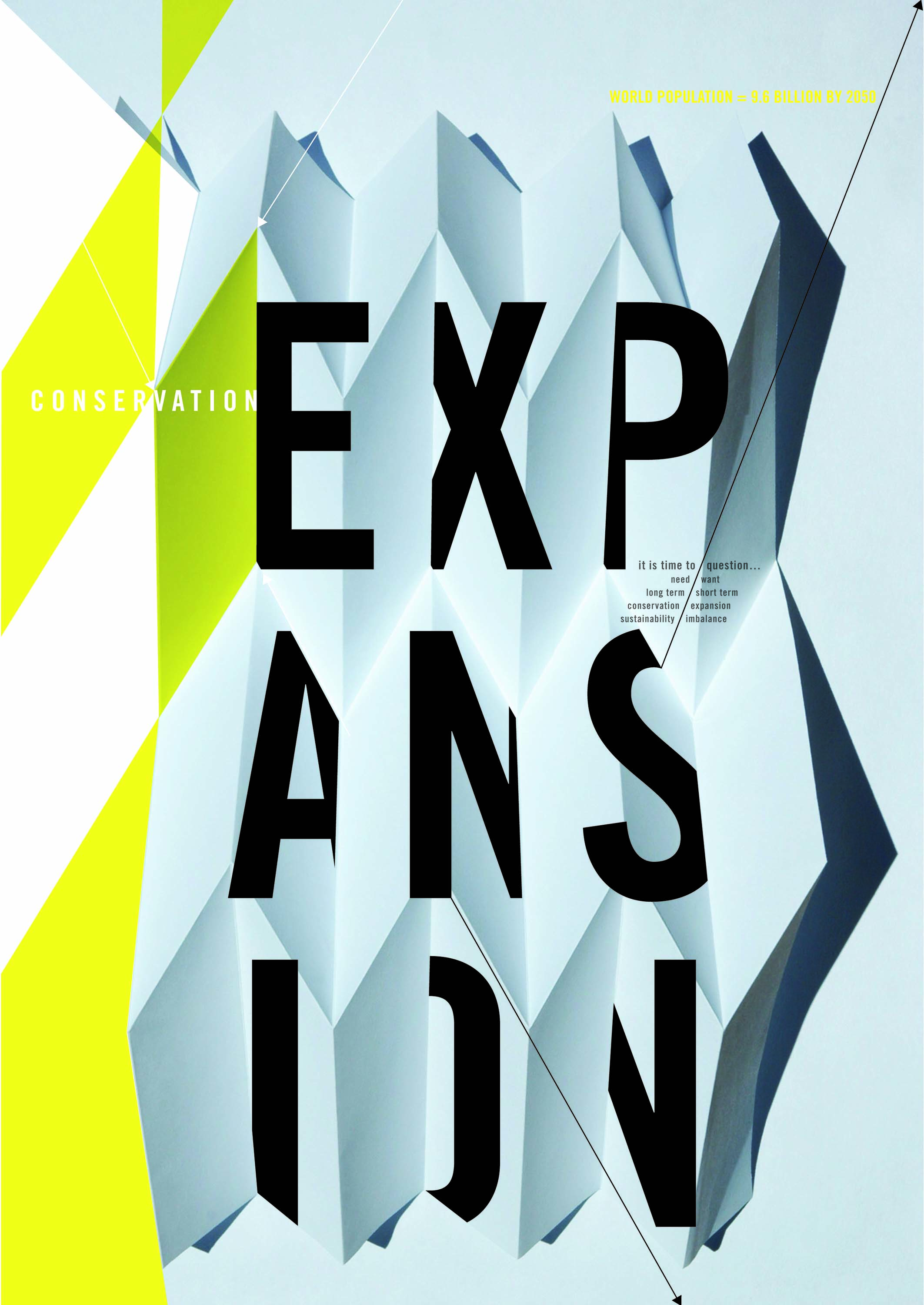
I employed this process while designing Expansion (Figure 1); my intent was to depict the dynamics inherent in the opposing forces of expansion vs. conservation, and use this as the basis for a metaphor about actively contemplating the projected world population of 2050. By engaging in a series of folded paper experiments during which I used a ruler, pencil, bone folder, and X-Acto knife to manipulate my materials, I created several volumetric forms which could be either compressed or opened. The viewfinder of the camera I used to document this made me aware of perspective, focus, depth of field, crop, light and shadow. As the project evolved, I shifted my position and the light source as I made slight adjustments that affected how the camera was capturing the effects I was creating. Transferring the photographs I shot to the computer led to the image editing phase and allowed for the digital incorporation of color and typography. The resulting 2D poster captures evidence of the dimensional and physical creative process, and demonstrates a method of unifying haptic and visual strategies and tactics in the making of imagery.
Utilizing 3D Printing as a Tool to Guide Creative Expression
Employing a haptic methodology can also inform a designer’s approach regarding how the tools of production technology can be used to operationalize expressive capabilities. Producing the common artifacts and systems of artifacts that now constitute much of graphic design relies on various production processes to facilitate the practical execution of books, environmental graphic displays, and packaging. To be effective, each of these must unify elements of two-dimensional, visual form and three-dimensional volume to satisfy a specific purpose, whether this involves presenting the cover and interior narrative structure of a book, visualizing a wayfinding system to aid a person’s navigation through a given space, or executing a package in a way that effectively informs a user about its contents and their functionalities, its brand identity, and its merchandising niche in the marketplace. Instances that challenge audiences and users to expand, question or re-define the established boundaries of these formats disrupt these peoples’ routine interactions with the artifacts and systems that constitute them. An exemplification of this concept is realized within the design for Helen Yentus’ 3D printed slipcase for the book On Such a Full Sea (Figure 2) by Chang-rae Lee, which recently garnered attention from Time Magazine,[6] dezeen.com,[7] and AIGA’s Eye on Design[8] for its experimental reconsideration of what a slipcase can and should be, and the levels and types of engagement it can create for its audience. The 3D printed aspect of this slipcase challenges how an individual user interacts with the book. It facilitates an interaction that proceeds well beyond the expected sequence of initial grasping, removing the book from a traditional, essentially flat slipcase, and reading the pages within. Rather, it presents a surprising tactile experience that violates the audience’s schema regarding what a slipcase should look like and how it should function, cleverly relates to the content that comprises the book within, and simultaneously engages the audience by allowing them to experience it visually and haptically.
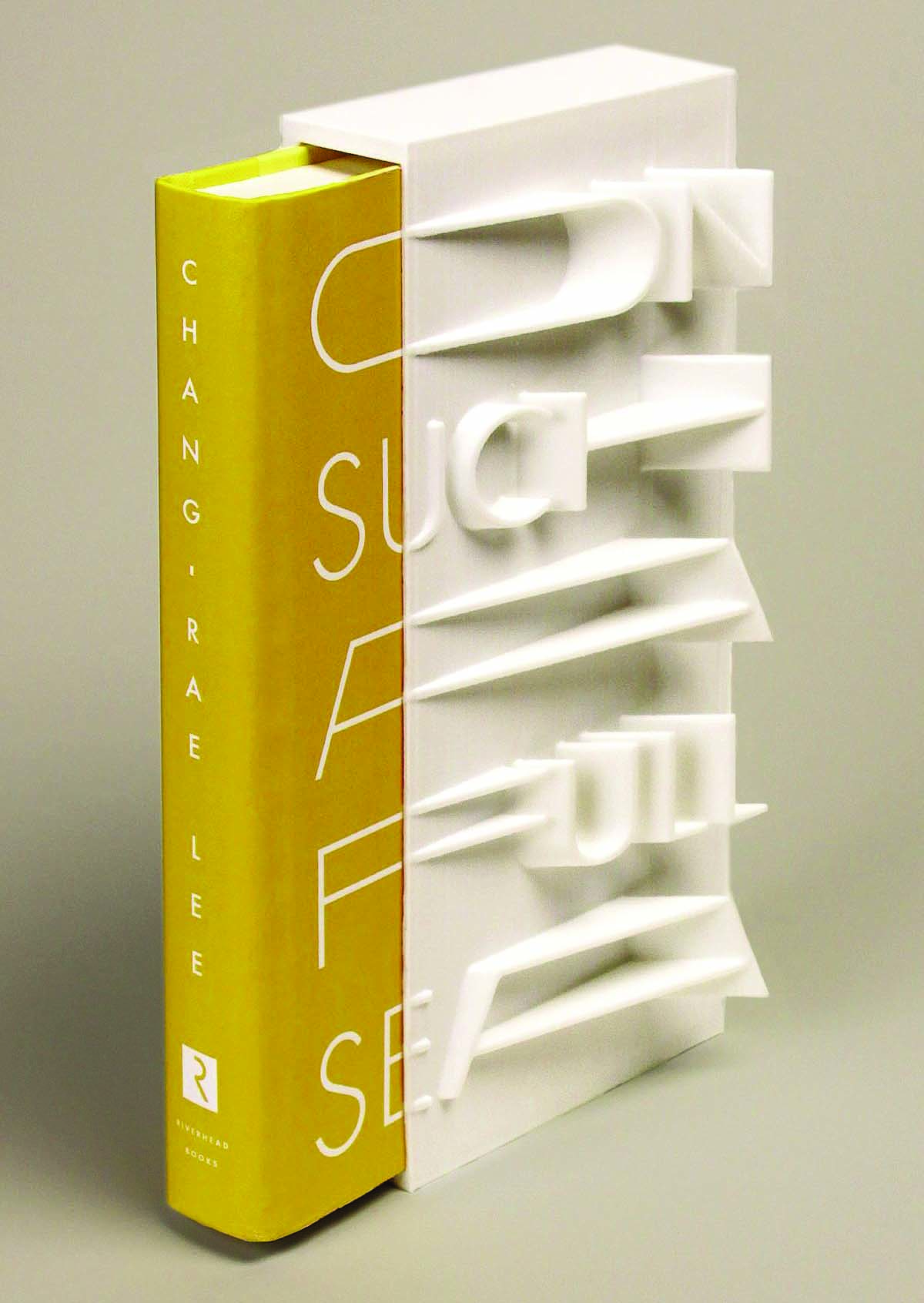
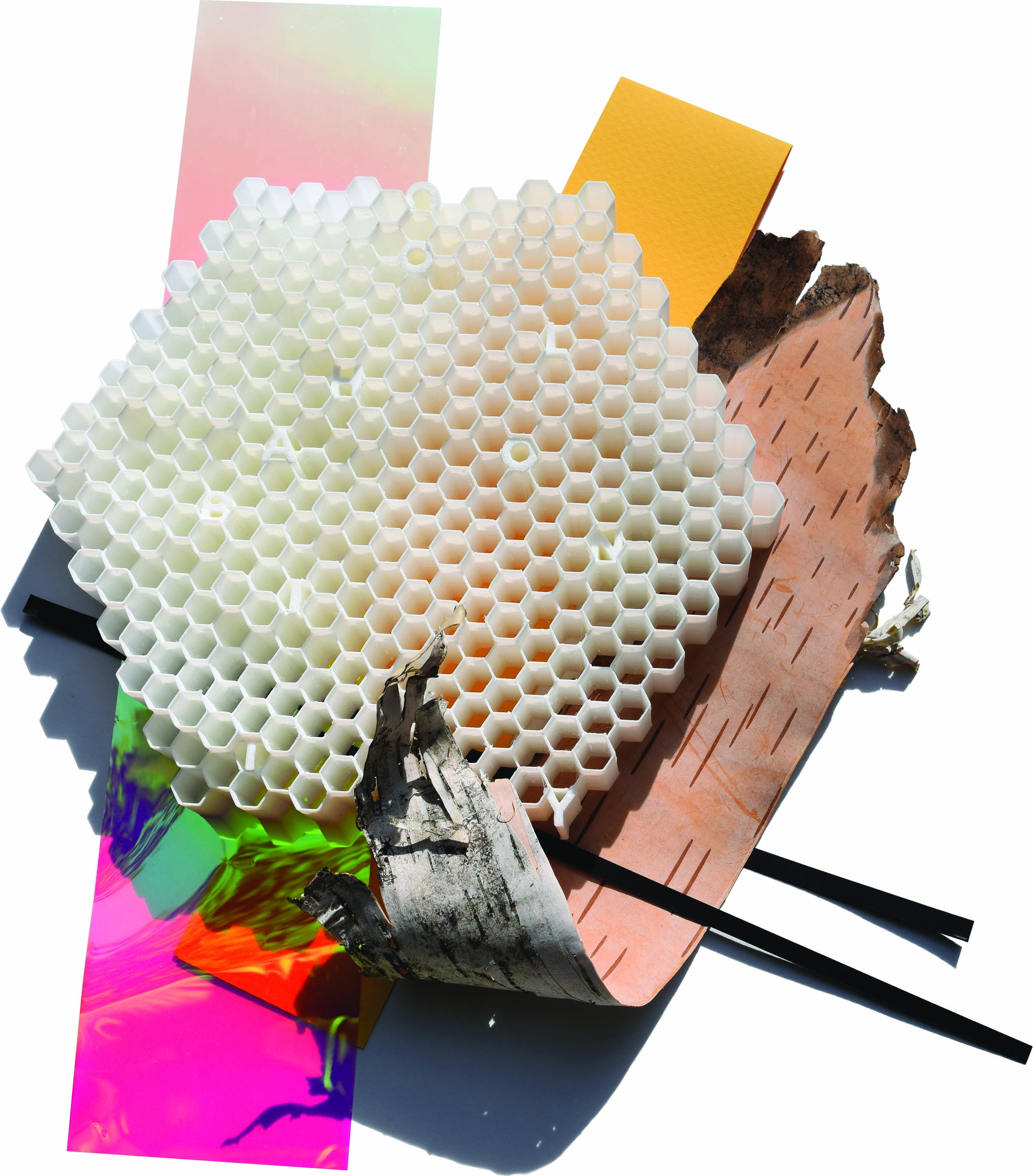
With this piece, Yentus capitalized on 3D printing as not only a means of production, but also as a set of tools that allowed her new ways to creatively express the experience of reading this novel. I explored a parallel concept that involved pushing the capabilities of 3D printing towards the realization of the precise volumetric fabrication of a piece of visual communication. To this end, I designed and fabricated Colony (Figure 3), an assemblage consisting of a 3D print, radiant light film, paper, and birch bark. The volume created by the honeycomb pattern embeds the words “colony” and “cohabit” as a commentary on the declining bee population, and pollinators’ importance within the ecosystem. While the digital creation of the 3D file, as well as the printing, were not especially haptic processes, I revisited the tactile interaction between the components that constituted this piece when I assembled it.
Examining Topographic Typography and Imagery
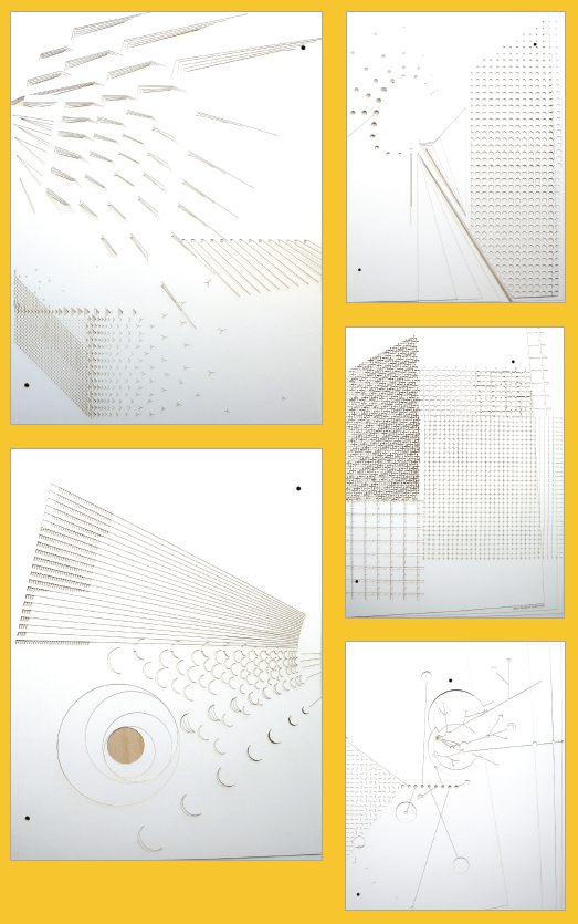
Perceiving production tools, such as 3D printing apparatuses, as having the potential to facilitate new kinds of expressive opportunities has led to my explorations of laser cutting as a primary mark-making and volume-making tool in graphic design. I reached this area of inquiry after I spent a decade exploring the design of 3D posters. This entailed working through various analog and digital methodologies, and experimenting with approaches rooted in materiality and methods that involved my use of other production tools. Propelled by research frameworks rooted in constructivist and humanist approaches, combined with a longstanding interest in industrial design and architecture, I became interested in the self-directed challenge of considering graphic design from the aerial perspective of architecture—conceptualizing the picture plane as being comprised of various levels, each of which is imbued with height. This led me to consider creating relationships between typography and imagery by exploring the contrasts between solids and voids (or between the presence and omission of specific material), as I have observed in the topographically-constructed environments that surround sited architectural models. Tectonic (Figure 4) is a five-part poster series made of 6 laser-cut layers, or panels (the top five are made of paper, and the bottom is made of plywood). Letterforms that spell out “tectonic” appear across these panels and occupy concave and convex areas, while shape and pattern represent the “transformative,” “convergent,” and “divergent” relationships that exist between tectonic plates. The planes of paper progressively shift away from the right edge towards the left, to further emphasize change and movement through the inherent depth created in the topographic form. I worked without using color within the self-imposed limitations of solid and void areas, and the shadows created by these.
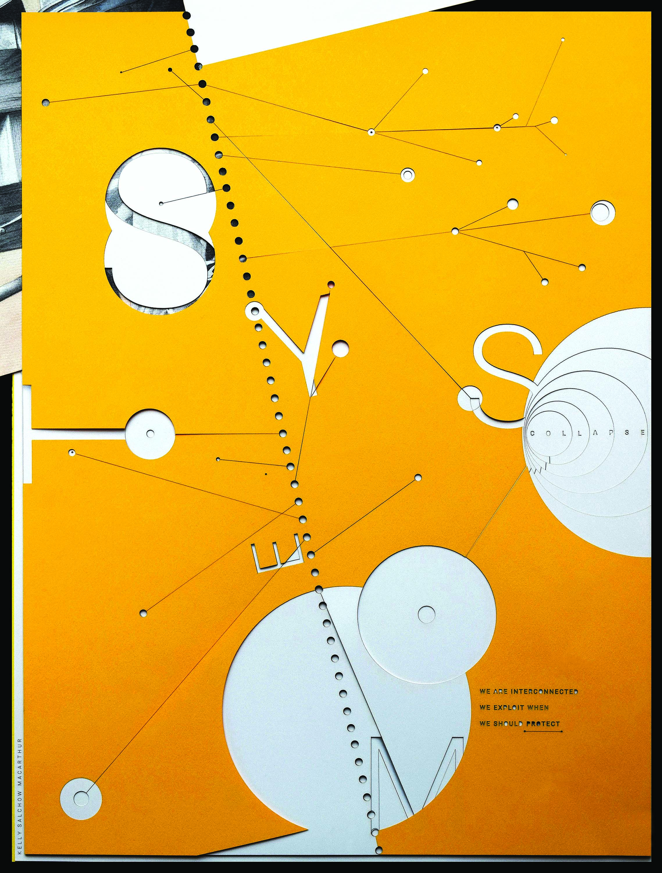
Continuing with my pursuit of the trajectories afforded me by engaging in topographic graphic design, I next explored opportunities that involved the integration of color. System (Figure 5) is the result of a series of experiments with colored paper, variable layers, and objects laid atop the poster surface and then photographed. The legibility and hierarchy of the message changed with each adjustment I made during this tactile collage process (These included offsetting particular sheets of paper, switching one for another, adding layers to emphasize shadow, and removing pieces to expose a layer underneath.) This became a hands-on exploration with the goal of establishing a clearly communicative message that entailed the manipulation of solid and void areas created by juxtaposing nine planar layers.
Exploring the Development of Forms Guided by Examinations of Their Materiality
Each experimentation with production tools and technology has the potential to offer new and engaging challenges within the increasingly diverse realms of the design process, as does working with an unfamiliar material. In Mapping the Intelligence of Artistic Work: An Explorative Guide to Making, Thinking, and Writing, writer, curator, and educator Anne West writes, “Using different tools and various strategies, artists explore and transform... materials and discover playful, bold paths into their art. The way they work with materials is central in shaping their ideas and responses. Finding the medium that challenges the vision and ultimately gives it expression is a joyful and felicitous discovery for any artist.”[10] The act of making is a form of experiential learning, as one taps into the inner dialog that transpires between hand, eye, and mind as the process of attempting to physically express ideas evolves. As much of our society—at least those among us who have regular access to the internet and electricity—becomes more focused on engaging with flatly depicted viewing experiences operationalized by the screens of our digital devices (where type and image appear behind a thin piece of glass that we swipe and tap), moments that break out of this strictly XY planar reality can be especially enriching on a humanist level.
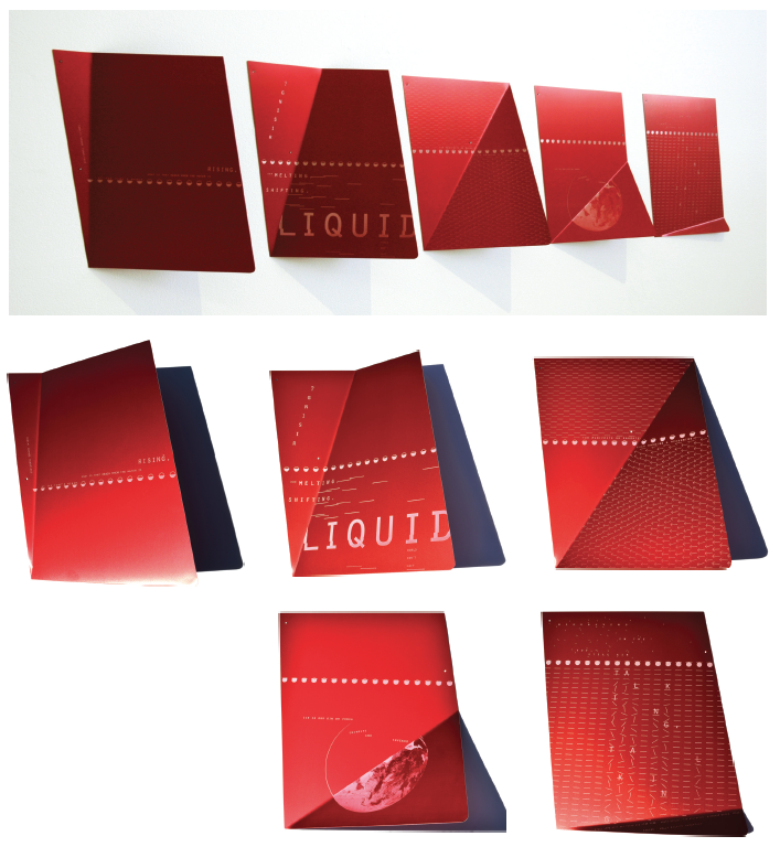
A piece I created that was particularly informed by an in-depth exploration of the materiality inherent in the components I used and was also reliant on information I gleaned by using hand processes is High Tide (Figure 6), a five-part poster series that was realized on etched, anodized, and folded panels of aluminum. Conceptualizing and designing the piece began with sketches and many series of small, paper models, and eventually evolved to the point where I was creating the digital raster files necessary to make effective use of the laser cutter. Fabricating this piece entailed engaging in a careful sequence of steps that required the use of various tools in the maker space, including the laser cutter, the stomp shear, the magnetic sheet metal break, the disc sander, and the hand punch. This creative process also involved a collaboration with British poet Maura Dooley that challenged me to visually convey the meaning of her poem, “Still Life with Sea Pinks and High Tide” by employing approaches involving concrete poetry that were originally pioneered by the so-called Futurists almost 70 years ago.[e] Conceptually, this piece gives visual and dimensional form to Dooley’s poignant poem that describes the effects of global warming. To emphasize the relationship between humankind’s infrastructure and rising sea levels, one angled fold runs through each panel, tilting progressively downward—which, in combination with strategically implemented deployments of typography, line, and symbols help to emphasize and visually communicate the content of the poem. The structural qualities of the aluminum allow parts of the panels to hover away from the surface of the wall upon which they have been mounted, and the luster of the anodized surface accentuates the play of light and shadow across this five-element series. High Tide demonstrates the capability of materiality to function as an integral part of the design process, which, as a method for enhancing the perception and interpretation of meaning, can enhance a given audience’s viewing experiences.
Exploring Folding as a Means to Generate Varied Formal Design Outcomes
Because the most prevalent substrate used to execute the outcomes of graphic design processes is paper, the tactile process of folding is a logical method to integrate into these processes, and one that provides immediate feedback and inspiration for the designer. In his book Folding Techniques for Designers, world-renowned paper artist Paul Jackson recognizes some of the advantages of engaging in tactile explorations with material, yet also acknowledges the absence of them in many graphic design processes: “Since almost all objects are made from sheet materials (such as fabric, plastic, sheet metal or cardboard), or are fabricated from components used to make sheet forms (such as bricks—a brick wall is a sheet form), folding can be considered one of the most common of all design techniques. And yet, despite being so ubiquitous, folding as a design topic is rarely studied.”[11] Graphic design education typically covers dimensional experimentation in foundations coursework (which may include folding exercises, such as in the construction of platonic solids of paper), but often does not revisit it in depth as students’ educational experiences progress. With this in mind, folding is one method my students and I explore in a Spatial Design course I teach on behalf of graphic design students enrolled at Michigan State University in East Lansing, Michigan in the U.S. As this course progresses, we discuss the advantages of being receptive to the haptic feedback one receives when working with materials in tactile ways. A 3D poster project I’ve developed for this class begins by challenging each student to engage in secondary research about a chosen architect. After collecting imagery and information pertinent to him or her, students participate in a freeform folding workshop, during which they consciously tap into the structural and formal opportunities afforded by the folded and curved paper sheet. As they do this, they reference their assigned architect’s employment of formal principles such as proportion, rhythm, balance and contrast; the central aim is not to create a miniature paper building, but to establish a faceted poster surface that connotes the formal qualities that are associated with the work of the assigned architect. Once this phase of the project has been completed, the students are challenged to apply and integrate typography, imagery, and color into their respective paper constructions.
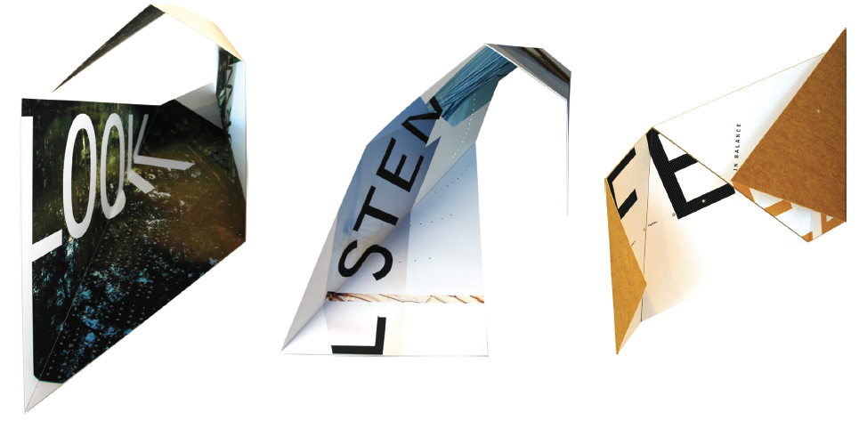
The act of folding allows a planar form to become three-dimensional and introduces the possibility of allowing shifting planes to conform to the constraints inherent in a specific space. Look (Figure 7), Listen (Figure 8), and Feel (Figure 9) are three posters within a series that incorporate and share a progressive system of folds across their surfaces. The hinging capabilities of the planar poster format allow these pieces to nestle into a corner of a room, cascade off the edge of a table, or balance on an edge or corner of the poster’s format itself. Depending on their orientation and how this affects gravity’s pull on their various components, these can appear and be haptically experienced in different states of openness or closure. Installing these kinds of pieces in a space is an especially haptic experience in itself, as delicate balance points that guide the positioning and perception of them are determined through my tactilely guided awareness of their weight and stability. Each poster is double-sided, which ensures that the viewer will see the three-dimensionality inherent in both of its surfaces. Die cuts are used in two of the posters, and are strategically placed so they appear to interact with those pieces’ typography and imagery, and to allow for a distinct play of light and shadow across these compositions. Feel is backed with felt, inviting viewers to experience the piece by actually touching it. The series is meant to express three senses through which an individual can connect with the natural environment: Look is intended to communicate “look forward, for reason, reflect/respect;” Listen is intended to communicate “listen instinctively, intelligently, in silence/in solitude.” Feel is intended to communicate “feel in balance, whole/human, at peace/at one.”
Dimensional work demands an acute awareness of the affects that materiality (for the sake of structure) have on audience perception in ways not usually considered when working to create visualizations that will appear on a digitally rendered screen or other type of flat, planar substrate. Greek architect and educator Sophia Vyzoviti addresses the liberating and physically active process of working by hand with materials in her book Folding Architecture: Spatial, Structural and Organizational Diagrams when she writes, “Considering... an open and dynamic development where the design evolves with alternate periods of disequilibrium, we can appreciate the function of folding as a design generator by phase transitions, that is, critical thresholds where qualitative transformations occur.”[12] Phase transitions are the decisions and changes throughout the design process that advance a piece towards resolution. Graphic designers work through moments and periods of uncertainty, and pivot to consider multiple options. Sensitivity of both vision and touch when folding enables a reciprocal relationship between designer and material, and synchronizes the hand, eye, and mind to guide confident choices towards the realization of well-conceived visual artifacts and systems.
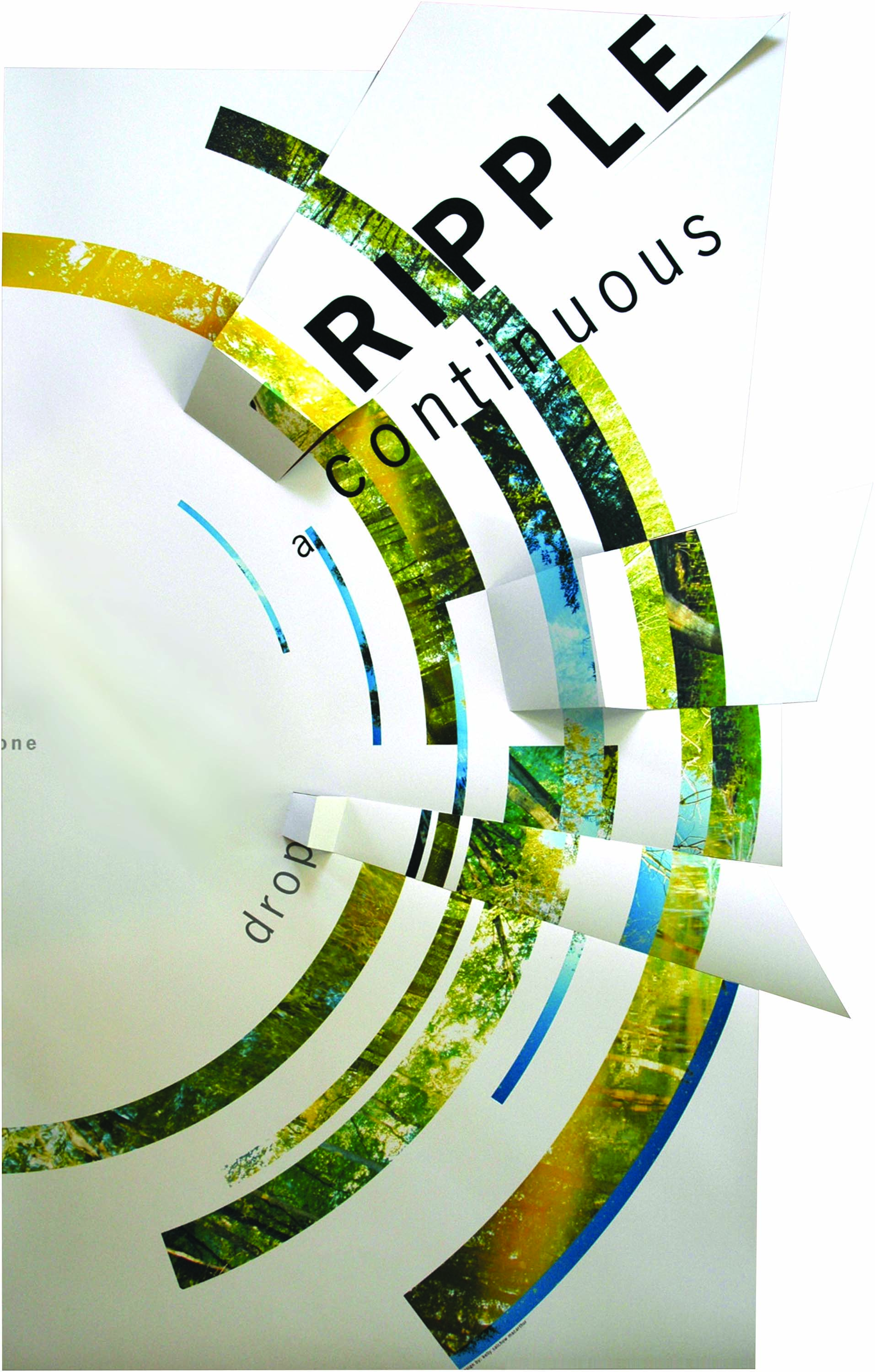
A piece that allows volume through folding to occur once it has been hung is One Drop (Figure 10), a primarily flat poster that has been strategically cut and folded (both as a means to relate to the information it visually communicates and as a means to conform to a concentric, circular grid). It is specifically designed to be mounted in the corner of a space, with its left edge running along a wall. This relationship in the corner positions the “o” of “one” to be simultaneously bisected by the poster edge and wall edge, and instantiates the ripple effect that is apparent across the array of visual elements and folded surfaces that both constitute and violate the so-called picture plane that forms the formal base of this piece. Type, image, and volume each contribute to the integrated representation of the repercussions one choice can have on the natural environment.
Catalyzing the Visual/Haptic Process
By undertaking this sequence of experimental projects, I have discovered a series of working methods that involve visual/tactile interaction that can broadly inform a graphic designer’s formal decision-making processes and help her develop effectively communicative and aesthetically compelling project outcomes. In an effort to catalyze the visual/haptic design process for creative peers, I designed and distributed a poster that visually communicated some of my early investigations and discoveries.
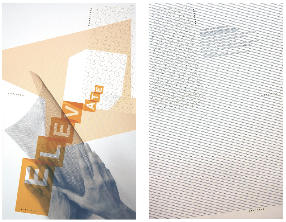
Created in 2010, Elevate (Figure 11) is a two-sided printed and laser-cut poster that asked a group of invited participants from the worlds of visual communication design, architecture, the studio arts and paper engineering to “Alter the plane, investigate the latent spatial possibilities that this sheet of paper embodies, discover ways to introduce dimension, and disrupt the surface: fold, bend, tear, cut, deconstruct, reconstruct, etc.” Laser cut into the surface in sans-serif type are the words “longitude,” “latitude,” and “altitude.” These are references to the x-, y-, and z-axes which the experience of engaging with this interactive poster aspires to activate among its diverse audiences. The line interval printed on the back of the poster helps emphasize the formal variation in its physical volume, as a surface overlaid with a pattern depicts the illusion of volume more clearly than one that is rendered with a consistent swath of color. Seventy-nine participants from four continents responded to my targeted online call for participation in this collective, collaborative project over the course of three months. Each project participant was asked to alter the flat poster provided, and challenged to do so by tapping into their visual and haptic senses to manipulate the tactile dimensionality inherent in this piece. The results were documented in photographs, and each participant wrote about their experience of physically handling and changing the poster’s physicality and visual composition. The participant’s written statements address a range of reflective feedback regarding their engagement in this process—they included but were not limited to their recognition of the joy of working by hand, “staying in flow,” responding to and embracing the physical qualities of the laser cut paper, being guided by typography, imagery, light and shadow, and the uncertainty and unfamiliarity of being challenged to respond to this prompt. The results are exhibited online at elevatedesign.org.
Conclusion: Critically Interrogating The Creative and the Receptive
The body of work I have shared here was initiated when I decided to attempt to satisfy my curiosity about how physical dimensionality and materiality, and my desire to integrate graphic design and volume in hopes of discovering untapped opportunities. Fabrication technology (such as 3D printing and laser cutting), and hand processes (such as folding) can be deployed as tools that help facilitate the transference of meaning in communication design systems as ways that parallel how well-considered combinations of type and image also facilitate this. Armed with the ability to deploy these additional tools, a designer can imagine and execute a design for a poster surface that includes self-authored volumetric imagery, explores production tools as expressive opportunities, embeds topography, evokes meaning through materiality and dimensionality, or folds to become integrated within a space.
This expanded scope of exploration in graphic design has led to design processes that are guided simultaneously through ways of working that allow audiences and users to activate what they can feel and see. As Stephen Nachmanovitch writes in Free Play, “The Creative and the Receptive, making and sensing, are a resonating pair, matching and answering each other.”[13] Sensory interdependence is bolstered when working visually/tactilely, as the creator receives feedback and immediately responds with design decisions based on this parallel feedback to continue moving forward with new iterations as this type of design process evolves. I have recognized this reciprocity in the act of designing as I deploy analog methods, and I attribute it to finding satisfaction in the creative process and working in flow. The resultant work I produce then yields visual/tactile experiences on behalf of the audiences I’m designing to communicate with, which enables them to interpret these pieces in ways that enrich and broaden their understandings of them.
References
- Ackerman, D. A Natural History of the Senses. New York, NY, USA: Vintage Books, 1990.
- Csikszentmihalyi, M. Flow: The Psychology of Optimal Experience. New York, NY, USA: HarperCollins Publishers, 2009.
- Howarth, D. “First 3D-printed book cover created with MakerBot,” dezeen, January 15, 2014. Online. Available at: https://www.dezeen.com/2014/01/15/first-3d-printed-book-cover-created-with-a-makerbot/ (Accessed July 2, 2018).
- Jackson, P. Folding Techniques for Designers. London, UK: Lawrence King Publishing, 2011.
- Moore, H. & Wilkinson, A. Henry Moore—Writings and Conversations (Edited by Alan Wilkinson). Berkeley, ca, usa: University of California Press, 2002; p. 210.
- Nachmanovitch, S. Free Play: Improvisation in Life and Art. New York, NY, USA: G.P. Putnam’s Sons, 1990.
- Petit, Z. “When the Struggle is Part of the Process,” AIGA Eye on Design, June 7, 2018. Online. Available at: https://eyeondesign.aiga.org/when-the-struggle-is-part-of-the-process/ (Accessed June 9, 2018).
- Rothman, L. “Check It Out: The First-Ever 3D-Printed Book Cover,” Time Magazine, June 6, 2014. Online. Available at http://entertainment.time.com/2014/01/06/check-it-out-the-first-ever-3d-printed-book-cover/ (Accessed July 2, 2018).
- Skolos, N. & Wedell, T. Type, Image, Message: A Graphic Design Layout Workshop. Gloucester, MA, USA: Rockport Publishers, 2006.
- Vyzoviti, S. Folding Architecture: Spatial, Structural and Organizational Diagrams. Corte Madera, CA, USA: Gingko Press, 2003.
- Werner, F. Designing With Light. Self-published. Portions of this text are viewable online at: https://imvdesign.com/publications-1 (Accessed May 25, 2019).
- West, A. Mapping the Intelligence of Artistic Work: An Explorative Guide to Making, Thinking, and Writing. Portland, ME, USA: Moth Press, 2011.
Biography
Kelly Salchow MacArthur is an Associate Professor of Graphic Design at Michigan State University in East Lansing, Michigan, USA. Her visually articulated concepts and design work have appeared in national and international publications and exhibitions, including Graphis, Print, Creative Quarterly, GD USA, the International Institute for Information Design (IIID), the Type Directors Club, the American Alliance of Museums, and United Designs. She is the Vice President of Design Research for United Designs Alliance, as well as member of University and College Designers Association’s (UCDA’s) Design Educator's Advisory Committee, and the College Art Association’s (CAA's) Committee on Intellectual Property. She also served as the President of AIGA (American Institute of Graphic Arts) Detroit from 2009–2011. Professor Salchow Macarthur has presented at AIGA, ead, UCDA, CAA, IIID, and Design Principles & Practices (DP&P) conferences, and has guest-lectured at several universities. She received her MFA from the Rhode Island School of Design, in Providence, RI, USA and a BS in Graphic Design from the University of Cincinnati, Cincinnati, oh, usa. More of her work can be found at elevatedesign.org.
Notes
- a
The two-dimensional plane, or flat area (also known as the Cartesian Plane) that exists within the X (width) and y (height) axes. Whether on a digital screen or a flat printed poster, graphic design employs elements of visual form (point, line, shape, space, and color) to manipulate and control the planar surface.

- b
The three-dimensional area articulated by the traditional, Cartesian x-, y-, and z- (depth) axes; working within this cubically defined, three-axis spatial system affords designers the opportunity to merge visual and physical form.

- c
The tangible embodiment of physical properties, such as texture, translucency, rigidity, luster, and other inherently formal qualities as they are formally perceived and experienced singly or in combination with one another in artificial (i.e. planned and constructed) or natural forms.

- d
The branch of psychology that explores data perceived through the sense of touch.

- e
Early instances of what Max Bill and Öyving Fahlström deemed “concrete poetry” in 1950 were being published by the likes of Guillaume Apollinaire in France beginning in about 1913, and, just a few years later, by Filippo Marinetti and other members of the self-proclaimed “Futurists” in Italy and “Dadaists,” or “Dada artists,” such as Hugo Ball, Max Ernst and Tristan Tzara there and in France and Germany. Concrete poetry shares some ideological space with visual poetry: they both endeavor to fuse typography, photography, and illustrative forms to visually communicate the meaning inherent in a given poem or piece of prose.

Csikszentmihalyi, M. Flow: The Psychology of Optimal Experience. New York, NY, USA: HarperCollins Publishers, 2009. pg. 71.

Ackerman, D. A Natural History of the Senses. New York, NY, USA: Vintage Books, 1990. pg. 94.

Moore, H. & Wilkinson, A. Henry Moore—Writings and Conversations (Edited by Alan Wilkinson). Berkeley, CA, USA: University of California Press, 2002; p.210.

Skolos, N. & Wedell, T. Type, Image, Message: A Graphic Design Layout Workshop. Gloucester, MA, USA: Rockport Publishers, 2006.

Werner, F. Designing With Light. Self-published. Portions of this text are viewable online at: https://imvdesign.com/publications-1 (Accessed May 25, 2019).

Rothman, L. “Check It Out: The First-Ever 3D-Printed Book Cover,” Time Magazine, June 6, 2014. Online. Available at http://entertainment.time.com/2014/01/06/check-it-out-the-first-ever-3d-printed-book-cover/ (Accessed July 2, 2018).

Howarth, D. “First 3D-printed book cover created with MakerBot,” dezeen, January 15, 2014. Online. Available at: https://www.dezeen.com/2014/01/15/first-3d-printed-book-cover-created-with-a-makerbot/ (Accessed July 2, 2018).

Petit, Z. “When the Struggle is Part of the Process,” AIGA Eye on Design, 7 June 2018. Online. Available at: https://eyeondesign.aiga.org/when-the-struggle-is-part-of-the-process/ (Accessed June 9, 2018).

Yentus, H. Makerbot Stories|A Slipcase for Chang-rae Lee. Online. Available at: https://bit.ly/2N7reDp (Accessed May 29, 2019).

West, A. Mapping the Intelligence of Artistic Work: An Explorative Guide to Making, Thinking, and Writing. Portland, MN, USA: Moth Press, 2011. pg. 108.

Jackson, P. Folding Techniques for Designers. London, UK: Lawrence King Publishing, 2011. pg. 9.

Vyzoviti, S. Folding Architecture: Spatial, Structural and Organizational Diagrams. Corte Madera, CA, USA: Gingko Press, 2003. pg. 8.

Nachmanovitch, S. Free Play: Improvisation in Life and Art. New York, NY, USA: G.P. Putnam’s Sons, 1990. p. 34.


