Energetic Alpha: Co-Designing a Tool that Encourages Three- to Six-Year-Olds to Develop Handwriting Skills
Skip other details (including permanent urls, DOI, citation information)
: This work is licensed under a Creative Commons Attribution-NonCommercial-NoDerivatives 4.0 International License. Please contact [email protected] to use this work in a way not covered by the license.
For more information, read Michigan Publishing's access and usage policy.
Abstract
The bedrock of our communication remains rooted in our alphabet—the ultimate confluence of concept, sound, and image in a systematic code. This paper documents the research and prototype design of an iPad app — Energetic Alpha — in the service of teaching three- to six-year-old children to write. Examining the decision-making processes that guided the development of this interdisciplinary project highlights opportunities and challenges for designing interactive and flexible technology for a young audience. The authors discuss the approaches and decision-making strategies and methods that shaped their research and design decision-making processes as they developed this app.
Energetic Alpha is neither intended as a prescriptive tool nor as a replacement for classroom tasks. Instead, it can supplement classroom exercises and practice materials and enhance a three- to six-year-old child’s confidence and familiarity with letter writing, letter sounds and the alphabet. In this article, the authors trace the trajectory of their interdisciplinary project’s goals and design process and reflect on key insights and pivotal decisions that shaped their thinking as the project progressed. They also highlight opportunities and challenges that they observed in this area of study that may constitute worthy pathways for future research, with particular regard to designing interactivity and typography for children in and across new media formats.
keywords: Children, Co-Design, Digital Media, Handwriting, Interaction, Interface Design, Type Design
Introduction and Context
“The important thing is to know and to teach that handwriting, not the computer, is a root of democracy and rational thought.” [1]
In elementary-level curricula across the U.S. and Europe, there have been attempts to shift the focus from teaching cursive to teaching typing. [2] One such attempt in the U.S. came in the form of the 2010 Common Core State Standards. [3] These academic standards, which were adopted by forty-two states, stipulate what children are required to know at the end of each grade and emphasize the teaching of typing skills over handwriting. According to the standards, students should “... ‘demonstrate sufficient command of keyboarding skills’ by fourth grade but they were required to teach students ‘basic features of print’ only in kindergarten and first grade. Cursive was left out entirely.” This new curricular change indicated that in the states adopting the Common Core State Standards, public schools would reduce the overall time for teaching handwriting to two years, essentially limiting instruction to basic print (unconnected) letterforms and curtailing the teaching of cursive (joined) handwriting.” [4]
The main argument in favor of diminishing the role of cursive handwriting asserts that the ubiquity of digital media and the requirement for printed or screen-based typographic presentation of content makes the ability to write well in cursive redundant. [5] This trend can be seen internationally as well: in 2014, Finnish schools replaced teaching cursive with teaching typing. [6] It is the position of the authors that this overall reduction in time spent on learning handwriting erodes the connection between concept and form that is fundamental to the acquisition of this language learning code. [7]
Although this elementary-level teaching trend directly affects the teaching of cursive rather than its precursor, ‘print’ handwriting, the authors contend that such policy decisions by legislative bodies governing children’s education constitute a shift toward demoting the acquisition of fine-motor and cognitive skills in favor of acquiring digital literacies and competencies. The authors believe these decisions highlight an underlying bias, which demonstrates a willingness to jettison long-practiced, fine-motor skills that are associated with children’s cognitive development. Instead, we believe that the digital environment and new media can serve as possible teaching tools to support and enhance the teaching of manual writing skills.
As people learn to write, they learn to sort and recognize myriad of nuanced shape variations of individual letters (and the phonemes they signify) in whatever alphabet they are attempting to learn. This process allows them to learn to identify letterforms by a range of characteristics. They assimilate the structures and the differentiating features of each letter to make a mental model of the concept (rather than the concretely defined shape) of an ‘a’. Reading and writing serve in equal measures to shape and reinforce the various methods children use to make meaning, [8][9] and then to interpret and ultimately codify their perceptions of the world.
Following a summit convened in 2012 titled Handwriting in the 21st Century?, [10] the United States Board of Education published a policy update that countered the trend toward teaching typing in lieu of teaching cursive handwriting, [11] citing a body of research amassed over the course of the previous 15 years. The research upon which this policy update was based articulated the benefits of teaching cursive as a means to help children develop cognitive abilities, literacy, brain development, memory, and self-expression, as well as benefits that children with disabilities accrue if they learn to write by hand. Research described in 2013 by The New York Times and The Washington Post on the longer-term educational benefits of teaching cursive also directly questioned this trend and suggested that being deprived of the cognitive skills developed by learning to write in cursive can negatively affect a student’s learning experiences as they progress through the American K–12 education system. [12][13]
In the United States, learning to read and write are prioritized as a means to teach young children to communicate over learning to do this by painting, drawing, and reading visuals. The United States’ educational curriculum from kindergarten through twelfth grade does not typically prepare most individuals with the skills necessary to create or read visually communicative or expressive work. [14] The authors hypothesize that, as a result of this, the ability of many American children to effectively progress their educational experiences from concrete learning (using images and visuals) to abstract learning (using symbols, letters and numbers) is significantly inhibited. This, combined with the increasing prevalence of digital media (and pressure to teach K–12 students to use it) in many American elementary, middle and high school classrooms, as well as at home, led the authors to identify a need and an opportunity to support and extend the teaching of traditional hand skills, such as print handwriting, in these learning environments. To test this premise, they chose to design, implement, test, and then develop a touch pad application that could help introduce ‘print’ (unconnected) handwriting to three- to six-year-old children in a small scale, applied design research project.
Typically, the teaching of cursive, or letters that are physically joined together by connecting strokes, follows the teaching of print handwriting. Print letterforms are the foundational forms for handwriting in the Latin script and are formed as individual units that do not formally connect. The essential forms that constitute print handwriting are simpler than those of cursive and are built out of simple strokes consisting of straight lines, diagonals and circular movements for letters like ‘c’ or ‘o.’ Cursive handwriting extends these print stroke behaviors to make the letters connect. This form of handwriting is more complex because it requires the child to consider and then effectively execute not just the strokes that build the identifiable parts of a given letterform, but also the correct position from which to make connections to the next one. Additionally, the child must learn new, alternate forms for the letters they have previously learned to write in their unconnected context, such as the lowercase ‘f’ or ‘r,’ which differ in form in each of these handwriting models.
Learning print handwriting initiates the process whereby children learn to write in school and / or with their parents, and the authors felt that, due to this fact, it should also be the starting point for this applied design research project. To test our hypothesis with as few variables as possible, we designed an app to help preschool age students (between 3- and 6-years-old in the U.S.) become more familiar with hand-formed letters, and to help them recognize words in this print handwriting model. We did not conduct investigations regarding how the affordances of this learning tool might affect the children’s construction of more complex cursive script due to time and resource limitations. It is also our intent to address this area of research and development in a future project.
By following a goal-directed design process, as described by Cooper, Reimann & Cronin in their seminal book on interaction design titled About Face, The Essentials of Interaction Design, we acknowledged that a designer or a design team must learn why their users might engage in a given experience to accomplish a particular goal or reach a specific aspiration. Ascertaining this would also require us to understand what types of experiences they find appealing and rewarding. [15] We know that young children are entertained and engaged by iPad applications and touchpad interfaces. [16] Our goal was to create an app that was educational and that would support the playful exercise of letter-writing and the synthesis of visual and verbal language skills. The user group for this applied design research endeavor was comprised of preliterate learners, as well as their educators, caregivers, and parents. For the purpose of this research, we defined ‘preliterate’ children as young (roughly 3- to 6-years-of-age), non-readers who have not yet assimilated any type of writing code and who are gaining early familiarity with the shapes and behavior of the alphabet in representing sounds, or phonemes, and combining them into meaningful units (words and simple sentences).
To facilitate the development and testing of our ideas, we designed an iPad app called Energetic Alpha, which is a learning tool that uses interaction and motion to engage preliterate children in handwriting practice. It was the result of a collaborative research project undertaken between three university-level educators specializing in different areas, including: typeface design and typography, children’s literature and new media formats, and motion and interaction design. Our team also included an iOS developer who coded and produced the interface and back-end functionality of the app, a photographer who was part of the motion design team and documented our co-design process in still images and video, and a doctoral student who assisted with field notes.
Creating Technology that Supprts Traditional Handwriting Practice
“The instructions of the teacher consist then merely in a hint, a touch — enough to give a start to the child. The rest develops itself.”— Maria Montessori, Ph.D. [17]
Our first step involved a critical examination of existing apps designed to teach children the alphabet as well as those that instruct children in basic skills such as recognizing shapes, numbers and colors. We found that many apps designed for early learners are difficult for children to use, do not hold children’s attention, or have little to no educational value. In contrast, traditional writing worksheets and booklets offer educational value and practice space but they lack engagement and motivational features that digital technology is able to provide in the form of rewards, music, entertainment and participatory play. Our team decided to create an iPad application to encourage children to practice traditional handwriting. Children are enamored and encouraged in digital environments, specifically those with touch pad interfaces. The immediacy of the feedback paired with colorful graphics and sound create the perfect platform to capture their attention. Subsequently, we reviewed the scholarly literature as described next.
Review of the Literature
The literature review that framed and supported this applied design research project is categorically divided into these four areas: 1) handwriting in context; 2) a review of issues related to designing typography for children; 3) educational research; and 4) an evaluation of extant children’s apps. These topics subsequently support the formulation of our research methodology, which is described later in this piece.
Handwriting in Context
Handwriting has significant value and impact on the development of student writing skills. “If children cannot form letters — or cannot form them with reasonable legibility and speed — they cannot translate the language in their minds into written text. Struggling with handwriting can lead to a self-fulfilling prophecy in which students avoid writing, and see themselves as not being able to write, and fall further and further behind their peers.” [18]
In their comprehensive scholarly survey of handwriting research conducted between 1980 and 1994, Graham and Weintraub outline the findings of a multitude of studies on pre-school and school-aged children describing how they responded to prompts to write or draw by doing so interchangeably because they perceive the practices to be interwoven.[a][19] In an increasingly networked and digitally mediated world, digital devices are a part of a workflow of activities — including standardized testing — that occurs in most classrooms in the United States and other Group of 20 (G20) nations. Twenty-first century education of children ages 3 to 18 in these areas of the world is facilitated by an abundance of graphically packaged inputs. [20] As Graham describes, the mechanical act of writing develops cognitive abilities that allow us to give form to ideas confluent with our thoughts and to interpret the visual forms of letters derived from a broad range of sources, which leads to visual fluency with the alphabet. In the parts of the world that have regular access to the internet and therefore where there is a plethora of digital media, it is easy to overlook the role handwriting plays in the development of cognition or to view manual skills like cursive handwriting as being outdated. In developing Energetic Alpha, we aimed to use the affordances of digital media as a tool to enhance, rather than subordinate, the role of the manual handwriting practice.
A Brief Overview of Issues Related to Designing Typography for Children
British graphic designer, author and Pentagram co-founder Alan Fletcher once described typography as “the alphabet in a straightjacket.” [21] By this he meant that the typographic forms of the alphabet are more systematized and rational than those produced by the hand. Typefaces are systems of shapes with repetition and modularity inherently built into the design of the letters. This differs from letters created by even the most systematic of writers whose nuance is influenced by the pressure and movement of their hands and fingers. When Gutenberg placed cast, metal letters of the Latin alphabet onto moveable metal plates, he established a process for rationalizing and systematizing the shapes and spaces within and between letters and the ‘lines’ of words created from them. These conventions for arranging letter and word shapes and the spaces between them continues to affect design decision-making to this day. Typographic letterforms and numerals are distinct from handwritten symbols in the sense that they use repeating, identical symbols to produce a body of text, and are without the idiosyncrasies, errors, and variation derived from the inherently manual practice of handwriting commonly seen in written text. The authors survey of typography and typographic systems intended to facilitate children’s reading and writing revealed that there is a limited range of typefaces suggested for use in these contexts for an audience of (mostly) three- to six-year-old children. When presented in typographic form, the configurations of individual letters and words are governed not only by the archetype they describe, but also by typographic conventions.
The appearance of individual letters also vary according to the genre of the type into which the typeface might fit. For example, the multiple forms of a sans serif ‘a,’ whether it be a glyphic sans, a humanist sans or a geometric sans, all deviate from and constitute a refinement of the natural form of the letter as created by the movement of a hand. The underlying modularity of any typeface, in which the letters are governed not just by the archetype, but by system-wide shape behaviors, indicates that there is a “...split between the constructed and the organic” [22] forms of the letters.
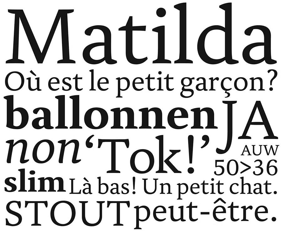
To better understand the context of typography for children, the authors surveyed typefaces explicitly designed for children, as well as research projects that described the considerations involved in designing typographic systems, layouts, and typefaces for them. A common result, or outcome, of these research projects was often a typeface. These typefaces were also used to showcase the research project’s findings and to illustrate the embodiment of what the author considered to be “best practices” in typefaces designed for young children. These vary from examples like serif offerings such as Matilda, “a research-based font for improving reading” (Figure 1), which emerged from Ann Besseman’s Readsearch legibility project,[b] to the sans serif pencil forms of the Fabula typeface (Figure 2), which resulted from the KidsType[c] project that was formulated and operated at the University of Reading in the United Kingdom.
Typographic researcher and designer Juliet Shen’s Early Bird typeface (Figure 3) was developed for Oxford University Press in 2005[d] and shares formal similarities with traditional, uncomplicated sans serif typefaces like Paul Renner’s Futura (often used in children’s texts) and Eric Gill’s Gill Sans Infant (Figure 4) [23] in its use of basic geometric forms and simple in-strokes and out-strokes.[e] Another example of. Typeface designed for use by young readers is the Heinemann Special collection of types (Figure 5), which were also produced in consultation with “children, literacy advisors, teachers of special needs / dyslexia, and primary school teachers,” and were tested over a period of 8 years.[f] Similarly, the Twinkl fonts (Figure 6) were developed for educational use and in consultation with teachers. [24] The Twinkl Handwriting Font is one of the few families found by the authors that was designed specifically to facilitate the process of learning to write among young children. It was developed in the UK in 2016 “with teachers and industry experts, the Twinkl Handwriting Font is aligned with the National Curriculum guidelines to aid the development of handwriting for children of all age groups.” [25]
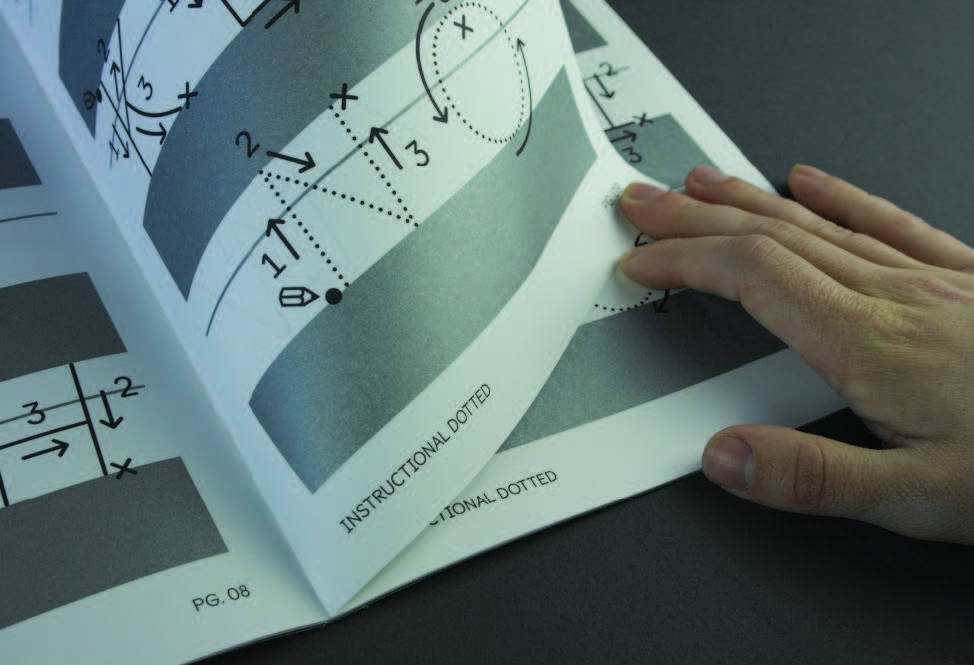 top to bottom:Figure 3: Juliet Shen designed the Earlybird typeface family on behalf of Oxford University Press. It was designed to be used in their primary level publications.Figure 4: British type designer Eric Gill designed Gill Sans Schoolbook, now known as Gill Sans Infant, in 1931 with the intent to have it be used in language teaching, children’s books and school texts.Figure 5: The Heinemann Collection was designed by the in-house design team at Heinemann Publishing Company, 2008. http://www.myfonts.com/fonts/fw-heinemann/heinemann/ (accessed March 5, 2018).Figure 6: The Twinkl Handwriting Font was designed by Twinkl in 2016. http://www.twinkl.com/twinkl-font (accessed July 24, 2017)Figure 7: The Castledown Instructional Typeface Family was designed for use among young children learning to write and read at the Castledown Primary School in the United Kingdom. The typeface comes with three levels of instructional cues that direct students how to write letters in the proper stroke order. https://www.colophon-foundry.org/typefaces/castledown/ (accessed March 12, 2018).
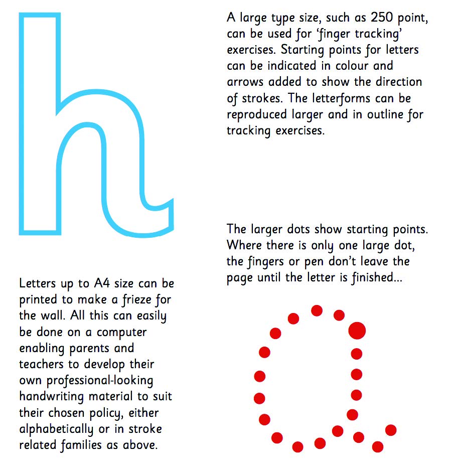
The scholarly literature regarding the design and implementation of these typefaces suggests that the majority of the studies and research processes that informed their designs centered on improving the reading experience of the early reader, rather than explicitly developing typographic forms and systems that could function as means to bridge the gaps between learning to write and read handwriting and learning to read typography. Notable exceptions include the recent Castledown Instructional family published in 2014 by Colophon in the UK (Figure 7), g which is directed toward the teaching of handwriting, and the long-established Sassoon Primary family (Figure 8). h Both of these include what is called an ‘instructional’ style where the letter-writing movements are made explicit. First designed and published in 1985 by Rosemary Sassoon, Sassoon Primary is perhaps the most versatile and extensively researched example of a typeface that, although it was developed to facilitate reading among early readers, is comprised of shapes and styles across the full family that cater to teaching both reading and writing. This includes the ‘instructional’ style, which functions to indicate the order in which the strokes should be formed as well as the movements required to create them.
Sassoon Primary also includes a ‘semi-serif’ style, which presumably was designed with the aim of familiarizing children with typographic forms and helping them transition from rendering letterforms manually to reading them typographically. The technology that facilitates type design and usage has evolved considerably since the development of Sassoon Primary in 1985, and this has helped speed up the design and production of typefaces. Additionally, these technological developments, which include the introduction of innovations such as the Open Type format for intricately scaling computer fonts by the Microsoft Corporation, have facilitated the development of typefaces that can include a much higher level of formal variability. This includes but is not limited to facilitating the deployment of alternate characters that support end-user customization, depending on the context within which they are used. However, the innovative research and useful tools that were formulated and operated during the design processes that yielded the design of Sassoon Primary have not been expanded upon in ways that (as of this writing in the spring of 2018) would allow for a wide variety of alterations in early writing and reading classrooms.
An Overview of How the Authors’ Educational Research Informed the Design of Energetic Alpha
While there are a wide variety of apps intended to teach and entertain young children on offer in the App Store of the Android and iOS platforms, there are limited resources for evaluating them. Librarian Claudia Haines has designed an app evaluation rubric, [26] which consists of eleven questions and focuses on both user experience and content. Using Haines’ rubric for guidance and taking inspiration from educational theorist Maria Montessori, who advocated for young learners to have parameters rather than prescriptions to guide their approaches to solving learning problems, i we created a typographic and iconographic interface that supports young users and encourages haptic learning. We employed Cooper’s principles for harmonious interactions, j and combined these with the basic elements of gameplay (i.e., interactivity, choice, feedback, rules, and rewards) [27] to create a gender-neutral context of use for the interface we designed that conveys authority and stability to parents while engaging children with play. We supported these approaches by deploying a bright color palette across our systems of interface components. Montessori’s pedagogical philosophies of sequential and multisensory experience also influenced our research approaches and interaction design strategies, as we hoped these would allow children to “develop prelinguistic and preliteracy skills [...] for the development of symbolic language spoken and written.” [28]
This multi-sensory experience was reflected in our design decision early on to expand the functionality of the app from a more entertainment-based focus (video watching only), to requiring the young children who comprised our user groups to interact with the various letters and numerals presented within our interface design by tracing them on the screen. In this way, we created a learning tool that relied on facilitating actual gameplay rather than one that relied on facilitating a gamification-based approach (Deterding et al. define “gamification” as “the use of game design elements in non-game contexts;” gamification also implies that competition between players or participants, often abetted by scoring, is a key aspect of the experience). [29] According to Nicholson, educational contexts can be gamified by adding “points, levels, and achievements.” [30] However, Nicholson describes a downside to gamification as users shift their focus away from playful elements of game-like qualities and onto extrinsic values such as earning points and increasing scores. We wanted to ensure that Energetic Alpha offered children a haptic and visually guided learning experience on a digital platform that necessitated hand movements that would mimic those involved when writing on a paper substrate. This was also done as a means to ensure that they would develop cognitive abilities similar to those necessary to write effectively on paper. According to Tekinbas, “The promise of game-based learning lies in the premise that the technology provides an efficient and effective tool with which to replace a points-based extrinsic motivation system with a contextualized hands-on learning experience.” [31]
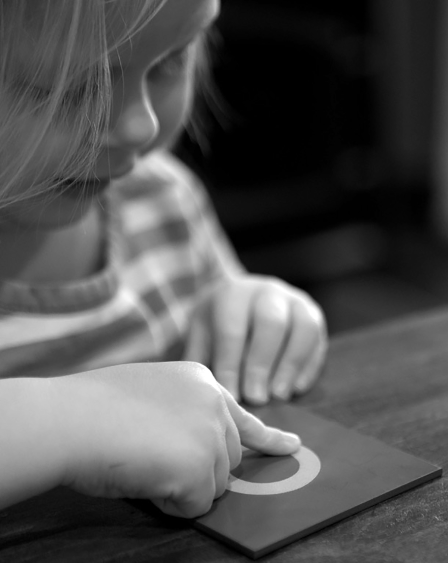
The design and functionality of the Energetic Alpha interface playfully challenges a child to learn to create the series of marks (or strokes) necessary to write a given letter correctly. Doing this unlocks the playing of an animation that visually and verbally articulates a verb that begins with the corresponding letter (“a = appear,” “m = melt,” and “s = slither”). The child sees the visual demonstration and then hears the narrator say: “B is for Build.” In the context of this research project, our goal was to embed the tasks of recognition, shape-composition, reading, experiencing, and hearing as interrelated and mutually reinforcing while providing a multisensory (auditory, visual, and tactile) experience for each child user. This “tracing-while-hearing” approach differs from the traditional ‘copying’ approach found in the teaching of handwriting. It more closely aligns with the combination of haptic, auditory and visual processes that children utilize when they work with Montessori’s ‘sand-letters’ (Figure 9), where children follow the shape of a given sandpaper form with their fingertip and receive haptic feedback from the friction created by the sandpaper texture as they do this. This approach is also advocated by the popular learn-to-read website, Reading Rockets, which encourages the child to create sweeping movements with the whole arm rather than just the hand to encourage conceptual learning of the letter’s structure. [32]
By requiring manual handwriting skills to be practiced in the digital learning environment facilitated by Energetic Alpha, we aimed to harness the affordances available within it to provide more engaging, multi-sensory writing exercise options to early learners. We also hypothesized that this might expand the possibilities for how writing might be taught most effectively and help us critically interrogate current practices. There are multiple approaches for teaching children to write letterforms by dissecting them into ordered strokes. To align with common educational practice, we chose to take a hybrid approach to stroke order prompts, combining the Handwriting Without Tears (HWT) [33] and the Zaner-Bloser [34] models. HWT has been established in the U.S. since 1977 and Zaner-Bloser since 1888 and both are widely used.
A Critical Evaluation of the Extant Array of Children’s Teaching and Learning Apps
The team reviewed Apple’s App Store for learning-to-write alphabet apps during the initial research phase by using Claudia Haines’ rubric for assessing the quality of apps designed primarily for use by children. [35] We found that, despite receiving positive reviews from a wide variety of mostly non-academic, not critically educated or trained assessors, many of the existing apps were poorly designed in terms of how their combinations of typography and imagery were configured. They often ignored basic, two-dimensional design principles (among them: establishing contrasting relationships between key formal elements, using negative spaces effectively, and achieving balance and emphasis effectively). Many of them also tended to flout many essential User Interface (UI) conventions, such as using common UI elements consistently, strategically using color and texture, and using typography to create hierarchy and clarity. More specifically, problematic design issues among these apps included a lack of negative space (i.e., the available “screen real estate” was overcrowded), poor visual spacing among letterforms, or color palettes that vibrated. Often, animations and interactions were devoid of contextual meaning, and instead of supporting learning among their child users and audiences, served instead as distractions to the task at hand. Other apps lacked or omitted the types of crucial feedback scenarios and error prevention that young users often need to ensure that the goals of a particular learning scenario are met. These types of UI-based problems often cause children (and adults) to get stuck in so-called interface loops, which inhibit or prevent their ability to move forward or progress in skill-level within a portion of a given app. As these negative experiences continue, frustration levels rise, particularly among children.
Looking specifically at apps that use the Montessori Method[k] as the foundation of their interaction, we reviewed Mobile Montessori’s The Movable Alphabet App, [36] and Montessorium’s Intro to Letters. [37] Mobile Montessori’s The Movable Alphabet App was specifically designed to support the development of writing in younger children. However, unlike the tracing functionality that is designed as an inherent functional feature in Energetic Alpha, The Movable Alphabet App does not utilize interactive movements that directly connect form and movement.
An app that does share our approach is Montessorium’s Intro to Letters, [38] which operates like a touch-screen version of sandpaper letters and uses the sound of chalk on a blackboard to imitate the feedback a child receives during a manual handwriting experience. In evaluating Intro to Letters specifically, we found that while it incorporated in-app recording features, letter pairings, and audio playback, rewards for completing a task did not exist, and children had no additional motivation to move forward in the application or to continue playing. Additionally, the app’s navigation is confusing to both children and parents. In Intro to Letters, the rewards for the child’s accuracy in tracing are limited to audial feedback and linear progression to the next part of the application. In this sense, Energetic Alpha expands the possibilities of the medium by incorporating ideas of practice, play, and exploration throughout the interface and the animations, and empowers users rather than prescribing tasks. By focusing on the properties of movement, touch, and free-form learning of the Montessori school, Energetic Alpha highlights opportunities for interactive app and typeface design to function in ways that meet the essential needs of its early childhood learners. The knowledge the authors gleaned from their abbreviated review of literature and their assessment of extant early writing facilitation apps led us to articulate and explore the set of research questions that are described in the next section of this piece.
The Research Questions that Guided Our Methods for Designing Energetic Alpha
We sought to find out how a game-based learning tool could exercise letter writing skills for young children while encouraging “meaningful play.”[l] By incorporating something pre-literate children enjoy using (touch-pad interfaces) and connecting it to something they need to learn, we wanted to know if we could effectively engage children to participate in a tedious but required learning activity using an entertaining screen interface. This led us to formulate the following questions.
- What does the context of direct interaction with a letterform through touch-screen tracing tell us about the relationships between the typographic and handwritten forms of given letters in teaching preliterate children to write and read? What unmet need does this reveal among the current offerings of typefaces available for children’s reading?
- By reflecting on the relationship between the typographically and manually rendered forms of letters, how could our work inform the development of new typefaces intended to help pre-literate children learn to write and read?
- Specifically, what specific aspects of a given typeface make it easy or difficult for children to recognize and recreate letterforms and words in written form, i.e., what formal typographic characteristics are most crucial to rendering typographic elements — like letters — in a digital environment in ways that would be most helpful to children attempting to learn to write and read? (Such charac-teristics could include but are not limited to typographic weight, utilizing serif or sans-serif typefaces, employing in-strokes and out-strokes, employing single-story vs. two-story forms of specific letters, and relative contrast between the stroke weights of particular typefaces.
The next section describes the methods we used to address our research questions.
An Analytical Description of our Research Methods
After reviewing the contemporary offerings of typefaces designed for children (outlined in the section “A Brief Overview of Issues Related to Designing Typography for Children” earlier in this piece), we chose to use a typeface to use during the facilitation of our initial pilot study that possessed some of the formal characteristics of type designs that are often advocated for use in children’s texts. BioRhyme, a typeface created by co-author Aoife Mooney, was influenced by the warmth and didactic feel of Morris Fuller Benton’s Century Schoolbook (Figure 10a). Century Schoolbook was developed to incorporate the results of research [m] into the typographic needs of children and was used extensively in the first half of the twentieth century in texts set for children who were learning to read. BioRhyme also echoes the ‘simplified’ construction of Paul Renner’s Futura (Figure 10b), which is often used for the ‘ball-and-stick’ construction advocated and discussed by practitioners and teachers writing about the teaching of handwriting in the early part of the twentieth century. [39] It is a monolinear family of typefaces imbued with generous apertures, large counters, and straightforward and uncomplicated letter structures.
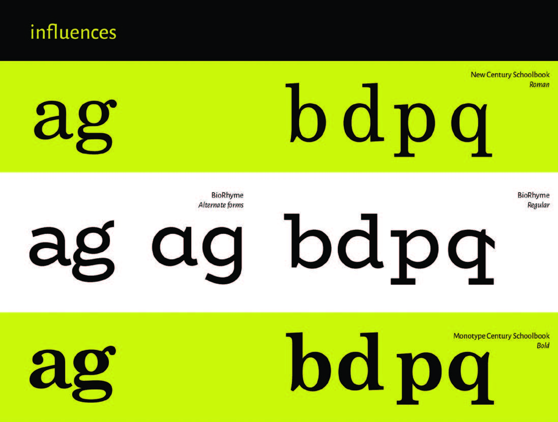
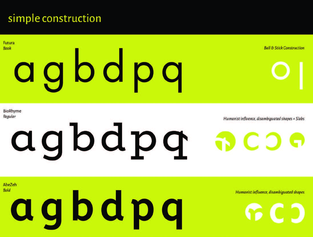
Compared to the typographic shapes found in reading material intended for consumption by adults, letterform structures that are used to teach children to write are (generally) simplified in terms of their formal characteristics. Letters such as “a” and “g” are typically depicted as single-story forms in contexts where they might be encountered by young children learning to write, as well as in situations that involve attempts at early reading. Typefaces designed or adapted for children will often feature exit strokes and alternate type characters and more cursive variants of forms for letters like the “k” and “e.” BioRhyme also incorporated these formal features (Figure 11), which sought to reflect the action of the hand in creating a pen stroke. [40]
Having established the initial look, feel, and basic interactivity of our app, we involved a total of 20 members of our target audience and user group — young children — as co-designers in the process as described in the User Studies detailed in the next section of this piece.

The Effects of User Studies on Design Decision- Making in the Development of Energetic Alpha
Scholarly work by Druin [41] and Sanders [42] on co-design and co-creation[n] informs our study. Dr. Druin is the founder of the International Children’s Digital Library at the University of Maryland, which was designed in part by allowing children to make creative contributions to the decision-making processes that informed its development. Dr. Sanders is an Associate Professor at The Ohio State University and the founder of Make Tools. Her writings on co-design techniques, tools, and methods provided much of the foundational literature for participatory design and co-design strategies. As we designed Energetic Alpha, we operationalized co-creative methods that included pre-literate children (20 in all) as our design processed progressed to create an end-product that supports their needs. By incorporating feedback from children in the user studies that guided the development of our prototypes, we were able to develop and design a much more useful and usable set of interactive experiences for them. This strategy facilitated both user testing and user designing. We incorporated storyboard sketching focused on ideation of possible reward animations. Children were also asked to help design the sounds for the app by providing comments on chimes and buzzer sounds for user feedback and by helping to choose music for the app.
We gained valuable input from these activities as we engaged in the iterative processes that guided the development of the app. Overall, we operated a total of four user studies including a pilot study. The pilot study allowed us to test the design of our initial typeface, BioRhyme, and its overall readability among pre-literate and newly literate children. The first iterative studies allowed us to test the technical functionality of the app, provide error prevention and correction, and observe the overall response from children. Initially, as the children tested the app, it crashed repeatedly within a single testing session. Because of this, the app had to be completely recoded and rebuilt by our developer. The second iterative study incorporated co-design methods by engaging children in designing the rewards and sounds that were associated with the completion of particular tasks. This allowed us to imagine what a child would want to see and engage with while practicing their writing of individual letters. It also allowed us to test the functionality of the interface and the animation as a reward structure. Finally, we tested the app with pre-school and kindergarten teachers at Kent State University’s Child Development Center. Their feedback helped us make design adjustments within the app, which will be addressed in future research.
The user studies we conducted with children each followed a similar structure: 1) participants were given semi-structured interviews (questions are available in Appendix A); 2) participants were asked to provide feedback by sketching out design ideas and improvements on iPad shaped paper; and 3) participants had an opportunity for free play with the app. Ethnographic field notes [43] were taken during each study, which allowed us to capture other activity that was occurring in the room during testing, such as how parents were interacting with their children (or not), and descriptions of what other children (such as younger siblings) were doing during the study, which might have distracted the test subjects.
The initial study sought to test the viability of several aspects and elements that were incorporated into the design of the app our approach to designing it. These included using a serif typeface in specific sizes, and critically examining details of the interactive behaviors that the child might experience during a usage experience. Additionally, we assessed the overall user experience and understandability of the app with our child subjects, and incorporated children’s input as co-designers. Our approaches were rooted in the principles of user-centered design in that feedback from our young participants was allowed to influence the design of Energetic Alpha.
For the second user study, we developed a two-part task booklet. The first part was designed to capture the children’s initial feelings about using the app while giving the authors (and app co-creators) a way of assessing how its functionalities affected the children’s overall user experience. To accomplish this, we assigned the children specific tasks and had them respond by using a child-friendly Likert scale.
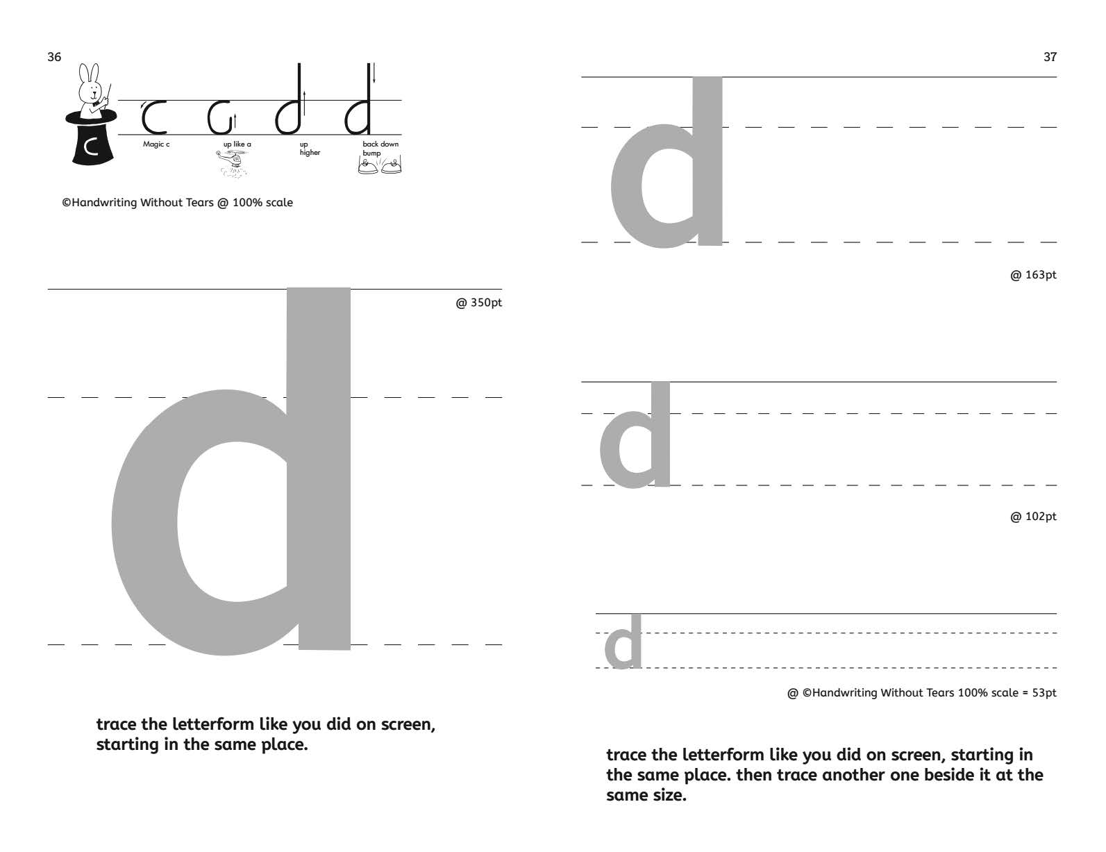
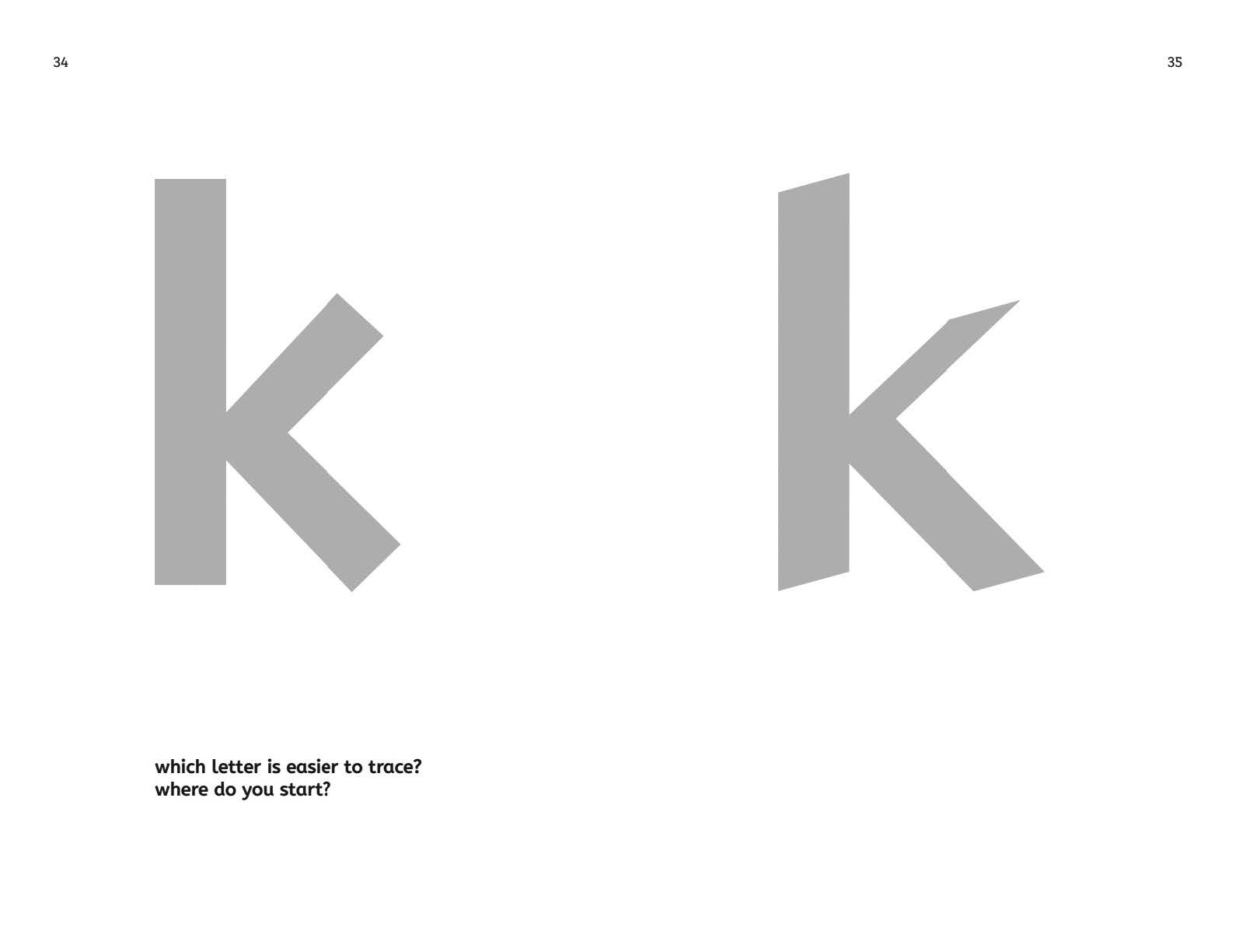
The second part of the booklet allowed us to explore how manipulating a typographic variable such as contrast — the variation between the thick and thin parts of the letter and the distribution of weight along a curve — might be used as an indicator of stroke order within an individual character (Figure 12). We also explored how the scale of the presentation of a given letterform on screen and on paper affected the children’s successful reproduction of letters (Figures 13 & 14) with reference to Montessori’s three periods of procedure for the education of the senses: 1) recognition of identities; 2) recognition of contrasts and; 3) discrimination of objects very similar to each other. [44]

From a typographic perspective, the second part of this study examined the role of monolinearity and low contrast as a means to ‘simplify’ forms[o] in a Type Study (Figure 14). The insights gleaned from this last round of testing revealed pathways for the development of interactive apps as a tool for research.
Findings
Assessment: Co-Design Session I, April 30th 2016
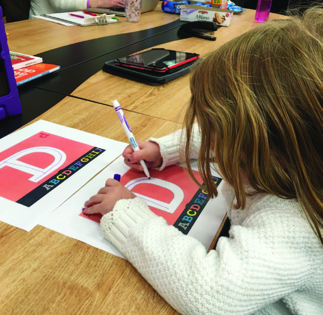
The first user study testing session with an early iteration of the app included 10 participants ranging between 4- and 10-years-old. Preliterate and preschool aged children between the ages of 3-6 are the target age range of the app. Children aged 7-11 were recruited to serve as “co-designers” because we expected this group to provide more concrete feedback and reflection. We watched the children interact with the interface, alphabet, and animations on the screen; we photographed and recorded video; and we interviewed our participants and their guardians to gain insights into the children’s experiences with digital technology and using Energetic Alpha (Figure 15).
Our initial user testing session yielded two key findings. We observed that the younger children, those aged between 4- and 6-years-old had difficulty both tracing and identifying letters with serifs. They tended to see the forms as abstract and unrelated to the letters they knew. Despite our efforts to add design elements to serif letterforms that we thought might help their recognition processes, we learned that we needed to choose less formally complex typefaces. One boy was shown two letters (one with serifs and one without) and was asked if they were the same letter. He replied, “no” and explained, “this one has lumpies on the top and standees on the bottom.” When asked which one was in his name, he indicated the sans serif letter but not the serif form of the same letter, which he did not recognize. [45] Based on children’s initial feedback, we learned that, as a slab typeface, BioRhyme was confusing to the children of our study. Our attempt to employ a slab serif in conjunction with a trace feature to reflect the relationship between typographic and manual forms was embedding too many complexities in the task of tracing and was inappropriate for 3- to 6-year-old children learning to write.
Working with the children to test various aspects of Energetic Alpha’s functionalities revealed a second key finding. We learned that its trace function was overly sensitive, which made unlocking animations extremely difficult for our child users. This led to us lowering the haptic tolerance levels that facilitated this function (failing to do this would have caused the children’s general interest levels to wane). Finally, we identified the need for letter writing feedback. When children wrote a letter in the wrong order or incorrectly, they needed an immediate response from the system to help them self-correct. In response, we created animated trace hints that act as prompts to help a child get started, initiate engagement, and self-correct writing errors.
In our study, a typeface was used to guide handwriting practice and the relationship between the two types of letterforms (typographic and handwritten) had to be a close one. For a letterform to be the skeleton, or frame, to effectively facilitate handwriting practice, we determined that had to find a typeface that closely aligned with the ‘print’[p] or ‘manuscript’ convention taught in schools. We envisioned that allowing the app to foster this practice would allow children to see the connection between the two different (but related) forms.
Selecting a new typeface family for use across the interface design of Energetic Alpha
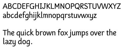
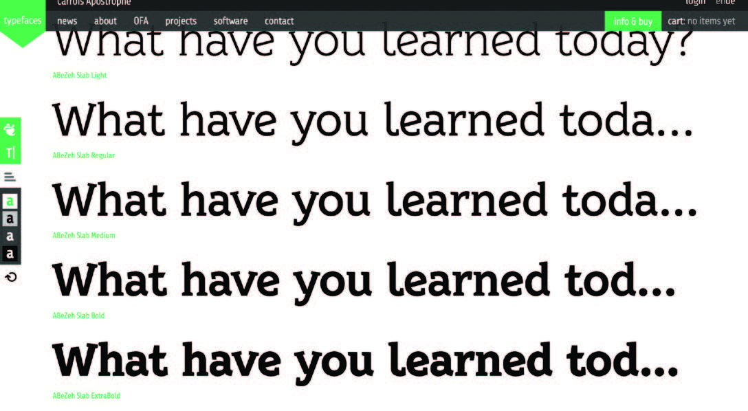
To better implement the trace function of the app and incorporate feedback from the first user testing session, the authors and co-creators decided to implement Anja Meiner’s AbeZeh typeface family (Figure 16) across the interface prior to facilitating the second user testing session.
This typeface, which is described as ‘the friendly learning typeface family,’ [46] was designed “to cross the rather unexplored typographical area of children’s and school books.” [47] In choosing AbeZeh, we implemented a typeface choice that aligned more closely to the ‘print’? [q] or ‘manuscript’ convention taught in schools in the U.S. without leaving the realm of typographic form altogether (we did this to retain the focus on the relationship between typographic and the manual letterforms). The design features of AbeZeh fused atmosphere and convention effectively to meet our goals, as it includes a slab serif counterpart (Figure 16) and an icon set, which allowed us to expand our options for the design of the Energetic Alpha interface. This was something that was important to us in creating and an integrated visual language to function as an immersive environment (Figure 17).
From this typeface, we derived a set of forms to guide hand tracing based on our research and reflections about the relationship between the typographic and manual forms. We reversed our research approach from that of observing the child’s interaction with typographic letterforms to the speculative design of traceable ‘manual’-looking letterforms, which we could test with the children using the app. Ultimately, this was a much more successful approach. In adapting the typeface for our ‘scribable’ purposes, the relationship between manual and typographic letterforms became clear.
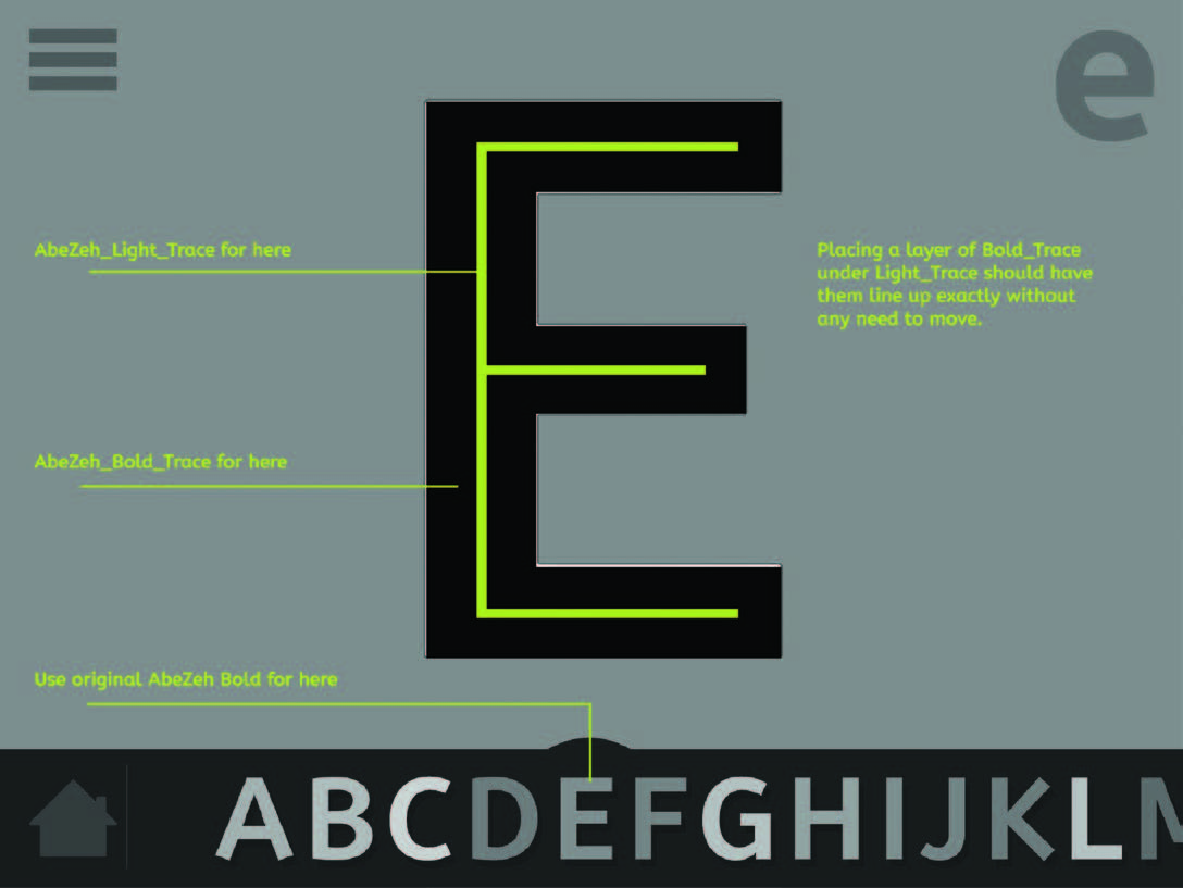
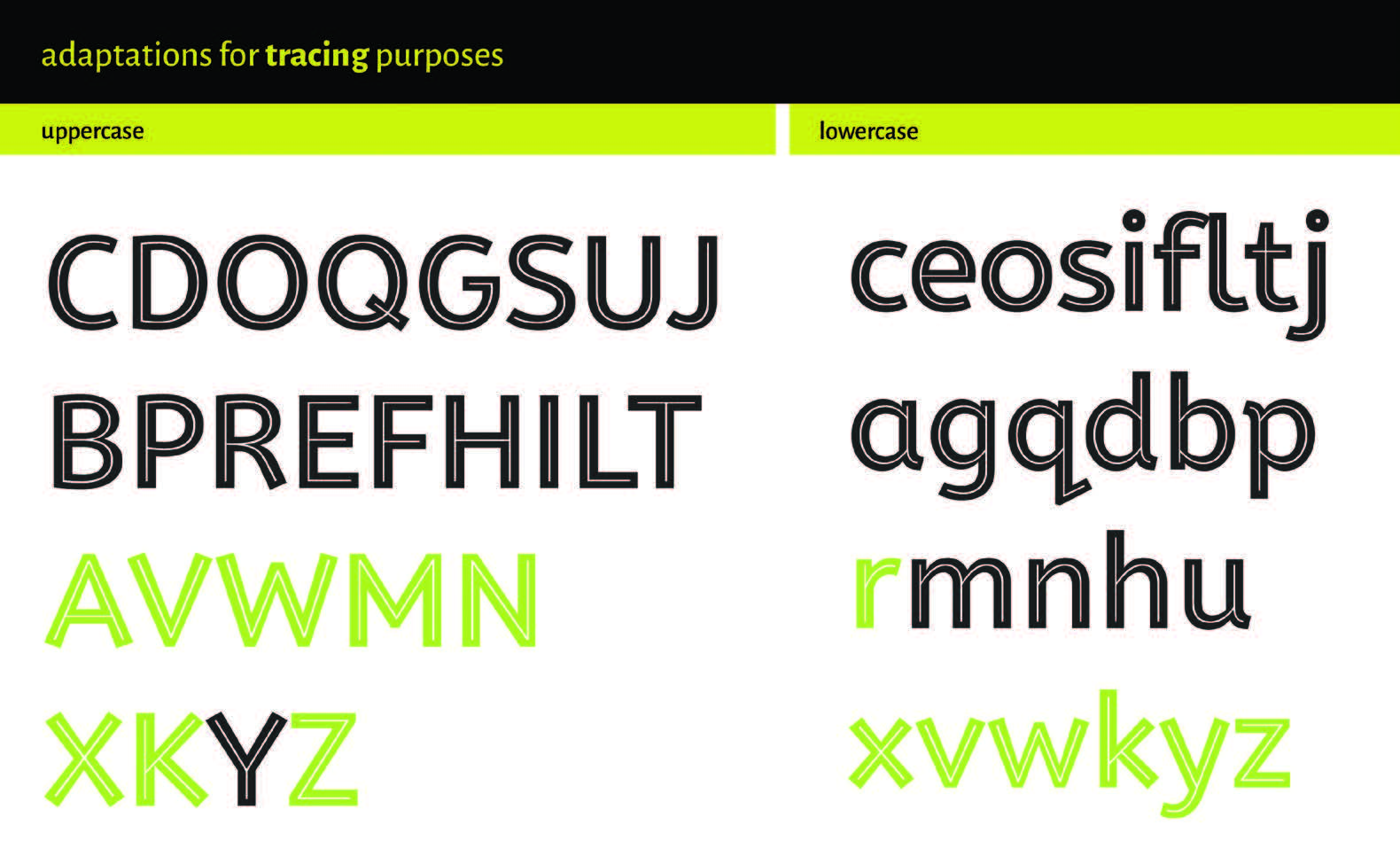
After licensing the weights required, we contacted the designer, Anja Meiners, for advice and for her permission to alter some of the forms. We wanted to allow for the possibility of removing or attaching in-strokes and out-strokes to some of the letterforms to: 1) test the impact of these visual cues on shape recognition and traceability; 2) be able to customize letterforms for testing purposes; and 3) create an altered version of the typeface that could be overlaid on top of the standard forms in our design to indicate the skeleton structure of each letterform, which is what we called a ‘trace-weight’ of the typeface (Figure 20).
The ‘trace-weight’ design is based on the lightest existing weight of the AbeZeh typeface, which was altered to lay over the heavier weight of the typeface within the app interface. The use of the trace-weight ultimately appears in the “animation hint” (Figure 19). As a child uses the app, a red pulsing dot on each letterform shows the child where to start. When the child encounters a letter they cannot write, they can select the “help button,” which is identified by a question mark at the bottom right hand corner of the screen. This button triggers an animation that plays over the top letter shape and includes two components: first, a graphic of a child’s hand moving in the proper stroke order, and then (and underneath) the trace weight of the letter fading in one stroke at a time. When the animation ends, the child can replicate the hint animation or play it again if more assistance is needed. If the child pauses on a screen without action, this also triggers the animation hint. This strategy allows the child to be independent in their play and capable of self-correction when encountering handwriting errors. The trace-weight functions as a skeleton letterform that visually represents the perfect letter mark (Figure 20) and provides a guide for the child user to mimic. The stroke order prompts we used are based on the combined approaches of the Handwriting Without Tears [48] and Zaner-Bloser [49] stroke order guides. This shows the child where to start each letterform and how many strokes were required (Figure 20).
Assessment: Co-Design Session II, February 17, 2017
In February 2017, after incorporating feedback from the initial study into the full prototype featuring a new typeface and updated interactivity, we tested Energetic Alpha with 13 participants between the ages of 5- and 11-years-old. The testing sessions lasted 30 to 40 minutes, and all were conducted with a guardian present as per our university’s Institutional Review Board mandates. In the first part, the children provided concrete feedback on: 1) whether the interface was functioning properly, i.e., if they were able to navigate through the interface without getting stuck; and 2) were they able to complete a full navigation loop by reproducing the letterforms and subsequently getting the reward of unlocking videos.
In the second part of the study, children were tasked with sketching their ideal rewards on storyboards. In the third part, we tested sounds with the children and got feedback on which sounds they found appealing and which ones were annoying. In the final activity, the children compared animations to see if they preferred a specific style (vector / stop-motion / time lapse) — or if there was one they did not like. Overall, the children were receptive to and engaged with all of the activities.
We received concrete feedback that our new and revised typeface functioned well in the interface. Children recognized the letters and confusion was eliminated. The decision to add both trace hint animations and visual cues (for example, a glowing red dot that indicated where children were to begin) helped them use the app in the way it was intended.
In this second user study, participants gave us positive feedback on improvements to the interface and the new typeface. In our Task Booklet’s Type Study section, we gathered information about the impact of using typefaces that exhibit more contrast between the thick and thin parts of the letters and their effect on the child’s ability to recognize and trace a given letter, which we will explore in future research. Initial findings from our small study suggest that using contrast could help children more easily recognize the way the shape is constructed and thus make writing more accessible. This runs counter to the general trend in typeface design for children, which has produced primarily low-contrast sans serif typefaces.
Limitations and Future Research
Once we were entrenched in the full development process, our team had to deal with technology from a critical design perspective as well as from a product-development position. Not all of our big goals were possible. We sought to rigorously follow Haines’ rubric [50] for quality app design, but one particular criteria could not be met with our app’s goals (i.e., structure) and the current iOS development recommendations that state that apps should be under 4 GB in size. [51] Haines recommends that apps be “free of links to social media and the internet.”[52] Energetic Alpha contains 26 animations that are between 10 seconds and 3 minutes in length. To comply with iOS guidelines, we designed the app to work with Internet videos that download on an as-needed basis. The app can function without Internet connectivity, but to have the full app experience it works best connected to the Internet. Finally, the study should be repeated with the finished app.
Conclusions
In developing Energetic Alpha, the authors set out to investigate the possibilities for enhancing letter-writing practice in a digital environment by creating a game-based learning tool in which a child traces directly over a letterform on an iPad screen to unlock an animated reward. Data we collected from our child co-designers in interviews and task booklets as described herein allowed us to reflect on: 1) the possibilities of the screen as an interactive learning tool for teaching handwriting; 2) the relationship between typography and handwriting, and in particular, its potential to highlight a means for typography to more closely align with or support pedagogical strategies that improve handwriting; 3) the potential for type designers to create forms specifically for use in the context of the kind of direct interaction found in the trace function in Energetic Alpha; and finally, 4) it demonstrated the success of the animations to encourage a young audience to playfully engage with letter-writing practice.
In developing Energetic Alpha, we investigated how a game-based learning tool could engage children with meaningful play in which children are excited and motivated to play with an app that serves as a pedagogical tool to increase their familiarity with the alphabet and handwriting. In the process, we collected input from children, teachers, and parents, and observed children using the app to trace letters and enjoying the animated rewards from their work.
The app supports preliterate learners by providing a context that allows them to directly correlate given letterforms to their typographical counterparts and extends this experience by augmenting it with sound and animation. In the heuristic and iterative processes that guided our development of this app, we observed the limitations of typographic letterforms to depict handwritten letterforms for use in the context of children learning to recognize the constituent parts of letters. This was particularly noticeable when children attempted to directly trace over them as a means to gain familiarity with their essential forms. In our secondary research, we examined letterforms and typographic systems designed for children in our age group, and this allowed us to reflect on the relative dearth of typefaces designed expressly for the purposes of teaching children to write as a distinct task from learning to read.
Our research questions allowed us to explore the potential for new media to support established pedagogical strategies like those espoused by Maria Montessori,[53] and highlighted the continued relevance and immediate possibilities for further typographic and psychological research in this area.
Based on our observations of the children interacting with Energetic Alpha, and the feedback we received from our study participants, we believe that touch screens can serve as a tool for helping early writers practice handwriting. Our study demonstrated the capacity of digital media to support traditional methods of handwriting instruction, as well as to extend these methods. By using digital tools as an alternative approach to encouraging play and motivating learning, apps such as Energetic Alpha can facilitate interactions that are entirely led and paced by the child. In our user-centered design study, children had leadership roles as co-designers. Their feedback informed our decisions about typeface, sound and design within the app.
With this in mind, we believe that the disciplines of typography and typeface design have significant roles to play in the development of interactive tools for children engaging directly with letterforms as they learn to write. Expression, tone and context must be considered as judiciously for typography intended to be read and traced or mimicked by children as it is for reading-literate adults, and so far, the range of typefaces designed to facilitate children’s digital writing and reading experiences does not reflect this. If not solely for the benefit of the child, typography that facilitates a wider visual range of expression and contexts can also provide more opportunities for creating learning tools and environments that are varied and expressive. In the United States, schools have used sans serif versions of teaching letterforms that do not incorporate in-strokes and out-strokes. Our research shows that while slab typefaces like BioRhyme were confusing to the young children of our study, in-strokes and out-strokes were helpful for the children to disambiguate letterforms from each other and also to find the starting point of a stroke. This confirms suggestions made by Rosemary Sassoon and evidenced in her Sassoon typeface family, included in the A Brief Overview of Issues Related to Designing Typography for Children section, above.
We intend to continue to refine and test Energetic Alpha by conducting larger studies with parents, librarians and media mentors, and children. Future research will expand upon questions opened by these initial inquiries and, in particular, might compare how learning to write in a purely manual environment (i.e., using conventional writing tools like pencils and paper) and learning to write in a digitally facilitated environment (like a touchscreen) changes students’ learning processes.
References
- Asher, Asha V. “Handwriting Instruction in Elementary Schools.” American Journal of Occupational Therapy, 60 (2006): pgs. 461–471.
- Asherson, S. B., "The Benefits of Cursive Go Beyond Writing,” The New York Times, 30 April, 2013. Online. Available at: https://www.nytimes.com/roomfordebate/2013/04/30/should-schools-require-children-to-learn-cursive/the-benefits-of-cursive-go-beyond-writing (Accessed November 7, 2017).
- Baudin, F. “Education in the Making and Shaping of Written Words.” In Computers and Typography, edited by R. Sassoon, Oxford, UK: Intellect, 1993: pgs. 102–128.
- Berninger, V., et al. “Early Development of Language by Hand: Composing, Reading, Listening, and Speaking Connections; Three Letter-Writing Modes; and Fast Mapping in Spelling.” Developmental Neuropsychology, 21.1 (2006): pgs. 61–92.
- Bessemans, A. “Legibility Research: Type Design for Children with Low Vision.” Typography. Guru, 1 October, 2013. Online. Available at: https://typography.guru/journal/legibility-children/ (Accessed November 7, 2017).
- Bessemans, A. “Matilda: A Research-Based Font for Improving Reading.” Filmed 17 May 2013. TYPO Talks Berlin, 46:20. Online. Available at: https://www.typotalks.com/videos/matilda-a-reasearch-based-font-for-improving-reading-2/ (Accessed November 7, 2017).
- Carter, M. “Theories of Letterform Construction (Part 1).” Printing History, 13–14.1/2 (1991–1992): p. 1.
- Chetty, K., Josle, J., Gcora, N., Aneja U., & Vidisha, M. “Bridging the Digital Divide: Skills for the New Age,” G20 Insights, 13 October, 2017. Online. Available at: http://www.g20-insights.org/policy_briefs/bridging-digital-divide-skills-new-age/ (Accessed April 19, 2018).
- Chisholm, J. “What is Co-Design?,” Design for Europe, 8 September 2016. Online. Available at: http://designforeurope.eu/what-co-design (Accessed April 28, 2018).
- Dehaene, S. Reading in the Brain. London, UK: Penguin, 2010.
- Deterding, S., Khaled, R., Nacke, L. E., & Dixon, D. “Gamification: Toward a Definition” in Proceedings of the CHI Conference, 7–12 May 2011, Vancouver, BC, Canada. Online. Available at: http://gamification-research.org/wp-content/uploads/2011/04/02-Deterding-Khaled-Nacke-Dixon.pdf (Accessed October 30, 2017).
- Downton, P. Design Research. Melbourne, VIC, AU: RMIT University Press, 2003: p. 17.
- Druin, A. “What Children Can Teach Us: Developing Digital Libraries for Children with Children.” The Library Quarterly, 75.1 (2005): pgs. 20–41.
- Entente, The. “Castledown Typeface.” Colophon Type Foundry. 2014. Online. Available at: https://www.colophon-foundry.org/typefaces/castledown/ (Accessed July 24, 2017).
- Fletcher, A. Beware Wet Paint. New York, NY, USA: Phaidon Press, 2004.
- George, B., George, J. & Nassner, A. George. Montessori LetterWork. New York, NY, USA: Abrams Appleseed, 2012.
- Graham, S. “Want to Improve Children’s Writing? Don’t Neglect Their Handwriting.” American Educator, 76. 1 (Winter 2009-2010): pgs. 49–55, Online. Available at: http://www.aft.org/sites/default/files/periodicals/graham.pdf (Accessed November 7, 2017).
- Graham, S., & Weintraub, N. “A Review of Handwriting Research: Progress and Prospects from 1980–1994.” Educational Psychology Review 8.1 (1996): pgs. 7–87.
- Haines, C. “Evaluating Apps and New Media for Young Children: A Rubric.” Never Shushed (blog). 2016. Online. Available at: https://nevershushed.files.wordpress.com/2015/01/evaluatingappsandnewmediaforyoungchildrenarubric1.pdf (Accessed November 7, 2017).
- Haines, C. & Campbell, C. Becoming a Media Mentor: A Guide for Working with Children and Families. Chicago, IL, USA: The Association for Library Service to Children, a Division of the American Library Association, 2016.
- Kress, G. R., & van Leeuwen, T. Reading Images: The Grammar of Visual Design. New York, NY, USA: Routledge, 1996.
- Kysilko, D. “The Handwriting Debate.” National Association of the State Boards of Education Policy Update 19.7 (September 2012). Online. Available at: https://www.hw21summit.com/media/zb/hw21/H2989_NASBE_PolicyUpdate_TheHandwritingDebate.pdf (Accessed November 7, 2017).
- Learning Without Tears. “About Us.” Online. Available at: https://www.lwtears.com/about-learning-without-tears (Accessed November 7, 2017).
- McCloud, S. Understanding Comics. New York, NY, USA: William Morrow, 1994.
- McLuhan, M. The Gutenberg Galaxy: The Making of Typographic Man. Toronto, ON, CA: University of Toronto Press, 2011.
- Meiners, A. “AbeZeh Specimen.” Carrois Apostrophe GbR. 2016. Online. Available at: https://carrois.com/typefaces/ABeZeh/#!layout=specimen (Accessed November 7, 2017).
- Meiners, A. “About.” Carrois Apostrophe GbR. 2016. Online. Available at: https://carrois.com/about/AnjaMeiners (Accessed July 24, 2017).
- Monotype, Fonts.com. “Gill Sans Infant.” Online. Available at: https://www.fonts.com/font/monotype/gill-sans/infant. (Accessed July 24, 2017).
- Montessori, M. Dr. Montessori’s Own Handbook. New York, NY, USA: Schoeken Books, Inc., 1965.
- Mobile Montessori. Online. Available at: http://www.mobilemontessori.org/ (Accessed July 24, 2017).
- Montessorium. Online. Available at: https://montessorium.com/ (Accessed July 24, 2017).
- Must, M. “Schools Will Start Teaching Typing Instead of Longhand.” Helsinki Times. 20 November 2014. Online. Available at http://www.helsinkitimes.fi/finland/finland-news/domestic/12767-schools-will-start-teaching-typing-instead-of-longhand-2.html (Accessed July 24, 2017).
- Nicholson, S. “A user-centered theoretical framework for meaningful gamification.” Paper presented at Games + Learning + Society 8.0, Madison, WI (2012). Online. Available at: http://becauseplaymatters.com/pubs/ (Accessed October 30, 2017).
- Noordzij, G. The Stroke Theory of Writing. Translated by Peter Enneson. London, UK: Hyphen, 2005.
- Petzold, D. “Heinemann Special Fonts Collection.” We and the Color. Released by MyFonts 2008. Online. Available at: http://weandthecolor.com/heinemann-special-fonts-colection/29643 (Accessed July 24, 2017).
- Richardson, S. O. “The Montessori Preschool: Preparation for Writing and Reading.” Annals of Dyslexia 47 (1997): pgs. 241-256. Online. Available at: http://www.jstor.org/stable/23768103 (Accessed July 24, 2017).
- Rinnert, G., Mooney, A. & Martens, M. “Energetic Alpha: A Design Continuum Created Through Collaboration.” In The Theory and Practice of Motion Design: Critical Perspectives and Professional Practice, edited by Brian Stone and Leah Wahlin. NY, NY, USA: Routledge, an imprint of the Taylor Francis Group. Expected publication date: Summer/Fall 2018.
- Sanders, E. “Co-creation and the new landscapes of design.” CoDesign: International Journal of CoCreation in Design and the Arts 4.1 (2008): pgs. 5–18.
- Salen, K. & Zimmerman, E. Rules of Play: Game Design Fundamentals. Cambridge, MA: MIT Press, 2004.
- Saperstein Associates. “Handwriting in the 21st Century? Research Shows Why Handwriting Belongs in Today’s Classroom.” Summary of research presented at Handwriting in the 21st Century? An Educational Summit. Columbus, OH, USA: Sapersten Associates. 2012. Online. Available at: www.hw21summit.com/media/zb/hw21/H2948_HW_Summit_White_Paper_eVersion.pdf (Accessed July 24, 2017).
- Sassoon, R., ed. “Through the Eyes of a Child — Perception and Type Design.” In Computers and Typography, edited by R. Sassoon. Oxford, UK: Intellect, 1993.
- Sassoon, R. & Williams, A. “Why Sassoon?” Last modified 2015. Online. Available at: http://www.sassoonfont.co.uk/fonts/sas/WhySassoon1.3.pdf (Accessed July 24, 2017).
- Shen, J. “Typography and Graphic Design.” Juliet Shen (blog). Last modified 2017. Online. Available at: http://www.julietshen.com/typography-and-graphic-design (Accessed July 24, 2017).
- Shapiro, T. R., "Cursive handwriting is disappearing from public schools.” Washington Post. Online. Available at: https://www.washingtonpost.com/local/education/cursive-handwriting-disappearing-from-public-schools/2013/04/04/215862e0-7d23-11e2-a044-676856536b40_story.html?utm_term=.3ed9342e706b (Accessed November 7, 2017).
- Sousanis, N. Unflattening. Cambridge, MA, USA: Harvard University Press, 2015.
- Spear-Swerling, L. “The Importance of Teaching Handwriting.” Reading Rockets. 2006. Online. Available at: http://www.readingrockets.org/article/importance-teaching-handwriting (Accessed July 24, 2017).
- Steven, R. “Colophon Releases Castledown Type Family.” Creative Review. 26 March 2014. Online. Available at: https://www.creativereview.co.uk/colophon-releases-castledown-type-family/ (Accessed July 24, 2017).
- Striver, I. “Typography for Children.” Monotype. Online. Available at: https://www.fonts.com/content/learning/fyti/situational-typography/typography-for-children (Accessed July 24, 2017).
- Tekinbas, K. S. “Getting in the Game.” In Mindshift Guide to Digital Games and Learning, edited by J. Shapiro, p. 9. New York, NY: The Joan Ganz Cooney Center, 2014. Available at: https://a.s.kqed.net/pdf/news/MindShift-GuidetoDigitalGamesandLearning.pdf (Accessed October 30, 2017).
- Trubek, A. (2016, August 20). “Opinion | Handwriting Just Doesn't Matter.” The New York Times. Available at: https://www.nytimes.com/2016/08/21/opinion/handwriting-just-doesnt-matter.html (Accessed October 26, 2017).
- Twinkl Font. Online. Available at: http://www.twinkl.com/twinkl-font (Accessed July 24, 2017).
- Ujifusa, A. “Resistance to the Common Core Mounts.” Education Week. 21 April 2014. Online. Available at: http://www.drmichelson.org/web_documents/resistance_to_the_common_core_mounts_-_education_week.pdf (Accessed July 24, 2017).
- Walker, S, & Reynolds, L. “Serifs, Sans Serifs and Infant Characters in Children’s Reading Books.” Information Design Journal + Document Design 11.2-3 (2003): pgs. 106–122.
- Walker, S. “Letterforms for Handwriting and Reading: Print Script and Sans Serifs in Early Twentieth-century England.” Typography Papers, 7 (2007): pgs. 81–114.
- Walker, S. Book Design for Children’s Reading — Typography, Pictures, Print. London, UK: St. Bride Foundation, 2013.
- Wolf, M. Proust and the Squid. New York, NY, USA: Harper, 2008.
- Zaner-Bloser. Authors(s) unknown. “Pre-kindergarten Handwriting.” Zaner-Bloser website. Online. Available at: https://www.zaner-bloser.com/products/index.php?product=handwriting (Accessed March 5, 2018).
- Zapf, H. About Alphabets: Some Marginal Notes on Type Design. Cambridge, MA, USA: MIT Press, 1970.
Biographies
Aoife Mooney is an Assistant Professor in the School of Visual Communication Design at Kent State University in Kent, Ohio, USA, where she teaches classes in Typography, Graphic Design, Identity and Typeface Design. She holds an MA in Typeface Design from the University of Reading (UK), and is a practicing typeface designer, having previously worked in-house for Hoefler & Co. and as a freelance designer with Frere-Jones Type and Google. Her research interests are centered around critically examining the practice and theory of this discipline, including the broader cultural contexts and implications of typeface design and its relationship to other design disciplines. She is a member of the International Society of Typographic Designers, and is the North American Coordinator for their annual Student Assessment Scheme.([email protected])
Marianne Martens is Assistant Professor at Kent State University’s School of Information in Kent, Ohio, USA, where she teaches classes including Materials and Services for the School Age Child, Youth Literature in the Digital Realm, Art and Story: The Study of Picturebook Art, and International Children’s Literature and Librarianship. Her interdisciplinary research, grounded in Library & Information Science and Media Studies, converges at the intersection of books and technology in new literary formats—from picture book apps to multiplatform books. Martens has an extensive background in children’s publishing, has translated over 100 picture books into English, is co-chair of the Association for Library Service to Children’s Task Force on Evolving the Carnegie Award, a member of ALSC’s Children and Technology Committee, and serves on the Littlelit Advisory Board. You can read more about her work at mariannemartens.org. ([email protected])
Gretchen Rinnert is an Associate Professor in the School of Visual Communication Design at Kent State University in Kent, Ohio, USA. She teaches interactive media and motion design. She is a graduate of North Carolina State University’s College of Design. As a researcher, her work focuses on the intersection of design and education, classroom participation, and tools that aid in understanding and comprehension. She continues to research participatory culture by investigating learning spaces, digital tools, online video, and time-based media. You can visit her portfolio at www.flyingtype.com. ([email protected])
Notes
- a
Graham and Weintraub summarized their findings on the confluence of writing and drawing among these groups of children as follows: “Thus, as often as not, these students’ compositions combined writing and drawing in unconventional ways. They also frequently interchanged the terms drawing and writing, particularly writing for drawing, when describing the composing act. This did not appear to be a consequence of being unable to distinguish writing from drawing, but probably represented overlapping definitions for the processes involved in the two acts (e.g., creating objects for others)”.

- b
The Readsearch Project, based in Hasselt University in Holland, is a research group focused on so called ‘reading research’, and, according to their website, “explores borders of legibility for several target groups’ including but not limited to ‘dyslectic readers, beginning readers, readers with visual impairment,’ ” and others. Bessemans, A. “Matilda: A Research-Based Font for Improving Reading.” Filmed 17 May 2013. TYPO Talks Berlin, Germany, 46:20. Online. Available at: https://www.typotalks.com/videos/matilda-a-reasearch-based-font-for-improving-reading-2/ (Accessed November 7, 2017). Matilda was designed by Ann Bessemans in 2014. Online. Available at: https://typography.guru/journal/legibility-children/ (Accessed March 5, 2018).

- c
The Kidstype Project, based at the University of Reading, UK, and more formally titled “The Typographic Design for Children,” aimed to “find out how typography can help children’s reading.”Walker, S. “Kidstype.” 2005. Online. Available at: http://kidstype.org/ (Accessed March 5, 2017).

- d
Earlybird was designed by Juliet Shen in 2005. Earlybird was developed for use by Oxford University Press in primary level publications and is not commercially available for purchase. Shen, J. “Typography and Graphic Design.” Juliet Shen (blog). Online. Available at: http://www.julietshen.com/typography-and-graphic-design (Accessed July 24, 2017).

- e
The terms ‘in-stroke’ and ‘out-stroke’ describe shapes formed in the manual formation of letterforms. Sans serif typefaces often show no indication of this letter formation characteristic, shedding the manual or ‘organic’ influence in favor of adhering to the typeface system. An in-stroke is the shape formed by a stroke that begins a letterform, such as a slight curl in the top left of an n, following the behavior of the pen. An out-stroke is the shape formed by a stroke that exits a letterform, or completes it, such as that in the lowercase ‘a’ of Gill Sans Infant, shown here.

- f
The Heinemann Special Fonts collection was designed were designed in 2008 by the in-house design team of Heinemann educational publishing “to create a highly legible font family for reading books and literacy products.” We and the Color, “Heinemann Special Fonts Collection.” Online. Available at: https://weandthecolor.com/heinemann-special-fonts-colection/29643 (Accessed March 5, 2018).

- g
Colophon Type Foundry. “Castledown Instructional Family.” 2012–2014. Online. Available at: http://www.colophon-foundry.org/typefaces/castledown/ (Accessed July 24, 2017). The Castledown Instructional Family is one part of a larger family of typefaces developed between 2012 and 2014 by The Entente and later released by the Colophon Type Foundry for use within the Castledown Primary School, in Hastings, UK. The whole family is designed with young children learning to write as well as to read in mind, but the instructional set of typefaces includes prompts for the children designed to help them negotiate the tasks inherent in forming individual letterforms. This functionality is built into the design of the typeface, which includes small scale icons and drawings within the font itself, using Open Type features to turn the styles on and off—a good example of type design being used in service of this important area, and one that is made more important in the context of writing applications designed for touch-screen use, where the adaptability of digital fonts must be effectively harnessed.
- h
The Sassoon Primary Typeface family was originally designed in 1985 and was intended to meet the needs of young children who were learning to both read and to write. Sassoon, R. & Williams, A. “Why Sassoon?” Online. Available at: http://www.sassoonfont.co.uk/fonts/sas/WhySassoon1.3.pdf (Accessed July 24, 2017).
- i
In Dr. Montessori’s Own Handbook, she describes the duty of a teacher as that of facilitator, who encourages self-reliance and independent problem solving. Developing parameters for identifying and framing problems is emphasized over mandating prescriptions for “solving” them.
- j
The design followed the principles Cooper et al describe for designing harmonious interactions: “1. Follow users’ mental models. 2. Less is more. 3. Enable users to direct; don’t force them to discuss. 4. Keep tools close at hand. 5. Provide modeless feedback. 6. Design for the probable; provide for the possible. 7. Provide comparisons. 8. Provide direct manipulation and graphical input. 9. Reflect object and application status. 10. Avoid unnecessary reporting. 11. Avoid blank slates. 12. Differentiate between command and configuration. 13. Provide choices. 14. Hide the ejector seat levers. 15. Optimize for responsiveness; accommodate latency.” Cooper, A, Reimann R. & Cronin D., About Face 3: The Essentials of Interaction Design, Indianapolis, IN, USA: Wiley Publishing, Inc., 2007; p. 203.
- k
The Montesssori Method” allows an individual three- to six-year-old child to make personal choices relative to what he/she is interested in learning about or from within a given learning environment with the supportive guidance of a teacher. Lessons and materials are adapted to what are referred to as “sensitive periods, or windows of opportunity” along a given child’s learning trajectory. Learning through sensory-motor activities and working in situations with materials that allow them to develop their cognitive powers through direct experience—seeing, hearing, touching, tasting, smelling, moving—allows children to both self-construct and absorb knowledge.

- l
We define both games and meaningful play using Salen and Zimmerman’s definition from their book Rules of Play. They define a game as, “a system in which players engage in artificial conflict, defined by rules, that result in quantifiable outcome.” They define meaningful play as something that, “in a game, emerges from the relationship between player action and system outcome; it is the process by which a player takes action within the designed system of a game and the system responds to the action. The meaning of an action resides in the relationship between action and outcome.” Salen, K. and Zimmerman, E. Rules of Play: Game Design Fundamentals. Cambridge, MA, USA: MIT Press, (2004). Unit 1 Summary, pgs. 28–115.

- m
In his 1919 design of the typeface Century Schoolbook, Morris Fuller Benton incorporated what had been reported as “best practices for the design of letterforms intended for young for children” that had been advocated by the British Association for the Advancement of Science in a report they issued in 1913 that was based on research conducted by faculty at Clark University.

- n
John Chisholm of Design for Europe describes co-design as approach to creative practice that grew out of the participatory design techniques that originated in Scandinavia in the 1970s. It is an approach to designing that relies on processes that, “...enable a wide range of people [including those who have not been to design school] to make a creative contribution to the design process... A key tenet of co-design is that users, as ‘experts’ of their own experience, become central to the design process.” Excerpted from Chisholm, J. “What is Co-Design,” Design for Europe, 8 September 2016. Online. Available at: http://designforeurope.eu/what-co-design (Accessed April 28, 2018).

- o
This reflected Edward Johnston’s advocacy of utilizing the broad nib pen to teach children to construct the elemental strokes of letterforms and explored whether the weight distribution of strokes rendered by the broad nib pen might have helped children understand the importance of rendering strokes in a particular order, through the implied gesture it indicates, and without need for prompts. Excerpted from Johnston, E. Writing & Illuminating, & Lettering, London, UK: John Hogg, 1917; pgs. 70–98.

- p
In an article she published in 2007 and in a book she published in 2013 (see below), Professor Sue Walker of the Department of Typography and Graphic Communication at University of Reading discusses the origins of the teaching of ‘print’ or ‘manuscript’ handwriting in the UK and attributes the origins of this approach to calligrapher and type designer, Edward Johnston. Johnston looked to the Roman form of the letters as a guide to teaching handwriting and the teaching of simplified, essential forms, broken down into strokes. This idea was adopted by the teaching profession in the early 20th century and many teachers created their own versions of this simplified ‘print’ script. Walker, S. “Letterforms for Handwriting and Reading: Print Script and Sans Serifs in Early Twentieth-century England.” Typography Papers, 7 (2007): pgs. 81–114. Walker, S. Book Design for Children’s Reading—Typography, Pictures, Print. London, UK: St. Bride Foundation, 2013.

- q
In an article she published in 2007 and in a book she published in 2013 (see below), Professor Sue Walker of the Department of Typography and Graphic Communication at University of Reading discusses the origins of the teaching of ‘print’ or ‘manuscript’ handwriting in the UK and attributes the origins of this approach to calligrapher and type designer, Edward Johnston. Johnston looked to the Roman form of the letters as a guide to teaching handwriting and the teaching of simplified, essential forms, broken down into strokes. This idea was adopted by the teaching profession in the early 20th century and many teachers created their own versions of this simplified ‘print’ script. Walker, S. “Letterforms for Handwriting and Reading: Print Script and Sans Serifs in Early Twentieth-century England.” Typography Papers, 7 (2007): pgs. 81–114. Walker, S. Book Design for Children’s Reading—Typography, Pictures, Print. London, UK: St. Bride Foundation, 2013.

Baudin, F. “Education in the Making and Shaping of Written Words,” in Computers and Typography, edited by Rosemary Sassoon. Oxford, UK: Intellect, 1993, p. 127.

Ujifusa, A. “Resistance to the Common Core Mounts,” Education Week, 28 April, 2014. Online. Available at: http://www.drmichelson.org/web_documents/resistance_to_the_common_core_mounts_-_education_week.pdf. (Accessed February 4, 2018).

“About the Standards,” Common Core State Standards Initiative. Online. Available at: http://www.corestandards.org/about-the-standards/ (Accessed February 27, 2018).

Trubek, A. “Opinion | Handwriting Just Doesn't Matter,” New York Times, 20 August, 2016. Online. Available at: https://www.nytimes.com/2016/08/21/opinion/handwriting-just-doesnt-matter.html (Accessed February 28, 2018).

Kysilko, D. “The Handwriting Debate,” National Association of the State Boards of Education Policy Update 19.7 (2012). Online. Available at: https://www.hw21summit.com/media/zb/hw21/H2989_NASBE_PolicyUpdate_TheHandwritingDebate.pdf (Accessed February 1, 2018).

Must, M. “Schools Will Start Teaching Typing Instead of Longhand,” Helsinki Times, 20 November, 2014. Online. Available at: http://www.helsinkitimes.fi/finland/finland-news/domestic/12767-schools-will-start-teaching-typing-instead-of-longhand-2.html (Accessed January 28, 2018).

Berninger V., et al., “Early Development of Language by Hand: Composing, Reading, Listening, and Speaking Connections; Three Letter-Writing Modes; and Fast Mapping in Spelling,” Developmental Neuropsychology 29.1 (2006), pgs. 61–92.

McLuhan, M. The Gutenberg Galaxy: The Making of Typographic Man. Toronto, CA: University of Toronto Press, 2011.

Wolf, M. Proust and the Squid. New York, NY, USA: Harper, 2008.

Saperstein Associates. “Handwriting in the 21st Century? An Educational Summit.” White Paper. Columbus, Ohio: Saperstein Associates, 2012. Online. Available at: https://www.hw21summit.com/media/zb/hw21/H2948_HW_Summit_White_Paper_eVersion.pdf (Accessed March 5, 2018).

Kysilko, D. “The Handwriting Debate.” National Association of the State Boards of Education Policy Update 19.7 (September 2012). Online. Available at: https://www.hw21summit.com/media/zb/hw21/H2989_NASBE_PolicyUpdate_TheHandwritingDebate.pdf (Accessed November 7, 2017).

Shapiro, T. R., "Cursive handwriting is disappearing from public schools.” Washington Post. Online. Available at: https://www.washingtonpost.com/local/education/cursive-handwriting-disappearing-from-public-schools/2013/04/04/215862e0-7d23-11e2-a044-676856536b40_story.html?utm_term=.3ed9342e706b (Accessed November 7, 2017).

Asherson, S. B., "The Benefits of Cursive Go Beyond Writing,” The New York Times, 30 April, 2013. Online. Available at: https://www.nytimes.com/roomfordebate/2013/04/30/should-schools-require-children-to-learn-cursive/the-benefits-of-cursive-go-beyond-writing (Accessed November 7, 2017).

Kress, G. R. and van Leeuwen, T. Reading Images: The Grammar of Visual Design. New York, NY, USA: Routledge, 1996.

Cooper, A, Reimann R. & Cronin D., About Face 3 The Essentials of Interaction Design, Indianapolis, IN, USA: Wiley Publishing, Inc., 2007: p. 25.

Rosin, H. “The Touch-Screen Generation,” The Atlantic, 15 March 2013. Online. Available at: https://www.theatlantic.com/magazine/archive/2013/04/the-touch-screen-generation/309250/ (Accessed April 18, 2018).

Montessori, M. Montessori’s Own Handbook. New York, NY, USA: Schocken Books Inc., 1965: p. 59.

Graham, S., “Want to Improve Children’s Writing? Don’t Neglect Their Handwriting,” American Educator, 76.1 (2010): pgs. 49–55. Online. Available at http://www.aft.org/sites/default/files/periodicals/graham.pdf. (Accessed March 5, 2018).

Graham, S. & Weintraub, N. “A Review of Handwriting Research: Progress and Prospects from 1980–1994.” Educational Psychology Review, 8.1 (1996): pgs. 7–87.

Chetty, K., Josle, J., Gcora, N., Aneja U., & Vidisha, M. “Bridging the Digital Divide: Skills for the New Age,” G20 Insights, 13 October, 2017. Online. Available at: https://www.g20-insights.org/policy_briefs/bridging-digital-divide-skills-new-age/ (Accessed April 19, 2018).

Fletcher, A. Beware Wet Paint. New York, NY, USA: Phaidon Press, 2004.

Carter, M. “Theories of Letterform Construction (Part 1).” Printing History, 13-14.1/2 (1991-1992): p.1.

Gill, E. “Gill Sans Infant” typeface family, designed by Eric Gill between 1928–30 and published by Monotype. Online. Available at: https://www.fonts.com/font/monotype/gill-sans-infant (Accessed March 5, 2018).

Twinkl Handwriting Font. Online. Available at: http://www.twinkl.com/twinkl-font (Accessed July 24, 2017).

Claudia Haines, Evaluating Apps and New Media for Young Children: A Rubric, (2015). Online. Available at https://nevershushed.files.wordpress.com/2015/01/evaluatingappsandnewmediaforyoungchildrenarubric1.pdf. (Accessed March 28, 2018).

Salen, K. and Zimmerman, E., Rules of Play: Game Design Fundamentals. Cambridge, MA, USA: MIT Press, 2004.

Richardson, S. E. “The Montessori Preschool: Preparation for Writing and Reading.” Annals of Dyslexia 47 (1997); p. 255. Online. Available at http://www.jstor.org/stable/23768103. (Accessed May 5, 2017).

Deterding, S., Khaled, R., Nacke, L. E., and Dixon, D. “Gamification: Toward a Definition” in Proceedings of the CHI Conference, Vancouver, BC, Canada, May 2011. Online. Available at: http://gamification-research.org/wp-content/uploads/2011/04/02-Deterding-Khaled-Nacke-Dixon.pdf (Accessed March 5, 2018).

Nicholson, S. “A user-centered theoretical framework for meaningful gamification.” Paper presented at Games+Learning+Society 8.0, Madison, WI (2012). Online. Available at: http://becauseplaymatters.com/pubs/ (Accessed October 30, 2017).

Tekinbas, K. S. “Getting in the Game.” In Mindshift Guide to Digital Games and Learning, edited by J. Shapiro, p. 9. New York, NY, USA: The Joan Ganz Cooney Center, 2014. Online. Available at: https://a.s.kqed.net/pdf/news/MindShift-GuidetoDigitalGamesandLearning.pdf (Accessed October 30, 2017).

Spear-Swerling, L. “The Importance of Teaching Handwriting.” Reading Rockets, 22 August, 2006. Online. Available at http://www.readingrockets.org/. (Accessed March 12, 2018).

Authors(s) unknown. “Handwriting Without Tears.” Research Review, 27 January 2015. Online. Available at: https://www.lwtears.com/files/HWT%20Research%20Review.pdf (Accessed March 5, 2018).

Authors(s) unknown. “Pre-kinder-garten Handwriting.” Zaner-Bloser website. Online. Available at: https://www.zaner-bloser.com/products/index.php?product=handwriting (Accessed March 5, 2018).

Haines, C. “Evaluating Apps and New Media for Young Children: A Rubric.” Online. Available at: https://nevershushed.files.wordpress.com/2015/01/evaluatingappsandnewmediaforyoungchildrenarubric1.pdf) (Accessed July 24, 2017).

Wickremasinghe, M. “The Movable Alphabet App.” Mobile Montessori. Online. Available at: http://www.mobilemontessori.org (Accessed March 7, 2018).

Montessorium. Online. Available at: https://montessorium.com/ (Accessed July 27, 2017).

Walker, S. “Letterforms for Handwriting and Reading: Print Script and Sans Serifs in Early Twentieth-century England.” In Typography Papers, 7 (2007): pgs. 81–114.

Sassoon, R. “Through the Eyes of a Child—Perception and Type Design,” in Computers and Typography, edited by R. Sassoon. Oxford, UK: Intellect, 1993.

Druin, A. “What Children Can Teach Us: Developing Digital Libraries for Children with Children.” The Library Quarterly, 75.1 (2005): pgs. 20-41.

Sanders, E. “Co-creation and the new landscapes of design.” CoDesign: International Journal of CoCreation in Design and the Arts, 4.1 (2008): pgs. 5-18.

Emerson, R.M., Fretz, R. I., & Shaw, L. L., Writing Ethnographic Fieldnotes, Second Edition. Chicago, IL, USA: University of Chicago Press, 2011.

Montessori, M. Dr. Montessori’s Own Handbook. New York, NY, USA: Schocken Books, Inc., 1965, p. 109.

Meiners, A. ‘AbeZeh’. Online. Available at: https://carrois.com/typefaces/AbeZeh/#!layout=specimen (Accessed March 5, 2018)

bBox Type Foundry. ‘AbeZeh Type Specimen’. Online. Available at: https://bboxtype.com/typefaces/ABeZeh/#!layout=specimen. (Accessed March 12, 2018).

Author(s) unknown. Handwriting Without Tears K–5. “Research Review.” Online. Available at: https://www.lwtears.com/files/HWT%20Research%20Review.pdf (Accessed March 5, 2018).

Authors(s) unknown. “Pre-kindergarten Handwriting.” Zaner-Bloser website. Online. Available at: https://www.zaner-bloser.com/products/index.php?product=handwriting (Accessed March 5, 2018).

Claudia Haines, Evaluating Apps and New Media for Young Children: A Rubric, (2015). Available at https://nevershushed.files.wordpress.com/2015/01/evaluatingappsandnewmediaforyoungchildrenarubric1.pdf. (Accessed February 27, 2018).

Apple Help Library, http://help.apple.com/itunes-connect/developer/#/dev611e0a21f. (Accessed March 6, 2018)

Claudia Haines, Evaluating Apps and New Media for Young Children: A Rubric, (2015). Available at https://nevershushed.files.wordpress.com/2015/01/evaluatingappsandnewmediaforyoungchildrenarubric1.pdf. (Accessed February 28, 2018).


