
Designing Philosophy
Skip other details (including permanent urls, DOI, citation information)

: This work is licensed under a Creative Commons Attribution-NonCommercial-NoDerivatives 3.0 License. Please contact [email protected] to use this work in a way not covered by the license.
For more information, read Michigan Publishing's access and usage policy.
Introduction
I teach philosophy to undergraduate and graduate students in a college of visual arts and design. Teaching philosophy in this location possesses unique difficulties and possibilities for philosophy teachers. In particular, I deal with students who (a) lack a background in philosophical knowledge or philosophical skills and (b) are trained in the visual arts rather than in a humanities-oriented, text-based tradition. At the same time, teaching within a college of visual arts and design also affords unique opportunities to think differently about one’s teaching practices (and perhaps about philosophy as such). Indeed, over the last several years, I have become increasingly interested in the connections between words and images and how the verbal and the visual interact with one another. In the rest of this brief article, I will focus on a particularly fruitful example of crossing the verbal / visual divide through the use of information graphics, also referred to as “infographics.” I hope to illustrate how infographics are situated at a point of intersection that allows for translation of words into images and vice versa, thus offering a powerful pedagogical supplement to text-based inquiry models. I will then provide an example of an infographic which I co-designed with an art education graduate student who was enrolled in my seminar on phenomenological research methods (here listed as co-author of this article).
The Use of Images in Teaching Philosophy
The use of literary / poetic imagery to teach philosophical reasoning or to address philosophical concepts is ancient. We might recall Plato’s use of the cave or the myth of metals to convey complex ideas to those who might otherwise be excluded from participating in philosophical dialogue. Also of note might be the imagery found in the writings of Nietzsche, especially in his masterwork Thus Spoke Zarathustra. The philosophical novels and plays of Sartre, Camus, and, more recently, Alain Badiou also suggest a tight connection between literary imagery and philosophical argumentation. Unlike theories of images (as in Barthes’ Mythologies), these authors write philosophy through imagery. But such imagery remains within the realm of language. What about using visual images, and not just poetic imagery, to teach philosophy? In the twentieth century, phenomenology is perhaps the only school of philosophy that has consistently turned toward the visual arts to answer, not simply ask, philosophical questions[1] Yet given this relationship, few have systematically inquired into how images can help (and perhaps hinder) the teaching of philosophy.
In an attempt to answer this question, authors such as Daniel A. Dombrowski have persuasively argued that using visual images to teach philosophy has its benefits[2] There are two reasons for this. First, as we all know, it is easier to intuitively grasp a visual image than it is a string of words or propositions, in a formula, argument, or paragraph. Second, images have a tendency to stick in the mind. Thus, as Dombrowski summarizes, “... what a visual presentation of philosophy lacks in depth and subtlety of meaning it makes up for in accessibility and mnemonic endurance, what are boons to any teacher”.[3] He then goes on to illustrate this point with reference to his use of Raphael’s famous painting The School of Athens in his own classroom practice.
But Dombrowski also highlights the limits of relying on images to teach philosophy. He thus states, “Explaining Hegel through visual images may be impossible”.[4] Although Dombrowski does not go into details as to why this might be impossible, we can speculate that it is because of (a) the complexity and density of Hegel’s work and (b) because the philosophical concepts contained in Hegel’s dialectic unfold in time and thus are inherently dynamic. As such, Dombrowski seems to imply a classic split between time and space, a split that is also inherent in the long history of discussions relating to word and image[5] The image is spatial whereas the word is temporal, thus creating a division between the two—a division which more often than not privileges the temporality of the word over the spatiality of the image.
The question that emerges here is: Are there pedagogical limits to the use of images for teaching philosophy? If philosophy unfolds in time whereas images appear in space, then do the limits of one run up against the limits of the other producing certain pedagogical miscommunications?
A Case Study in Overcoming the Verbal and Visual Divide
In an attempt to teach Martin Heidegger’s classic text Being and Time to a group of studio artists, art educators, and communication design students, I found myself in a particularly efficacious position to explore these questions and to put to the test Dombrowski’s thesis concerning the limits of using images to teach philosophy. Heidegger’s book is textually and conceptually dense and richly multidimensional even for the most advanced philosophy students let alone a group of visually inclined novices. When creating the syllabus for a course in phenomenological research for a college of visual arts and design, my first inclination was to leave Heidegger out of the picture entirely. I felt that the writing would be too opaque for the students and that it might be more philosophically and educationally apt to focus on secondary literature, primarily from the social sciences, to give them the tools to engage in basic phenomenological research. Yet this approach was distressing to me. On the one hand, it might very well get them in the field, using phenomenology quickly. On the other hand, the room for abuse of phenomenology seemed greater if students where not first carefully and slowly introduced to the philosophical texts informing the development of specific research methods. Such a warning has been previously offered by qualitative researchers who write on phenomenology and stress its fundamentally philosophical roots[6] But to commit to teaching Heidegger meant that I would have to spend a significant amount of time dwelling with Being and Time, for one cannot simply jump into such a text.
I thus decided to dedicate about half of the semester to reading and discussing Part One of Being and Time, with the assumption that a firm grasp of the basic analytic of being-in-the-world provided by Heidegger would help students understand (a) the stakes of phenomenology and (b) provide a solid foundation for empirical research. What I quickly discovered was that the largest hurtle was neither the density of the writing nor the project of phenomenology as such but rather the scope of the book as it unfolded. Students quickly became lost. They were unable to hold together all the facets of the analytic as Heidegger moved back and forth between analysis of various dimensions of human being-in-the-world and larger, more holistic structures that bound all the various dimensions together. If, for Heidegger, the most essential feature of our being-in-the-world is its unity and holism, then students were quickly losing their footing. Details of particular chapters could be grasped with clarity, but how these details then fit within the overarching structure of being-in-the-world remained obscure.
Because of this frustration, I found myself grasping for innovative pedagogical strategies to help. Intuitively, I started drawing graphs of the book that combined words and symbols. Neither prose nor visual image, the result was something else entirely. It was at this point that one of my graduate students who is trained in design introduced me to infographics. Infographics concern the visual design of information systems, allowing us to perceive complex patterns and sets of relations between concepts, metaphors, ideas, as so forth. Theorists such as Banu Inanc Uyan Dur stress how communication design is coming to play a crucial role in navigating through our information saturated world[7] The infographic is one tool that can promote both analysis and synthesis of concepts found within informationally dense systems. Ideally, the infographic has the potential to make salient important qualities of a phenomenon in a comprehensible fashion—important qualities that might otherwise be drowned out by the information barrage that all of us encounter on a daily level. In this sense, the infographic is an attempt to solve not merely a design issue but also a pedagogical issue: how to be attentive / take care of what is important and meaningful in a world where meaning is easily lost.
While current research on infographics conceptualize them as a kind of filtering and focusing device in an informationally saturated world, I would like to point out that the infographic can also help students in classrooms navigate the complexities of philosophical thought / textual analysis, and thus intervene into the teaching of the humanities on university campuses. Although infographics are often thought of as pedagogical tools for the sciences, there are some who are now using infographics to help K-12 students critically engage with literature,[8] and to help students philosophically reflect on their ethical beliefs and value systems[9] Educators in schools are thus beginning to recognize the importance of communication design and visual thinking to help students engage in text-based ideas within a world that is undergoing a “pictorial turn”,[10] yet such pedagogical practices are less common in humanities classrooms in higher education, or at least there is less written about them.
Infographics can, in short, help design philosophy with an eye toward pedagogical facilitation. To design philosophy means translating verbal communication into visual communication with sensitivity toward visual readability and accessibility. In this sense, I am not speaking about design’s own philosophy, but rather about how design principles can help teachers open complex texts to visually acute students. Using a mix of design elements, writing, images, maps, and illustrations, the infographic can orient students toward the structure of an argument, central themes, core beliefs, and essential plot points. In other words, a successful infographic can help remind students what is worthy of being cared for in any given context of thought. Unlike formalizing analytic proofs in philosophy, the infographic does not rely on standardized symbols or formulae. Instead, there is much more creative leeway to experiment with verbal and visual imagery find a graphic representation of the desired content. Conventions can be tailored to the specificities of the texts or problems or audiences that are being dealt with. As such, infographics are incredibly versatile and flexible.
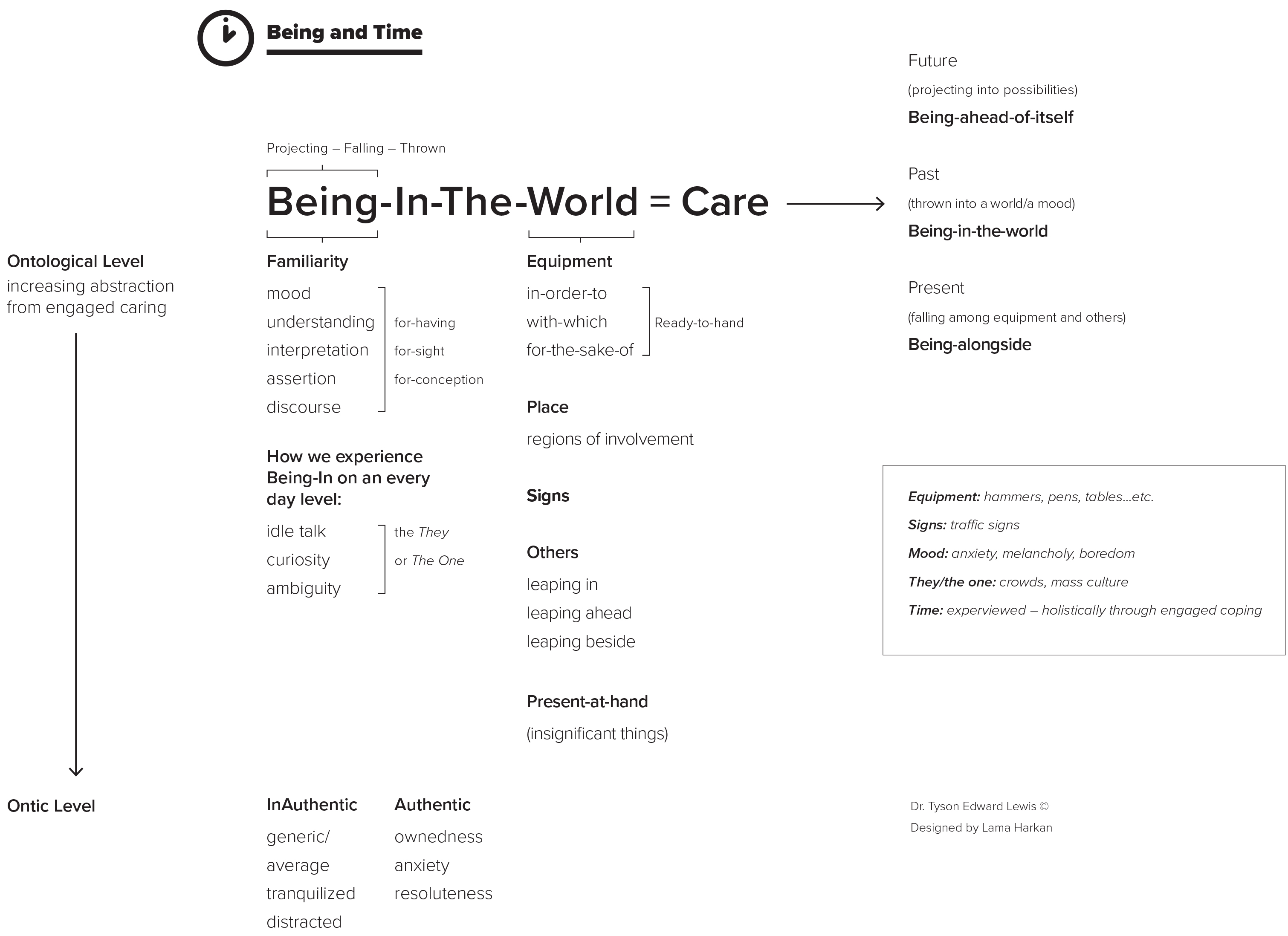
Working closely with my graduate student, we began the design process. Our task was to translate the fundamental structure of Part One of Being and Time into a visual representation that would not level down the meaning of the text but rather open the text to further reflection and discussion. We had to search for key concepts in the text and find symbols and forms of organization that would ensure faithful organization of the content. This is a major challenge because part of the content of Heidegger’s thinking is its form. Indeed, the very principle of the hermeneutic circle for Heidegger is that meaning will shift based on one’s starting point. Further, Heidegger greatly values language, and his word choices and sentence structures are far from arbitrary. There are any number of misunderstandings that could occur if one were to pick out a word and change it or place it in another context. As such, great sensitivity to the form of the book had to be observed throughout the design process. The result, far from perfect, is a first attempt at an infographic that is accessible but also philosophically rigorous. Indeed, at first blush, it might very well resemble any number of graphs philosophy teachers might draw on the board to help students in discussion. But what I found most significant about this project was (a) the collaboration with a design student who brought a design sensibility to my sketches and (b) the aesthetics of the final result. In both cases, the blurring of dichotomies between the verbal and the visual seemed to be productive for further discussion in the class.
From the Design Standpoint: A Student’s Perspective
At this point, I will turn toward my graduate student who helped with the design. The narrative will shift to her voice as she reflects on how designing the infographic shaped her experience of learning Heidegger:
Being and Time was my gateway to a new experience that developed my thinking in philosophy. Heidegger's concept of phenomenology involves many thoughts that should be addressed in a visual map to make it become more “readable,” especially for those of us who are unfamiliar with philosophy. When I started designing this work, I had a real phenomenological moment, which, according to Heidegger, is “the appearance showing-itself”.[11] For a moment, I understood what he was trying to say because of the design process that I had to go through. To emphasize, I think all designers have this experience when they transfer a feeling about the subject to the actual object so that they can come up with the final product. Therefore, my practice was at the apparently unconscious level and led me to live the same moment that Heidegger passed through while he was thinking of being and time. For me, it was not simply a matter of clock time (of linear learning where we start a point a and end up at point b). Designing Being and Time for an infographic was one of those intuitive moments where we have to enter into the subject matter so intimately that we lose track of time. Consequently, my choices of the design elements came from Heidegger's concepts of time as they revealed themselves to me through the design process. Basing my visual ideas on these details, I began outlining the infographic work, in particular creating a visual language to express the holism of Heidegger’s approach to being and time.
Discussion
From a pedagogical perspective, the infographic solves (or at least attempts to solve) Dombrowski’s challenge to images with which I started this article. For Dombrowski, there are limits on the use of images in teaching philosophy. Hegel’s dynamic dialectic was a case in point. Because images are static, they cannot capture the temporal unfolding of thought. Yet I would argue that this worry is met by the infographic which rests precariously in the divide between verbal and visual, temporal and spatial dichotomies. Indeed, I would argue that it would not be too terribly difficult to imagine a vocabulary of signs and symbols that could convey the dialectical qualities of Hegel’s thought. Designing philosophy picks up this challenge and runs with it, developing unique vocabularies that are tailored to the specifications of particular philosophical systems.
Of course, it is impossible to miss the irony of using infographics to teach Being and Time, a book written by a man whose criticism of information, technology, and the leveling down of the rich meaning of being within our present age is infamous[12] For Heidegger, deep contemplation and wonder have become rarities, replaced by nothing more than superficial curiosity in new, debased everyday chit-chat, ambiguity without a center, and instrumental thinking[13] Indeed, it is likely that Heidegger would be appalled at the reductive use of the infographic, and would warn against the substitution of the infographic for the meaning-rich experience of reading his prose. By subtracting out words and inserting them into a schematized graphic, the results might be pedagogically efficacious but philosophically suspect. Signs would be reduced to nothing more than blunt tools for communication of information. Such a relationship with language is inauthentic in that it closes us off from a poetically effusive language that discloses the world and the being of that world. On this reading, the “cliff-notes” version of Being and Time visually represented in the infographic thus takes on the appearance of a symptom of the very informational world which the book attempts to resist if not undermine. The representational qualities of the infographic which are so praised from one perspective, emerge as highly problematic from another angle. The cultivation of attention, which was valued as resistance against the rush of information, becomes a violent attempt to possess or grasp the withdrawing and concealing nature of being. In short, more might be lost than is gained in designing philosophy. As such, it now appears that Dombrowski was indeed correct and that one cannot imagine an image that could do pedagogical justice to Heidegger’s thought!
Yet I would like to end with a suggestion, one that lives precariously between endorsing the pedagogical use of infographics in philosophy classrooms and one that rejects such interventions. While it might be important to discuss the underlying design principles informing infographics and their production, I think that it is also important to reflect on how we use them in classrooms. If they become nothing more than cheat sheets for students who were never going to read the book in the first place, then the infographic might very well be a philosophical failure (even if its design could be considered “effective”). Professors and teachers using infographics must do so cautiously and only in support of deep textual engagement.
And in this light, the term designing philosophy can take on a slightly different meaning that the one proposed above. When I first introduced this term, I emphasized designing philosophy. Stated differently, I emphasized how design principles can be applied to philosophical texts in order to make them more approachable and open them up for shared discussion. When I write designing philosophy, I am stressing how philosophy can help us focus on the limits of design. Stated differently, philosophy can loop back and help us reflect critically on what design means and how its application to philosophy might involve a certain level of violence against thinking. On this view, the infographic itself ceases to be a transparent pedagogical tool and becomes a text in its own right whose “work” is up for questioning. A meta-reflection on the function of the infographic in both capitulating to and resisting our information and technologically enframed society is key to its life in a dialogic classroom.
Indeed, I would conclude by arguing that the verbal and the visual found within the infographic are not merely reconciled / harmonized but rather exist in tension with one another. Such tension draws attention to itself. A skilled pedagogue can make this a point of reference in teaching, highlighting how this tension enhances our experience of a text while also possibly detracting us from textual engagement. Such movements back and forth from what the infographic presents and what withdraws from its capture can become the space and time of philosophical education within yet against an information driven, visually disorienting society.
References
- Dombrowski, D. “Raphael's School of Athens in a Philosophy Classroom,” Teaching Philosophy, 4 (1981): pgs. 33–38.
- Heidegger, M. Being and Time New York. New York, NY, USA: Harper Perennial, 2008, p. 35.
- Heidegger, M. The Question Concerning Technology and Other Essays. New York, NY, USA: Harper Perennial, 1977.
- Lessing, Gotthold Ephraim. Laocoon: An Essay upon the Limits of Painting and Poetry. Translated by Ellen Frothingham. Minneola, NY: Dover Publications, 2005.
- Lindblom, K. et al., “Composing Infographics to Synthesize Informational and Literary Texts,” English Journal, 105.6 (2016), pgs. 37–45.
- Mitchell, W. J. T. What Do Pictures Want?: The Lives and Loves of Images. Chicago, IL, USA: University of Chicago Press, 2005.
- Simpson, C. “Exploring Personal Values to Promote Critical Thinking, Mindfulness, and Empathy.” English Journal, 104.5 (2015), Online. Available at: http://www.ncte.org/journals/ej/issues/v104-6 (Accessed July 29, 2017).
- Uyan Dur, B. I. “Data Visualization and Infographics in Visual Communication Design Education at The Age of Information,” Journal of Arts and Humanities, 3.5 (2014): pgs. 39–50.
- Vagle, M.D. Crafting Phenomenological Research. New York, NY, USA: Routledge, 2014.
- Wrathall, M. “The Phenomenological Relevance of Art.” In Art and Phenomenology, edited by J.D. Parry, New York, NY, USA: Routledge, 2011, pgs. 9–30.
Biographies
Tyson E. Lewis is an Associate Professor of art education at the University of North Texas. His work on educational philosophy, critical theory, and aesthetics has appeared in critical humanities journals such as Cultural Critique, theory@buffalo, Cultural Politics, and Symploke. He is also author of several books, including On Study: Giorgio Agamben and Educational Potentiality (New York: Routledge, 2013), The Aesthetics of Education: Theatre, Curiosity, and Politics in the Work of Jacques Rancière and Paulo Freire (London: Continuum, 2012), and most recently, Inoperative Learning: A Radical Rethinking of Educational Potentialities (New York: Routledge, 2017).
Lama Al Harkan is a Ph.D. student in the Art Education program at the University of North Texas. She is also an instructor of art education at King Saud University in Riyadh, Saudi Arabia. Her interest is in design based art education, and she wants to extend her area of research in this direction through her dissertation.
Notes
Wrathall, M. “The Phenomenological Relevance of Art.” In Art and Phenomenology, edited by J.D. Parry, New York, NY, USA: Routledge, 2011, pgs. 9–30.

Dombrowski, D. “Raphael's School of Athens in a Philosophy Classroom,” Teaching Philosophy, 4 (1981): pgs. 33–38.
Dombrowski, D. “Raphael's School of Athens in a Philosophy Classroom,” p. 33.
Dombrowski, D. “Raphael's School of Athens in a Philosophy Classroom,” p. 33.
Gotthold E.L. Laocoon: An Essay upon the Limits of Painting and Poetry, translated by E. Frothingham, Minneola, NY, USA: Dover Publications, 2005; (originally published by Boston, MA, USA: Roberts Brothers, 1887).
Vagle, M.D. Crafting Phenomenological Research. New York, NY, USA: Routledge, 2014.
Uyan Dur, B. I. “Data Visualization and Infographics in Visual Communication Design Education at The Age of Information,” Journal of Arts and Humanities, 3.5 (2014): pgs. 39–50.
Lindblom, K. et al., “Composing Infographics to Synthesize Informational and Literary Texts,” English Journal, 105.6 (2016), pgs. 37–45.
Simpson, C. “Exploring Personal Values to Promote Critical Thin-king, Mindfulness, and Empathy.” English Journal, 104.5 (2015), Online. Available at: http://www.ncte.org/journals/ej/issues/v104-6 (Accessed July 29, 2017).
Mitchell, W. J. T. What Do Pictures Want?: The Lives and Loves of Images. Chicago, IL, USA: University of Chicago Press, 2005.
Heidegger, M. Being and Time. New York. New York, NY, USA: Harper Perennial, 2008, p. 35.
Heidegger, M. The Question Concerning Technology and Other Essays. New York, NY, USA: Harper Perennial, 1977.
Heidegger, M. Being and Time. New York, NY, USA: Harper Perennial, 2008.